


The converted townhouse in Edinburgh’s New Town
celebrates light and colour in a considered way
Just as it is for a photographer, the foremost consideration for an interior designer is light. How much is there? Where does it fall? Is there enough? Is there too much? How does it affect the mood in a room? How can it be manipulated? Kimberley Bremner of Jeffreys Interiors was reminded of light’s crucial role when she began working on an apartment in Edinburgh’s New Town last year.
The owners, who were relocating from Aberdeen, had come to her after seeing a property she’d designed a few years ago, in Ann Street. It was full of rich, dark colours, and they loved its moody atmosphere. Could she do something similar with their new place?

But when Kimberley went to have a look, she could see immediately that such a scheme would never work here. “The house in Ann Street faced north and it needed to feel cosy – the warm, dark tones achieved that,” she explains.
“This apartment, though, faces south, has lovely big windows and is filled with a beautiful light. Going dark would have felt really forced and would have jarred with the strong, almost luminous golden-orange light that streams in. I’d have been fighting with the natural light instead of working with it, and the interiors would have felt uncomfortable and claustrophobic.”
If the clients had any doubts, they were won over once she explained how a dark scheme would impact their treasured art collection – a collection they’d told her they were planning to rotate and add to. “I said, ‘If we go dark, we’ll have to illuminate your paintings so you can see them, and that will jar against the darkness too. And if we put up picture lights, you’ll be restricted over where you can hang things.’ I had a lot of winning
arguments!”
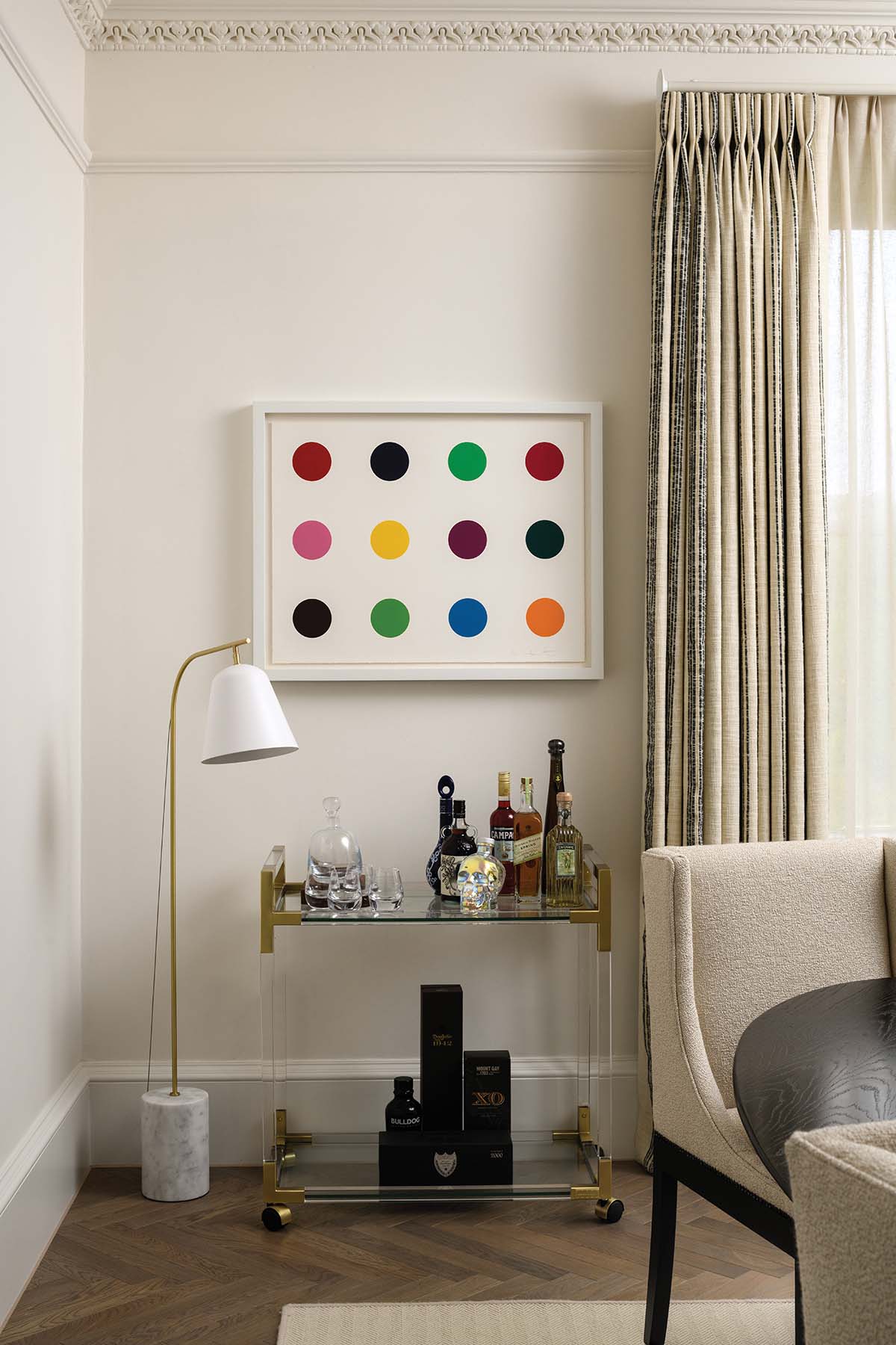
She also had a solution: to go with dark elements – pieces of furniture and accessories – set against a calm, serene background. The walls, the ceilings and the doors are all one
colour so the eye can focus on what really matters: the art.
The apartment, on the top two storeys of a Georgian townhouse, had been recently overhauled by a developer, and looked in good shape on first viewing. But as soon as the Jeffreys team scratched the surface, all sorts of issues emerged: the floors weren’t level, the kitchen was a cheap off-the-shelf model, and only some of the wiring and plumbing had been upgraded. “It just lacked quality. The craftsmanship was really poor,” recalls the designer.
A bigger problem awaited on the upper floor, which was crammed with tiny rooms. It needed a total rethink. Working with an architect, Kimberley redrew the layout, getting rid of the utility room and a long corridor that took up a lot of space. The new arrangement still had three bedrooms, but each was bigger, brighter and more comfortable than before.
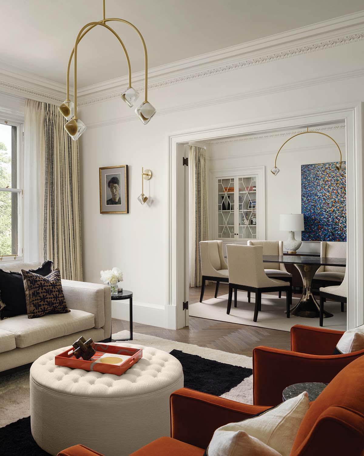
There were changes downstairs, too. The wall between the lounge and the dining room was opened up, so dinner guests can move from one to the other without traipsing through the hall. Double doors mean there’s still the option to close off the space for a cosier feeling.
“These clients are young – they’re only in their early 40s and they live a great life – so their home should reflect that,” says the designer. “‘Let’s not keep it trad and stuffy, because that’s not you,’ I told them. I felt it was important to create something that would suit the way they actually live, rather than focusing on what a house of this size ‘should’ have. Their interests, their social lives, how they spend their day-to-day – we took it all on board and incorporated it into the design.”
To that end, she ditched the traditional study you might expect to find and gave them a snug instead. “And the first thing any snug needs is an enormous sofa. So we got the biggest one that would fit in and built the rest of the room around that.”
There is still plenty of respect shown to the apartment’s Georgian heritage, though, as can be seen in the new Shakerstyle kitchen from Edinburgh cabinetmaker Peden & Pringle. “We could have gone for something a bit more modern, but the owners were clear they wanted it to be in keeping with the style of the house, a bit softer and more tactile,” says Kimberley.
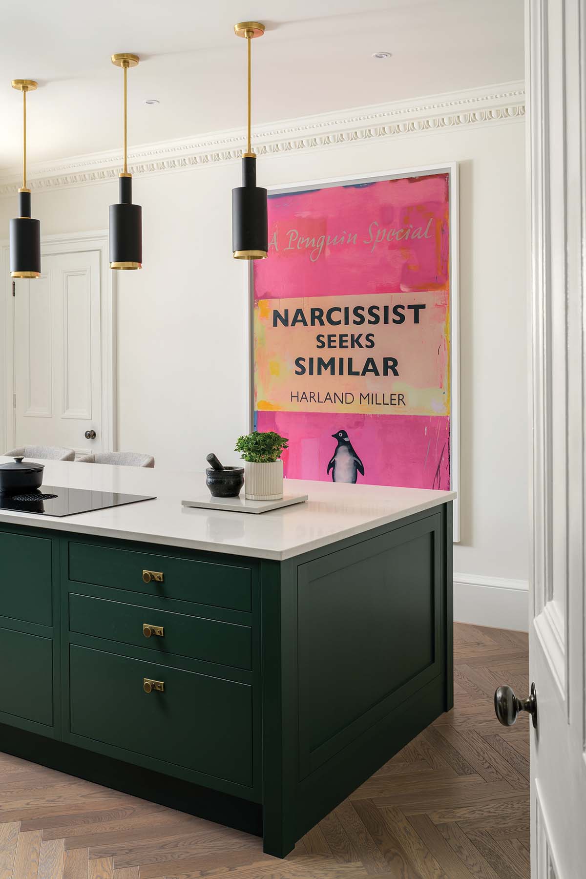
A utility cupboard has been fashioned from an alcove, its contents hidden behind doors painted to match the pale walls, allowing the dark green island and cabinets to take centre stage.
The island is topped with a single slab of quartz nearly 2.5m long and so heavy it had to be craned up three flights and in through the window. “That was nerve-racking – seeing all these expensive cars on the street below this giant block of stone!”

The bright, airy rooms work brilliantly in summer – but how do they hold up under Edinburgh’s iron-grey winter skies? Kimberley has pre-empted that problem, building in layers of lighting that give off the right glow and are in the right position in each room.
“I like to illuminate corners with floor lamps an place table lamps on sideboards, for those nice mid-level lights,” she says. “Soft touches are everywhere too, and lightweight throws
and cushions can be switched for heavier woollen ones. The layered window treatments help as well – a heavy curtain with a sheer one gives a lovely softness.”
The owners had quickly got on board with her bright scheme, and were keen to contribute; they would often snap photos of pieces they spotted when they were out and about, then ask Jeffreys if they could be used. “If they weren’t suitable, we’d find out what it was the owners loved about these pieces and then try to incorporate that element somehow,” she recalls.
Once or twice, though, the clients would insist: “We sent them to look at front door colours and they came back with this wallpaper [left], calling it ‘really good fun’ and directing us to use it in the downstairs loo…” laughs the designer. “We were happy to do it – we know it’s good for the soul to throw in something weird every now and then! We won’t steamroller you if you want to get a little weird sometimes – instead, we’ll make it work.”


