


Bold, daring, colourful and playful: this home designed by Mia Karlsson celebrates youthful energy and zest, without ever feeling anything less than polished
Adventurous people crave challenge. The adrenaline rush of climbing a mountain or beating a personal best; that push beyond the comfort zone that pays off: that’s where those willing to take risks get the biggest rewards.
A meeting of minds with Mia Karlsson allowed Michelle Curtis and her family of adventurers – partner Steve and kids Audrey (12), Sylvia (11) and nine-year-old Jack – to apply the same kind of spirit to their new home.
The Swedish-born, London-based interior designer helped them completely overhaul their property in Hampstead.
 What was previously a tired and soulless house is now chock-full of colour, brimming with exciting design tricks and reflecting the life and personality of its owners. “Michelle and her family had been living in an apartment in London,” recalls the designer.
“Then, when lockdown hit, they did what a lot of other people did and moved to the countryside, in their case to the Cotswolds.
The time they spent there gave them a chance to figure out what they really wanted. When they returned, they sold up and bought this place. Their lifestyle had changed.”
Michelle and Steve’s aim was to fashion a home that worked for their family and their newfound, post-pandemic sensibilities. Mia, who’d set up her own practice in 2004, was the perfect fit.
Her approach is very far from the kind of cookie-cutter style that many studios dub their ‘signature look’.
• Inside the restoration of a 200-year-old cottage on Mull
Her raison d’être is to find practical solutions for her clients, working out a bespoke scheme that speaks to how they live and enhances their everyday routine.
She’s able to discern the best way for a space to function, marry that with how each client wants to use the property, and come up with beautiful interior design flourishes that tell the story of its inhabitants.
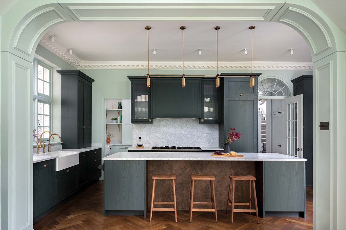
In this instance, the narrative was clear: this family needed the layout to flow, they needed lots of storage, and they wanted lots of natural light.
Mia welcomed the challenge. “There was no continuity of light from front to back,” she recalls, “no vista. It was like walking into a box. There was no storage either, which was a problem since the kids all like to ski and having somewhere to stash all their kit was crucial.”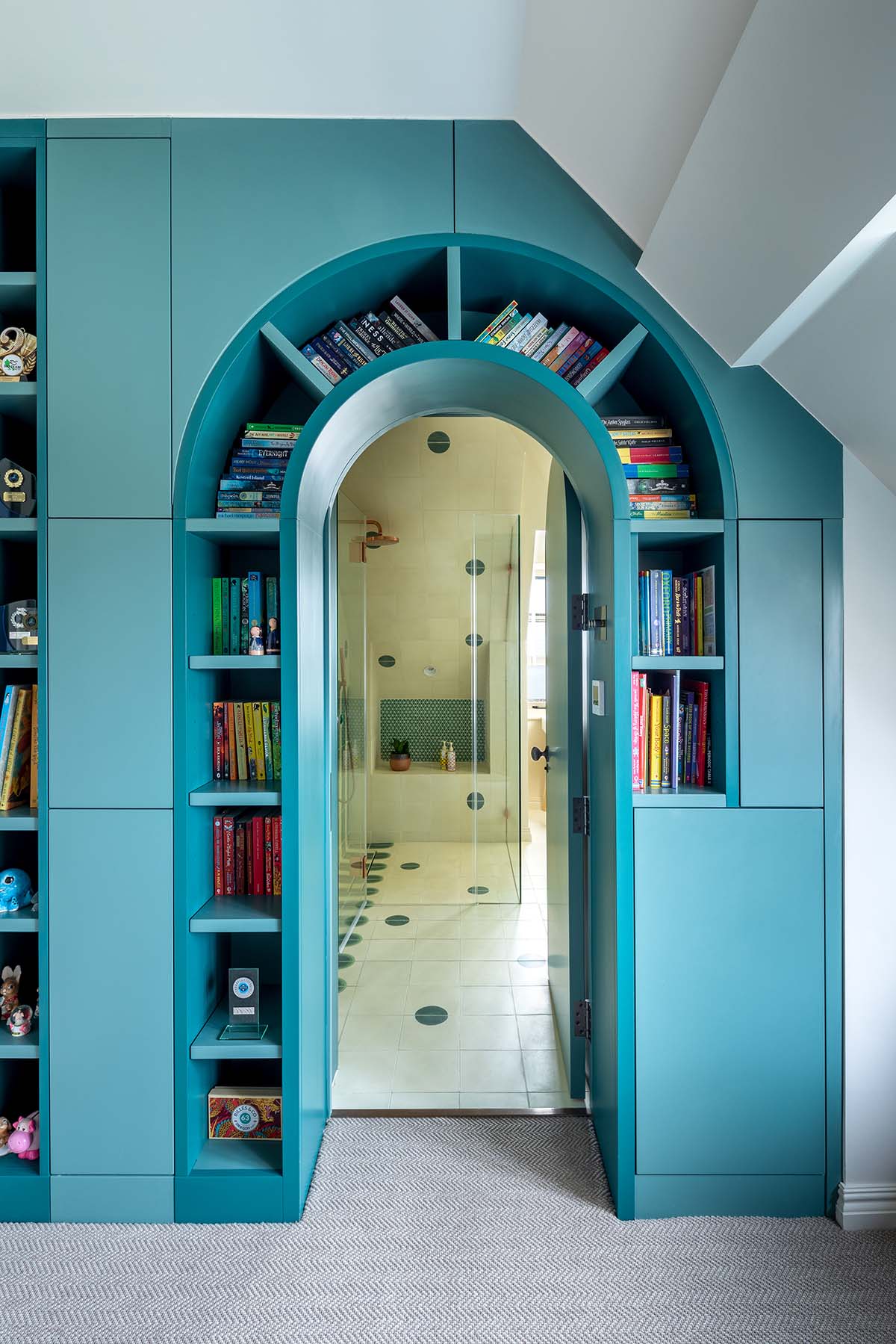

Together with the builder Kom Interiors Ltd and architect John Allsopp, the designer set about reimagining the layout to converge with the family’s needs.
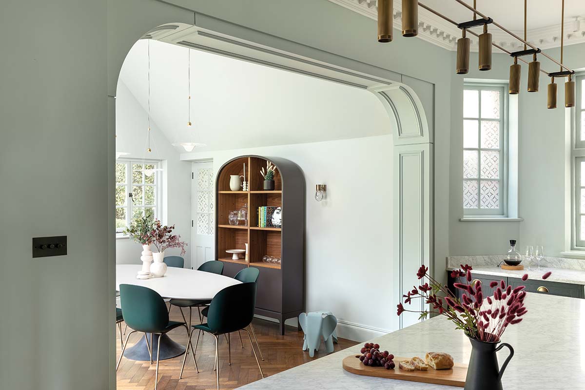
From the front door, she opened up the hallway right through to the garden by using glazed arched doors.
These echoed the original period of the property and ensured you’d never lose the view.
Panelling was reinstated (“the builder had this way of talking to old houses, taking so much care and being very sympathetic”), an archway was installed between the kitchen and
dining area to make the space more conducive to family life, and new dormers and skylights were introduced, too.
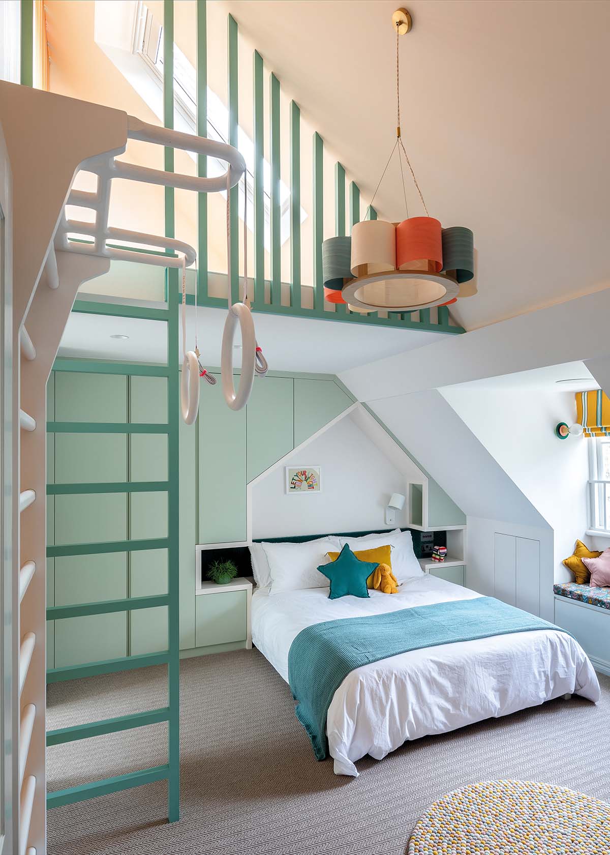
In the attic, Mia saw an opportunity to make much better use of what was little more than a cramped dead space.
By opening the ceiling right up to the rafters, she has crafted two bedrooms for Michelle’s daughters and given each a mezzanine level.
“We’d been promising the kids standout bedrooms for years but hadn’t gotten around to renovating in our previous property,” says Michelle. “We decided against a playroom and went for clever built-in storage and smart design instead. It has resulted in some very special spaces for them.”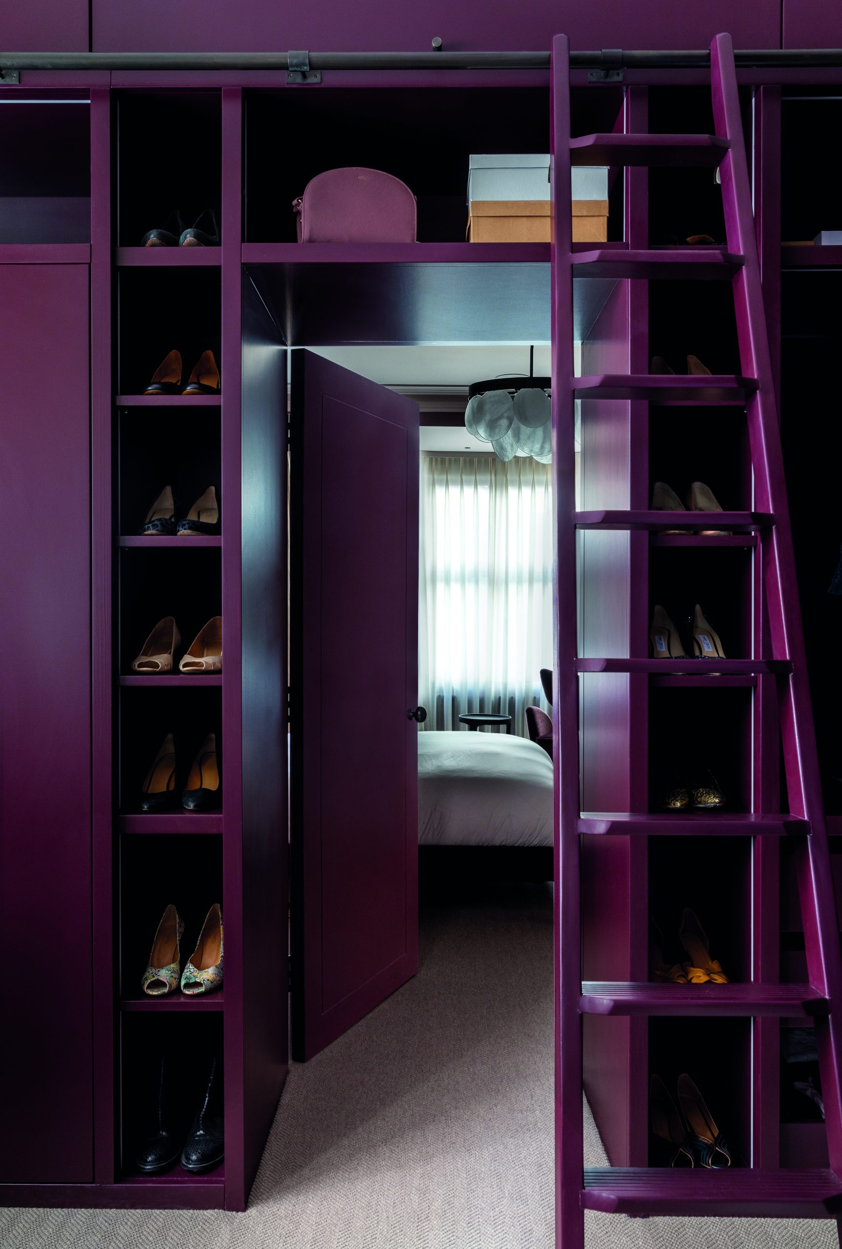
The ground floor has changed quite dramatically, too. “It used to be a very open-plan, modern family space with no separation, but we wanted options for grown-up rooms.”
A family room accessed easily from the kitchen, a separate, more formal drawing
room, and a music den with a piano (which doubles as a study/ library) were eked out of the footprint.
With these fundamental changes in place, Michelle can now say that the family use every inch of their home. Having four distinct task-focused areas downstairs makes life much easier.
• This tenement in Govanhill has been transformed into a work of art
The connection to the garden has improved dramatically and the bedrooms feel like special retreats which the youngsters – and their parents – can escape to, to enjoy some down time.
“We’ve also found that the children are much more incentivised to keep their rooms tidy as they’re so proud of them!”
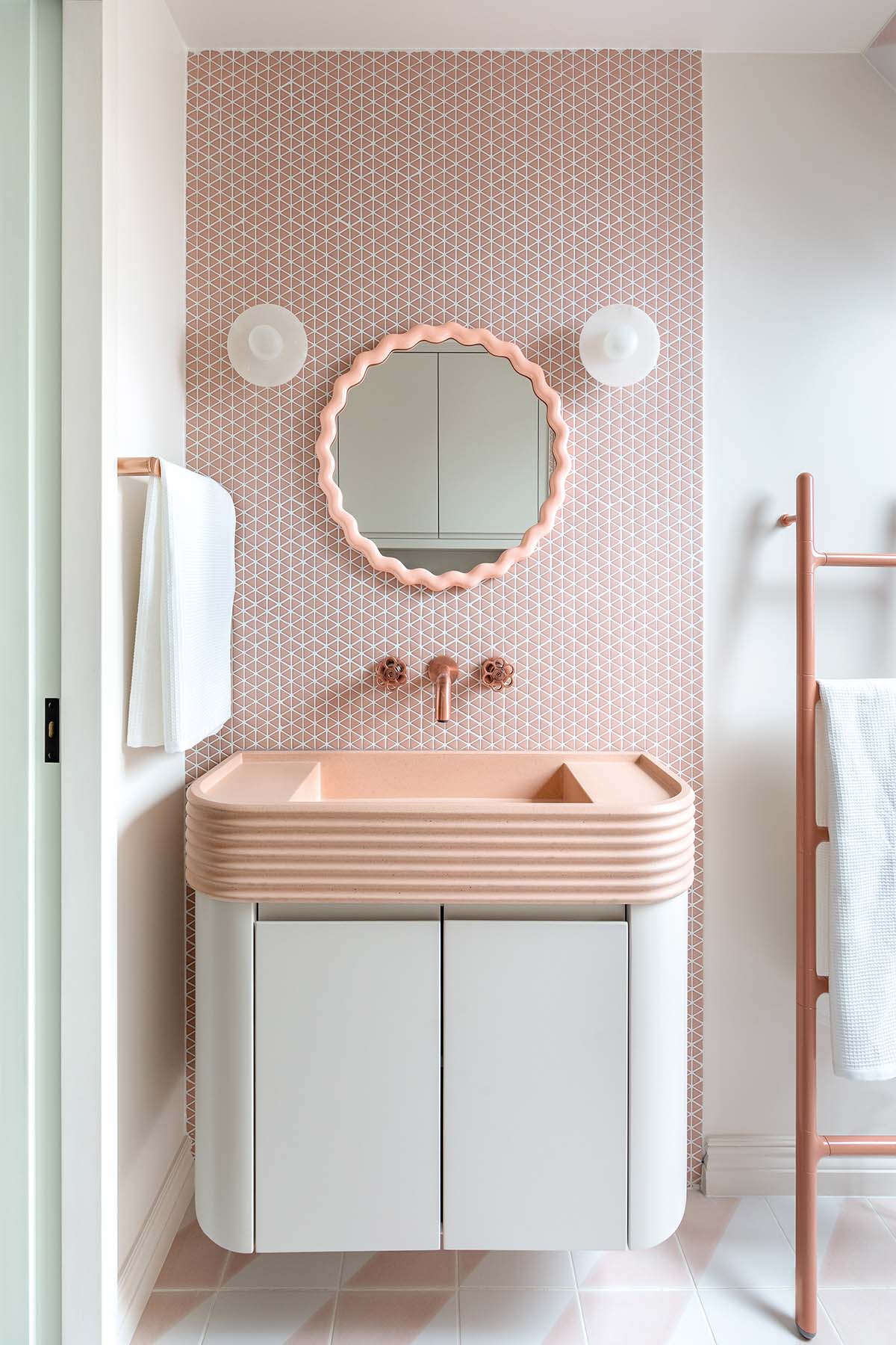
Audrey, Sylvia and Jack had a great deal of input into their bedrooms and bathrooms, helping to choose colours and patterns and add in extras like the climbing wall, gymnastics rings and a rope climb.
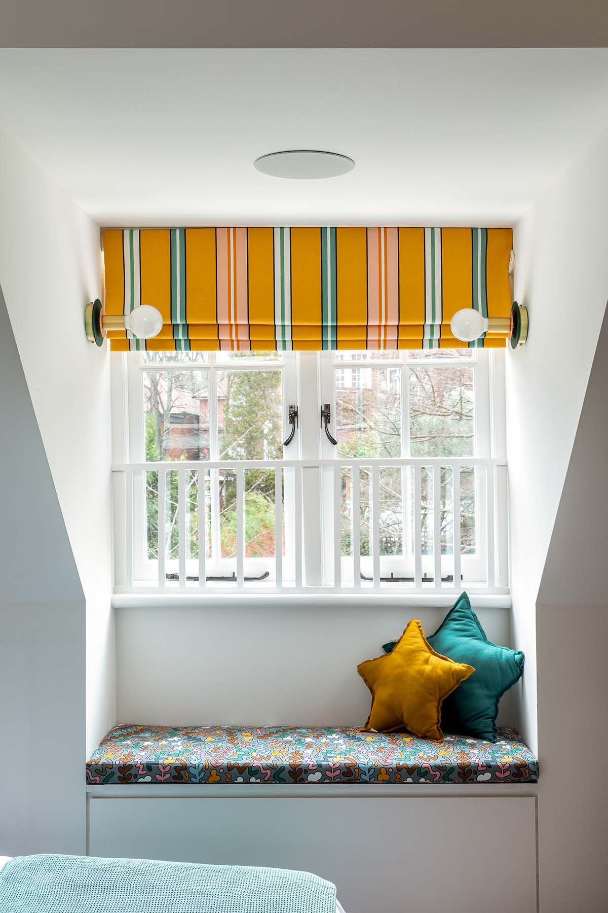
Mia’s intention was to allow them autonomy to be creative but to help guide them in terms of palette and offer a scheme that was timeless enough to last into their teenage years,
with some simple updates.
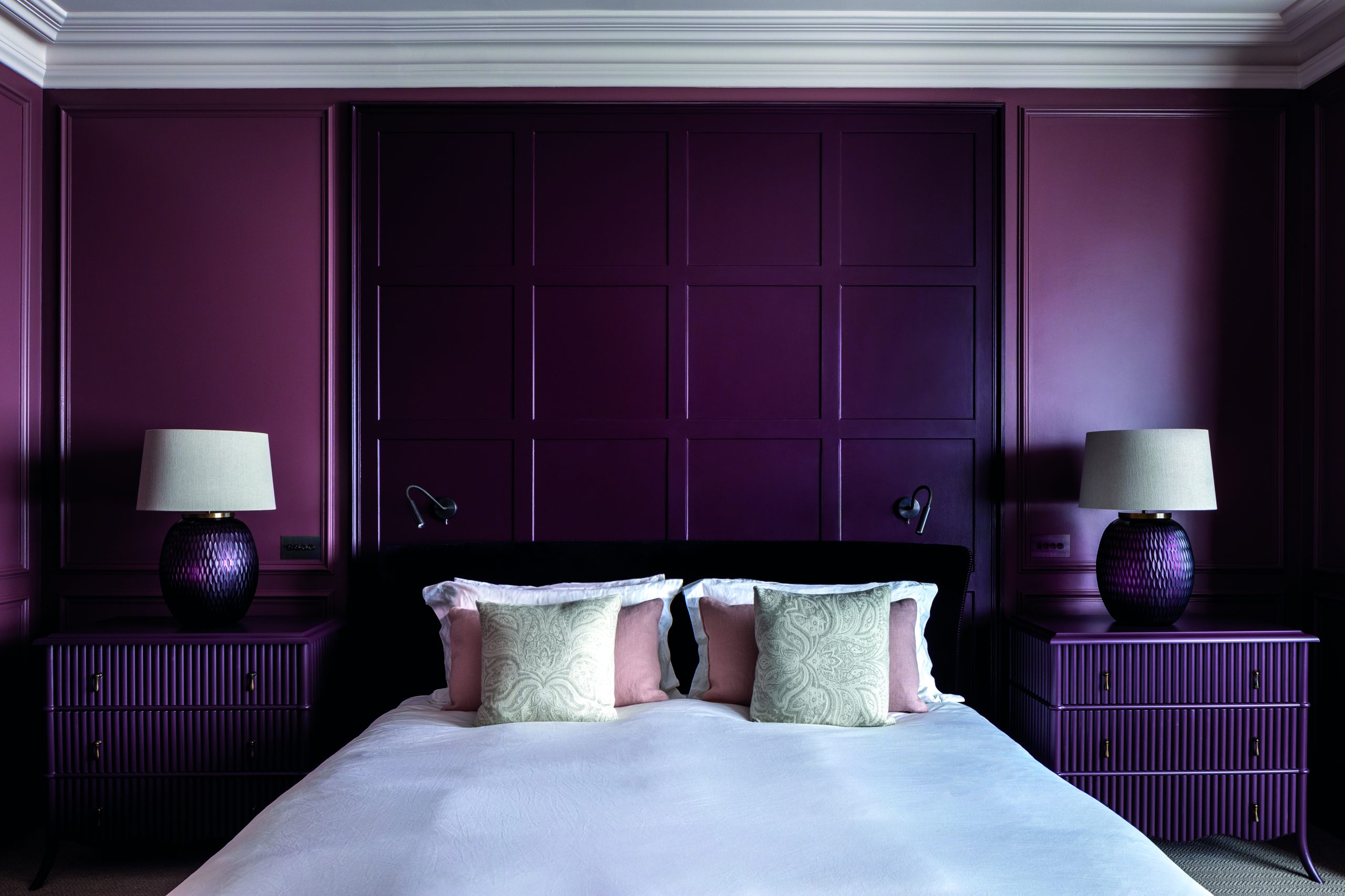
It’s one of the standout successes of this project, the way Mia has been able to demonstrate how kids’ rooms can possess a youthful energy yet still be just as appealing and sophisticated as the spaces for the grownups.
For her, a successful project is one where her clients smile and recognise themselves in their home – albeit an enhanced, much more pulled-together version of who they are.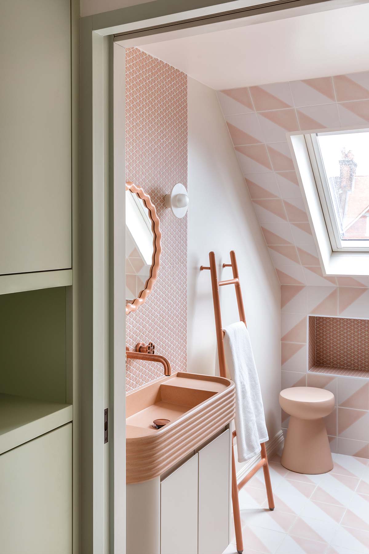
“My advice is always to get the best out of your space,” she states.
“It makes me cross when people spend a fortune but their designers don’t use the space well. You should always spend the money on getting the basics right. Buy the proper materials and invest in quality workmanship. Don’t skimp, but spend wisely on the structure.”
“It’s much easier to add in the fun elements and save on the dressing if the basics are sound.”


