Abram Games:
Responsible for some of the most iconic Home Front posters of the Second World War, Abram Games had a graphic style that is still resonant today. 1914 – 1996
“I am not an artist. I am a graphic thinker. I am bad at drawing, but what I lack in natural talent I make up for in solid hard work.”
Words Catherine Coyle
Originally published in issue 98
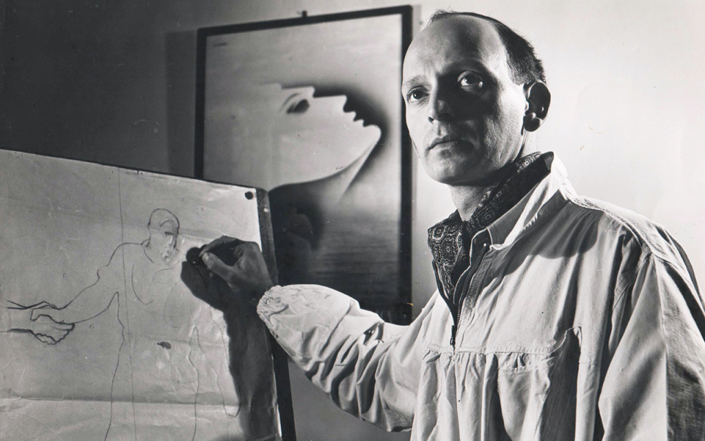
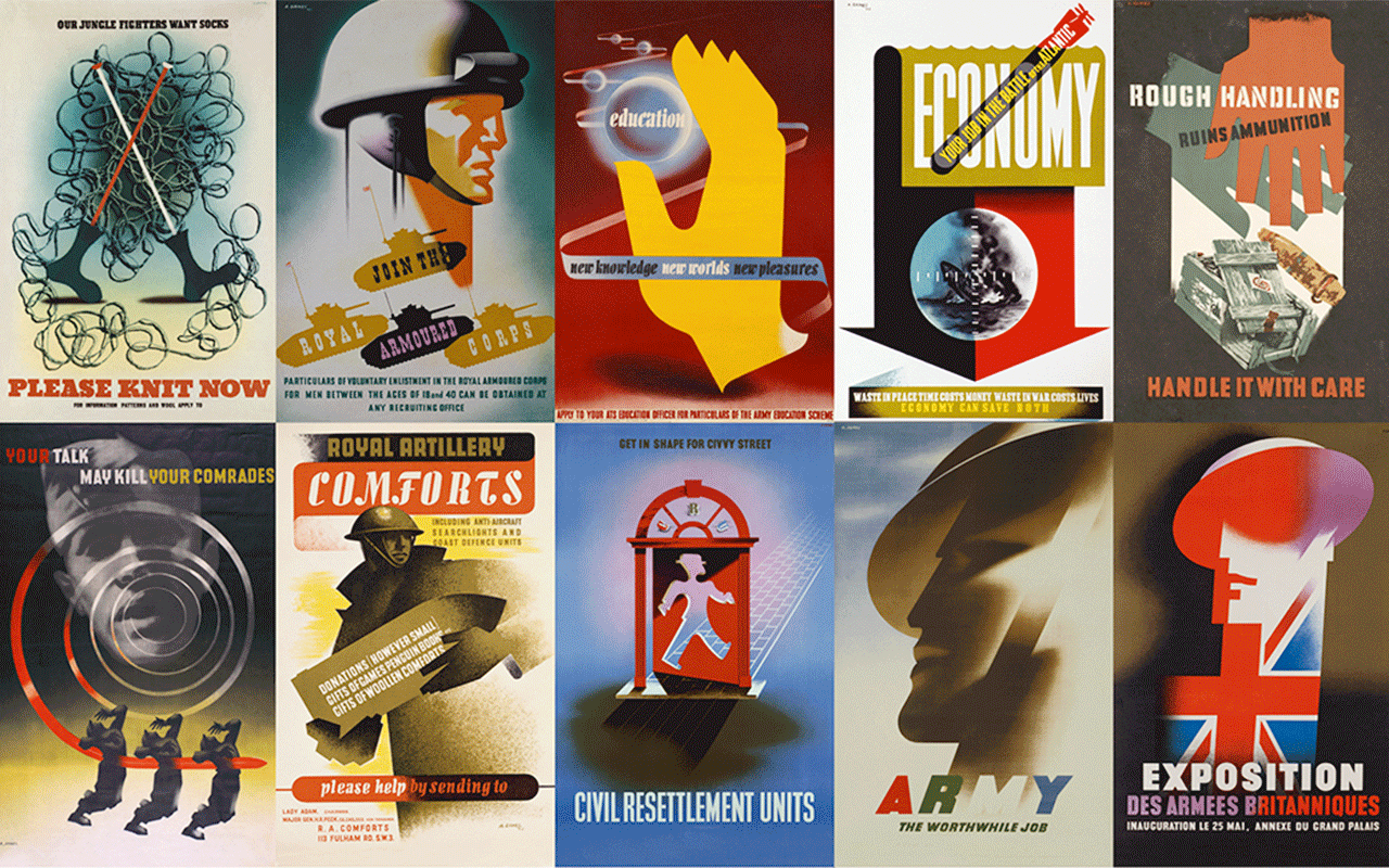
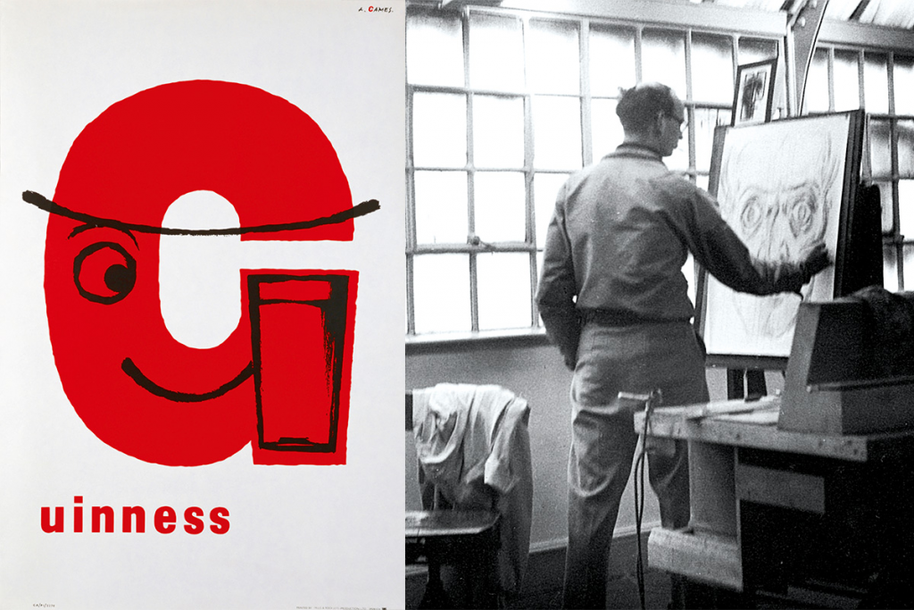
Abram Games was 11 when he decided to become a poster artist. His school report had noted that his drawing skills were ‘weak’ but this did not deter him. In 1942 he became the only official War Poster Artist, and six years after this he won a competition to design the emblem for the 1951 Festival of Britain.
For the full story, check out episode 8 of the Homes & Interiors Scotland podcast which focuses on design during WW2.
Bernat Klein:
A European designer, artist and master of colour who made his home in the Scottish Borders. 1922 – 2014
“Bernat Klein continues to inspire, but perhaps his legacy is simply that he brought colour into post-war Britain, transforming its drab hues.”
Photography courtesy of Bernat Klein Trust and Jed Gordon Words Rhona Warwick Paterson
Originally published in issue 102

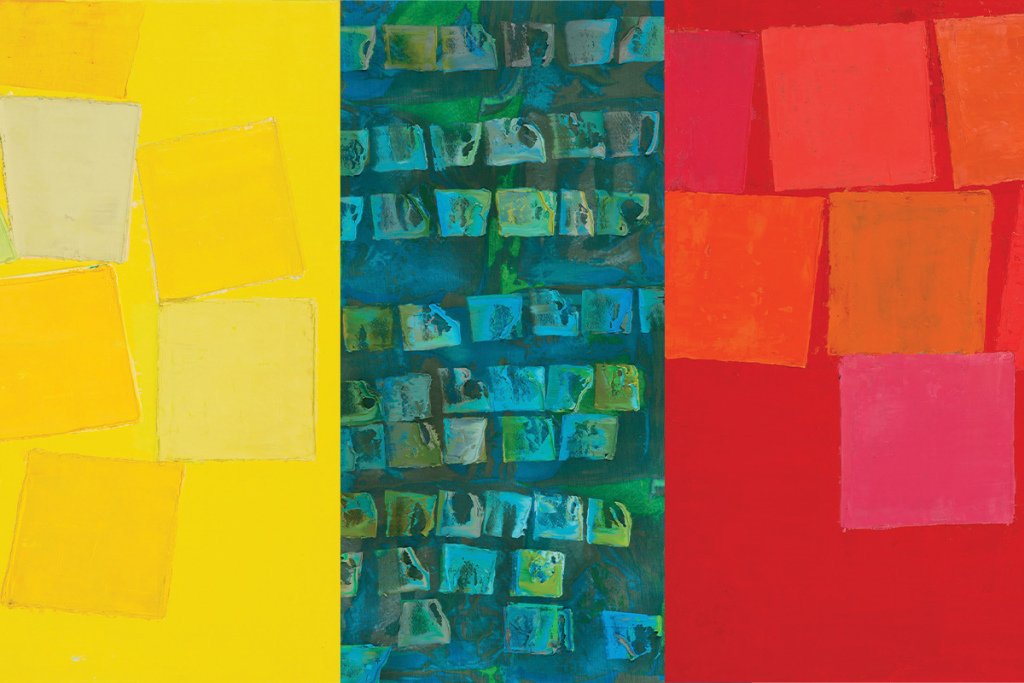

If all art reflects its maker, there is no doubt that the multifarious colours and textures of Bernat Klein’s oeuvre reveal him to be a man of many facets, whose inquisitive creativity and intellect defy categorisation. Known primarily for his vibrant textiles in mohair and tweed, he was also creatively involved in architecture, furniture design and painting.
For the full story, check out episode 8 of the Homes & Interiors Scotland podcast which focuses on design during WW2.
Tibor Reich:
A distinctive eye for colour and a desire to give his textiles three-dimensional texture set this Hungarian-born designer on a unique path to success.1916 – 1996
“He was defiantly avant-garde, always pushing the boundaries.”
Words Catherine Coyle Photography courtesy of Tibor Ltd
Originally published in issue 106


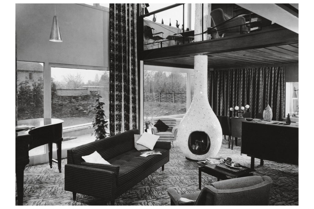
Tibor Reich had an unwavering drive to succeed. Riches and notoriety were of no interest to him. His passion, instead, was his work – the pursuit and development of his craft. He was eager to become an architect and drew prolifically as a child. He was from an affluent Jewish family of industrialists; his father owned a textiles factory while his mother was from a family of successful restauranteurs. Hard graft was in his genes.
For the full story, check out episode 8 of the Homes & Interiors Scotland podcast which focuses on design during WW2.
Ettore Sottsass:
This endlessly inventive Italian designer was also an architect, poet, and photographer. 1917 – 2007
“Karl Lagerfeld was a big fan, decking out his home in the late 1980s in Memphis pieces.”
Words Catherine Coyle Photography courtesy of Studio Ettore Sottsass
Originally published in issue 115

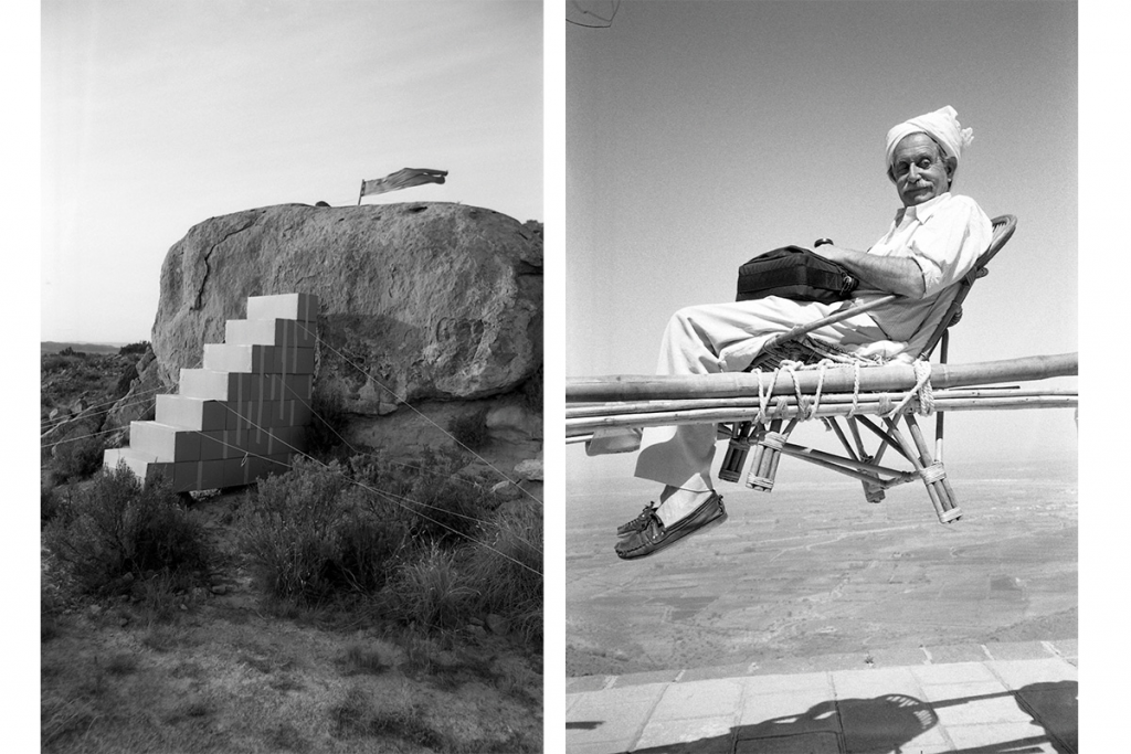

Ettore Sottsass was always one of a kind. All through his life he was labelled ‘designer’, or ‘architect, sometimes ‘artist’ or ‘writer’. He was all of those things – and many more – but at heart he was a consumer of life, a thrill-seeker, a passion-hunter. If ever there was a person who completely embraces the (currently very fashionable) notion of mindfulness, it was Sottsass: his life was lived fully and joyfully and nowhere more so than in his work.
For the full story, check out episode 8 of the Homes & Interiors Scotland podcast which focuses on design during WW2.


