


This is how you can use colour theory to create balanced spaces that look gorgeous and reflect your personality
Colour theory and the colour wheel can seem intimidating for those who are new to design and home improvements. But engaging with the theory – and taking time to understand it – helps build a more effective final result. Johanna Constantinou from Tapi Carpets & Floors shares the game-changing colour theories for 2025 – and how to use them.
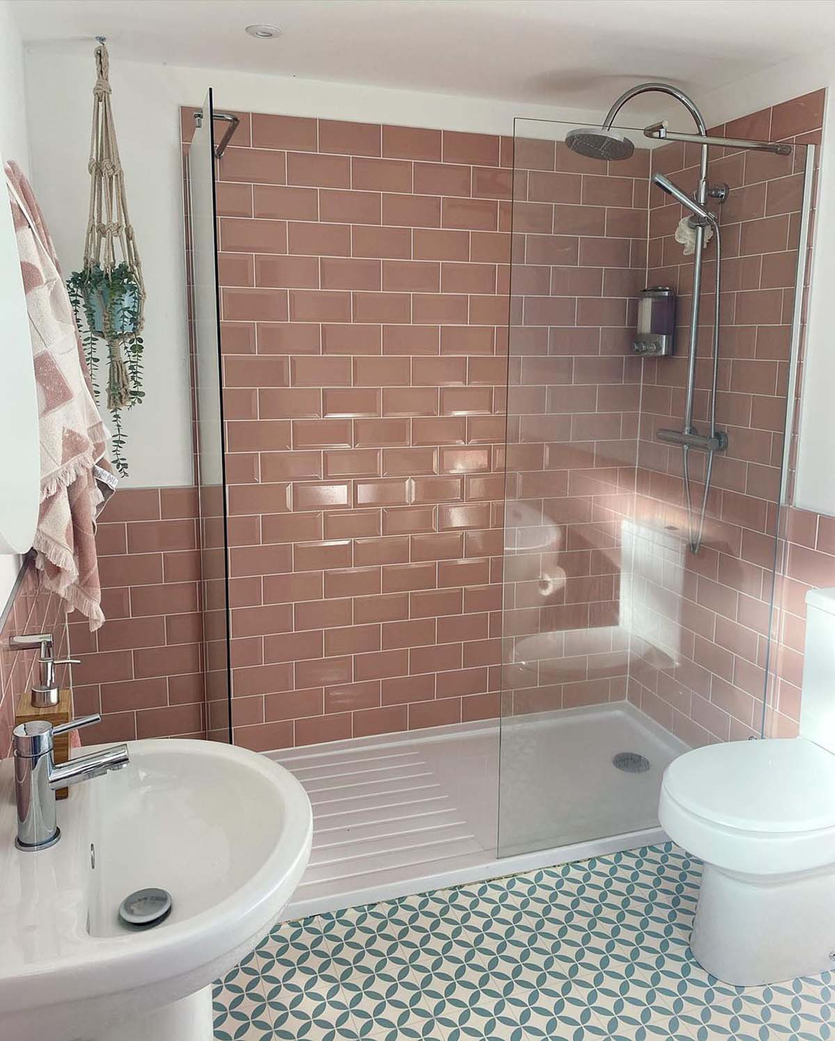
“60-30-10 is a timeless guideline in interior design that helps achieve a balanced colour scheme in any room,” Johanna begins. “By allowing one colour to dominate, the design maintains cohesion. This versatile rule suggests dividing a room’s colour palette into three proportions: 60% for the dominant colour, 30% for the secondary colour, and 10% for the accent colour.”
Let’s break it down.
60% – The dominant colour
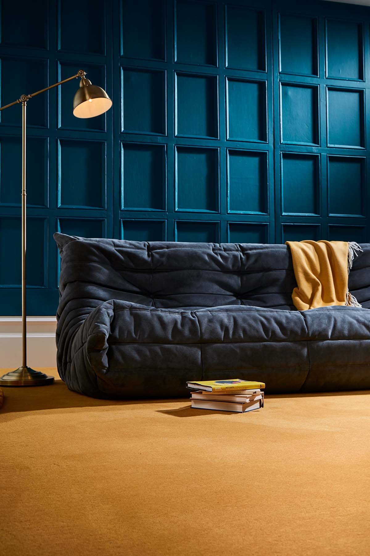
The dominant colour should cover the largest portion of the space – usually around 60%. “This colour serves as the foundation of the room and sets the overall atmosphere. It’s often used on walls, large furniture pieces, or flooring. This colour should align with the overall mood and purpose of the room, whether it’s warm and welcoming or cool and serene,” says Johanna.
For example, a soft neutral like light beige or a pale grey on the walls creates a calming backdrop, ensuring the room feels spacious.
30% – The secondary colour
The secondary colour makes up about 30% of the space and adds depth and contrast to the dominant colour. “The secondary shade complements the dominant hue but is usually a bit more striking, offering variety without overwhelming the room. It is often applied to larger pieces of furniture, window treatments, or accent walls,” says Johanna.
For example, a rich navy blue or a warm earthy tone, such as rust, could be used for the sofa or curtains, providing contrast to the soft neutral walls, while maintaining a balanced aesthetic.
10% – The accent colour

The accent colour makes up the remaining 10% of the space and is used sparingly to add vibrancy, interest, and focal points. “The accent colour can be an unexpected pop of colour that draws attention to key features like artwork or throw pillows. Accent colours can be bold or vibrant, offering an opportunity to experiment with trendy hues without overpowering the room,” says Johanna.
For example, a vibrant mustard yellow or deep emerald green used in accessories, such as cushions, adds a touch of excitement and draws attention to specific areas of the room.
Now, let’s use this to better understand the colour wheel. “It’s a powerful tool, so use it!” says Johanna.
“The colour wheel is used to understand relationships between different colours. It consists of primary colours (red, yellow, blue), secondary colours (green, orange, purple), and tertiary colours (such as red-orange or yellow-green).”
Complementary colours
“These colours are opposite each other on the wheel, they create high contrast and vibrancy, ideal for dynamic areas such as living rooms or creative spaces,” says Johanna.
Analogous colours
“These colours are next to each other on the wheel, they are harmonious and create serene, cohesive environments, ideal for bedrooms or relaxing areas,” explains Johanna.
Monochromatic
“These colours are variations of a single colour, using tints, tones, and shades, which create depth despite it being along one colour palette. You can use these in walls and floors to build a multi-layered look that not only adds visual interest but satisfies colour theory too.”
Visit the Tapi Carpets & Floors website
Harlequin’s collaborations are a masterclass in colour and texture


