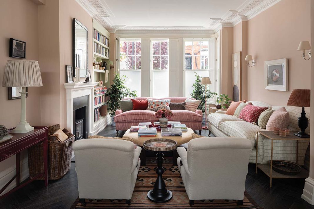
Expert layering and a palette of harmonious colours combine to bring this room together
An eclectic scheme full of different colours and prints: it’s Jessica Buckley’s calling card. The Edinburgh-based interior designer has a command of pattern that us mere mortals can only dream of.
A unique challenge that Jessica is willing to embrace
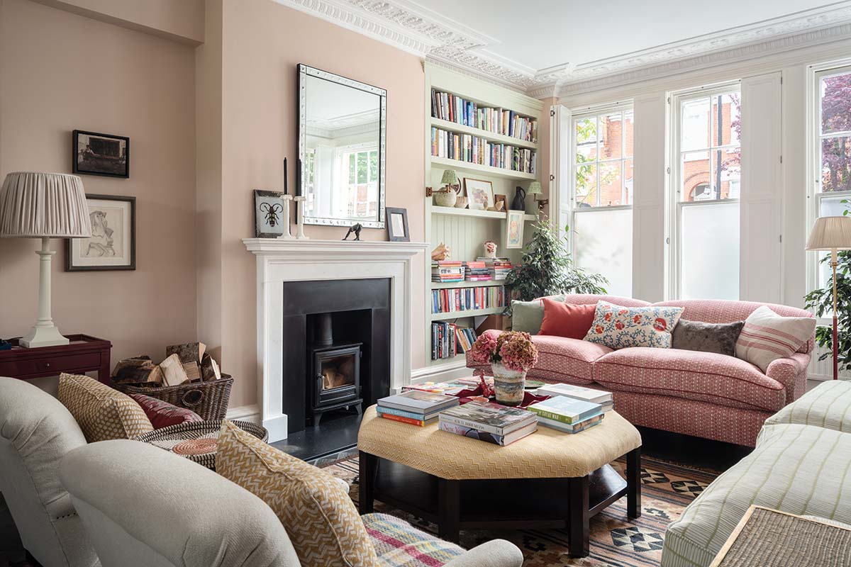
This tricky London living room was at the receiving end of her abilities, and is now an effortlessly cool retreat from the bustle of city life. The challenge was in the Victorian property’s long, slim entertaining space which, historically, was used as a front sitting room, with a parlour towards the rear.
Maximising natural light and defining the colour palette
“In this style of house, often that room at the back is used as a dining room, while a glass extension beyond it houses a brand new kitchen. This can make the dining space feel very closed in,” Jessica explains. “In this case, though, the back room didn’t feel compromised in terms of light because it was elevated and had direct views out to the garden.
“Nevertheless, it was difficult because there were two fireplaces, which made the room as a whole look a bit awkward. We blocked up the rear fireplace and found a fantastic wall-hanging for the chimney breast.”
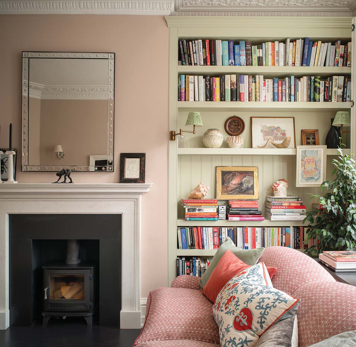
The owners had already chosen a soft pink for the walls and a pale green for the built-in bookcase to work against the dark flooring. Under Jessica’s keen eye orange-reds, yellows and greens were introduced into the scheme. “Little touches of blue as well,” adds the designer. “That was the one colour the clients weren’t too keen on, so there’s a bit in the embroidery of the cushions but it doesn’t feature heavily in the main palette.”
Designing for comfort
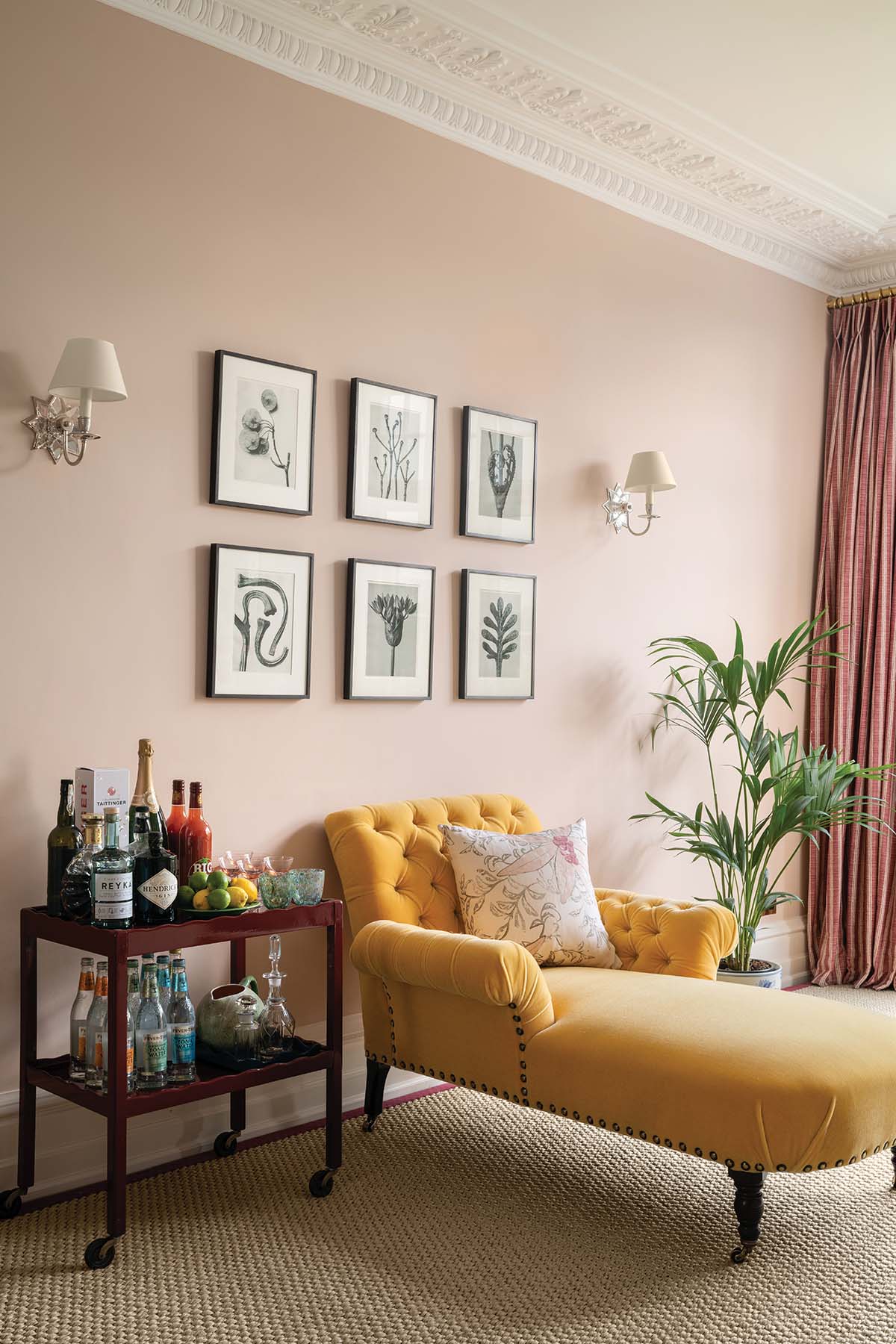
The custom octagonal ottoman and the two sofas are from George Smith, the latter upholstered in fabrics by Fermoie and Christopher Farr Cloth. “Even though they already had pink walls, the clients didn’t want it to feel too feminine – it’s a house full of boys. So instead of anything floral or frilly, we opted for geometric prints to balance it out.”
Channelling the client’s passions
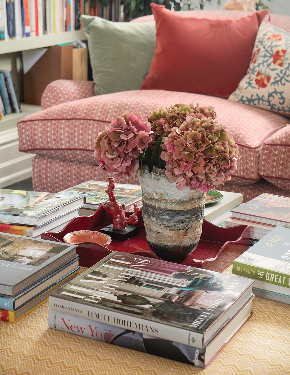
There’s an impressive collection of books and artworks in this room, which the clients had gathered during their careers in the media. “That was a real joy,” says Jessica. “Art books, travel books, interior design books… It was so nice to display some of these and not just have them all stuffed into a bookshelf.”
A dedicated table in the rear area is stacked with intriguing tomes. “The clients work from home so they wanted a space where they could read, work and sit. We did it in a decorative way rather than a highly functional way, but it works. You can clear the books away and set up drinks for a party, or even dine in here on occasion. It’s a really versatile and multipurpose space.”
The finishing touches
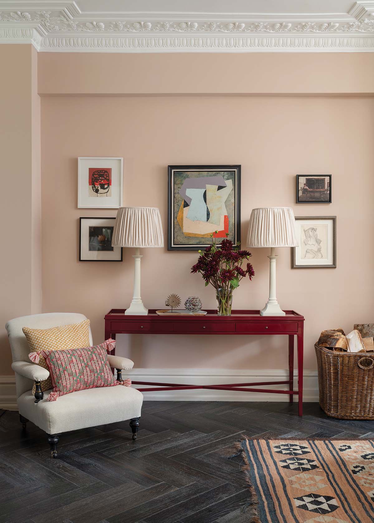
The finishing touches are what makes this scheme feel like it has evolved organically over many years. There is no overhead light, with illumination coming instead from a mix of bookcase lighting, wall lights and lamps. One picture hangs nonchalantly from a shelf, a reminder that this space is slightly undone, not too perfect to be enjoyed. The curtains are left unlined so that the reversible fabric may be appreciated when glancing in from the garden. Nothing matches, and everything sings. It’s a work of art.


