Colour, pattern and a lifetime of treasured pieces have
filled this period home with personality
Scott Maddux and Jo leGleud are laughing. “Are there really any new ideas?” Scott posits. They’re discussing a project they completed for a long-standing client, where they managed to make something new from a historic building coupled with an existing collection of furnishings that had come from the client’s previous home.
This merging of styles, however, is what the pair thrive on. They refuse to take the conventional route, eschewing traditional design practices in favour of encouraging curiosity.
That way, they argue, you create something altogether unique and personal. “You can’t be a slave to the algorithm,” smiles Scott. “You have to do better research. We encourage our team to go and look at print. Try to base things on something historic and make that your starting point.”
Jo agrees. The business partners have their own history. They’ve been friends since the early 1990s when Scott, an architect, arrived in London from Tennessee. Jo had trained in textiles in Carlisle and, thanks to a wonderfully keen eye and deft touch for the lost art of embroidery, had found her way into the capital’s fashion circuit, working with the likes of Koji Tatsuno.
Scott and Jo met out dancing, their passion for art and design collided and their partnership unfolded. “The 1990s were so vibrant and exciting,” says Jo. “Fashion, culture, music, art… there were so many references outside of the design industry, and we just embraced that.”
More than a decade together at Maddux Creative (Jo came back to the design studio once her family were grown up), they have expanded their operation in London where they now have eight staff, as well as colleagues on the ground in New York and LA. “We’re a small team,” explains Jo, “but we’re inquisitive, and that sense of fun and engagement and
shifting dynamics means everyone is important.”
Really getting to know their clients is what leads to the success of their projects. It means they don’t follow trends but have freedom to design as they wish, as well as getting word-of-mouth recommendations from satisfied customers. They take the time to understand what makes each client tick, immersing themselves in each property in order to truly
see how its spaces exist, to then work out how they can be made to work better for their owners.
This project, a five-bed Grade II-listed house in Primrose Hill, was undertaken for a family who’d outgrown their Maddux-designed apartment in Islington. It is a story of repurposing – not just the things they brought from their old home that were to be used in this new setting, but in the reimagining of a beautiful period property that needed some
adjustments before it could function properly for its new occupants.
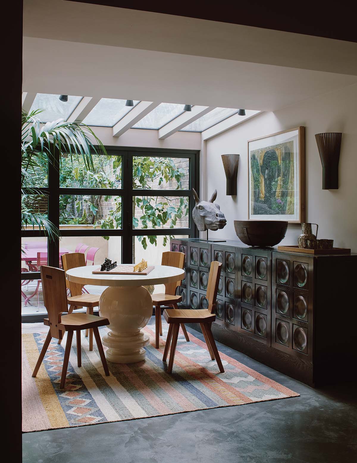
Remedial works were carried out on the lower-ground level, where an extension was added, giving the rear of the building a new lease of life. Inside, cornicing and ceiling roses, deep skirtings and architraves – all the hallmarks of the property’s roots – were in good repair.
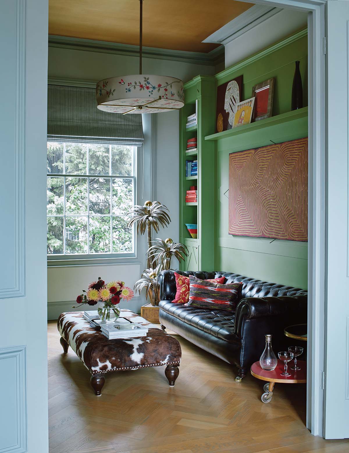
Scott and Jo’s task was to rearrange the space, based on how its new owners operated day-to-day, and then dress it. So they shifted the kitchen from the back of the house where it was inaccessible and dark, to the front, where it could take full advantage of a triptych
of windows overlooking a colourful square.
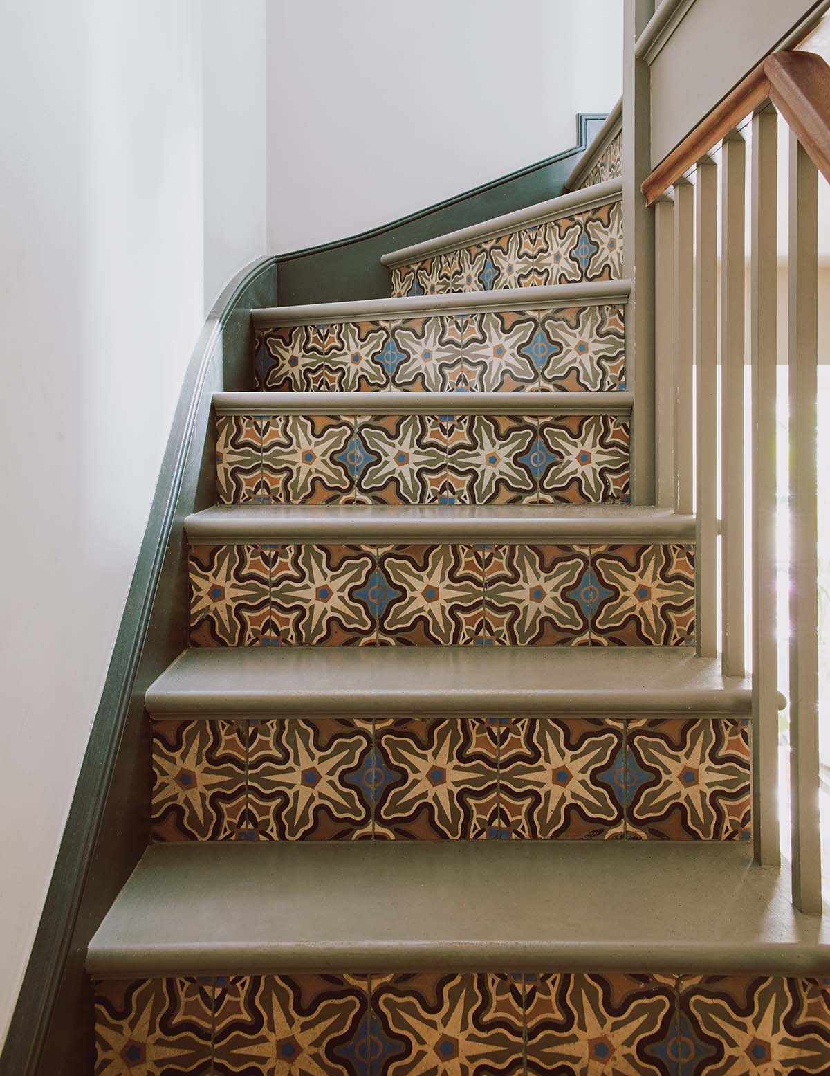
To give the ground-floor level a sense of unity, Scott and Jo knew they needed something that would both speak of the property’s history and give the owners something contemporary that reflected their personalities. “We visited three salvage yards in the Netherlands where we found some wonderful reclaimed encaustic tiles,” recalls Jo. “We chose five patterns for this project.”
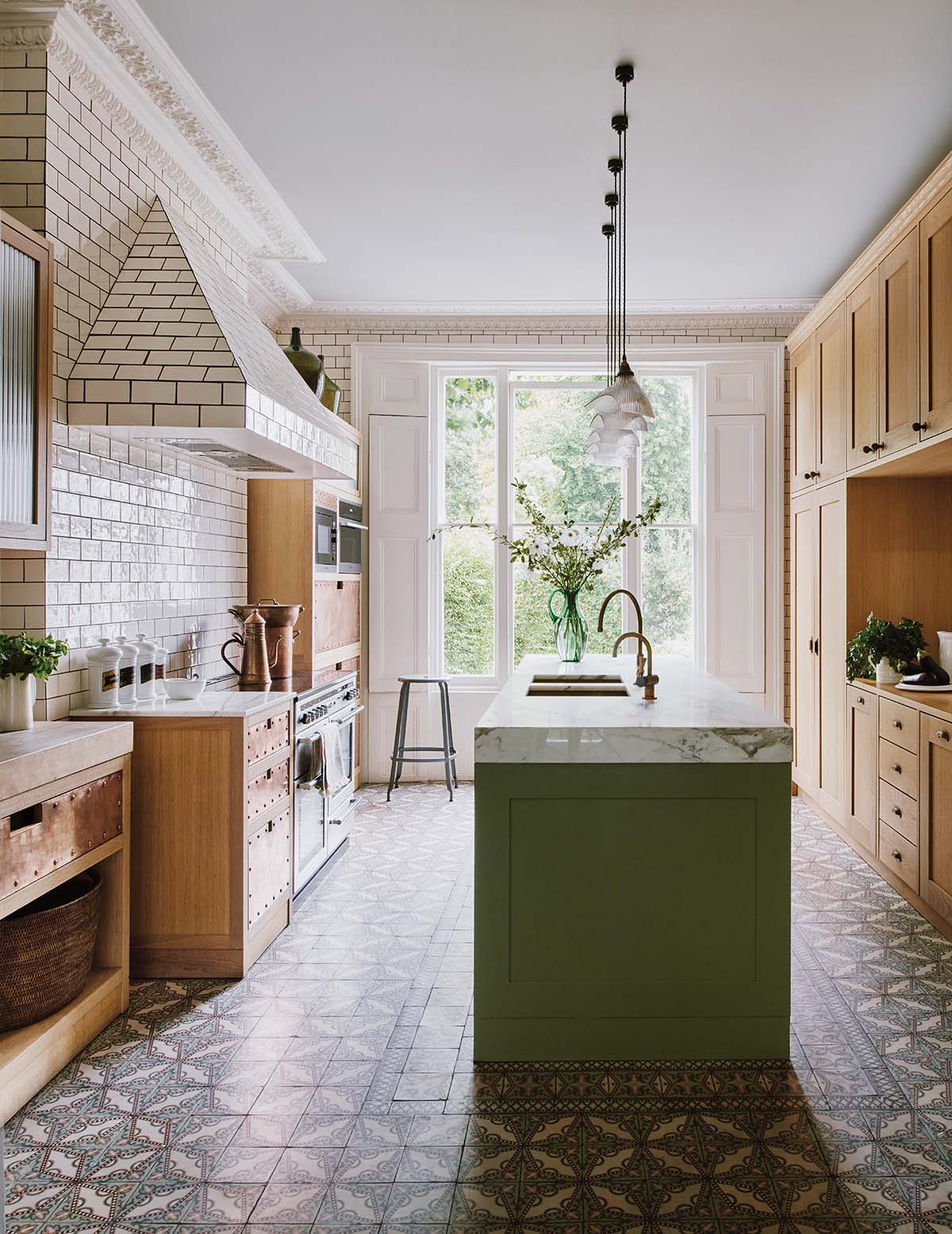
Grounding the tiles in one colour palette, the designers found a way to create a sense of flow without restricting it to uniformity. Reclaimed tiles feature prominently in the kitchen
(which has handmade cabinetry by OrsiniBrewin), where a border tile was also chosen on the Dutch buying trip; the kitchen island was built around this singular floor tile. “It adds another level of history to this home,” says Scott. “There is a similar degree of decoration and intricacy in what we chose together.”
The owners, who’d travelled widely and gathered an extensive collection of art over the years, were bringing much of their furniture from their Islington home. Maddux Creative didn’t want to make it feel like this was the same interior transplanted into another, albeit bigger, building. The aim, rather, was to tell new stories when these treasured pieces were placed in a different setting.
As an embroiderer, Jo has an intelligent eye for detail, and she crafts interiors with an open mind and an understanding of how things are made. Scott’s strengths, meanwhile, lie in his
architectural background and his ability to see the bigger picture.
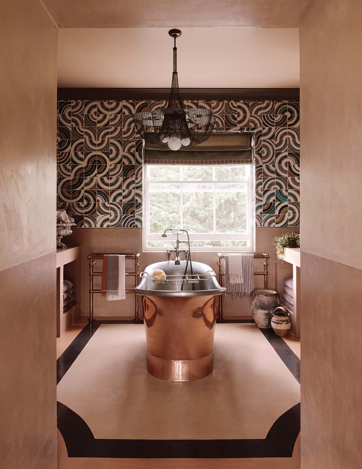
Together, they approach interior design with an appreciation of the wider creative arts. This can be seen throughout this house, but perhaps most notably in the master bedroom suite where the heady mix of 1970s tones could, in less-assured hands, have gone awry. “Mix things through a colour palette,” advises Scott.
“Different styles can co-exist if there is a thread running through them. I like to choose one thing and allow it to shine – the Portuguese 1970s tiles in the master en-suite, for example; these are balanced against a micro-cement that has a tadelakt effect. The palette is rich and earthy. We have embraced eclecticism.”
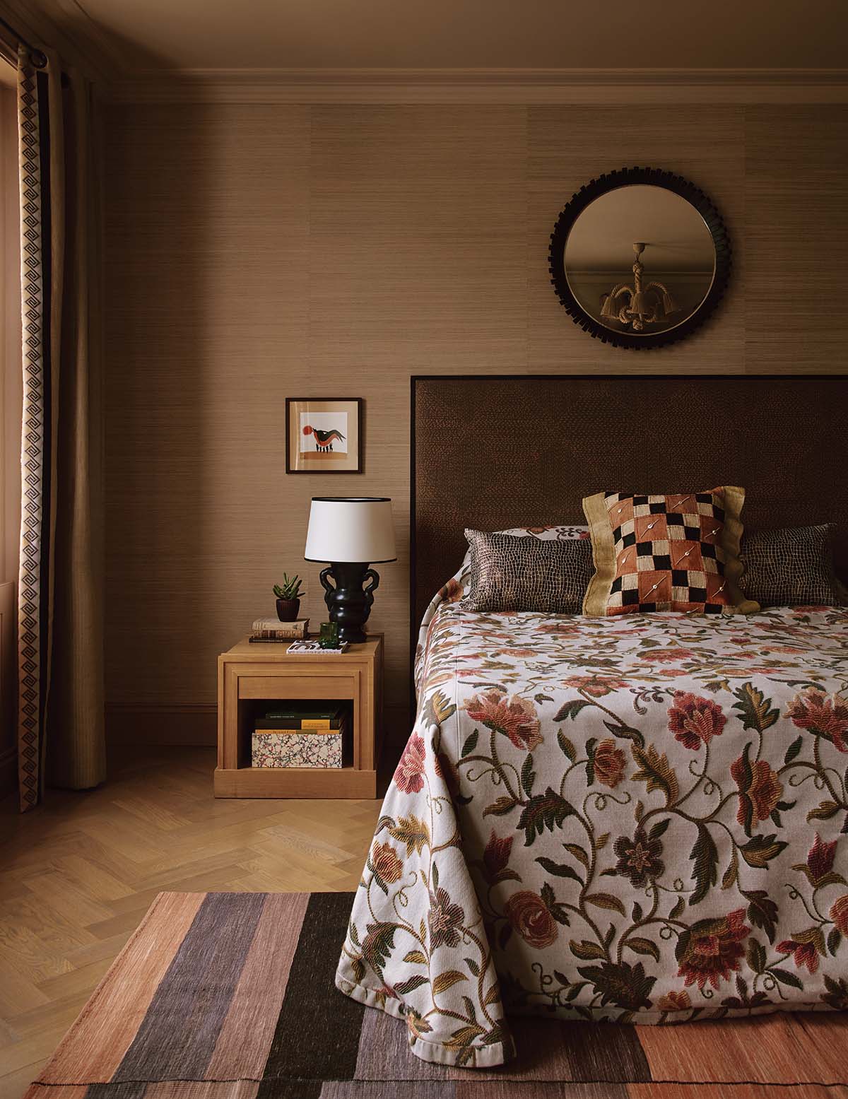
The bedroom furniture too came from the family’s old house, apart from the handmade leather wardrobes. That’s not to say they’re new, though; they belonged to another Maddux client and when Scott heard they were up for sale, he knew they’d work so well in this bedroom scheme. “It’s a tale of reusing. You buy things to last and you build around that.”
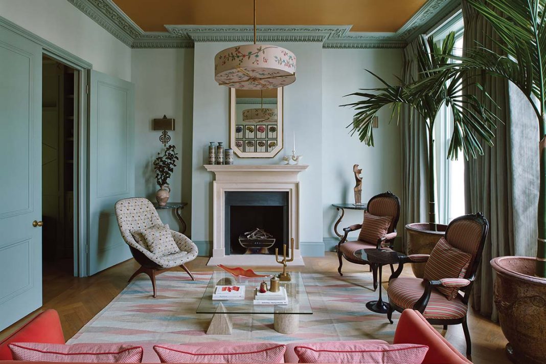
It’s a similar story in the first-floor sitting room, a contemporary take on the classic drawing room. Here, balance is found in tonal changes and mood-enhancing accessories that draw on the natural light.
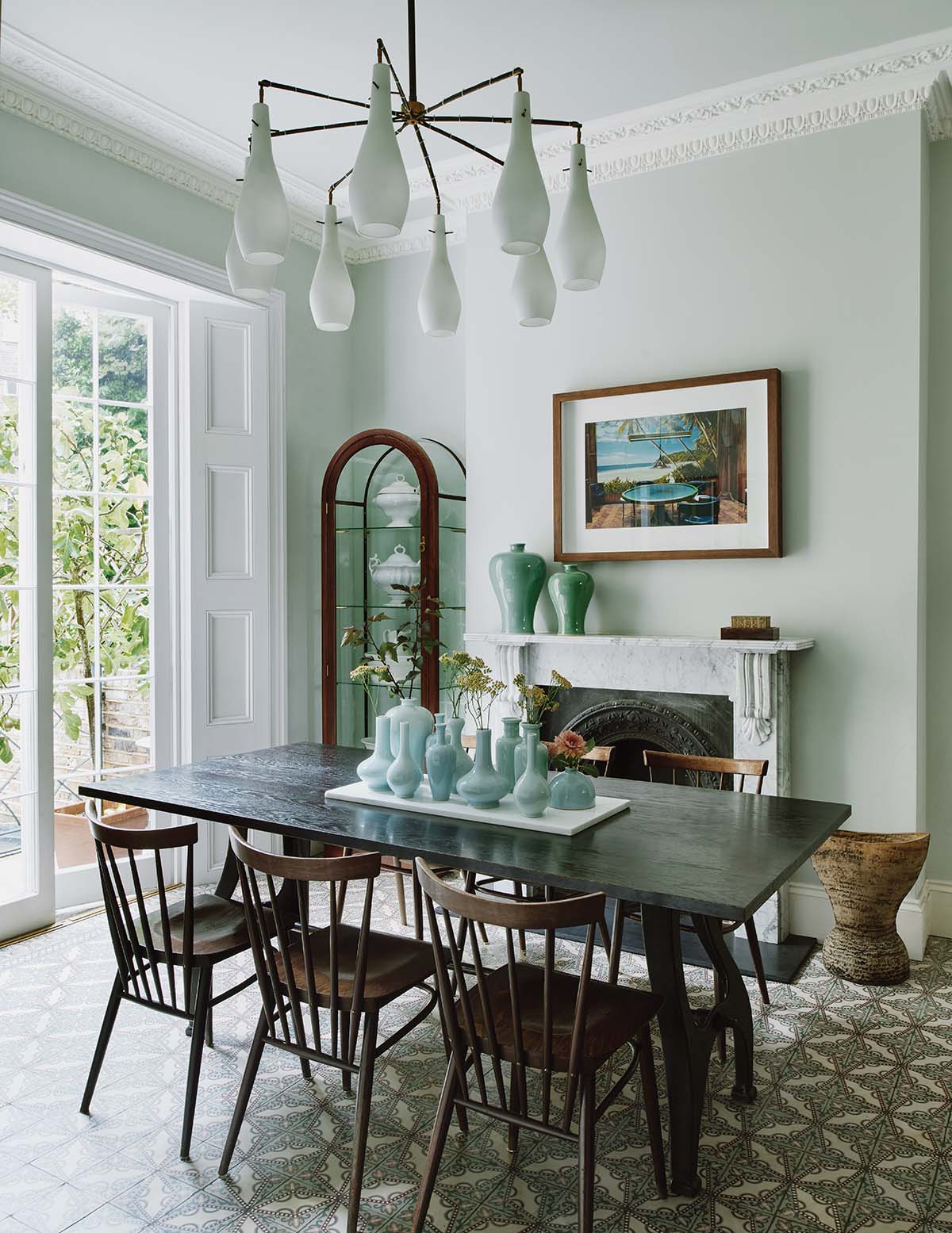
It’s fresh and playful without taking away from the grandeur of the period features, and feels invitingly warm, thanks to the deep gold paint on the ceiling that glints as the light changes. “There is a harmonious balance to the house,” says Scott. “It is elegant and playful, and we pushed the boundaries but not at the expense of it being liveable. We wanted to create a multi-layered, stimulating sensory experience for our clients.”
What is especially interesting is the designers’ willingness to represent the people who live here. It’s not about perfectly fluffed cushions or symmetrical lamps illuminating an immaculate, pulled-together ‘look’. Instead, the owners’ style is reflected back at them. Maddux Creative’s calling card is character, and that changes depending on who the client is and what the project calls for. “There is nothing formulaic about what we do,” they say.


