Edinburgh-based interior design studio Hen & Crask faced a tale of two halves when they were tasked with renovating this extensive family abode

words Catherine Coyle | photography Martin Safro
Rachel Richmond’s clients knew their new home had a split personality when they invited her to have a look not long after they’d bought it.
The interior designer and director at Edinburgh’s Hen & Crask had worked with the couple on previous projects but when they approached her for help with their latest acquisition, in East Lothian, she could see the problems they faced.
“The original house here had been built in the early 19th century – an impressive stately home surrounded by acres of land,” says the award-winning designer. “Unfortunately, it was largely destroyed at the end of the Second World War by an RAF plane crash.”
With the original steading, summer house and breath-taking walled garden intact, a new house had been built on the site in the early 1950s by architect Lindsay Jamieson. It hadn’t been touched for years, but Richmond could see why her clients had fallen in love with the place.
“They’d moved from an apartment in Edinburgh and bought the house with the idea of refurbishing it for their family, so the prospects were exciting.”
Studio LBA Architects were also on board, ready to extend the property so it would better serve the needs of modern family living.
“The house was purchased with aspirations of renovating and extending it to respond to the amazing grounds it sits in,” explains Gareth Jones, the lead architect on the project.

“The estate had been owned by the same family throughout its history, and while it was a wonderful home, modern practices and materials mean that you can achieve much more now than when it was built in the 1950s.”

The owners wanted to create more of a connection to the incredible setting and for the layout to be more functional and efficient.
Studio LBA set about reconfiguring the space to suit. “Although the house invited the landscape in through large window openings, there was still a sense of separation,” says the architect who, during this project, set up his own practice, Jones Robbins Architects, concluding on behalf of Studio LBA.
“The main house was renovated to form snug winter living areas with study zones and bedrooms. From there, when you enter the west extension, you are instantly transported into a very modern glazed section of the building that opens to the landscape.”
Rachel Richmond was just as conscious of the need to find a way to unify the house with the extension.
“I was working with existing pieces too,” she says, “in the sense that not only was the original building being updated, but my clients were bringing things from their previous home – I was designing around treasures they already owned, along with new furniture, art and accessories that we picked out to complement the modified surroundings. The challenge for me was how to make it feel organic and cohesive.”

By marrying old and new in the interior design scheme, she has successfully blended the historic and modern aspects of the home.
Capitalising on her clients’ love for texture and bold overlapping of periods, she has managed to make the interiors feel as though they have evolved over time. There’s nothing contrived or forced about her arrangements.
“The trick is to build looks around key pieces, so additions don’t seem disjointed or messy,” she explains. “Don’t try to shoehorn pieces in. There’s always a bit of trial and error too.”

For architect Gareth Jones, the kitchen is the linchpin that holds today’s homes together. “Here, the kitchen and the family dining and sitting rooms have been relocated and are now associated with daytime living.
We’ve arranged them so they take full advantage of the south- and west-facing natural light, with views out via the floor-to-ceiling glazing and doors. We’ve also made connections between the kitchen and the walled kitchen garden in the west of the grounds.”
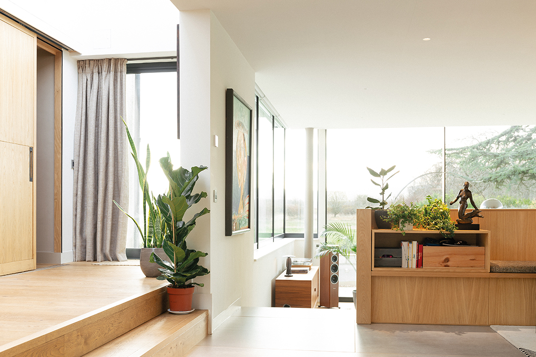
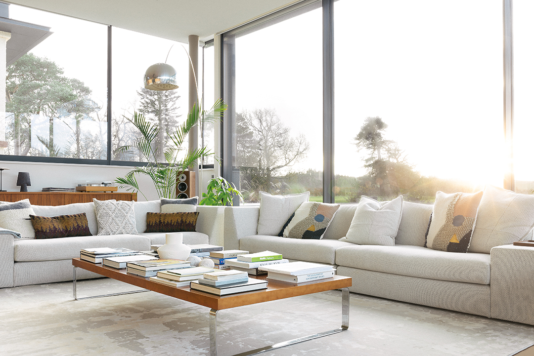
The simple palette allows the interiors to breathe, reflecting the tranquillity of the natural setting outside. Richmond has tapped into a mid-century modern aesthetic in the living area using timeless pieces, such as the Fast chair by Vibieffe, to demonstrate style and functionality can co-exist here.
Flooring by Strathearn Stone & Timber has been laid throughout, giving the space a fluidity that allows the various zones to come together as one. The lighting is an integral part of the look and feel too, with statement pendants and task lights providing personality and practicality.
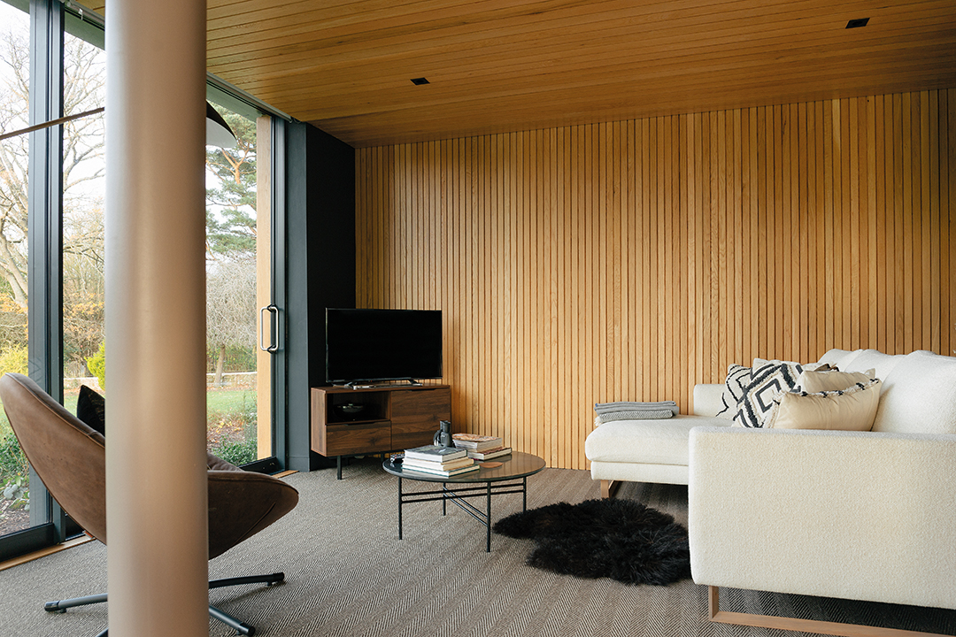
Natural wooden furniture (the dining table is by Heal’s and the Bok chairs are by Ethnicraft) work in harmony with the timber panelling, benches, shelving and interventions created by Jones.
Here, the architect had to be inventive, creating wall space for the art-loving owners that wouldn’t detract from the windows.
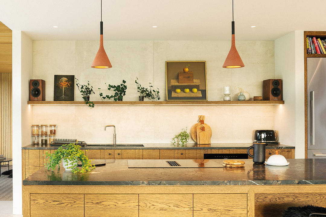
A bespoke kitchen by Edinburgh-based specialists Joseph French brings the open-plan space together; the design by John Angus feels like a collection of freestanding pieces of furniture that complement the interior aesthetic, rather than a traditional ‘fitted kitchen’.
The lines between the various zones are further blurred with open shelving that give artworks and objets space to breathe. A trio of Foscarini’s Aplomb pendants in bold brick-red hang over the island like a sculptural art installation, and moody grey ceramic tiles underfoot (Prism Fog from Collinson’s Ceramics) offer a low-key yet sumptuous grounding for the whole scheme.
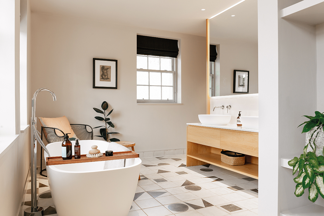
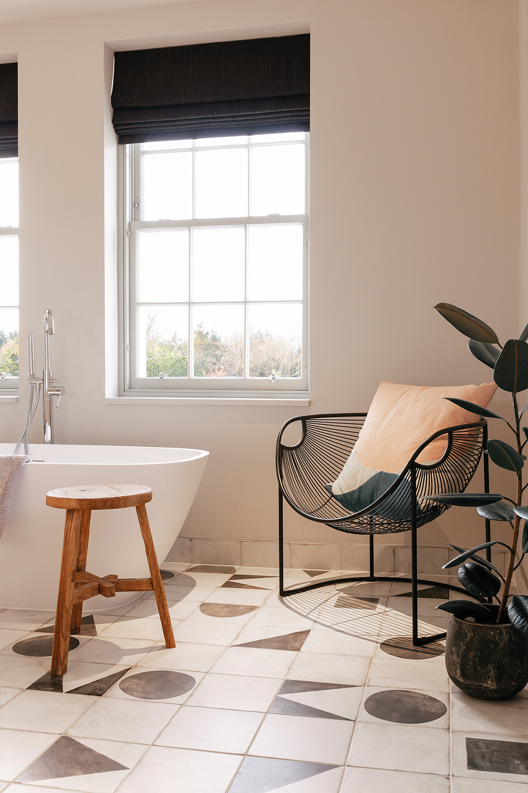
The bathrooms are equally chic, with the same casual elegance as the rest of this beautiful home. Richmond opted for a simple palette of light, earthy colours and natural wood to ensure they wouldn’t date.
A bespoke vanity by Joseph French, sanitaryware by Lusso Stone and quirky flooring (Monochrome Decor porcelain by Mandarin Stone) keep these restful spaces gently stylish.
“You always need to listen to the unique character and setting of each project,” believes Jones.
“I wouldn’t say that these are restrictions, but they do provide parameters to tune into and respond to. Here, it was about reinstating a sense of splendour.” 


