When a fire destroyed their family home, this couple had to gather all their strength to build a new base, but what ensued is a masterclass in clever, future-proofed design, found in the heart of the Carron Valley
words Caroline Ednie | photography David Barbour
“We lost all our belongings in the fire and were left homeless,” recalls Kathy Li, an architect who teaches at Glasgow School of Art.
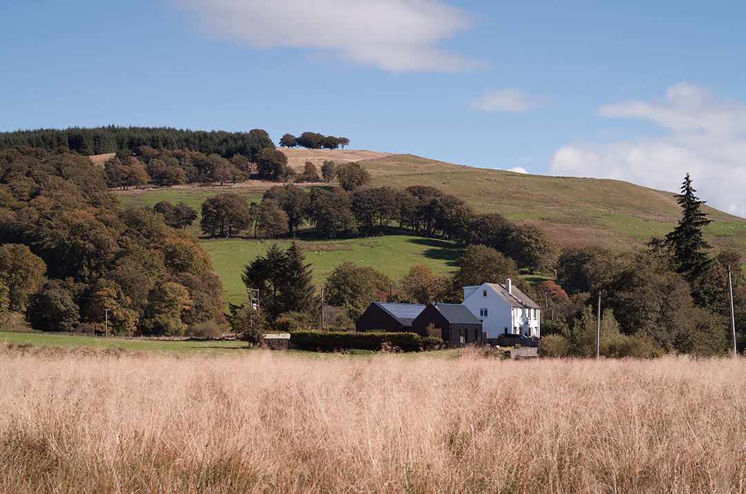
“It was pretty traumatic. But after the initial shock wore off, we realised that what was important to us wasn’t necessarily the house itself but its location. It’s close to a beautiful reservoir where you can swim or fish, and forests that are perfect for mountain biking or road cycling.
It’s like a little bit of the Highlands in the middle of Scotland between Glasgow and Edinburgh.”
So Kathy and her partner Richie Elliot decided to stay on the site, initially in a tiny caravan and then in a larger one-bedroom static caravan.
“It took five years to resolve with the insurance company and we lived in the caravan the entire time,” recalls Kathy.
“It was a journey of understanding the real basics of living and the things that are important.”
Eventually, with the situation settled in their favour, she and Richie could begin to think about replacing their home on the site.
“As an architect, I thought, this is the opportunity of a lifetime,” says Kathy. She spent time developing a detailed design brief.
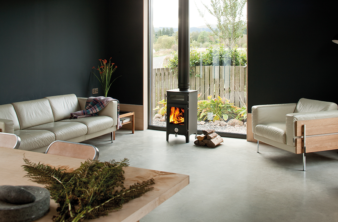
“We knew we didn’t want lots of little rooms. There are fantastic views right down the valley, and we wanted to take advantage of these and of the woodland at the front.
There is a southerly aspect too, which then got us thinking about a low-energy building. It was time to start again. We had this chance to create a house for life.”
She approached architect Ann Nisbet, whom she knew from her work at GSA and the Scottish Ecological Design Association, to design the project and take it forward.
The brief was essentially for an energy-efficient one-bedroom house, flexible enough to suit both living and working, to be constructed using ‘harmless’ materials.
An unusual but crucial part of the brief was that the house should be dementia- and age-friendly. Kathy’s mother and stepfather both had dementia, and she was keen to explore and incorporate design features that would make it easier for sufferers to live in the house.
In response, Ann Nisbet attended a dementia design course at Stirling University – one of the world’s leading centres for research into the syndrome.
“We were keen to take this information, which mostly looked at care homes and hospitals, and apply it to a domestic house in a design-led, non-institutional manner,” the architect explains.
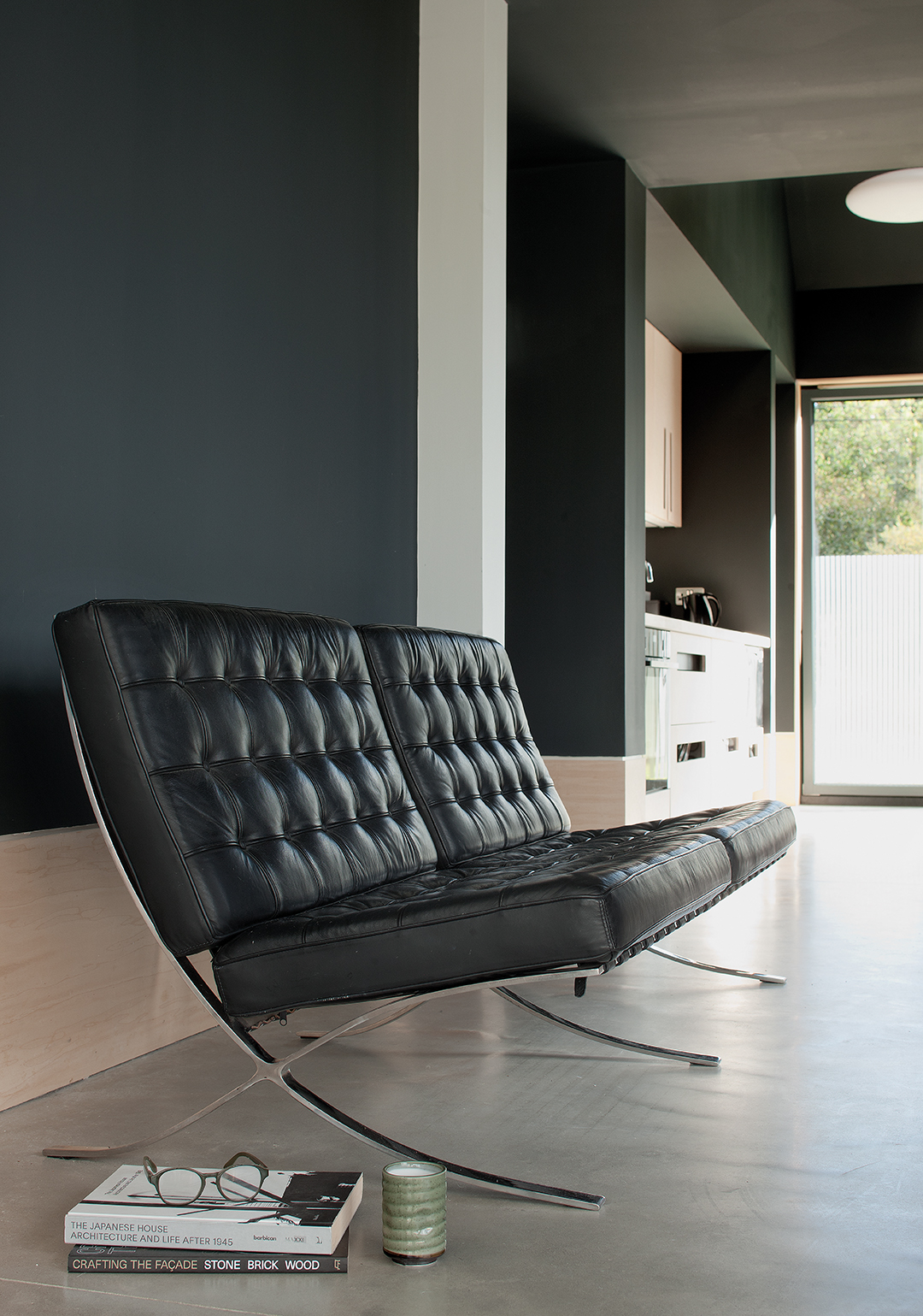
“Research shows that you read your surroundings differently if you have dementia – for example, two materials of similar monotonal colour when read together will be viewed as the same object.
We used this knowledge to try to create a navigation system throughout the building, while still keeping the material palette modern and minimal.”
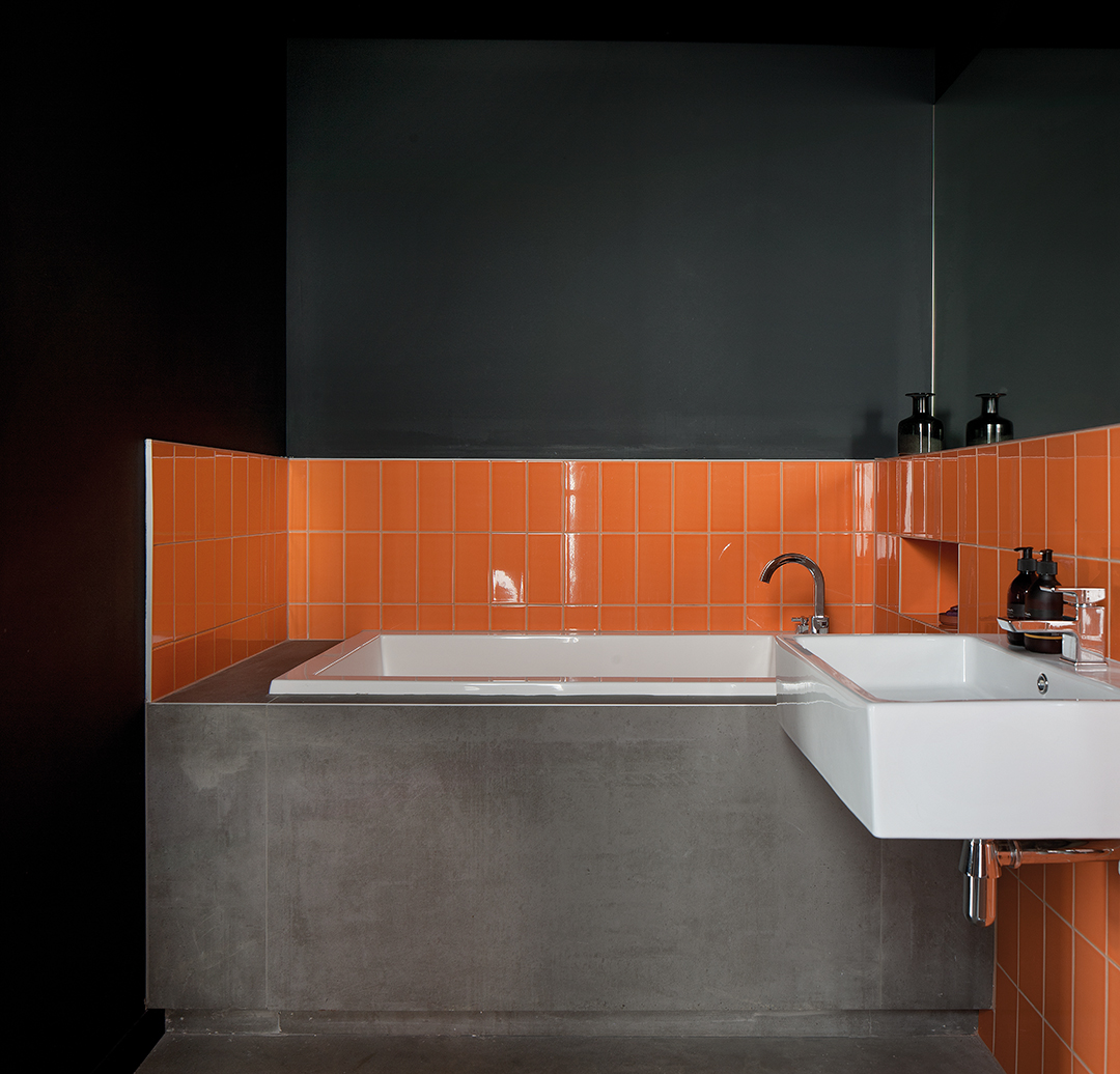
As a result, the door and window frames, floors, skirtings and walls are all tonally different. As for circulation, all the key areas of the building are visible from the connection lobby, which helps you navigate the floor plan and prevents confusion.
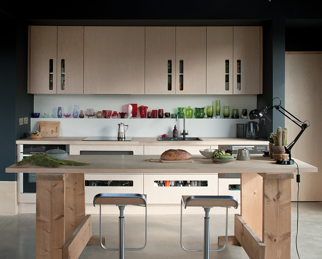
Thought was given to the kitchen units too: there are large letterbox-type slots in the drawers and cupboards to allow someone with dementia to see that there are cups, plates, cutlery and food inside.
“Many people have experienced a close friend or family member being diagnosed with dementia, and as we live longer, the number of sufferers is increasing,” says Fay Goodwin, project architect at Ann Nisbet Studio.
“This house demonstrates that buildings can and should be designed to enable people with the condition to live longer in their own home and to help them overcome the day-to-day challenges they face.
The local planners were happy with the proposals, and what eventually emerged following an 11-month build was a new home, named Harmless House by its proud owners.
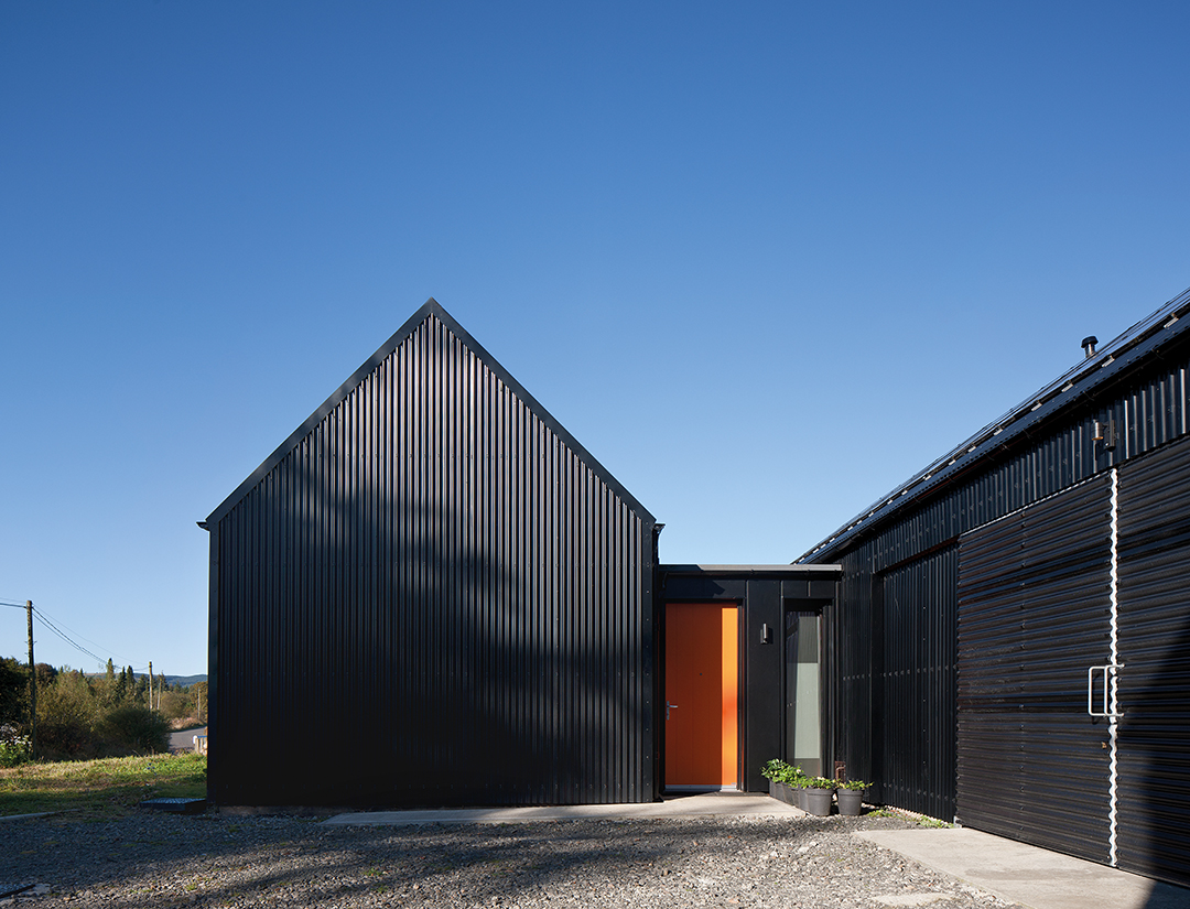
It takes the form of two linked ‘barns’ which echo traditional styles of rural architecture in their pitched roofs, narrow plan and long linear form.
Materials such as the black corrugated metal cladding for the external walls and roof and perforated corrugated metal cladding to the sliding shutters over the pend (passageway) also reference the farm buildings and sheds commonly found in the local rural landscape.

The front building, with views to the south and west, contains the living and kitchen space, open to the double-height apex, as well as the bedroom, bathroom, storage and pantry.
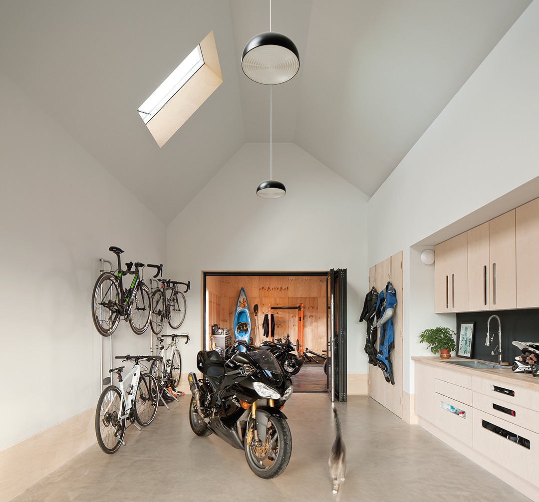
The studio in the rear building is accessed from the pend. A large opening to this area allows the couple’s bikes and motorbikes to be taken into the studio, where they can be worked on or stored.
The ‘harmless’ materials used in the construction and finishes include the likes of Warmcel cellulose fibre insulation between the structural timber frames.
Plywood has been used for the skirting boards, internal doors (sliding and hinged) and the detailing around the windows and rooflights.
The floors are simple polished concrete and all the paint finishes are natural and non-toxic.
The energy strategy for the house was important, and consists of an air-source heat pump (for the underfloor heating and hot water), photovoltaics and a small wind turbine.
The house generates enough electricity to power Kathy and Richie’s two electric cars as well as heating and lighting the house.
The building is oriented to maximise solar gain and natural daylight via triple-glazed Nordan windows.
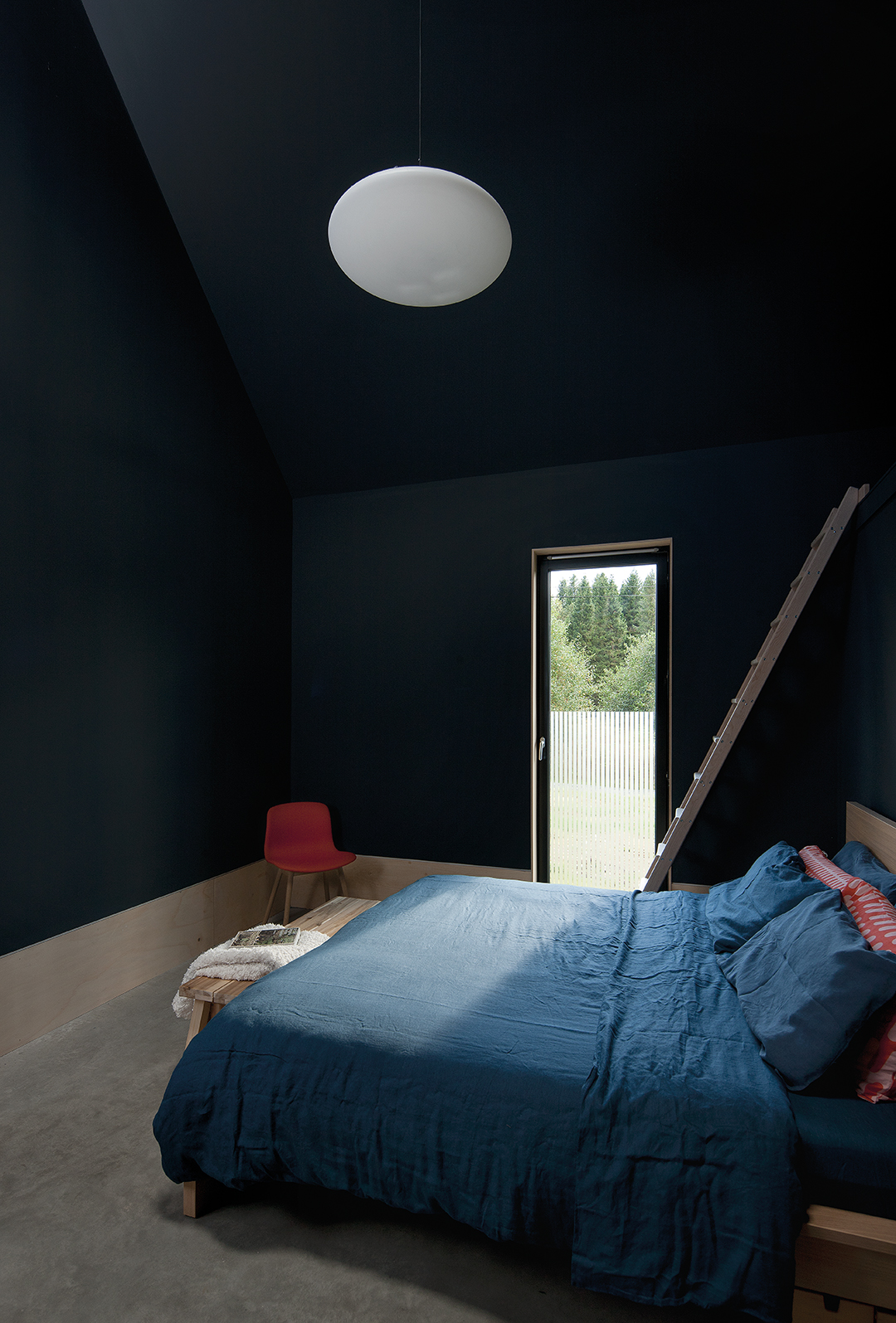
“Simple design decisions can make a significant difference,” she continues. “Many of these do not add additional costs to the project, but they should be considered early in the design process.
Most can be seamlessly integrated into a modern scheme, avoiding making the interior look or feel like a hospital or care home.”
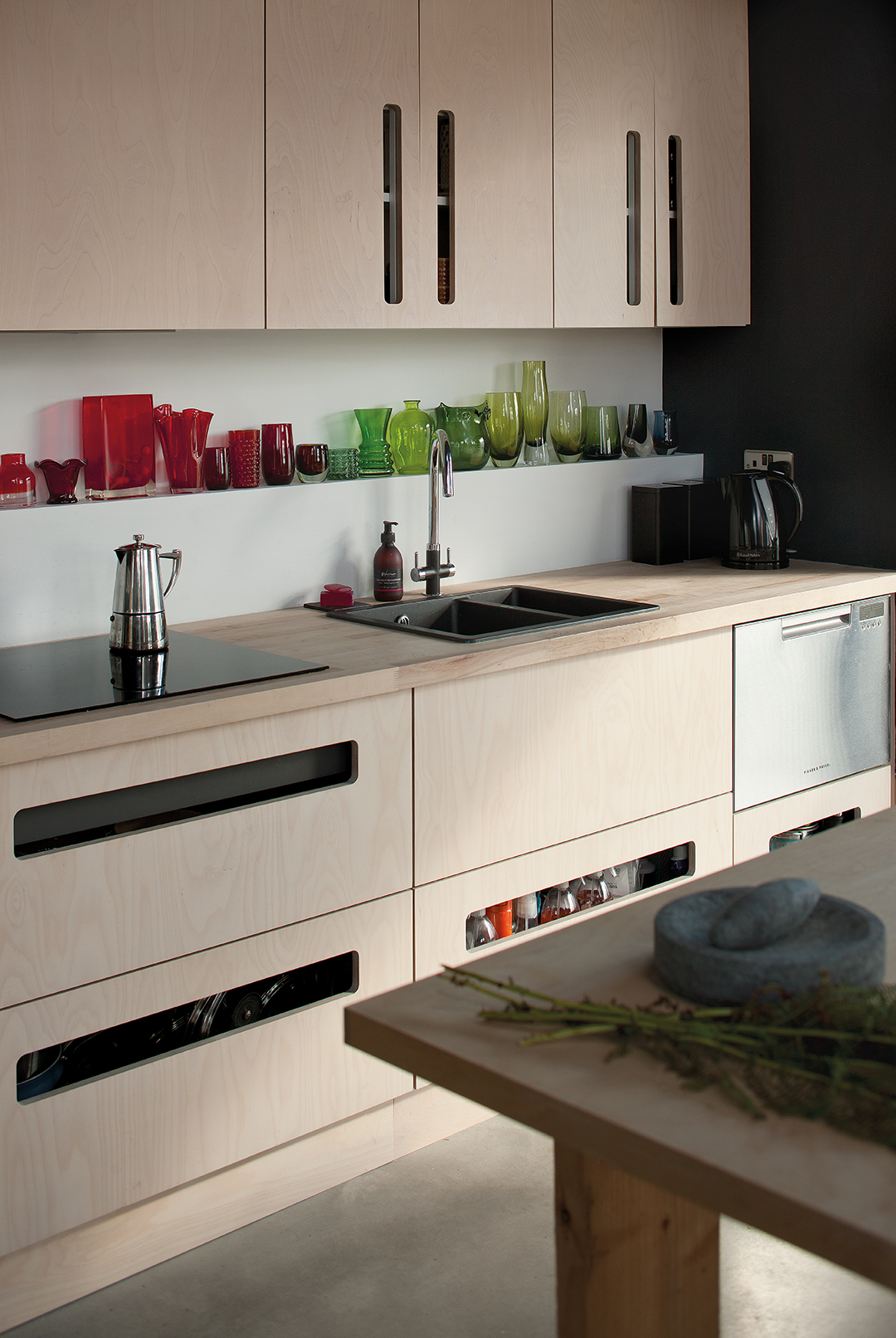
The pared-back interiors were more a necessity than a style decision. “We were forced to be minimalist,” says Kathy.
“We had no choice as we had no furniture – it was all lost in the fire. The shelf in the kitchen is important as it is a space for things that I’ve started building up since I moved in, gifts and little glass pieces I’ve picked up. I had a glass collection before.”
The look of the place may be minimalist, but the quality of the space and the living experience have been maximised.
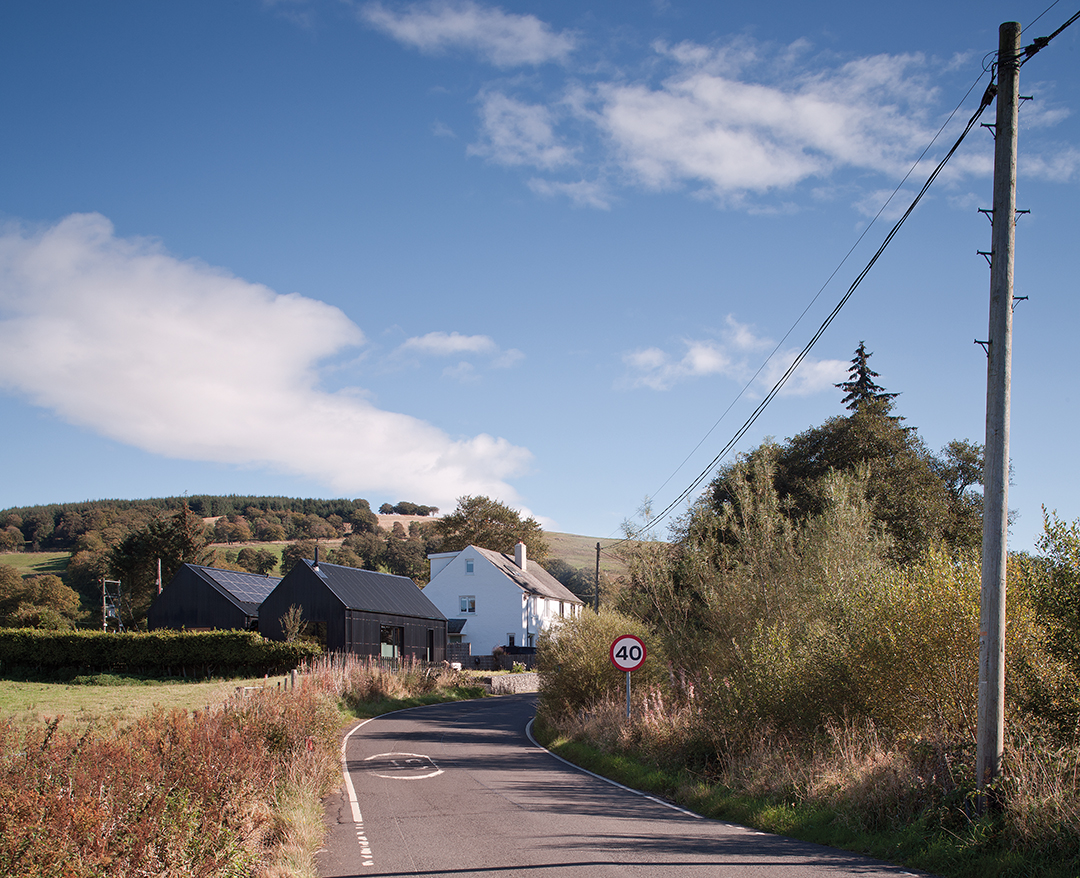
“One of the luxuries of this house is the double-height ceiling in the main living area,” says Kathy. “You can feel quite mentally con-strained in some houses, but this one gives me the feeling of head space – space to think. It’s also an economic luxury as it could be floor area that we could use.
We could put in a mezzanine level if we wanted to – it has that flexibility. But that would be for the future, if at all.”
“It’s quite a big house for two people, but the design allows us to be much more fluid in what we do and to be connected in whatever we do,” she concludes. “I love it – it makes me happy.”


