Close collaboration between architect, interior designer and client led to a joyful, harmonious result for this Edinburgh project
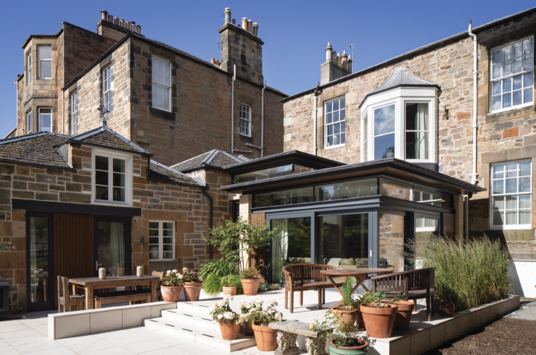
Designers and architects might be reluctant to admit it, but some projects are a nightmare. Obstructive planners, indecisive clients, uncooperative neighbours and incompetent builders can all play a part in delaying or even derailing a job. For this extension, there was plenty of scope for things to go wrong. It is, after all, a 200-yearold villa in one of Edinburgh’s loveliest conservation areas.
Happily, though, this was a project that was all about harmony – and it shows in what has been created here. Talk to architect Craig Amy and interior designer Rebecca Currie about their combined input, and you get delighted smiles and repeated assertions of the joys of collaboration. There’s also a phrase that comes up again and again: “It just worked.”
Their positivity is a breath of fresh air.
Rebecca, owner of the city’s Acanthus Interiors, had known the clients, Sarah and Phil, for years. “They bought this amazing late-Georgian/early-Victorian house in Blacket Place a long time ago,” she recalls. “The first time I went round, though, I was quite shocked to find it had a terrible 1960s extension stuck on the back of it. Once they were in a position to do this building work, I told them I had the perfect architect for them. They met Craig and really liked him, and it all worked out from there.”
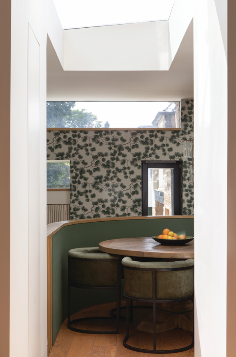
As for Craig, when he began thinking about how to design the extension, he realised there was a simplicity to it due to the limitations imposed by the existing house and available space. “Sarah and Phil were clear about the old extension being torn down, but what they wanted for the new layout was actually very similar to what was there already,” he explains.
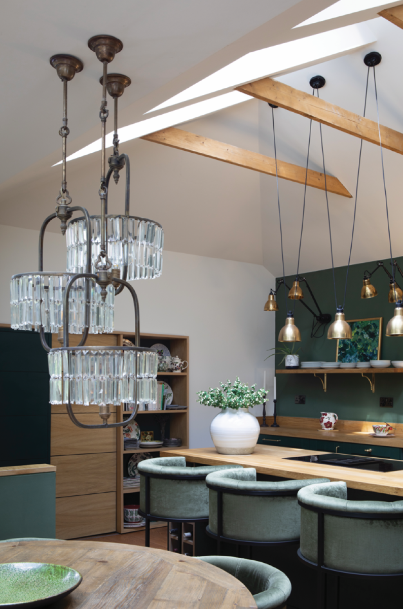
Getting planning approval from the council was a reassuringly smooth process, with the local residents’ group, the Blacket Association, which seeks to protect and maintain the area, getting behind the design.
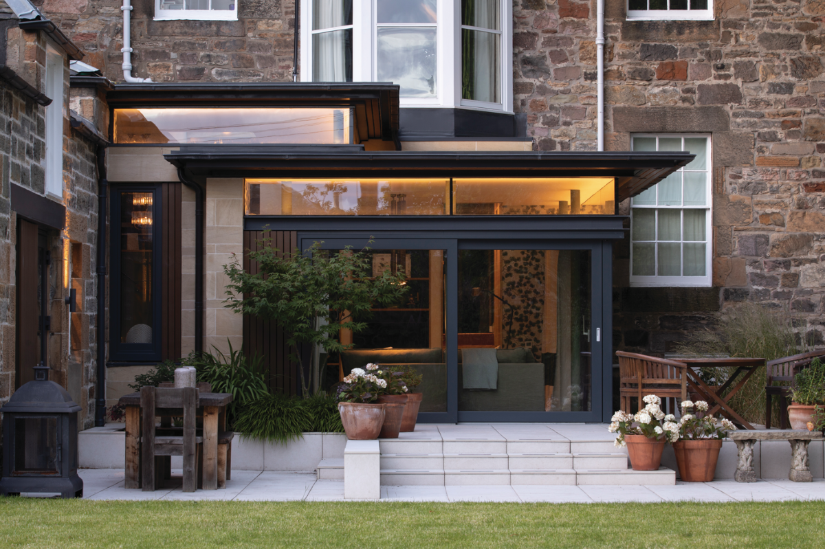
Craig’s idea was to create a series of spaces on different levels, spread between new extension buildings and an existing coach house. A combination of floor-to-ceiling windows and doors as well as rooflights and clerestories would flood the rooms with light.
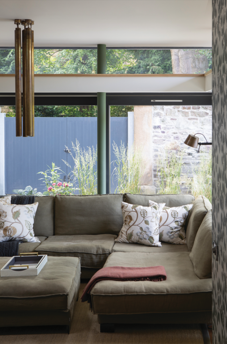
Externally, Craig went for a simple palette inspired by the existing house and by projects he’d worked on previously. “Creating that pagoda-style tiered roof can really only be done in steel,” he says. “Then you’re playing with a metal skeleton, and it’s how you fill in the gaps. For me it was a simple choice of nice stone panels complemented by timber cladding accents. As for the finishes internally, the majority of that is Rebecca’s vision.”
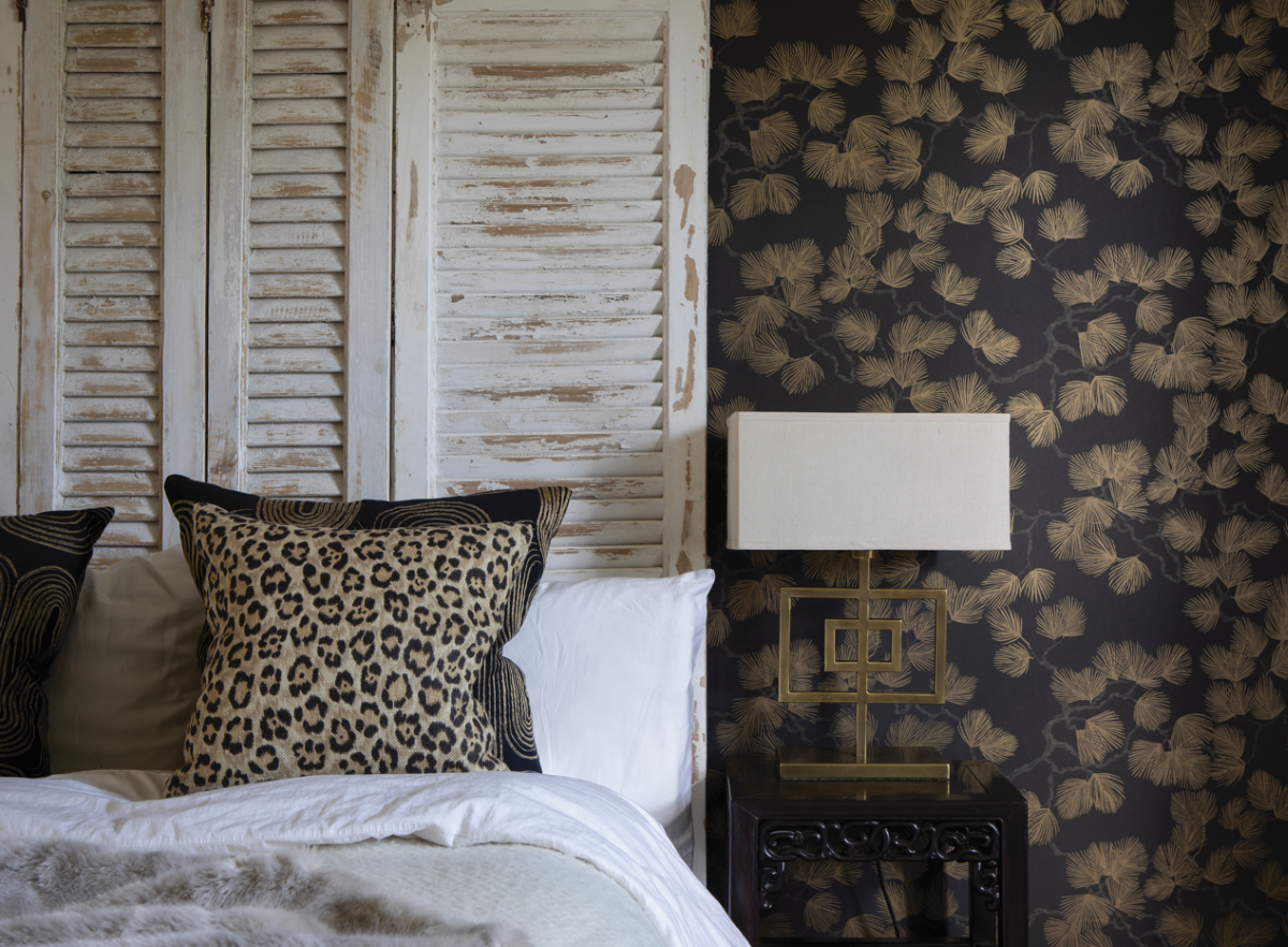
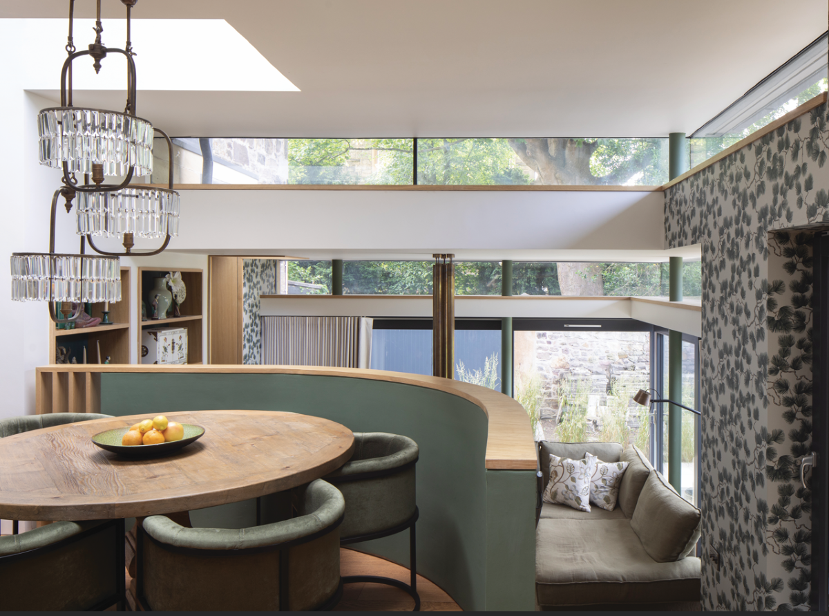
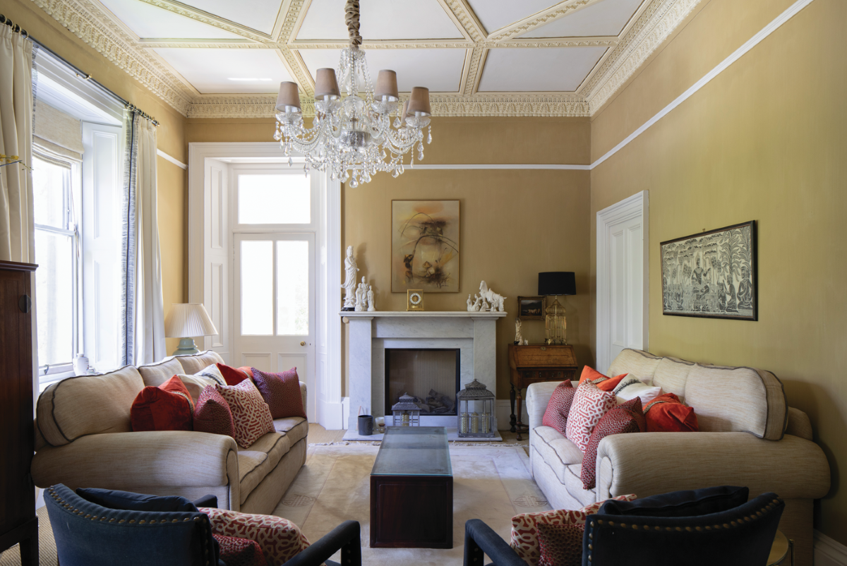
What Craig and Rebecca have achieved working together, both technically and creatively, is a flowing series of beautifully lit, textured spaces that allow Sarah and Phil to live, relax and work at all times of the day.
With such a straightforward, positive build and design, do Craig and Rebecca have a favourite area or feature? “I really love the light – and not just the brass lights we fitted,” says Rebecca immediately. “I love the way all the light works. You can be standing there, and there’s sunlight filtering through the trees and coming in the clerestories above the main windows. It’s just beautiful.”
Craig thinks for a few moments, trying to decide between the little staircase that opens out into the extension, the hidden ‘Aladdin’s Cave’ utility room, and the coach house. Ultimately, it’s too hard to choose, so instead he ends with a statement that sums it all up: “It just worked. Everyone’s happy.”


