


Interior designer and king of pattern drenching Matthew Williamson tells you everything you need to know about the maximalist trend
Colour drenching is out – and pattern drenching is in. Being brave with pattern helps you inject personality into your home, whether you’re looking to add a touch of sophistication with floral rugs or make a bold statement with dramatic wallpaper.
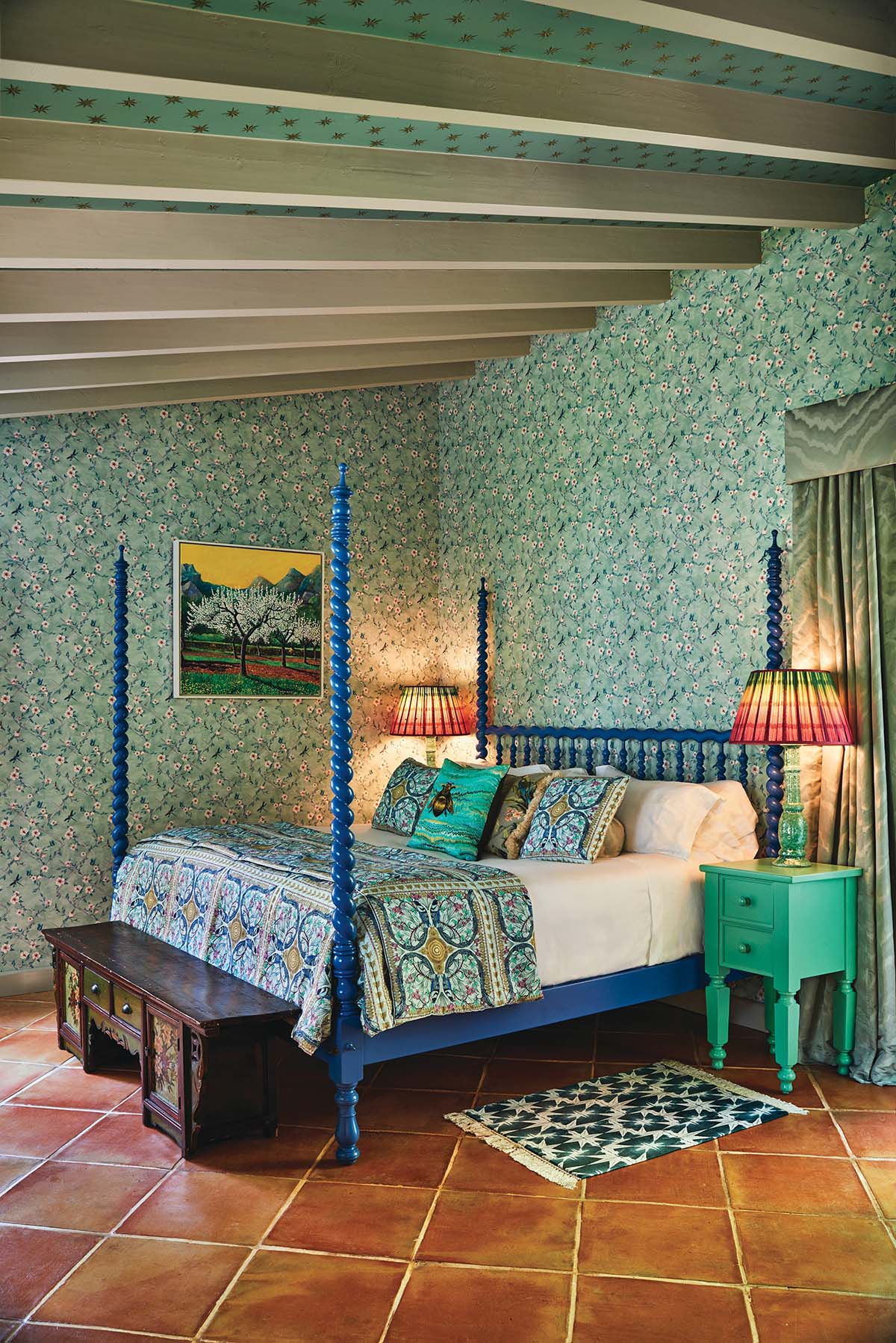
Award-winning interior designer and author of Living Bright Matthew Williamson is celebrated for his unapologetically flamboyant interiors, where colour and pattern take centre stage.
View this post on Instagram
A true maximalist, Matthew has a natural talent for pairing the brightest and boldest colours with the most intricate designs. Where Matthew goes, pattern will appear.
“I love experimenting with colour and pattern,” Matthew admits. “I’m a firm believer that these elements bring life and character to a space. Pattern drenching is a joyful way of elevating your interior and mixing prints that you’re drawn to.”
Here, he explains how you bypass the over-the-top and sail straight through to luxury.
How to create harmony between different patterns
Matthew says that considered use of colour is your key to creating harmony between mixed patterns. As such, one should always have a clear palette in mind before beginning a pattern-focused project.
How to select the right colour
Find the correct colour by identifying the shades that bring you joy and help you relax in your home. The more comforting the colour is to you, the easier it will be to create harmony between different shapes and forms – and avoid sensory overload.
Stick to a couple of key patterns
“Try limiting your pattern-drenched scheme to a few key prints,” Matthew recommends, “preferably with the same colour palette running through them or at least one colour that ties them together.”
For example, a floral pattern in a blue or green shade, whether blowsy and bold or delicate and ditsy, always brings an air of whimsy to the space. “To contrast this, I’d head towards something more graphic, such as a check or a stripe mixing blue, green and white, which invariably looks sharp.”
View this post on Instagram
The rule of threes
As in so many areas of design, things that come in threes always seem to work well. Matthew adds some context, “I’d add in a third print, such as an animal spot or perhaps a classic ikat in a complementing shade. Both of these options are timeless additions and will sit well within any scheme.”
View this post on Instagram


