A lakeside bolthole in Wisconsin is home to a collection of interesting bathrooms with bespoke tiling
Inspiration can be found anywhere, especially when you’re in a creative field like interior design. Minneapolis- based Prospect Refuge Studio, for instance, took inspiration for this project from a Boden catalogue. Yes, you read that right: we have the preppy British clothing company to thank for the look and feel of a cabin on a Wisconsin lake.
“I’d seen this image of kids dressed in bright swimsuits, racing down the beach with their hair all wild,” laughs studio founder Victoria Sass.
“I wanted to harness that feeling of a marriage between the natural world (sand, surf, air) and the more punchy elements like the colourful suits, picnic blankets and beach towels.”
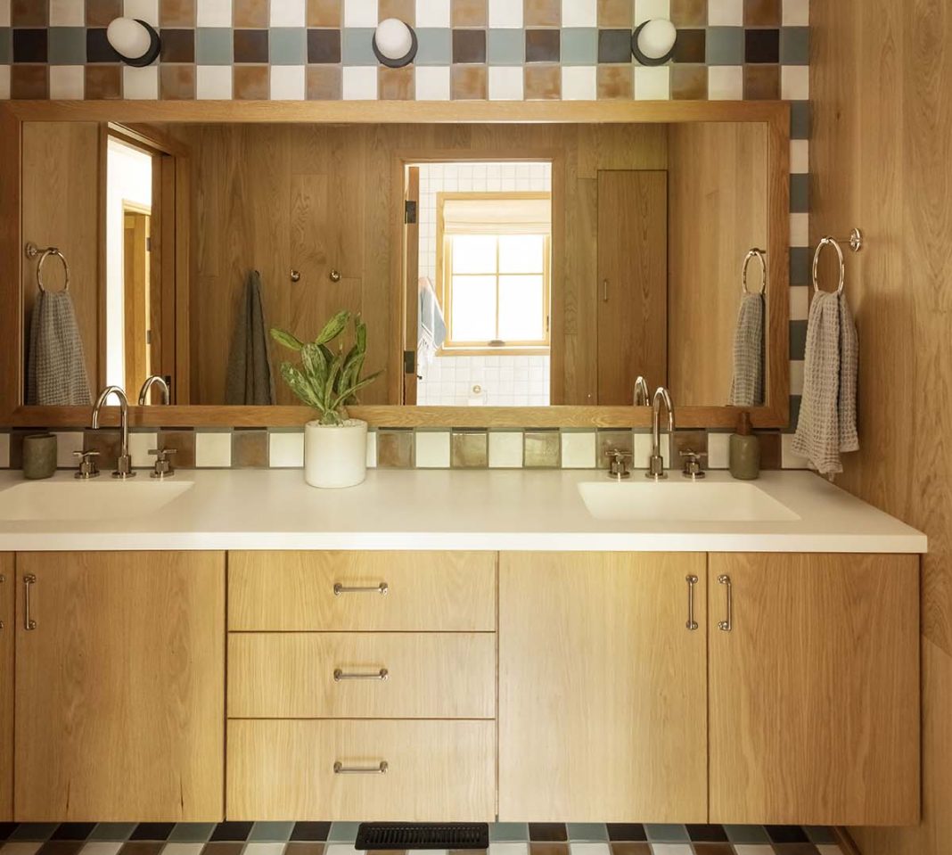
Nowhere showcases this combination as well as the bathrooms. There are four in total, if you count the guest cloakroom. Each one features a bespoke pattern of tiles, created in collaboration with a local tile maker.
“We worked with Clay Squared, who made all of the tiles by hand,” explains Victoria. “It’s not a sheet of tiles: each piece was laid individually in a custom pattern for the space. We had to pull one of the colour glazes out of the archives because I wanted it to come together and read as an optical illusion, like it’s woven material.”
Away from the tiles, Victoria kept it simple by using plain sawn white oak for the cabinetry. “I had a number of conversations with the carpenter on this project about the plain sawn cabinets. He thought it would resemble plywood, and that it wouldn’t look refined.
“I see what he was getting at, but it’s like the most beautiful plywood you’ve ever seen! It’s so stripped down and clean. It feels luxurious, but also kind of like your workbench. I love that juxtaposition.”
Countertops made from a synthetic resin material were used in the kids’ bathroom and the sinks were integrated so there are no seams anywhere.
“It’s great for sandy little kids to get in there and do their worst. It’s all wood or tile, so you could feasibly run a hose through there and do very little damage.”
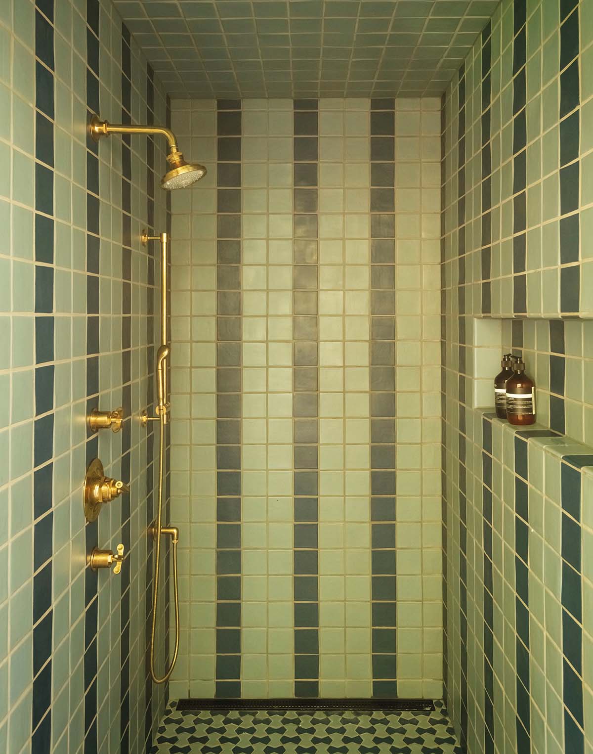
The grownups’ bathrooms are more refined, with natural stone countertops and less in the way of tiling. The plan had been to have one blue shower and one green.
“I asked the owners, ‘Are you sure you don’t want to do any pattern in there?’ and they kept saying no. There’s so much pattern elsewhere in the house, they just wanted something serene.
A week or two before the installation of the tiles, the owners suddenly had some regrets,” Victoria says with a knowing smile.
“We took a little stripe of tile from the blue shower and put it in the green and vice versa.” It’s a frankly genius solution that gave the clients the pattern they were after without having to source new tiles at the last minute.
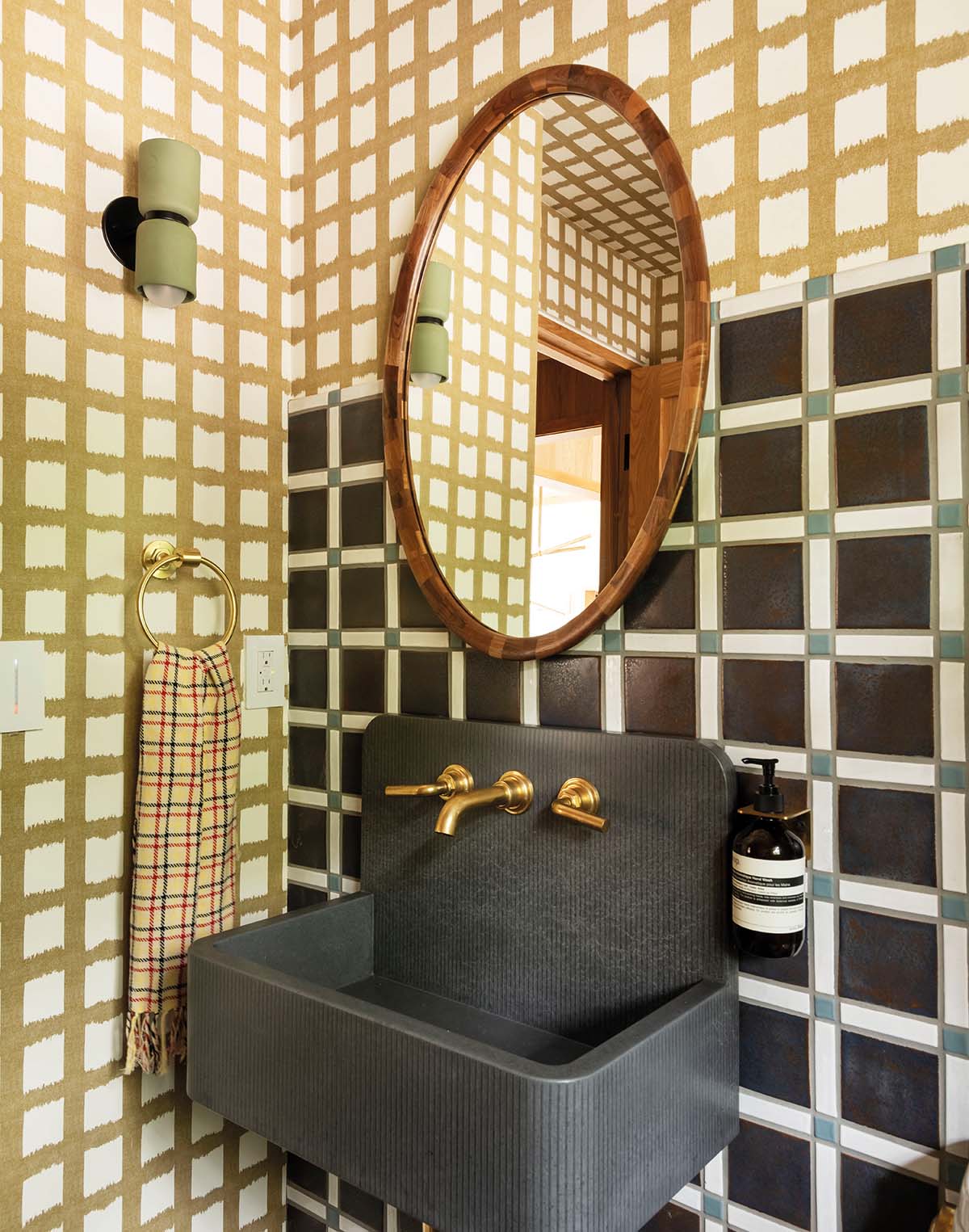
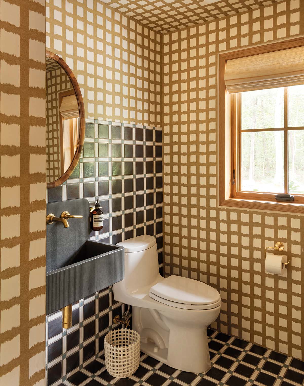
Just off the entrance to the cabin is a mudroom and powder room which Victoria describes as “plaid on plaid”. More individual Clay Squared tiles are laid in here, along with a Pierre Frey wallpaper.
“The tile makers recommended using the natural grey grout colour ‘like the Romans did’. I think this changes the energy of the tile,” says Victoria.
“It’s amazing how much the thickness or colour of grouting can alter the look. Crisp white grout makes the tile look more traditional and polished, while grey grout looks more utilitarian and balances out the ‘prettiness’ of the plaid.”
The owners have a ‘more the merrier’ attitude to hosting, which the designer has coherently translated into the décor of these brilliantly wacky bathrooms.


