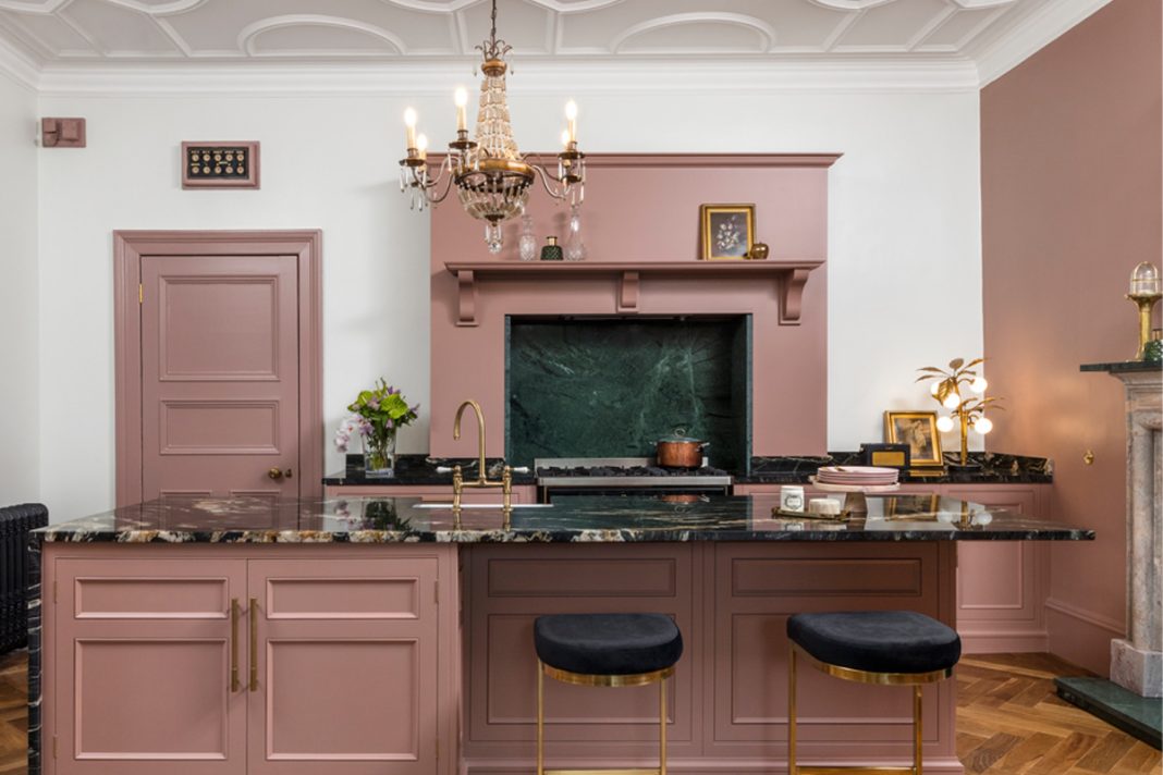
Audrey Reilly, creative director of Lululemon, wanted her kitchen to feel like an inviting social space in-keeping with the style of her Victorian home
The kitchen you see here wasn’t always a kitchen. When Audrey Reilly, creative director of global sportswear brand Lululemon, purchased her B-listed Victorian home in Motherwell, North Lanarkshire, this striking space was actually the dining room.
“The original kitchen was at the front of the house, but I reconfigured the layout,” she explains. “I wanted to bring the house back to its former glory in a way that was respectful to its architecture.”
FRONT TO BACK
This meant turning to bespoke kitchen design company Harvey Jones. Sarah McNeill from the Edinburgh showroom was tasked with designing a “non-kitchen kitchen” sensitive to the aesthetic of the house, which was designed by celebrated architect Alexander Cullen in 1888 and formerly owned by the Church of Scotland.
“It’s almost like a doll’s house – a mini-castle with a turret, surrounded by apple trees,” says the proud owner. “I’m heavily inspired by old places such as the Fife Arms Hotel and wanted to create a Victorian feel.”
The Original Kitchens range by Harvey Jones was an obvious fit to achieve that heritage look. Popular with people who own period properties, the cabinetry is delicate and refined with double-panelled doors, dovetailing beautifully with this room’s decorative plasterwork ceiling and architrave.
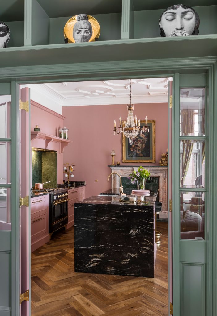
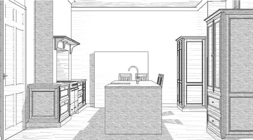
A central island divides the space, with a back-run of units on one side featuring an Ilve range cooker framed by a mantle and green marble splashback. On the opposite side are two free-standing units that look like larders – though neither is used as such.
“These are my favourite features of the kitchen,” says McNeill.
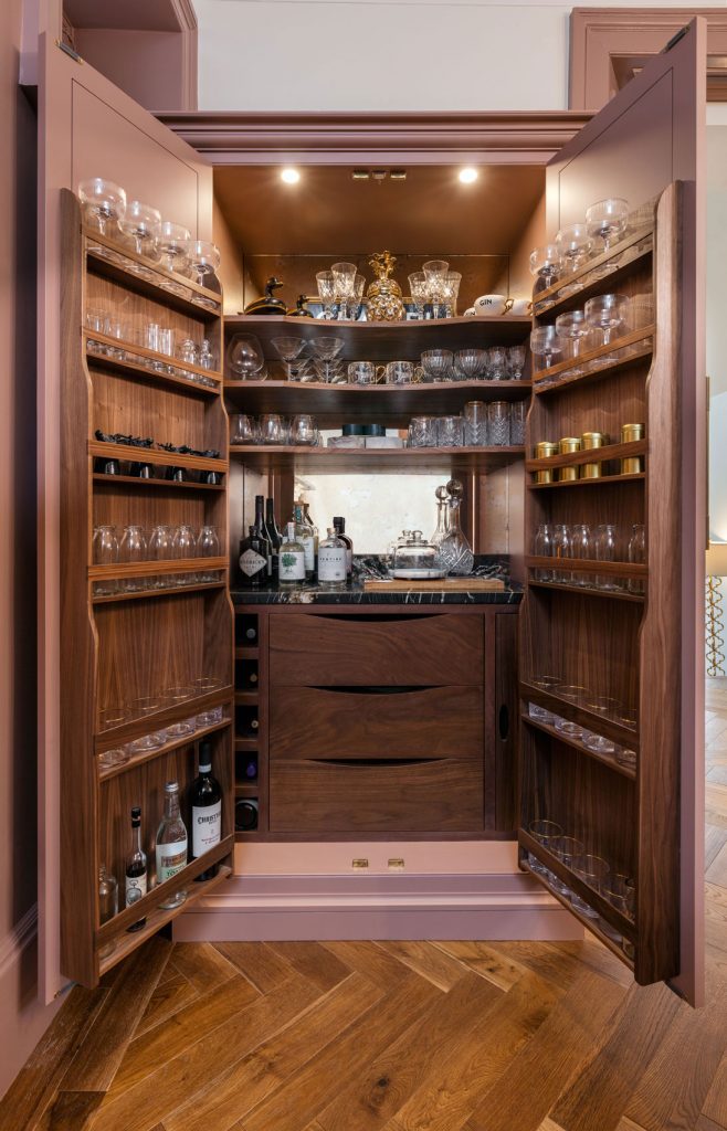
“Both of them look like standalone pieces of furniture, but one is an integrated American-style fridge freezer, and the other is a larder that Reilly has repurposed as a hidden bar. She has styled it so well – she really was a dream client to work with as she has a really good eye.”
Reilly, meanwhile, says she appreciated her kitchen designer’s pragmatism.
SOURCES OF INSPIRATION
“I’m inspired by books like The Secret Garden and Alice’s Adventures in Wonderland, where I want every room to have its own distinct sensation and atmosphere,” she says.
“I can sometimes wander off into a fantasy but there’s got to be an element of practicality too, and that’s where Sarah was amazing.”
The bar, along with the island, were part of Reilly’s vision for the kitchen to serve as a social hub. When guests come round, they can perch on a stool and there’s space for the larder to be opened out for a tipple or two.
“I had a cooking night a couple of months back and there were six of us all gathered around the island. It was just so flowing and fun,” she recalls.
“And the bar is a bit of a cabinet of curiosities. People normally store their toaster in a unit like this, but I wanted a bit of decadence.”
LUXE FINISHES
There are a few other touches that lend an indulgent feel. Reilly had the home’s original bell system restored, sitting above the kitchen door (“Every room has its own bell so you can ring for your tea, which my daughter loves,” she laughs).
The mix of materials is luxurious, too: the island is wrapped in a black Belvedere granite waterfall countertop, and there’s a tricolour marble fireplace that inspired the room’s gentle pink and green palette.
After much deliberation over Teams calls (the kitchen was designed during lockdown last year), Farrow & Ball’s Sulking Room Pink was chosen for the fireplace wall and cabinetry. It complements Card Room Green, a soft sage used on the bifold doors that open into a bright and airy sun-room extension overlooking the garden.
“I went back to the original Victorian palettes, and those two colours are everywhere throughout this house,” says Reilly.
“The pink is almost like a juxtaposition to the green, and it brings out the light and beauty of the room.”
THE DETAILS
BESPOKE DETAILS
CABINETRY “We used décor panels on the side of the larders which added to that aged, traditional look. On either side of the range we’ve got drawer stacks with hidden drawers inside them so the utensils are tucked away, and there’s a lovely flush all the way along,” says Sarah McNeill of Harvey Jones.
HANDLES “The gorgeous brass handles are from Armac Martin and tie in with the taps, which come from our own manufacturer.”
FIREPLACE “The fireplace is a cut-and-shut from the Georgian and Edwardian periods, which Audrey sourced.”
CABINETRY “We couldn’t use Farrow & Ball paint on the cabinets, so we colour-matched to it using an oil-based eggshell.”
FRIDGE “A free-standing fridge-freezer was going to look out of place with the style of the kitchen, so we used an integrated one from Liebherr.”
BAR “Our pantry larder has handcrafted solid wood trays and Audrey incorporated a mirrored splashback.”


