Sometimes we have to look back to step forward. This home’s restoration stripped it of its ultra-modern interior design – and it has never looked better
Fixer-uppers don’t often have a sleek Bulthaup kitchen or walls clad in micro- cement. Their gardens aren’t newly landscaped, nor do their staircases have stainless-steel balustrades.
But when the art historian and curator who now owns this property first viewed what would become her family home, she knew she would be making significant interior design changes.
Yes, the house had been renovated and was in immaculate, turnkey condition – but it simply wasn’t to her taste.
The location, close to Hampstead Heath, was ideal, as were the bones of the 1930s building. “But I just didn’t relate to the contemporary interior,” she explains. “I wanted the original features back; the cornicing, the panelling…”
More of a turner-backer than a conventional fixer-upper, then, and not the sort of request ordinarily made of Thomas Griem, director of interior architecture and design firm TG Studio.
But he was game. “Although the house was really well done, it felt a bit soulless,” he recalls. “It had floor-to- ceiling aluminium windows, engineered floorboards, plain doors. It was interesting to think about how we could turn back time by removing the modern interventions and returning its more traditional design elements.”
With a challenging six-month timeframe and a generous but not inexhaustible budget, they decided to focus on transforming the central two floors of the four-storey home while making subtle refreshments to the basement and top floor.
One adjustment dramatically altered the feel of the entire house, though: the replacement of the “bulky” central staircase, which had been fashioned from white MDF and had office-like glazed inserts on the landings.
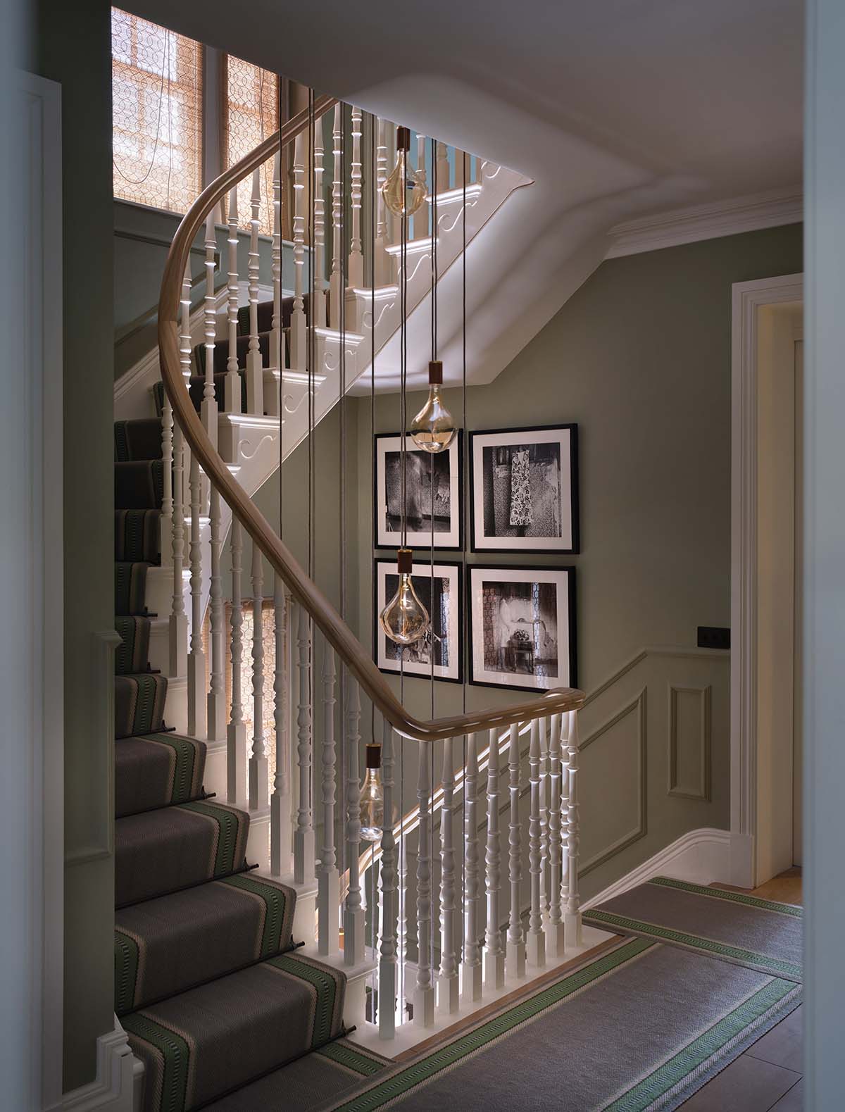
It was promptly demolished, and Thomas worked with timber stair specialists Higginson Staircases on an open design with oak treads and elegant pine spindles.
“They found remnants of the original staircase in the process and, interestingly, it looked exactly like the one Thomas designed,” says the owner. “He just has the eye for it.”
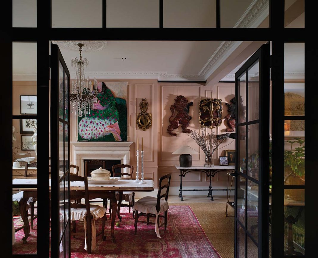
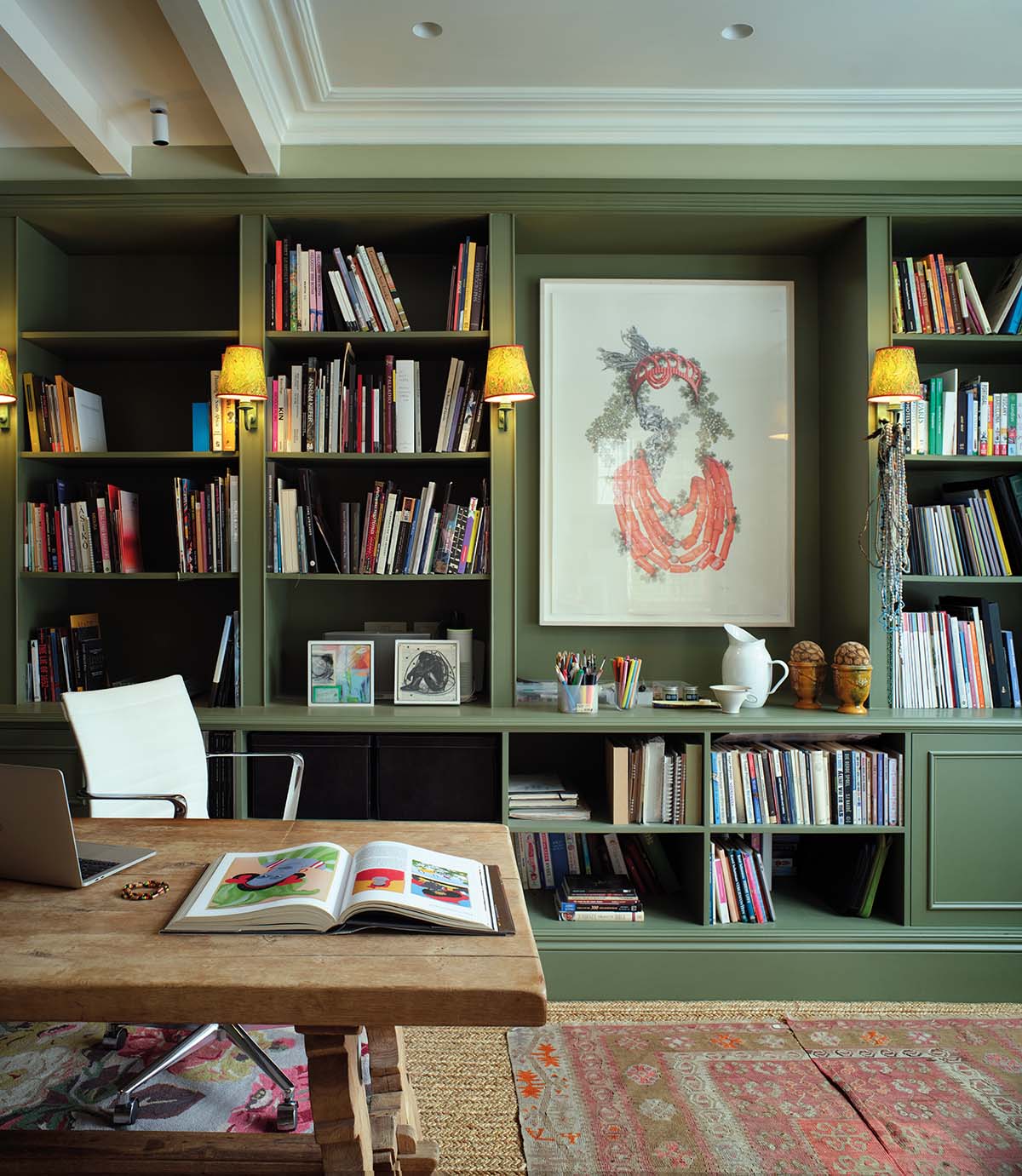
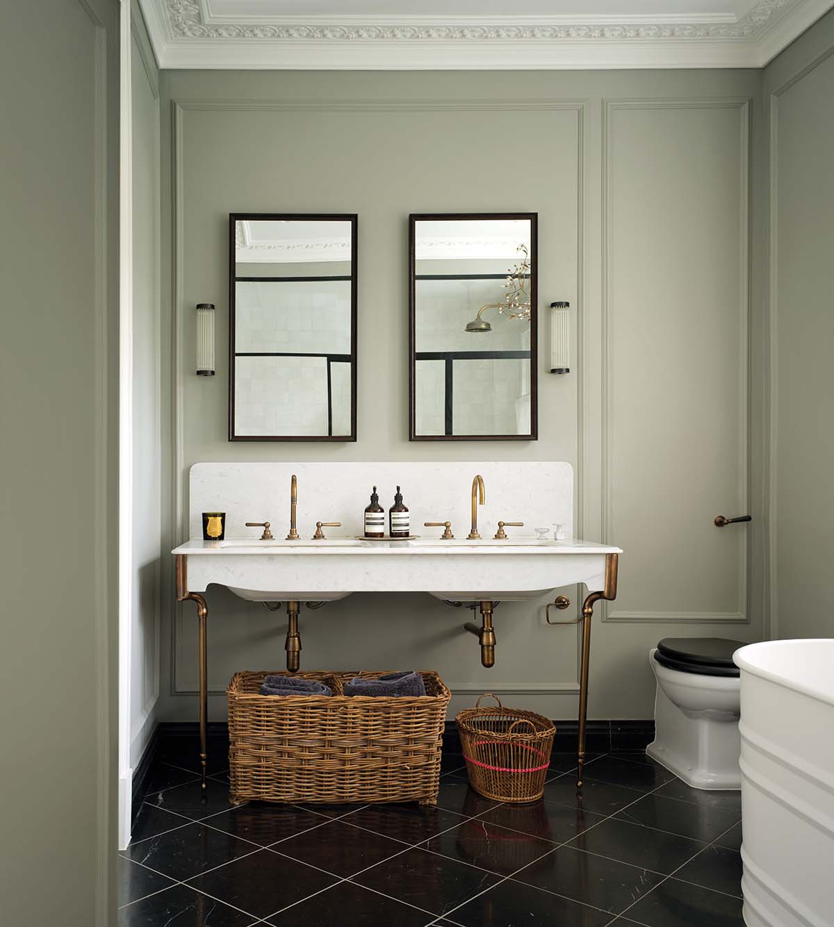
The interior designer’s expert eye then turned to the reintroduction of finer period details to the home: Victorian-style cornicing, architraves, moulding and panelling. A Juliet balcony composed from intricate ironwork was added to a study on the first floor.
Bit by bit, the home regained a sense of history and dimension, its formerly flat planes brought to life.
The living and dining room, once an amorphous space flooded with spotlights (“Like a sports hall,” says Thomas), was divided using a down stand beam into two distinct areas adorned by grand limestone fireplaces and antique chandeliers.
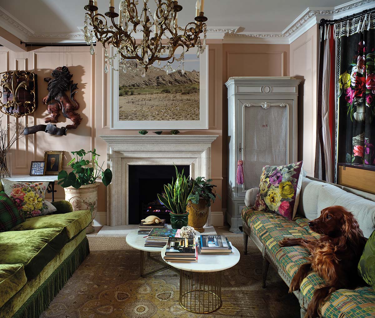
“Those chandeliers have moved house with us three times,” laughs the owner, who lives here with her husband and three children. “We also brought the 18th-century French cellar doors from our old house to go between the kitchen and entrance hall. I’m a bit of a hoarder!”
Collector would be a more apt description for this art expert. She is the person her friends come to whenever they need help sourcing something specific for their home (she even has an Instagram account, @the_curating_eye, where she sources art and objects for clients).
Her home is filled with exquisite artworks, antiques and furniture from around the world: a farm-style kitchen table bought in Belgium; a carved wooden dresser from an antiques store in New York; Wonki Ware pottery gathered in South Africa, her homeland.
Her greatest love affair, though, is with France. A self-confessed Francophile, she can often be found treasure-hunting at markets such as the Sunday fair at L’Isle-sur-la-Sorgue, renowned for its abundance of objets and bric-à-brac.
It sounds like a cliché, but the south of France is one of our favourite places to holiday,” she explains. “I speak French, and I’ve always loved looking through French interior magazines and collecting French antiques.”
The way the home is used has been influenced by the owner’s heritage and travels, too.
“Being South African, we just love indoor-outdoor living, and one of the big draws of this house was that it had a patio off the kitchen,” she says.
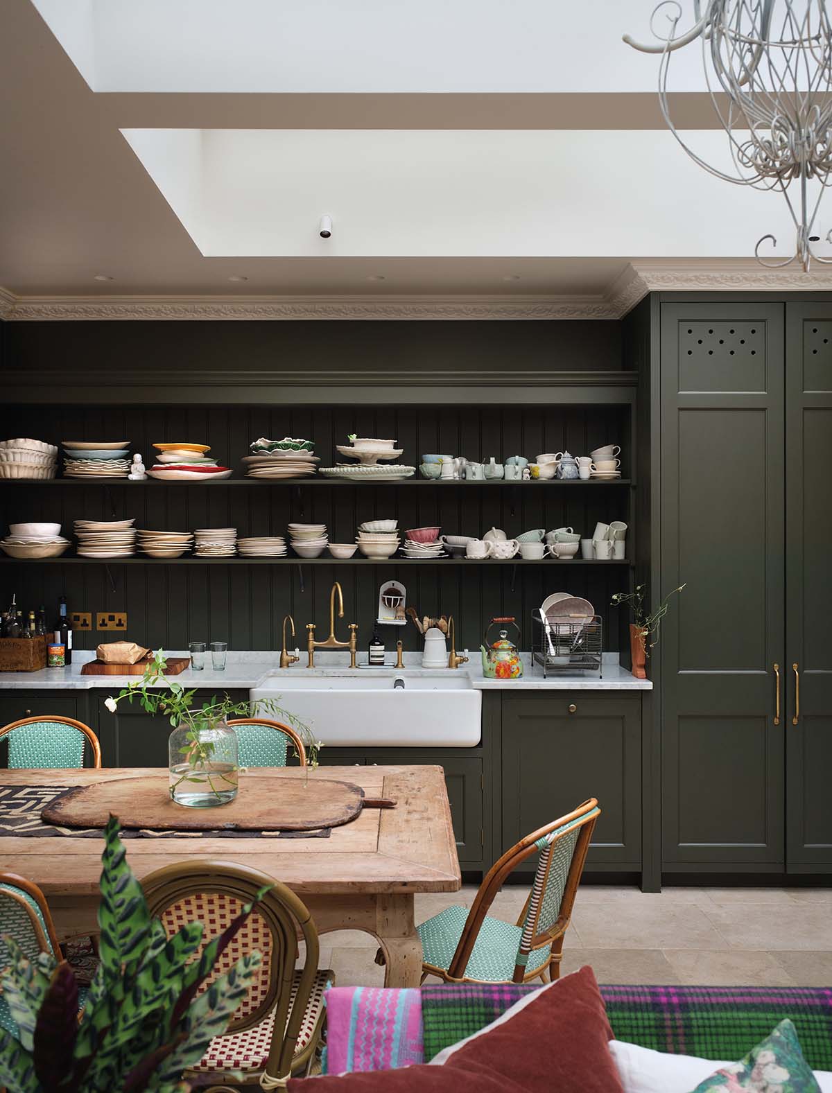
The Bulthaup kitchen is no more; in its place is a kitchen-cum-family room with racing- green cabinetry and a walk-in pantry. Located in an extension at the rear of the house, it has the feel of a traditional orangery, thanks to TG Studio’s installation of French doors and a large skylight.
The room opens out to a lower-level garden terrace housing a generous banquette, pizza oven and barbecue area, covered by a bespoke steel canopy. “We use it a lot in summer,” says the owner. “Since May we’ve had every meal outside, except when it’s rained. It’s really an extra living room.”
On the upper level is a French courtyard garden where a fountain imported from Provence takes centre stage. Planted with fragrant lavender, rosemary and loosely tamed greenery, this romantic outdoor space transports the family to their much- loved holiday destination.
The green theme continues indoors, pairing with pink to form the primary palette. “I decided on Farrow & Ball’s Setting Plaster for the lounge after curating an exhibition of an impasto painter’s work and seeing how good it looked against pink walls,” says the owner.
The colour scheme proves that a neutral canvas needn’t be insipid. “It was important to create a base where anything would work, as the art will change over time,” adds Thomas.
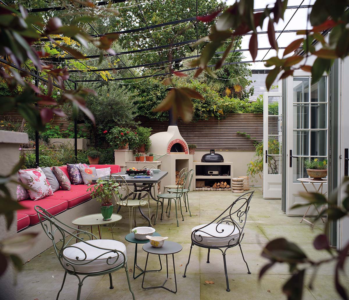
A place for alfresco eating and entertaining on the outdoor patio adjoining the kitchen. “The challenge here was to retain the traditional feel of the house despite this being a very modern addition,” says Thomas.
“What we were aiming for with the interior architecture was timelessness.” The owner admits to being very singular in her vision – a consequence of being immersed in the art world – so she appreciated that Thomas and his partner Lily were open to her ideas.
For Thomas, it was a rewarding project to work on. “I love the whole upside-down story of buying something modern and making it more traditional,” he smiles. “And the client has taste. I was pleased that after we finished our layer of interior design, she added the furniture and art to complete the story.”
Normally, the owner finds moving house a traumatic experience. “My star sign is Cancer so I’m supposed to be really into my house,” she laughs. “But joking aside, I clearly am. I was worried I would miss our old place, which was one of those really beautiful, tall Victorian houses, so it was really hard to leave it,” she says.
“But within two days of moving into this home, I just absolutely loved it. I haven’t looked back.”


