This house hasn’t looked so good since it was built in the 1920s, thanks to a dedicated, in-depth restoration
words Judy Diamond | photography Alex Maguire
Like a lot of architects and designers during lockdown with thousands of pounds tied up in projects, interior designer Lolita Colenso certainly felt that anxiety.
But, rather than panicking about work grinding to a halt, she turned the enforced break into a positive.
“It gave me time to research properly,” she says. “I was able to go online and take my time and find the right specialists across Europe to develop my ideas.”
By the time things picked up again, she had commissioned tiles from Berlin, tracked down vintage armchairs and tables, and expanded her knowledge of the Arts & Crafts movement, the period to which this property, Wayland house near Brighton, belongs.
“It was a funny project – everything required a lot of effort,” she laughs.

“It took time. It was done slowly. But I enjoyed it enormously, and it was so interesting. I did a lot of research. I worked with the architect too – figuring out how to open up and move spaces in a very sympathetic way.”
“We didn’t want the rooms to just be a box.”
Even without the pandemic getting in the way, this house was always going to require a slow, thoughtful approach.
There’s a lot of it, for a start – nearly 450 square metres: five bedrooms (three en-suite, and one with a dressing room too), a living room, study, kitchen, dining room, utility, hall and cloakroom.
“And every room is spacious. But even though it’s a big house, it’s not impossible because the rooms are all used.”
Colenso’s involvement had begun even before the owner bought the house. He had a shortlist of three properties in the Brighton area and asked her to visit them to see what she thought.
She reported back, explaining what would have to be done to each to create the kind of home he was looking for.
“This one was my favourite. It’s very rare to find something like this. It’s on a hill overlooking woodland – you can see treetops from every window – and it’s so quiet and secluded.
It’s like a Hansel and Gretel house surrounded by the woods. It feels like you’re in the countryside, but you can walk into town in half an hour.”

What was inside, however, did not match the exterior. The house had been extended in recent years but the original part dates from the 1920s and was built in the Arts & Crafts style, though you’d never have known it from the decor: rooms were dominated by cold, hard, shiny surfaces, many of them purple, and all clashing with the ornate fixtures and fittings.
The client was initially sceptical, but Colenso could see past the unattractive surface to what it could become. She outlined her vision and slowly he began to see it through her eyes.
“When he agreed to buy it, we came back here one more time,” she recalls.
“We really started to talk about what we were going to do with it and then we engaged an architect.”
The client lived in the house for six months before any changes were made, as Colenso’s plans developed and lockdowns began and ended. “Then he had to leave as everything had to be ripped out.”
First to go was a big chunk of the kitchen-dining room that was occupied by a boiler room – almost certainly left over from the house being extended decades before.
“It took quite a lot to persuade the owner to go with a different layout,” recalls the designer. “I said to him, ‘You’ll enjoy the kitchen so much more if it’s a bigger, more usable space,’ and eventually he agreed. And now, of course, it’s the room where the family spend most of their time.”
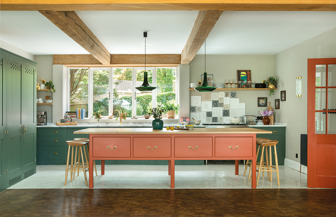
That, in part, is thanks to the beautifully simple but incredibly well-made Plain English kitchen that has been installed here.
The owner wanted the island to be free of a hob or sink so people could gather round it on all sides to eat or chat. It’s big and solid but the legs make it feel lighter and less bulky and more like a farmhouse kitchen table.
As the architectural alterations took shape, Colenso was able to concentrate on the decor.
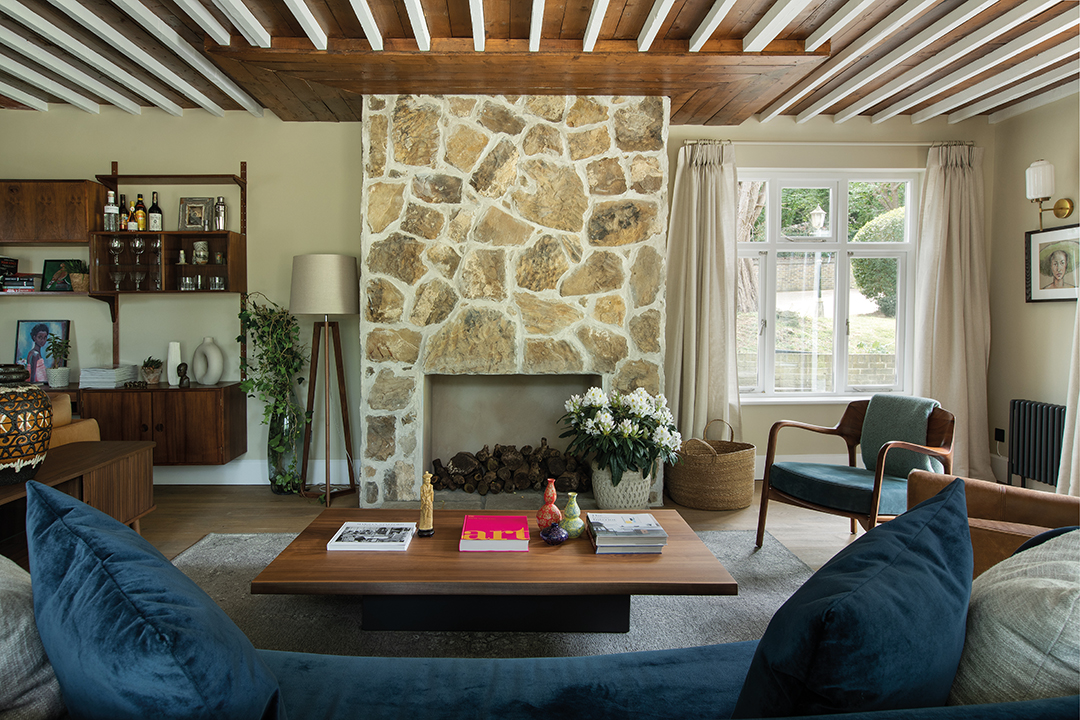
Her idea was to make the house feel like a mix of late Arts & Crafts and Art Nouveau, with touches of Victorian and Edwardian influences too – all much more in keeping with the building itself.
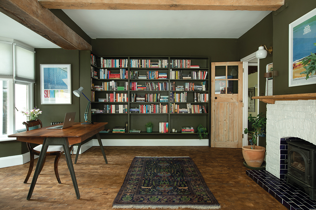
One way to achieve this was through paint that would replicate the colours that are so redolent of that era.
“A moodboard can only explain so much,” she says, “so I took the client to see quite a few Arts & Crafts houses to try to connect with that slightly muted, pastel-toned palette. I went for coppers and oranges and greens, but none of them really shouts or is too bright.”
She was so specific about the precise shades that were required that all the paints were custom-mixed by Little Greene.
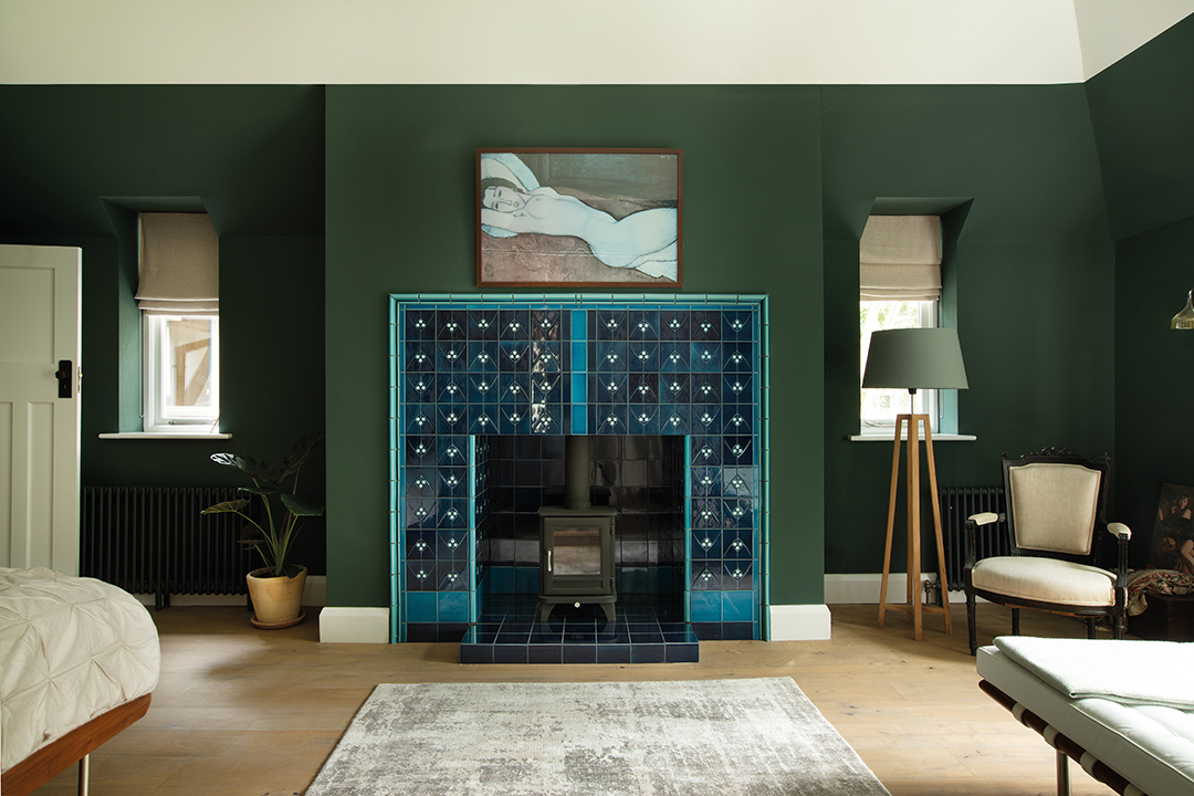
The owner loved the choice of colours – except one: the dark green in the master bedroom. “He’d never had a room that deep or dark before, so I had to compromise; I’d wanted to take it all the way up to the apex but I ended up agreeing to leave the top part white.”
Now, though, he loves the way the room looks and feels – warm yet sophisticated, and in harmony with the intense greens of the trees just beyond the windows. “The house is surrounded by green leaves – you just want to bring the outside in.”
Work continued to upgrade and improve the interior architecture. The staircase had been quite hard and “masculine looking”, but replacing the balusters softened the look and took it back to something closer to what would have been here originally.
Similarly, all the doors were replaced to match the period. Colenso searched for reclaimed doors and stripped them and had others custom-made, such as the double doors into the kitchen.
These elements of the house are not showy; you might not even notice them at first. But they are the foundation of the interior scheme and give it a sense of unity and harmony.

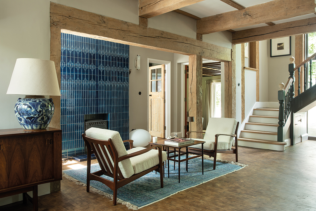
What you can’t help but notice, though, are the fireplaces in the hall and the master bedroom that have been brought to life with stunning Art Nouveau tiles from Golem, a specialist manufacturer in Berlin.
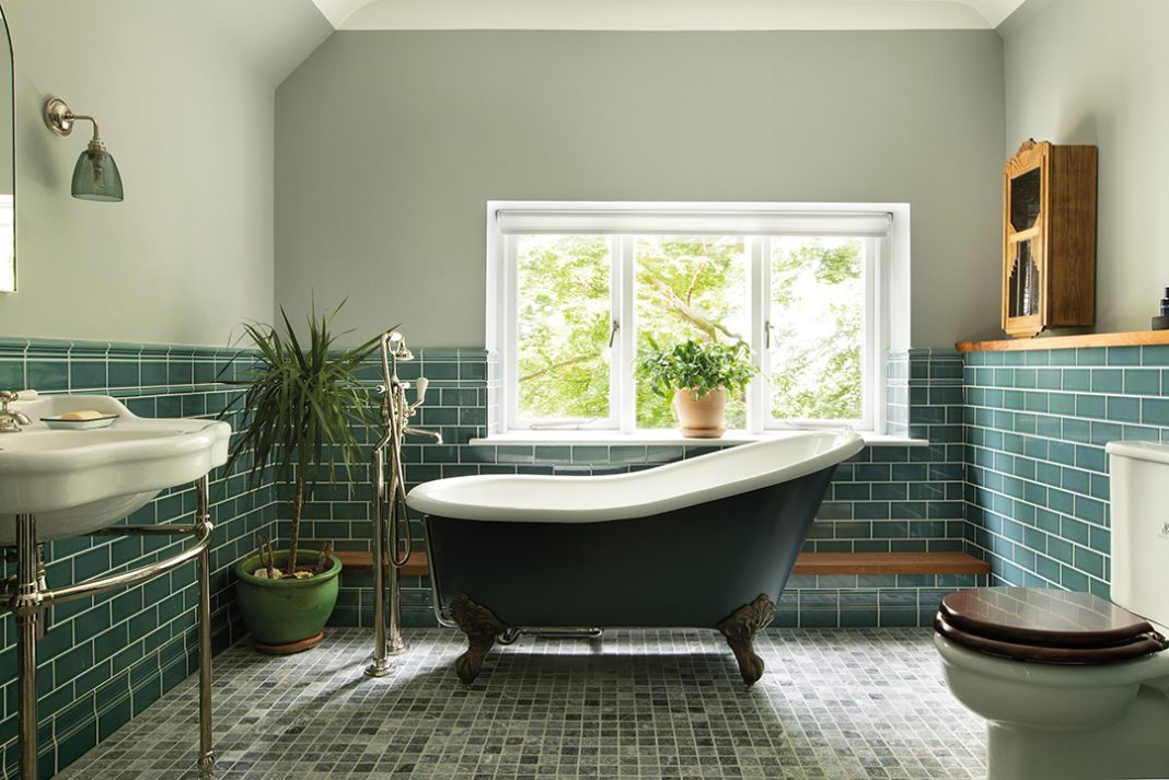
The hand-glazed tiles, in a palette of deep rich blues, are based on originals from around 1905. Tiles make an impact elsewhere too, such as the curving mosaics on the kitchen floor and the Victorian-inspired tiles in the bathrooms.
Furnishing the house was a substantial challenge too – the owner brought nothing with him when he moved in except a sofa and an armchair.
“Everything else we had to buy. He was using garden chairs in the kitchen because that was all he had,” recalls the designer.
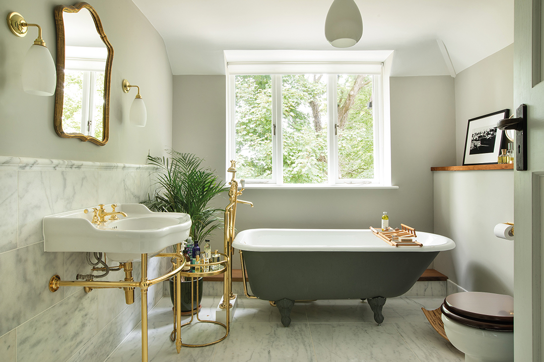
Part of the brief was to make the house feel as if he’d lived here for many years, so she sourced a lot of furniture from auctions and salerooms.
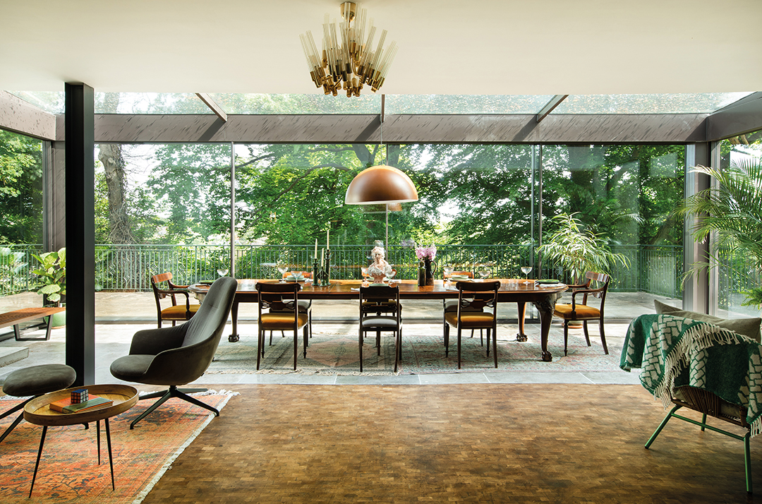
“Some pieces, like the dining table, you look at it and you think it’s really old. But it’s not, actually – it’s late Arts & Crafts, from the same period as the house itself.”
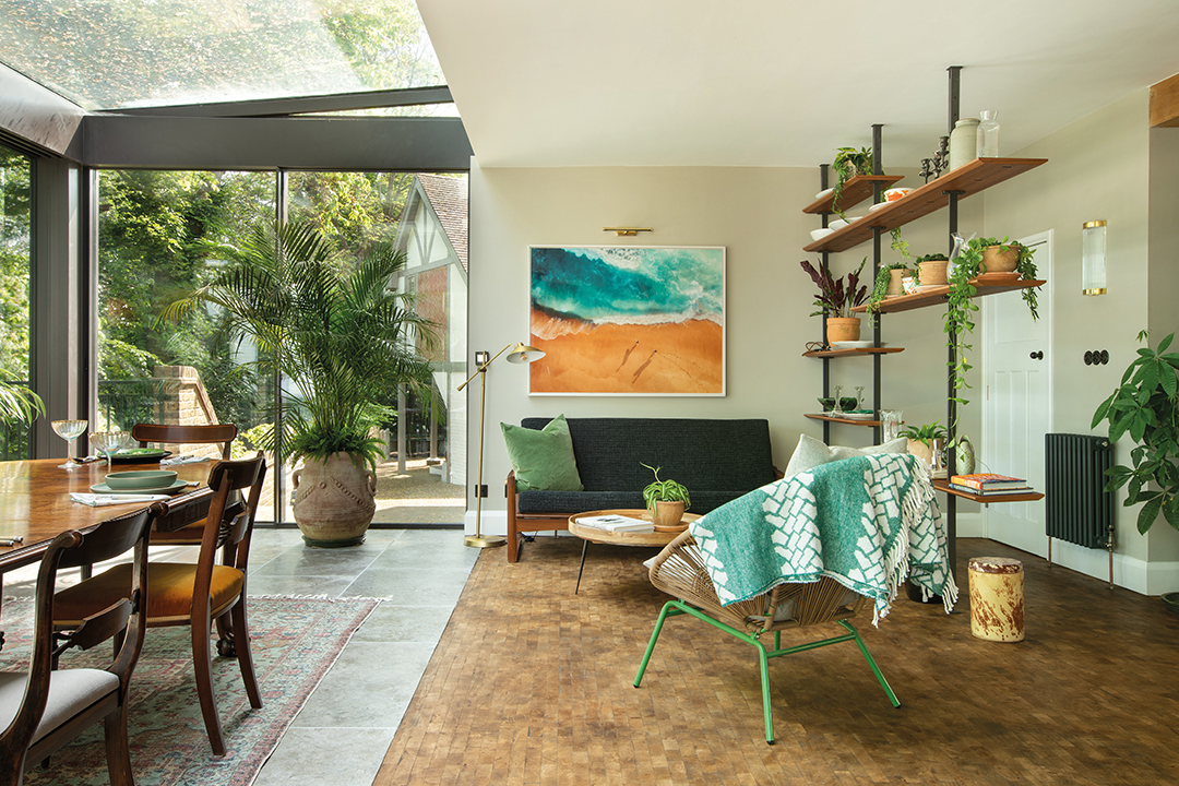
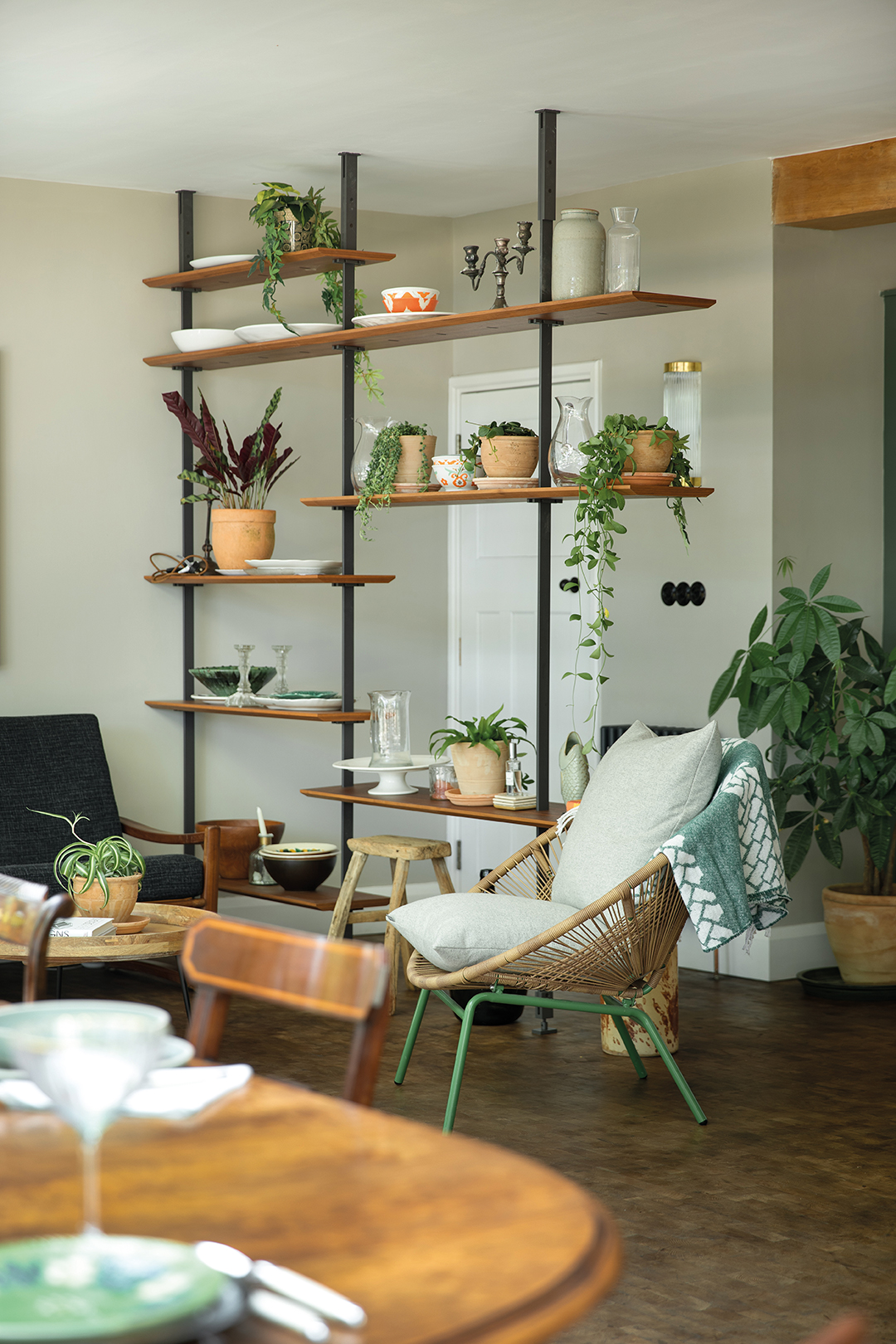
It’s easy to imagine this is the evolution of someone’s taste over the years, from 1960s circular wicker chairs and a ’70s G-Plan-style dining set to vintage Italian lighting and Danish Modern sofas and armchairs.
It’s an eclectic mix, but everything – including the new pieces, such as the Porada bed – shares a focus on quality materials and wonderful craftsmanship.
A lot of time, effort and money has been devoted to the restoration of this house, to dazzling effect, but there are still more rooms to tackle, more furniture to source, more period details to burnish.
“I’m not finished yet,” laughs Colenso. “The owner is focused on the garden at the moment but has asked if we can revisit the interior.”
It’s a challenge she relishes as the house continues its impressive revival.


