Sidestepping trends in favour of personal preferences has produced a Edinburgh townhouse that is unique, characterful and timeless.
words Judy Diamond | photography Susie Lowe
Alchemy is the word Jackie Fisken uses to describe what happens when all the elements of a design come together to produce something magical. She achieves her gold not by transmuting base metals but by combining texture, pattern and colour, layering them and juxtaposing them to generate a balanced, harmonious look that is also exhilarating, audacious and idiosyncratic.
As the design director of Ampersand Interiors, the Edinburgh studio that’s currently celebrating 30 years in the business, she makes it sound simple, but it takes an unerring eye, a sure grasp of design principles and a certain panache to pull off the kind of quirky, individual home that she has created for the owners of this Edinburgh townhouse.

EDINBURGH TOWNHOUSE
The owners had asked her to make it feel comfortable and timeless, incorporating antiques as well as more contemporary furnishings. Things didn’t have to match – in fact, they’d prefer it if it looked as though the interior had come together and evolved slowly.
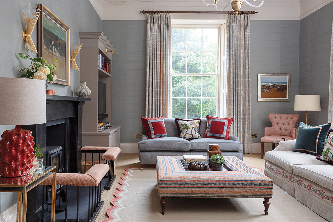
“They gave us a clear brief,” recalls the designer. “They said they didn’t like the kind of modernist look you see a lot these days, and that their natural habitat was more traditional. But they were keen to be pushed to incorporate more contemporary elements they might not otherwise have considered, such as the wonderful Kelly Wearstler wall lights in the sitting room.”

GEORGIAN APARTMENT
Even before Ampersand took it on, the ground-floor flat had a lot going for it. Right in the heart of the city, close to Stockbridge, it is beautifully proportioned, with the grand scale, tall windows and architectural features you would expect from a period property in Edinburgh’s Georgian New Town. It was in great condition, having been thoroughly upgraded by a developer before being put on the market.
The layout was fine (there’s a large entrance hall, sitting room, utility room, boot room, family bathroom, kitchen-dining room, master bedroom with en-suite, and two further bedrooms) and the electrics and central heating had been overhauled. What let it down was its generic decorative scheme.
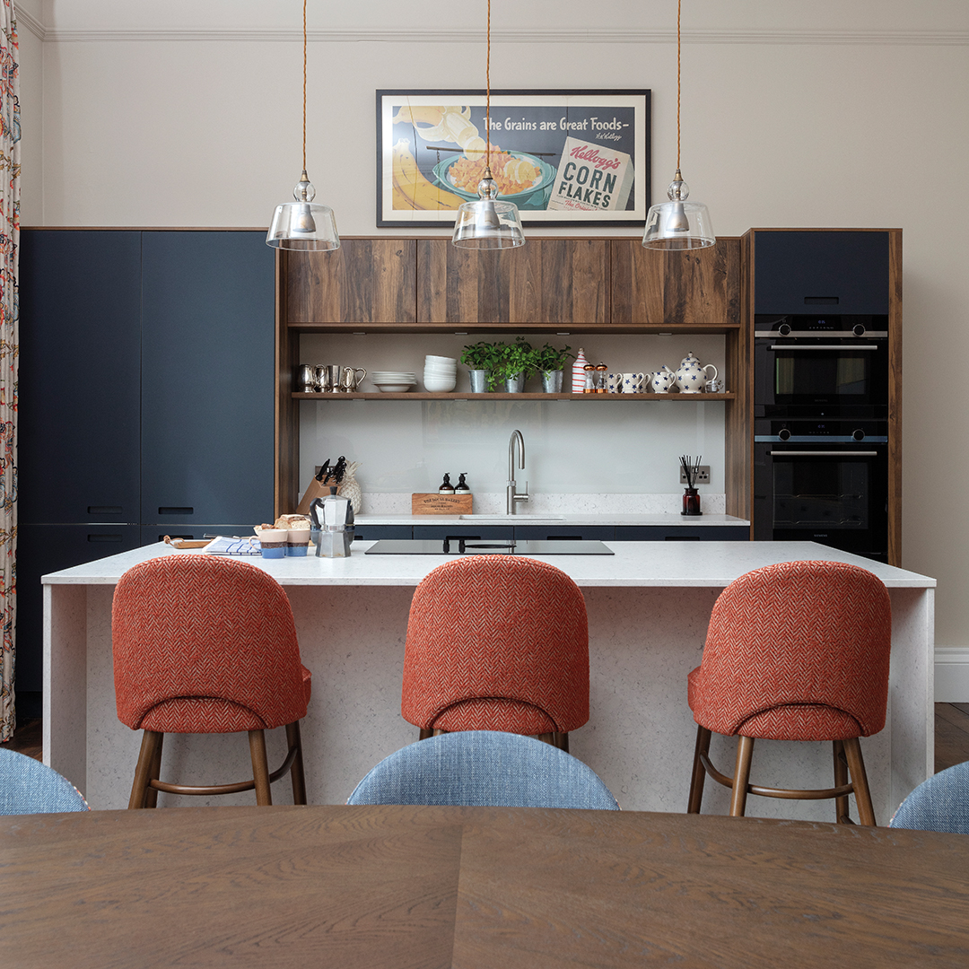
“It was just completely lacking in character and certainly did not reflect the personality of its new owners,” says Fisken. “It was effectively a blank canvas. The bathrooms and the kitchen cabinets were new and were to remain but everything else was up for consideration.”
The clients had used Ampersand on a previous home and it felt natural to turn to the studio again when, after spending many years working in America, they were looking for an Edinburgh base. Following discussions early in 2021, the team presented their initial concepts in spring, and everything was agreed and signed off by June.
“The core of the project was completed in time for the family to host a Thanksgiving celebration in November, with finishing touches completed by the end of the year,” says the designer.
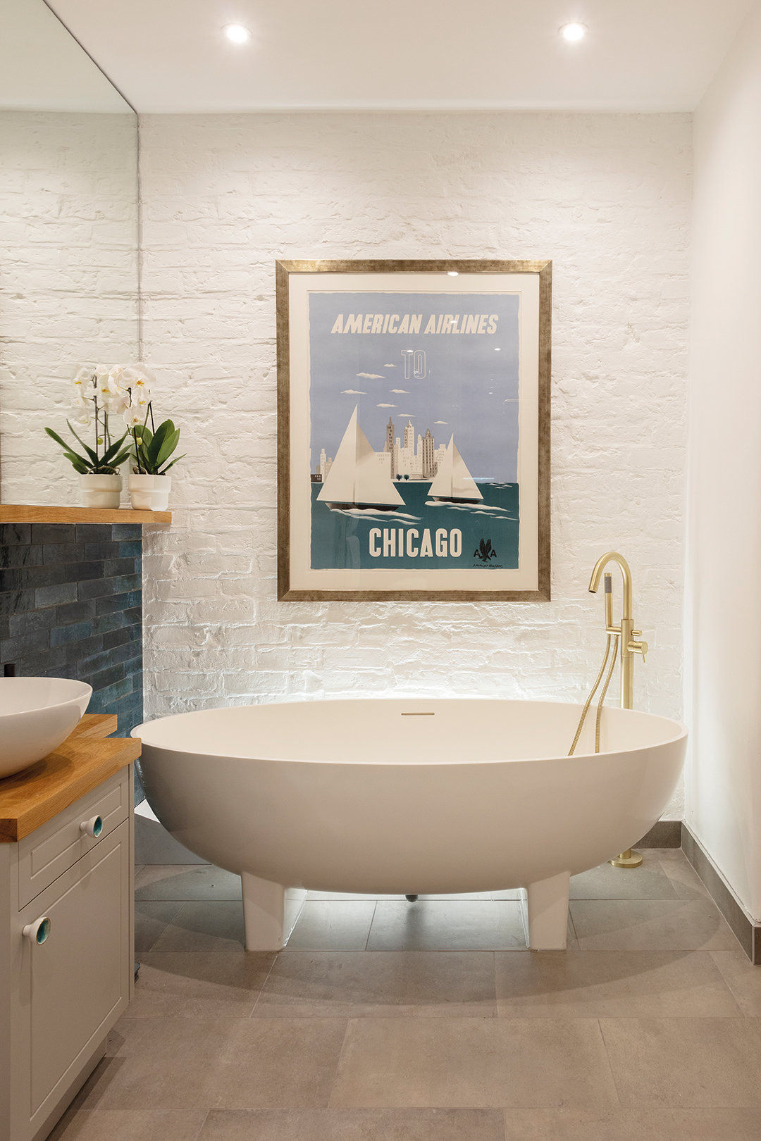
Apart from their paintings, the clients weren’t bringing anything with them, giving Ampersand a clean slate as far as furnishings were concerned. So where do you begin when there’s no obvious starting point?
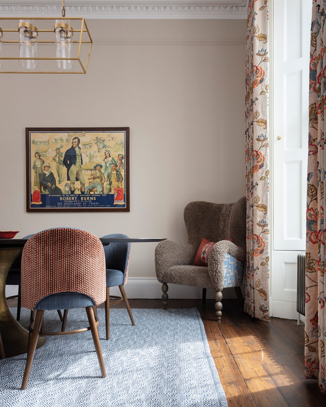
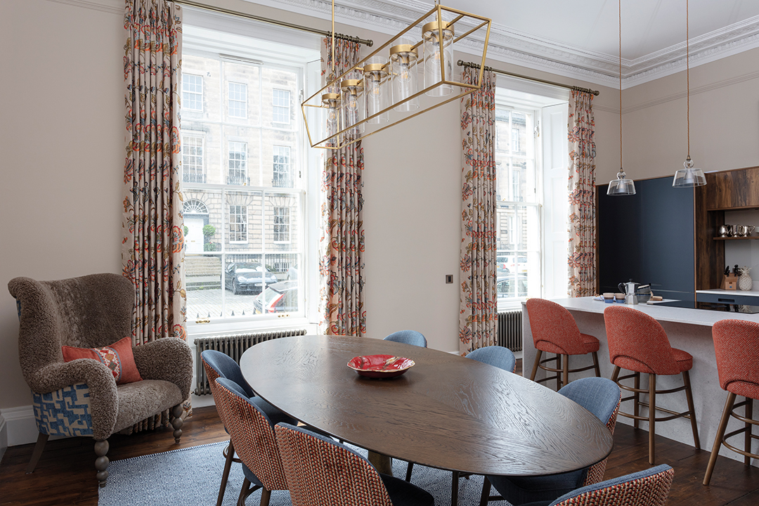
“Creating a sense of continuity and flow between the rooms is crucial,” says Fisken. “The kitchen units were blue so we clearly had to incorporate that colour into the overall scheme. I know the owners love orange, as do I, so while we mixed it up for a bit of interest this was an obvious starting combination.
“It’s usually textiles that get the creative juices flowing for me,” she continues. “Once I have a key piece, everything else falls into place. In this instance, once I had sourced the hall rugs and the fabulous crewel cushion fabric in the sitting room, everything else evolved from there.”

CLASHING HUES
That embroidered fabric, with its jewel-bright colours, is just one of many different patterns in both the sitting room and the dining room. Abstracts, geometrics, botanical swirls, stripes – they all have their place here. Fisken is supremely relaxed about the risks of clashing, arguing that if you get the balance right, it’ll work – and that using a mix of different patterns and textures is one good way to avoid an ‘overly schemed’ look.
“If you restrict the colour palette, you can mix quite a few different patterns and textures together and still retain a sense of cohesion but with much more interest and individuality,” she explains.

She has taken a similarly bold approach to the furniture, placing modern and antique pieces side by side. It’s a deliberate ploy to add depth and character. Look how the traditional elements in the sitting room, such as the fender seats at the fireplace and the silver sofa with its ‘skirt’, contrast with the quirkily modern red lamp base and scallop-edged rug. The striped ottoman seems modern until you spot its legs.
“Carefully selected antique and contemporary pieces can work extremely well together – each slightly knocking the other off and helping prevent the feeling of an overly curated interior,” agrees Fisken. “It’s always a balance – a home furnished entirely with antiques, however beautiful, can look a bit old-fashioned. Add in some contemporary art or furniture and it immediately looks considered and more current.”

The owners had mentioned that they liked bobbin furniture (which has its origins in 17th-century America), which is a good example of a traditional style that is also very much having a fashion moment. Ampersand was happy to oblige, sourcing new designs as well as vintage replicas.
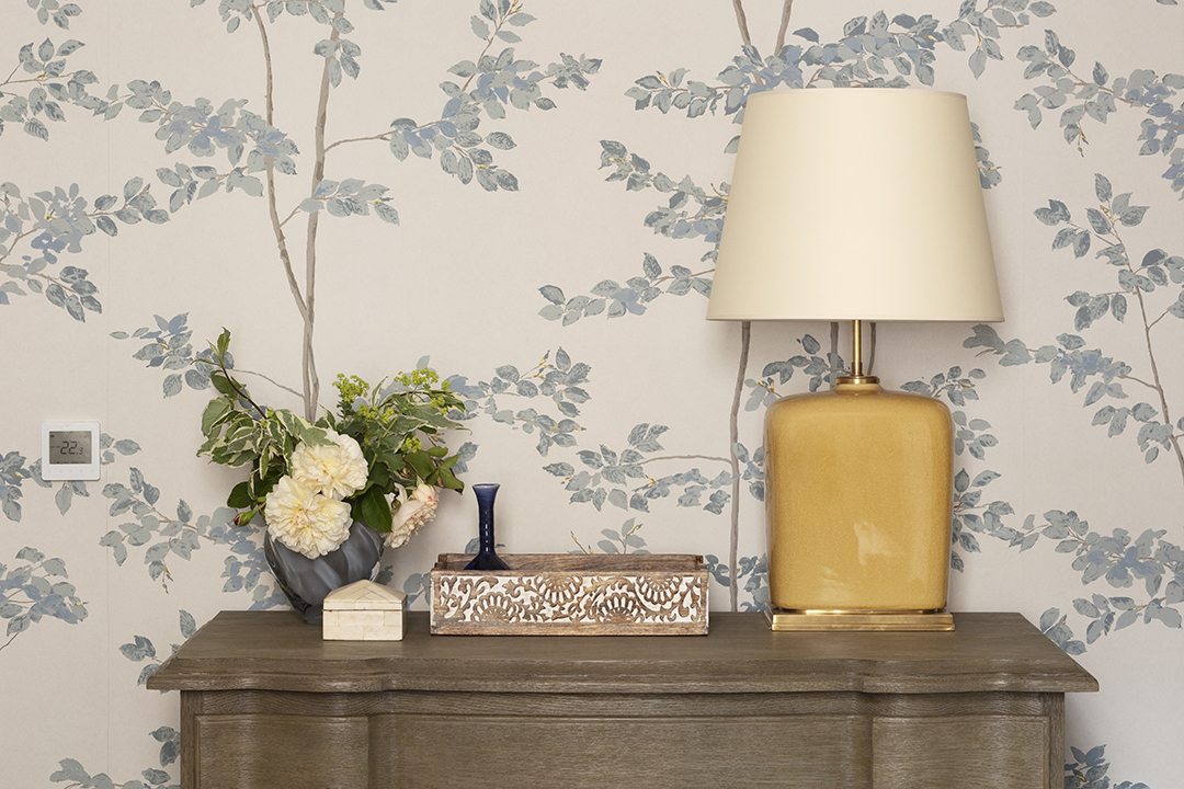
“To me, the most interesting rooms are often a juxtaposition of old and new with an element of playfulness where a quirky lamp offsets an antique desk, for example. There is also a move back towards more traditional detailing – with a vogue for skirted chairs and sofas, soft fabric pelmets and more elaborate trimmings, which all add further layers of interest.”
The high ceilings and generous proportions felt liberating.
“Clearly furnishings have to be sympathetic to the scale of the rooms but most of what we do is made to measure anyway so this isn’t an issue,” she points out. “The simple elegance of the spaces means there’s no need be restricted by the period of the property and allows a broad range of design inspiration to be accommodated.”

BOBBIN FURNITURE
The wardrobes in the bedrooms were all designed by Ampersand and made to measure – working from initial sketches and watercolours, through detailed CAD to the manufacture and installation of each piece. As well as reflecting the scale of the rooms, it’s a way to personalise the furniture, tailoring it to the brief and incorporating details to make each piece unique. Period properties, which often have the scars of age such as sloping floors or chunky skirtings, particularly benefit from this level of bespoke design and installation.
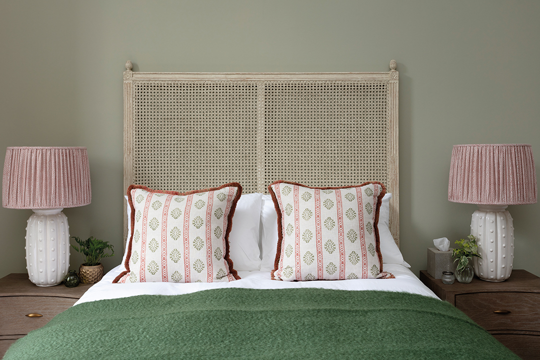
Besides the cabinetry, the designer was careful to give each of the three bedrooms its own personality. The master bedroom is an airy oasis of calm relaxation with graceful wallpaper and a cool silvery palette; the guest double is bolder, with strong hues singing against pale timber; and the twin room is the smallest of the three but its soft pinks and blues make it feel warm and welcoming.

Interior design can often fall into the trap of focusing on what looks fabulous now but which, with hindsight, will quickly turn stale. This beautifully idiosyncratic and distinctive home shows that putting the owners’ personality at the heart of the design will avoid this.
“It’s our clients, not trends, fashions or themes, that are at the core of what we do,” concludes Fisken. “Everyone is different, after all, so there’s really no reason why interiors shouldn’t be just as varied.”


