Clever design is paired with boldly personal decor in this smart update to one of Glasgow’s classic Victorian villas

What A reorganised Victorian villa
Where Pollokshields, Glasgow
Architect Studio SJM Architects
Main contractor Sitka Projects
Photography Mack Photos
Words Caroline Ednie
When Wendy Killin and John McGonagle decided the time had come to give up apartment living, they did so in some style, swapping their flat in Glasgow’s west end for a grand two-storey sandstone villa on the city’s southside, replete with original Victorian features and mature gardens. Even the driveway had pillars.
Having so much space for the couple’s two young sons to run around in was a real bonus, but it wasn’t long before the traditional layout of the interior began to present the family with some practical challenges. “The rooms are so far apart that if the boys were playing in the living room at the front of the house and I was in the kitchen right at the back, I’d be constantly running back and forth between them,” recalls Wendy. “The dining area was problematic too – it was a round a corner from the kitchen. It felt very separate from the rest of the rooms, and small too, as the ceiling had been lowered. The whole set-up was bizarre. So we began to think it would be good to have a space in which we could all hang out together as a family.”
A recommendation from a friend of a friend led them to architect Sarah Jane Storrie of Glasgow-based Studio SJM. “I liked the idea that Sarah Jane was a woman who had just gone out on her own, and that she was experienced,” says Wendy. “We clicked immediately, and she didn’t think my ideas were mental!”
The couple’s initial thoughts were to extend. “We’d also been thinking of putting up a separate building outside, to rent out. But we had no conception of how expensive that would be, so we scrapped that idea. Our main brief was to create one big family space, and Sarah Jane came back to us with so many good ideas about how to achieve that,” says Wendy.

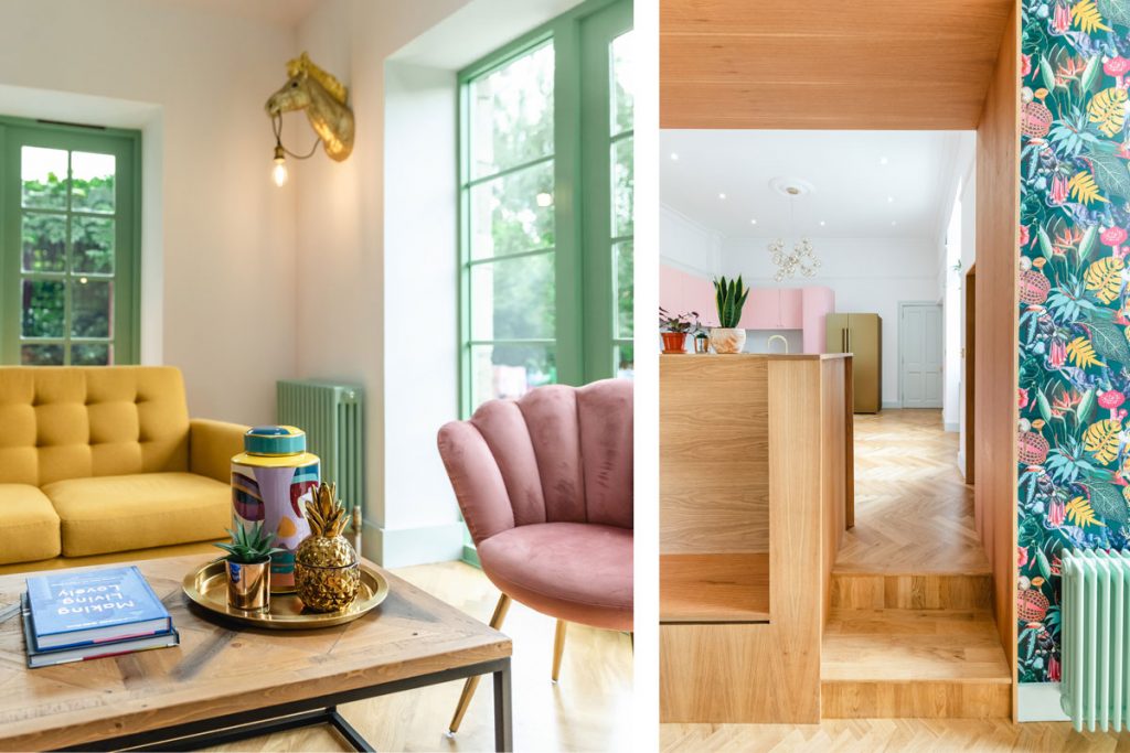
The flooring is from Luxe Casa, Glasgow. A mustard sofa from Next and pink Dunelm chairs sit around a coffee table from Reclaim Nation. A pendant from Pooky draws the eye up to the newly raised ceiling. The quirky zebra wall lights are from Store Without A Home.
Sarah Jane Storrie, who left Page\Park to set up her own practice with Marianne Partyka, says she likes to take a holistic view of architecture and interior design. “We also believe that the existing footprint should work as hard as possible before any extension is considered,” she explains. “Often, reorganising the existing plan can unlock relationships between spaces in a way that simply adding an extension wouldn’t solve – which was the case here.”
The key moves were to change the location of the kitchen and make a large opening between the new family and dining space and the new kitchen. An additional opening was formed in the external wall to the rear, allowing natural light to flood in and giving direct access to the garden and a new decking area. A cloakroom and utility (which doubles up as a shower room) and WC were also created. Removing the lowered ceiling and allowing the room to follow the line of the pitch of the roof gave much more volume and a greater feeling of space.
The house is in the West Pollokshields Conservation Area, so planning permission was required. Storrie, a conservation specialist, prepared the appropriate design statements to go alongside the planning application, and approval was granted within 12 weeks. The building warrant also got the go-ahead within the same timeframe.
So far, so straightforward, with a three-month build slated to go on-site in the summer of 2020. But by then, of course, the pandemic was in full swing, and plans were forced to a standstill until November. The family had taken the decision to stay put during the construction work because it was only scheduled to last 12 weeks and it was confined to the back of the house. But more delays and lockdowns were to follow, and the owners and their children were stuck in a building site with no real kitchen; trips to cafes and friends’ houses and all the things that would have made life more manageable were not allowed. Even once work restarted there were more hold-ups – in obtaining materials and with tradesmen self-isolating or off sick – which set progress back.
“With hindsight, we might have moved out, but it was a cost thing essentially,” says Wendy. “Work started in November and everything was stripped out. The internal wall was knocked down and the floor was taken up. It was just a dark space. This was the hardest period. Work didn’t resume again until the second week of January and it wasn’t completed until April. If lockdown hadn’t happened, it would have been a lot easier. At least now, though, we can see that all the pain was worth it.”
Compared to the rest of the house, with its bay window, decorative ironwork, ornate cornice and pilasters, the newly created space has the feel of a separate modern wing. It’s a contrast that Wendy and John enjoy. “I like the mix of traditional and modern. We love all the period features, but we’re so pleased with the new space, and it works being separate. We use it all the time now, especially at the weekend,” says Wendy.
Warm oak has been used to line the doorways in the new area, which has fixed furniture pieces and an oak parquet floor across the whole space. The walls have been painted a soft white to let the other elements sing and to give a bright, spacious feel. The couple were determined not to scrimp on the finishes or on the details that give character to a home and sourced the fixtures, fittings and furniture themselves.

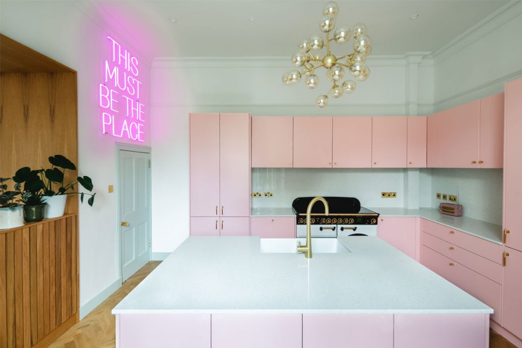
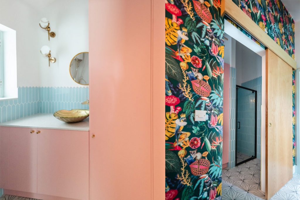
“Doing this was like having a second job,” says Wendy. “I’m a bit of a magpie. I sourced the brass and gold handles and other details, and we commissioned the neon sign. We didn’t know where it was going to go originally, but it looks really good on the wall. I found the bathroom shell sink from a company in China. The first one arrived in a million pieces! But I was sent another one straight away, and it got here intact.
“I knew from the start that I wanted a pink kitchen, and Sarah Jane recommended getting Archispek to make it. I found a Farrow & Ball colour that I liked called Nancy’s Blushes, and Archispek made up a sample in that colour, and it worked. The same paint was used for the bathroom units. And we had the radiators spray-painted to match the green of the doors. Sarah Jane never tried to rein me in! And it all came together. We’re really delighted with how it turned out.”
The architect is similarly impressed with the results. “We call the project our Wonderland House,” says Storrie with a smile. “Wendy’s love of vintage tea parties and bold prints gave us the feeling that you step into an unexpected world to the rear of this traditional Victorian villa, somewhere the family can relax together. It is a real conversation between minimalism and maximalism. We created the bones of a functional and interesting plan onto which Wendy and John’s individual and fun style could be hung.”


