Confident colour rules in this first home
DETAILS
What A two bedroom tenement flat
Where Glasgow’s west end
Interior designer Abi Crowther of Chelsea McLaine
Photography Ryan Johnston
Words Gillian Welsh
Sweetness isn’t just detected by the nose and the tongue. It can also be experienced via the eyes, in the form of delectable colour. That’s what happens at Abi Crowther’s home, a place that appeals to all the senses and where beautiful, rich flavours can be relished. It’s not a sugary scheme, more a considered selection of hues, layered and presented like an exquisite box of chocolates.
“I do have a love of colour and pattern,” agrees Crowther, interior designer at Chelsea McLaine, who shares the flat with partner David Kinnaird. “Each room pivots around a piece I’ve fallen in love with. In the lounge, it was the rug by artist Becky Blair for Habitat. Her work is inspired by the joy of being alive, being able to move, dance, laugh and touch.”
Pulling together a spectrum of luscious shades, the rug plays a big part in the overall design despite being one of the last pieces she purchased. “I coveted it for almost a year until I was able to buy it.”
There’s nothing impulsive about Crowther. This classic Glasgow tenement flat is her first property and she bought it with a view to upgrading it and unleashing her ideas and creativity on it. It fact, it was actually in great condition: sold as a two-bed apartment, it had been rewired, freshly decorated from top to bottom in a range of tasteful greys and buoyed by a glossy fitted kitchen and a sharp new bathroom. Nevertheless, Crowther was prepared to sacrifice some of these benefits, as, straight away, she began to envisage how much better it could look. “I was lucky that nothing needed immediate attention,” she says, “but anyone who knows me will appreciate that grey is not my colour!”
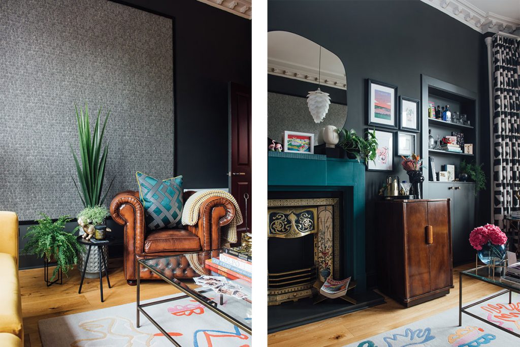

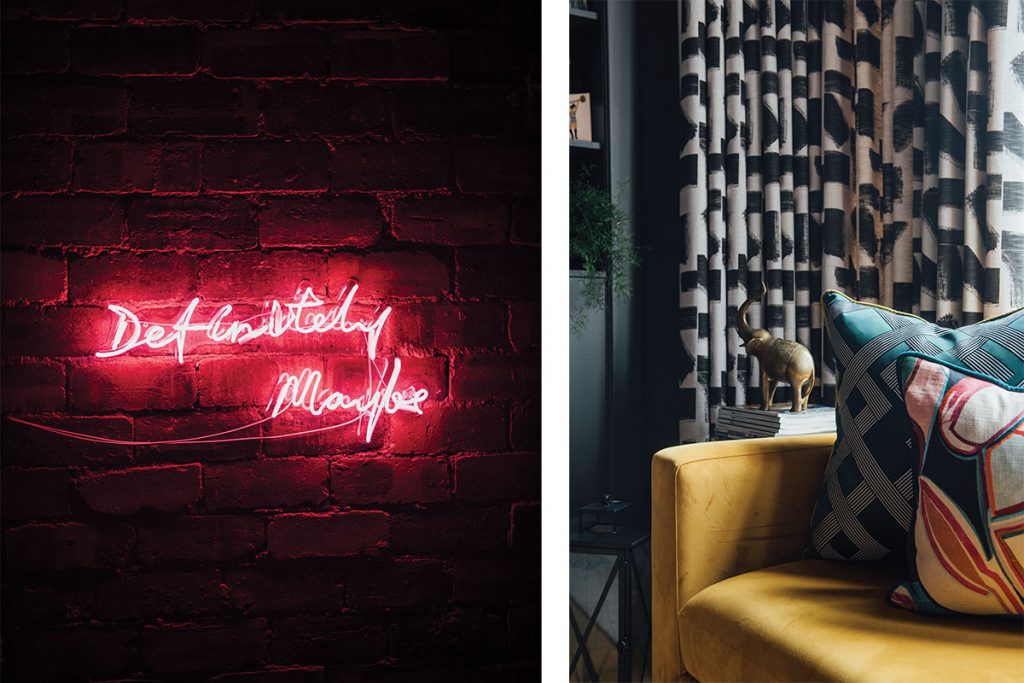
On an emotional level, she wanted her home to reflect her personality; economically, however, not all of it could – at least, not immediately. Take the bathroom: it’s taupe and windowless, but it has a walk-in shower and every inch has been used to its best potential. The lounge, in contrast, was ripe for conversion, with an underwhelming, pale palette that felt stark and cold. The traditional bay window, bringing in masses of natural light, was the feature that had sealed the deal in the first place, and Crowther wanted to enhance it. By painting the walls and woodwork in a dark and moody graphite, she has created a sensuous surrounding. The light that pours in through the window now invites you to explore the room’s warmth and elegance. Voluptuous cushions in emerald and magenta are offset by the dark tribal graphic pattern of the curtain.
One of this room’s most striking features is a huge timber-framed panel displaying one of Zoffany’s textural wallcoverings (the design, Guinea, in the Charcoal colourway, is from the Kempshott collection). Its artistry catches the eye, then draws the gaze upwards in appreciation of the generous proportions. “I loved this paper when I first saw it,” she says, “but I knew I couldn’t afford to cover the whole room with it, so I used a smaller amount in a creative way that would allow me to enjoy it within the constraints of my budget.”
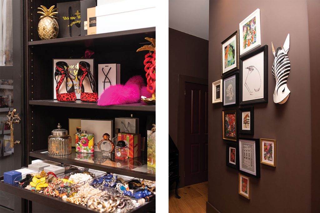

Through in the hallway, the designer’s magic can be seen again. Here, the dark wall tone is illuminated by bright bursts of pink, orange and yellow. These are not random, of course, but stylishly and methodically done, courtesy of a neon sign from Aoos and a gallery wall of framed prints. (The precise position of each was worked out in advance on the floor.) “My artwork is a real mix of pieces I’ve collected over the years. Many of them were gifts, or simply pages I’ve taken from Hermès lookbooks.”
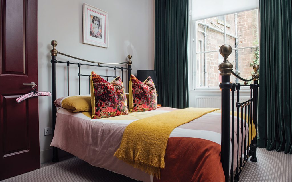
The second bedroom is now the dining room and is where her passion for colour shines brightest. “We love cooking together, so having a space to entertain friends and family is a massive advantage,” she says. The dining table, surrounded by comfortable orange chairs, is the focus, but the dazzling Cole & Son Savuti wallpaper was the springboard for the scheme and serves as a major talking point. Frameless mirrors, meanwhile, reflect the juicy hues and lively motifs.
Following on from here, everything else she addressed as required, allocating the budget according to her needs. “It wasn’t a plan so much as a journey based on how I felt. I was patient out of necessity. I knew exactly which pieces and furnishings I wanted, and once I’d identified those ‘must haves’, I made the investment.”

Just like a box of chocolates, there’s always one or two that raise an eyebrow. A challenging original bed recess is now a dressing nook, where a selection of off-the-shelf wardrobes have been remodelled to fit the tight space perfectly. Not that everything is neatly tidied away: open shelves show off a lust-worthy shoe collection that feels more like an art display than simply storage. In the lounge, the deep windowsills were problematic, so, to allow the full-length drapes to flow freely, she designed a pelmet to disguise the curtain track that allows them hang uninhibited.
The textile graduate lives and breathes her subject matter. “As designers, we bask in our own spaces and love experimenting with new ideas, paint and finishes,” she says.
As such, she undertook the majority of the redecoration herself before moving in, often in the evenings after work. Her efforts have paid off. Drawing on her time at art school, where she learned many hands-on skills, she also repainted the kitchen and the hallway, which took five weeks of late nights. “I enjoyed the freedom to furnish it as I wanted. My partner, who’s very appreciative of my skills, is an accountant. His job was to organise the spreadsheets, letting me know how much of the budget I’d blown!”
For her first flat, we reckon she deserves a box of Richart’s finest at the very least.

If you’d like to read more of our Interiors features pick up a copy of the magazine, or subscribe here.
Also in issue 132 (Sep/Oct 2020):
