Quirky antiques and mementoes from global travels combine with a daring colour scheme to make this period property a truly personal space
DETAILS
What A ground-floor three-bed Victorian tenement flat
Where Edinburgh
Photography Ivar Janssen
Words Geraldine Nesbitt
Styling Wilma Custers
It rarely happens as easily as this, so it’s no wonder David Kay and Tokes Sharif consider themselves lucky. In 2014, they heard that the flat they’d been renting for a couple of years in Edinburgh was going to be put up for sale. Rather than turfing them out, however, the landlord asked if they’d be interested in buying it. They jumped at the chance.
By this point they’d already made some improvements to the property; before they moved in, it had been let out to students and was in a pretty sorry state. “It was grim,” recalls Sharif. Happily, his creative eye (he is a ceramicist and potter) meant he could see past the out-dated kitchen, peeling magnolia walls and stained carpets with their cigarette burns.
“I loved it in spite of all that,” he says. “Even though it was a mess, it still had all its original features and it had a nice feel to it – it had a lot of character. And it’s quite unusual to find a ground-floor flat with a private front door and its own little front garden.”
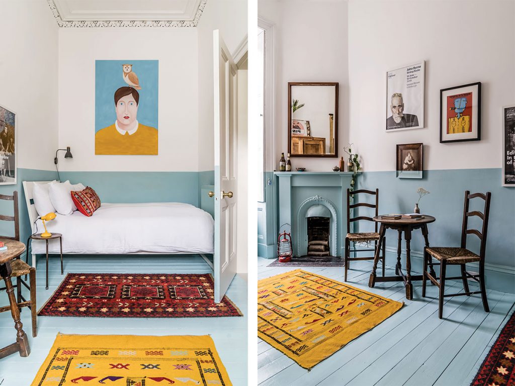
Kay, who works as a project manager, took a bit more convincing, but it wasn’t long before he too liked what he saw: “Once we started decorating, which we actually did while we were still renting, we fell in love with the place.”
They painted the walls and ceilings, pulled up carpets to reveal the original wooden floors and slowly but surely began the process of restoring life to the Victorian tenement flat.
So, when the owner decided to sell, there was no doubt in their minds that they should buy; once it was theirs, they knew, they would have the freedom to really fit it out to suit their own taste and lifestyle.
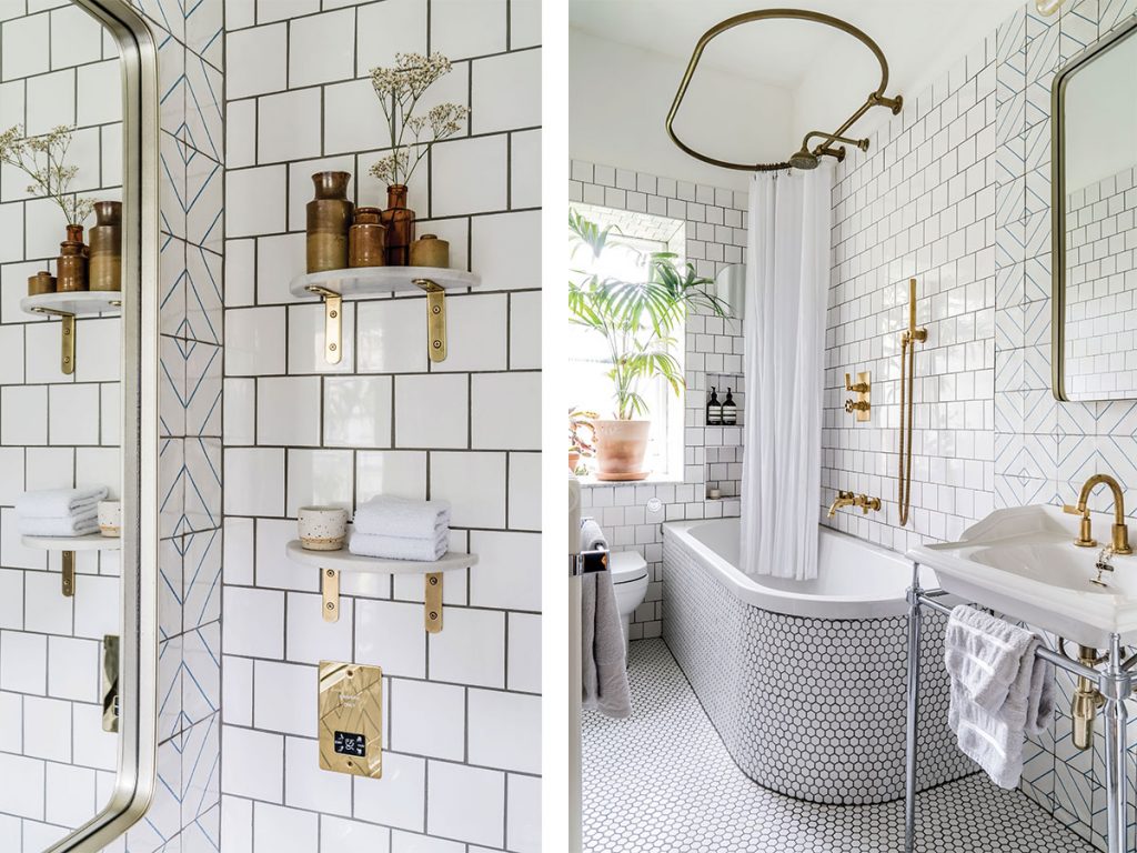
These changes went beyond the mere cosmetic, with a comprehensive rethink of the internal layout. Installing a new en-suite was a priority, as was enlarging and redesigning the kitchen.
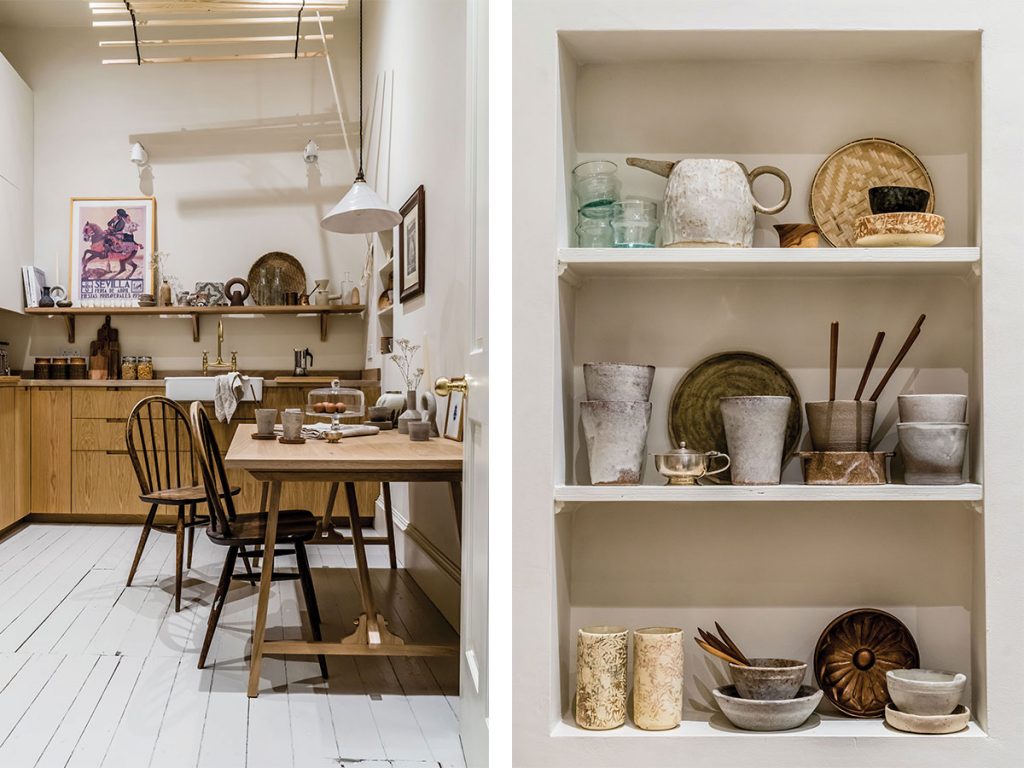
The latter was particularly important as the pair love cooking and entertaining – neither of which was easy in the cramped kitchen they’d inherited, which a previous owner had squashed into a box bedroom.
They decided to sacrifice the adjoining walk-in hall cupboard, knocking through and removing the lowered ceiling.
Now fitted out with cabinetry from Ikea with bespoke door fronts, the room feels surprisingly spacious, helped by plenty of clever lighting.
Painting the wall cabinets in the same neutral tone as the wall has opened up the space even more.
“It has been such a positive change,” says Kay. “It’s fantastic, and it’s now a really nice room to sit in.”
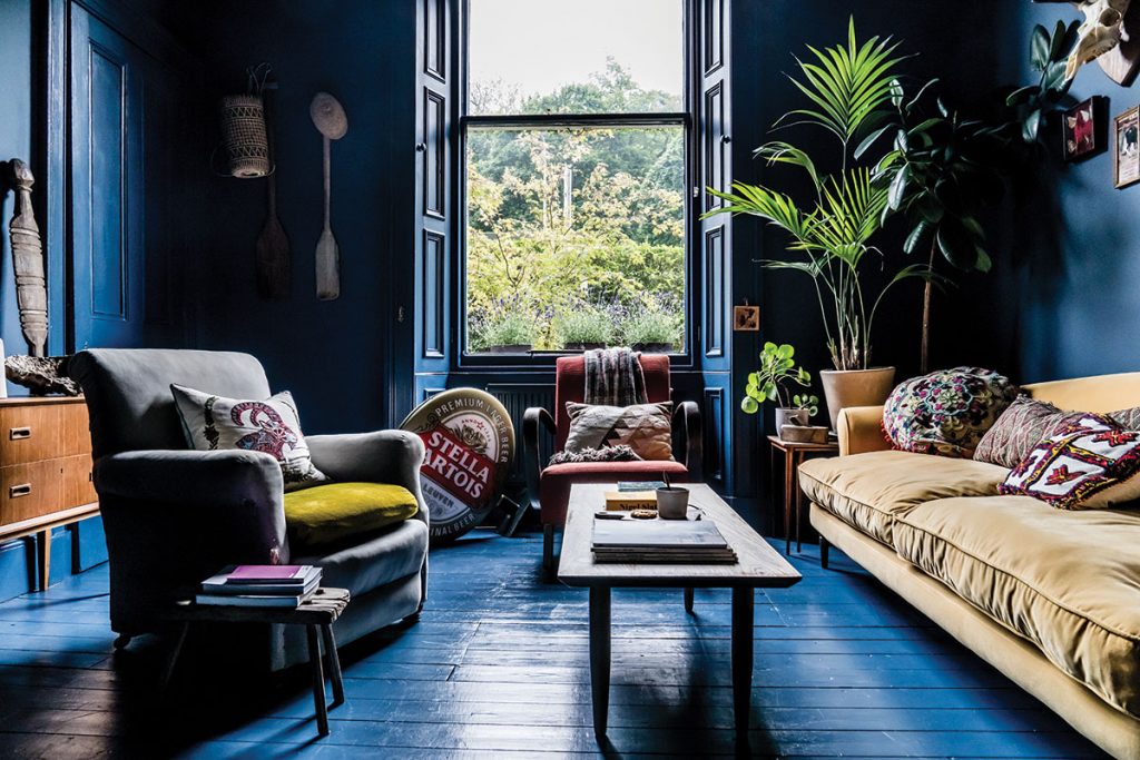
The pleasantly natural tones of the kitchen are in complete contrast to the dramatic living room, which is painted from head to toe in Farrow & Ball’s powerful Stiffkey Blue.
This rich inky hue is on everything – cornice, fire surround, floorboards, doors and walls.
It’s the kind of bold intervention that many people admire but are not quite brave enough to apply to their own home. Sharif and Kay, however, were commendably relaxed about the possibility of getting it wrong – perhaps because they’d already got it wrong: the blue wasn’t their first choice.
Their original attempt was light grey on the walls and aubergine on the ceiling. “We soon realised that this was a really bad choice,” laughs Sharif.
“We were halfway through doing the ceiling when we began to have doubts,” adds Kay. “But we kept telling ourselves that we’d get used to it. After a little more than a day, though, it was a definite no. It just wasn’t working.”
That’s when they came up with the idea of overall blue. The room is big enough to handle it, with a large bay window and 3.5m-tall ceilings. They’ve also broken up the dominant colour with lots of vibrant furniture and glossy green plants. A gold sofa, from Jeffreys Interiors, catches the light beautifully. It is one of the few pieces they bought new.
The coffee table is 1960s vintage and the red armchair is a 1930s Jindrich Halabala design. The grey armchair is from a small shop in Portobello where the pair are regular customers; the upholstery is slightly ragged in places (the previous owner had a cat) but they like it too much to change it.
A repurposed factory work bench, meanwhile, makes a great home for their vinyl collection, and the sideboard is an authentic Scandinavian 1950s oak veneer.
The couple are fans of Nordic style; on a trip to Copenhagen, they fell in love with a chandelier at Studio Oliver Gustav, but it was out of their price range. Undeterred, and with some clever mixing and matching, they managed to put together their own version with pieces from Dowsing & Reynolds.
The art and objects they’ve used to decorate the room all play an important role in the scheme too. Plug in the genuine Stellar Artois pub sign and it lights up. Sharif painted the geometric pink artwork that hangs above the fireplace and made most of the ceramics on the mantel.
The wooden oars were brought back from a holiday to Indonesia. “We wanted to bring home something authentic and handmade but there wasn’t much we liked in the way of souvenirs,” recalls Sharif.
“We actively went across the islands asking people if we could buy their paddles,” smiles Kay. “The locals found it slightly strange – people laughed at us as we carried them around when we clearly had no boat!”
“There’s a lot of character to them,” adds Sharif “We have a lot of strange, unique things.”
He’s right about that: they are constantly on the lookout for interesting bits and pieces. Even when hiking in the Highlands they’ll stop off at an antiques store for one-offs and bargains.
“You get some really good finds at these places, usually cheaper than in the city,” says Kay. And Leith Walk, close to their flat, has a constantly evolving roster of antiques shops, second-hand furniture stores and pop-ups selling vintage pieces.
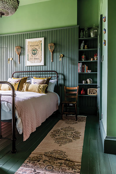
They love to travel further afield as well; in Indonesia, Morocco, India or some other exotic location, they’ll find the most extraordinary items and then have to figure out how to bring them home. The huge decorative wood tent peg in the living room is something they picked up in Portugal. On the walls of one of the bedrooms, meanwhile, is a framed cement bag found in Burma. What look like wooden paddles (actually a pair of ‘fruit catchers’) have been hung on either side of it.
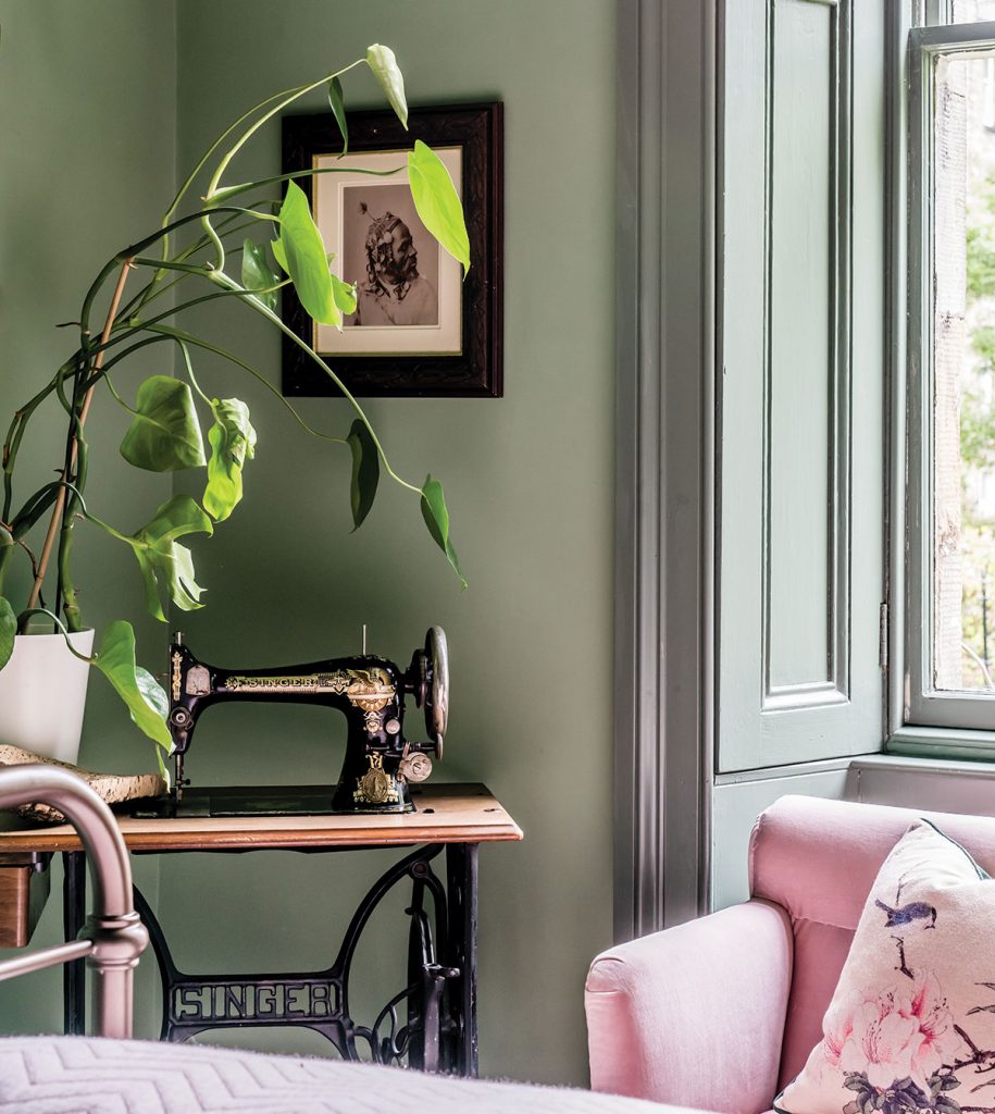
This bedroom, which they let out on Airbnb, glows with two of Farrow & Ball’s moodily evocative greens. This used to be the kitchen and, unlike the rest of the flat, has no cornicing. To give it character, they installed tongue-and-groove three-quarters of the way up one wall. The doors, panelling and floor are all painted the same colour, to play around with perspective and stretch the dimensions of the room.
“Tokes is the creative mastermind. With his artistic background, he’s able to visualise a design,” says Kay.
“I generally have a rough formula in mind,” agrees his partner. “I come up with an idea, usually the colour scheme. We do like to use bold colours as a backdrop.”
Since they bought the flat, they have tackled on average one room per year, taking their time to let it develop and evolve. Perhaps the success of the decor is down to the combination of artist and project manager – courageous choices, but properly executed without haste.
“We want to stay true to the house and to do it justice,” says Kay.


