

Unconventional colour choices and dramatic decoration have combined to produce a home that is deliciously different
DETAILS
What A remodelled three-bed flat
Where Stockbridge, Edinburgh
Design Cathy Dean Interior Design
Photography Susie Lowe
Words Catherine Coyle
Love this project? Steal the style with our moodboard
Cathy Dean is what you’d call old-school. Where others are logging on, checking out social media and losing themselves in the depths of Pinterest, this interior designer prefers to shut down, tune out and let her own creativity take over. Stepping away from the computer, she says, is massively liberating. “I stop and switch everything off, so there’s no music, no phone, no internet,” she explains. “What happens when you’re browsing online is that the algorithm takes over, and things that you’ve perhaps seen on a site are now fed back to you, so it becomes a self-fulfilling prophecy.”
This creative freedom was at the centre of Dean’s latest project, with herself as the client. After a stint in London, she was looking to relocate her home and her business north and, with family in Scotland, it wasn’t long before her search took her to Edinburgh. “My husband, daughter and I came to visit during the Festival. We stayed in an Airbnb in Stockbridge, and that was it – we were sold!”
The family set about researching Edinburgh and its property market, investigating its different neighbourhoods. Deep down, however, they all knew that if they were moving to the city, it had to be to Stockbridge. Their luck was in: spying a fixed-price flat, they went to view it immediately, making an offer that same day. “It had been rented out for about a decade, and it practically sighed at you as you walked through the door!” recalls Dean. “It was super-tired. The off-white walls, blue carpets and white-gloss kitchen were all fine, but they just didn’t speak of the potential this flat had. It felt to me like it had been let down.”
Fortunately, she was able see beyond the worn decoration to visualise something grander and more befitting of its Edwardian architecture. Dean studied at the KLC School of Design at London’s Chelsea Harbour after a career in marketing and advertising. She set up her own studio, Cathy Dean Interior Design, four years ago, following a spell at Grade Partridge Interiors.
Creating something for herself rather than for a client, she realised, would be a chance to go really explore the kind of thoughtful and celebratory design she loves to practise.
Within four weeks, she had the keys and her trusted crew of tradespeople were poised to start on the renovations. Although the property is not listed, a building warrant was required for the new layout and structural work Dean had dreamed up; the biggest problem with the interior, she felt, was that it was being used in the wrong way. “I decided to open up the rooms and reconfigure the layout,” she says. “The planning department accepted all of my alterations; the planners visited throughout the project to inspect it, and they continued to have queries about things like the services, for example. But there are always challenges to work around, and with this apartment, I didn’t want something that everyone else had.”
As the low-grade 1980s cowboy workmanship was ripped out, Dean, to her great delight, began uncovering lots of lovely period detailing, all of which she would integrate into the new luxurious scheme she had in mind: “I wanted to give this place the glamour it deserved but which it had seriously lacked until now.”
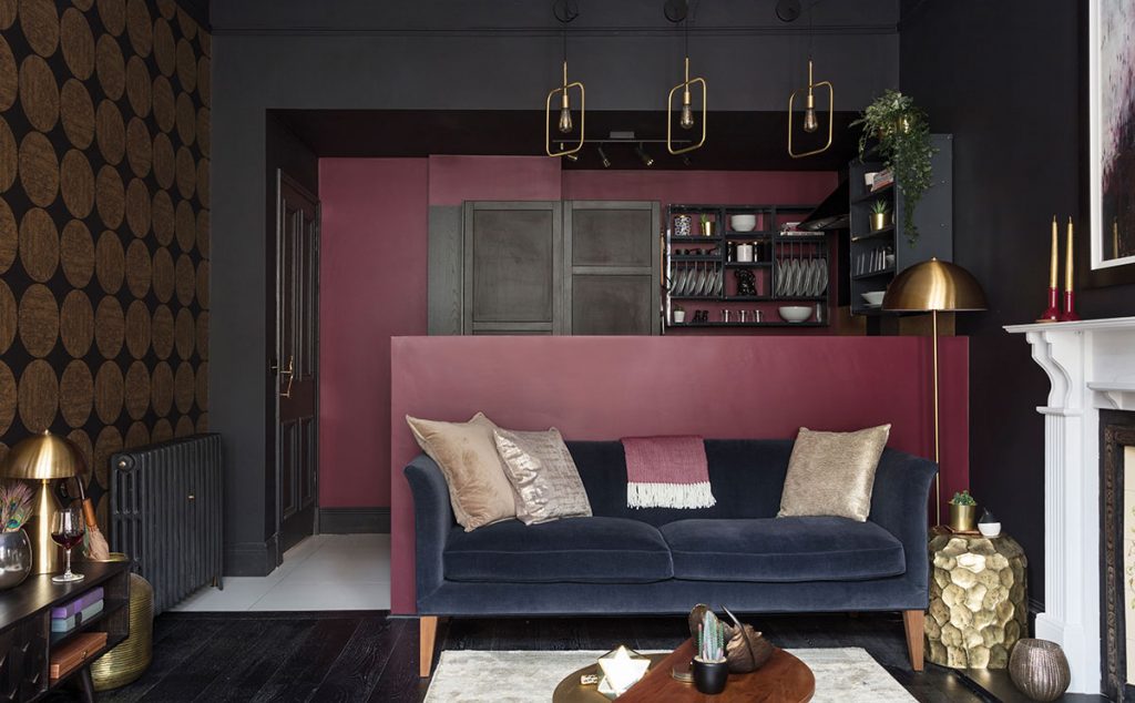
By altering the layout and making it feel more open, she was able to change the ambience of each room. The wall between the lounge and box room was taken down allowing for an open plan kitchen-living room and allowing the existing kitchen to be transformed into a master bedroom with ensuite. Such changes have made the apartment much more liveable, while at the same time giving it an opulent air and the kind of elegant sophistication Dean knew it could handle.
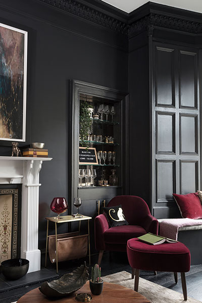
More alterations followed, such as a change to the focus of the living room. In most homes, the TV is the central point around which such spaces are designed; here, though, the first thing your eye is drawn to as you enter the room is the feature bar area. “I wasn’t restrained by client nerves,” explains the designer. “I wanted to come into this room and be cocooned by glamour. I didn’t want it to be pretentious or intimidating; I wanted it to say ‘hi’ as you walk in.”
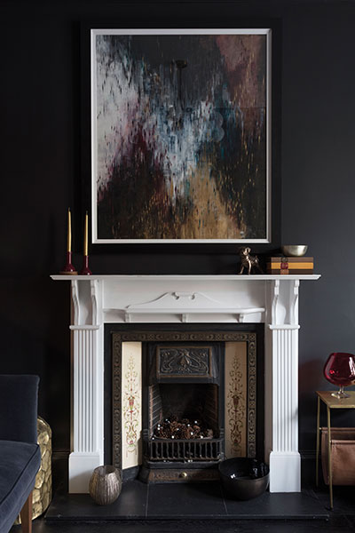
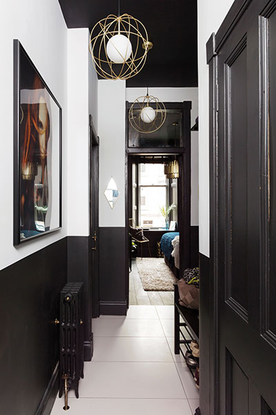
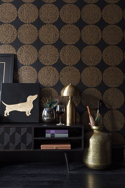
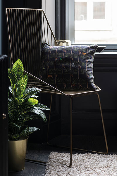
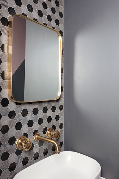
The new layout has had other benefits: “The whole flat just flows so beautifully now,” says Dean. “Each room has its own identity but there is a transitional design strand that runs through to make it feel like one entity.” One of those strands in the use of black and brass; they are present in every room, even if it’s just a hint on a lampshade or picture frame, connecting them almost on a subconscious level.
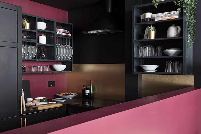
Some of Dean’s choices are daring to say the least, but there is a valid reason behind every one. Take the inky palette, for instance. Using very dark colours, particularly in small areas, is often regarded as a bad move, but this home demonstrates just how effective it can be. The two halves of the kitchen-living room are united by Cole & Son’s Luna wallpaper in black and gold and by rich, deep reddish-pink tones that bring the place to life.
Perhaps the bravest decision was to paint all the woodwork black (a Benjamin Moore colour called Black Tar), even in rooms where the walls themselves are black. Dean explains this by saying she wanted to treat the period aspects of the house with sensitive respect and dress them up to show them off. “It’s like putting on your little black dress when you’re going out,” she describes. Skirtings, doors and panelling that would normally be white, now, strangely, stand out more. Bringing them to the fore in this way has changed the atmosphere and given the whole apartment something of a boudoir feel. “I opted to throw away convention and do what I felt was right. I took a leap of faith. And I have a new mantra: ‘it’s only paint’.”
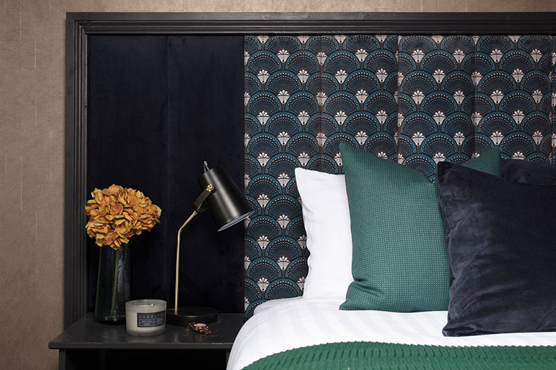
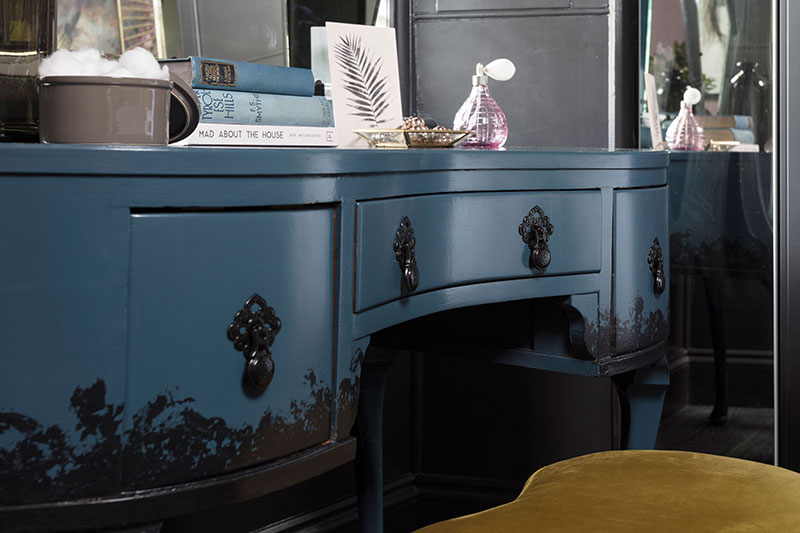
The colours alone would have made this home unique, but much of what makes it individual also comes as a result of combining personal accents, clever upcycling and beautifully made bespoke elements. The guest suite is a good example of this. It has an Art Deco-inspired style epitomised by the rich colour palette and the use of texture. Dean commissioned a velvet headboard (Deco Martini by Divine Savages) that stretches across the width of the wall, which itself has been papered with Tektura’s gold Overture wallcovering. The result could have been overkill, but it works brilliantly. This vinyl comes in extra-wide lengths, so there are fewer joins, and its matt finish ensures a subtler, much softer effect. It’s also a discreet nod to the brass motif.
In the master suite, Dean’s bold choices have given her a unique room that she’s very proud of. “I wanted a mural rather than a wallpaper,” she says, “so I used Woodchip & Magnolia’s Ava Marika – the paper comes in various scales so you can work to the room proportions and really play with the pattern. I’ve continued the design onto the ceiling, so that I can see the beautiful flowers when I’m lying in bed at night.”
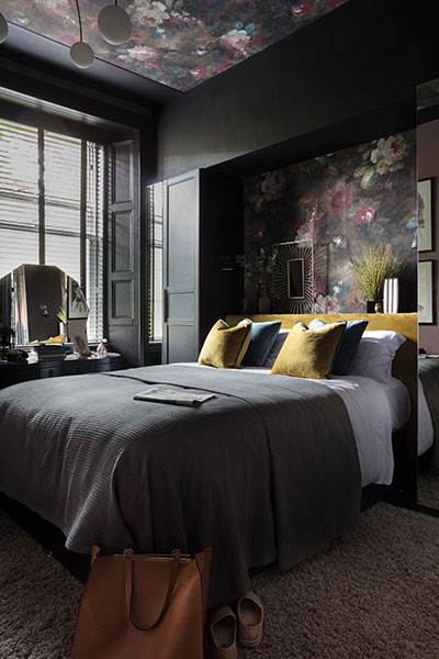
She designed a built-in recessed headboard that acts as a shelf-cum-bedside table. As well as being useful, it cleverly conceals services including an ugly vent that couldn’t be removed.
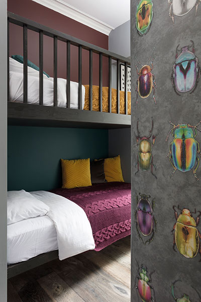
The design and colours in her daughter’s bedroom are decidedly mature and will age well without any major modifications. The joinery team built the bunks at their workshop and then assembled them on site. This is not a big room, and Dean didn’t want a ladder and standard bunks, so she had storage steps built at the end of the room to give access to the upper bunk. Each of the beds has a recessed doocot at its head that serves as a bookshelf and houses light switches and reading lamps. The wallpaper is Woodchip & Magnolia’s Beetle, as chosen by the designer’s daughter: “It’s fun, but not like a ‘kiddie’ room. It also injects a bit of colour.”
To introduce a natural element to the decoration, extra-wide planks of Bausen hardwood were chosen for the bedroom flooring throughout. These show up lots of the wood grain and help make the rooms flow into one another.
Every inch of this home has been given Dean’s careful attention. She has endeavoured to come up with practical solutions to how we live, without compromising on the all-important aesthetic. It feels incredibly luxurious and high-spec, but much of the effect has been created without breaking the bank. “Budget is real – we’re not all millionaires!” she agrees. “I’ve used clever ways of making cheaper things appear more high-end.” The kitchen, for example, is make up of basic Ikea carcasses and doors but is elevated by the addition of fashionably Scandi fixtures such as Stovold & Pogue’s sprayed metal shelves and plate racks.
And in the en-suite bathroom, she looked to Missoni for inspiration, creating a chevron pattern and introducing a colour gradient to make the wall look like a piece of art. A trio of fisherman’s lanterns by Wayfair helped get the look at an affordable price; using outdoor lighting for a wider choice and to introduce a more industrial feel is a trick she has employed before, she says.
Does she have any advice for those contemplating following her over to the dark side? “There’s always a fear factor,” she admits. “In the 1990s everything was beige and brown and pale, and then greys became popular. Now, I think designers are trying to bring out personality in their projects. ‘This is your home it should make you feel fabulous!”


