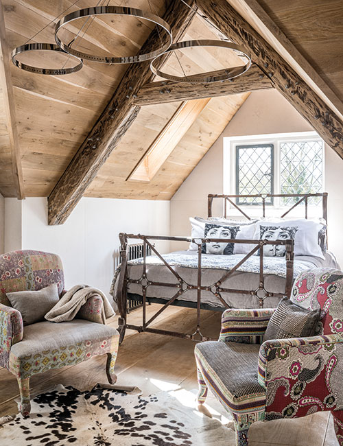
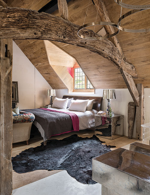
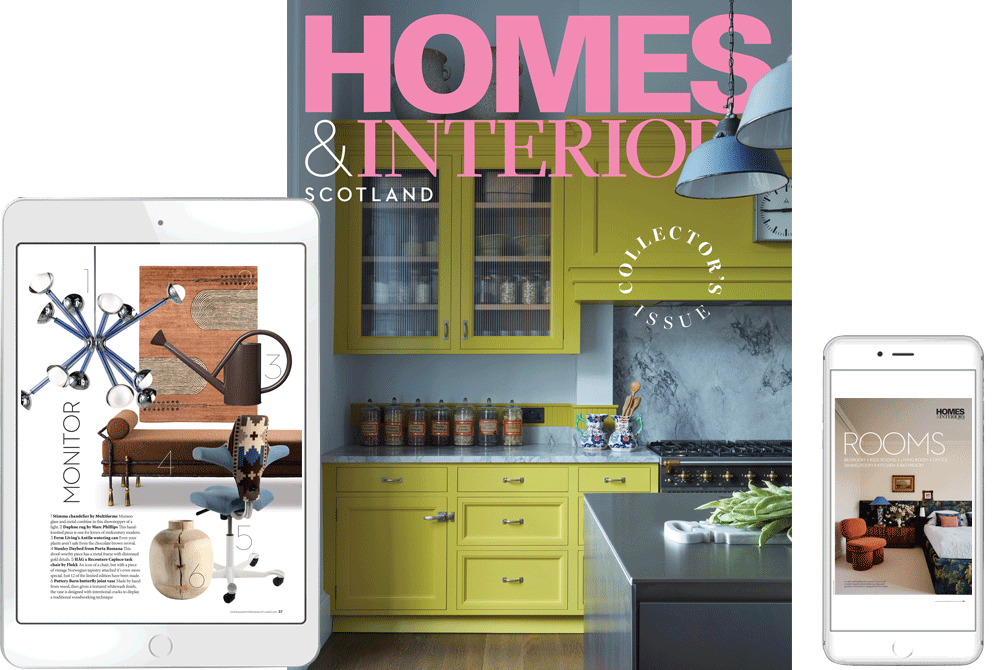
Architectural details from half a millennium have found a home here in this intriguing and harmonious blend of styles and eras
DETAILS
What A restored house of medieval origins
Design and interior architecture Mirka McNeill
Photography Andreas von Einsiedel
Words Amanda Harling
Recycling architecture is a concept that fascinates Mirka McNeill Farmer. “I like to retain the proportions and the detail of period buildings but update them using modern design and technology,” says the Warsaw-born designer. Her own house, in East Anglia, is testament to this, and has given her ample opportunity to put her theories into practice.
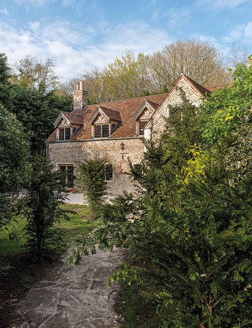
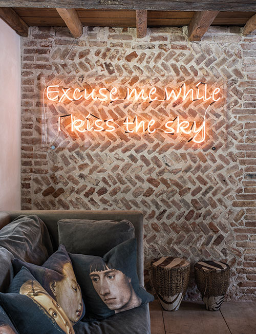
Hidden away in a little village near the Norfolk coast, the building has ancient origins. “During the renovations, we uncovered a section of medieval herringbone brick wall, which we’ve left exposed; and in the foundations, we unearthed another section of medieval brickwork.”
At some point during the 11th century, a community of Cistercian monks from Normandy had settled in the village, and there is still much evidence of their presence, as these discoveries show.
Until it was converted into a house around the middle of the 20th century, McNeill believes that the building might have been a barn attached to a small farm dwelling. It’s close to the Norman village church, and has clearly had a long and varied past. In that respect, it reflects its owner: after studying anthropology and archaeology in Poland, she moved to London, met and married an Englishman and became a web designer, before switching to interior design. She thrived in this new field and within three years saw her work included in Andrew Martin’s Interior Design Review, and again in three subsequent Reviews.
McNeill cut her teeth on two run-down flats that she and her husband had bought as an investment in Warsaw. “I had a free hand as far as design went, but it was stressful being in charge of a team of builders and planning the work so that they were kept busy. Sticking to the budget was a challenge too,” she says.
It was a steep learning curve but the end results were worth the sleepless nights – she would go on to work for Andrew Martin for several years, designing furniture and undertaking special projects for the company.
All of this experience came in handy with the Norfolk house, as did McNeill’s dedicated, if not mildly obsessive, approach to creating a home. Her vision extended far beyond restoring the house in a traditional manner associated with its period origins. Rather than taking a quick trawl around local builders’ merchants, for example, she would habitually spend days and weeks searching for unusual architectural details to give the house its unique character.
“I like to incorporate reclaimed materials and architectural details into every project,” she explains. “Creating a scheme using a combination of elements from different periods in varied materials, textures and colours makes the whole process more challenging, but it gives me a lot of satisfaction to achieve something unique.”
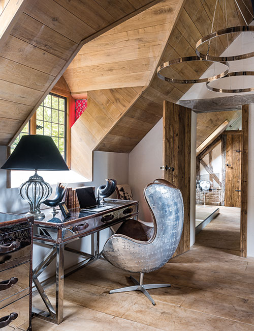
The idea of recycling is not a new one to her, she adds: “When I was working for Andrew Martin, I began designing industrial-style furniture using redundant machinery; my father was an aviation engineer, so I knew where to source parts of planes such as wings, seats and the fuselage. These were then cut, polished and fashioned into desks, chests, armchairs and coffee tables. There are several such pieces around the house now – I don’t think they look out of place in a medieval setting. Sourcing architectural details is just another form of recycling, really.”
Long before work could begin on reconfiguring the house, she was already busy assembling those architectural features, driven by a vision of creating a sense of harmony rather than imposing a wholly medieval or Tudor look on the place. “Most old houses have undergone alterations over the centuries, and this one is no exception,” she says. “You could argue that designing a house around reclaimed materials isn’t authentic or honest, but my view is that by reusing beautiful or useful artefacts rescued from buildings that were being demolished, the craftsmanship and skill involved in their making can be appreciated by future generations.”
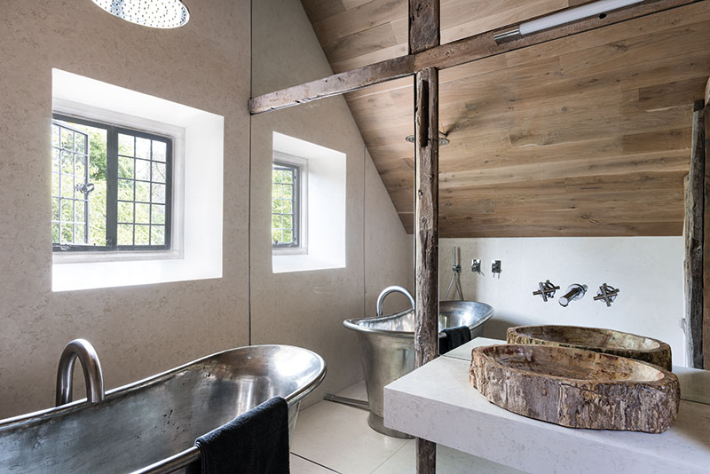
This is not to say that there are no contemporary features incorporated into the building – the stone stairs and the glass balustrade are a good example of this. The bathrooms too, of course, are contemporary in style, although the fossilised timber from which the basins are carved is thousands of years old. “Everything here is truly a mix of old and new,” acknowledges the designer.
The couple lived in the house for a year while McNeill planned the alterations, and they moved into a self-contained studio in the garden once work was ready to begin. “It was pretty cramped,” she recalls, “but it was such an advantage to be practically living on site.”
Structural work began with replacing (and insulating) the roof. Although the house is in a conservation area, it isn’t listed, which made it easier to get planning permission. All the external changes and new materials were scrutinised by the planners, but since the original A-frames were bowing out, the roof had to be renewed. “I searched online and found the right kind of terracotta tiles in a reclamation yard in the South of France,” says McNeill. “The existing dormer windows had to go, though; they’d been added fairly recently, and I designed others which I think are more sympathetic to the overall look of the house.”
The chimneys were rebuilt in an interesting design using locally sourced medieval bricks. “I copied the existing 16th-century Elizabethan chimney pot, and made a matching pot for the second chimney at the opposite end of the house,” she explains. “Then the chimney-breast in the living room was also rebuilt and we put in another one at the opposite end of the house so that we could have a fireplace in the kitchen. It was a great day when all three fire surrounds were finally installed!”
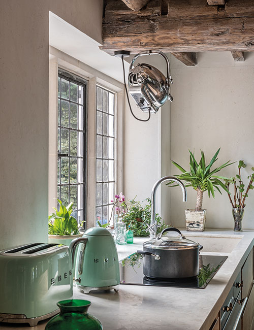
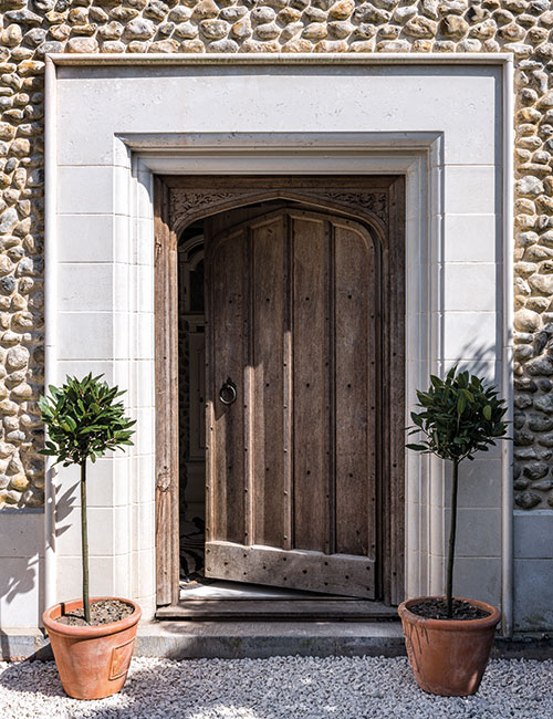
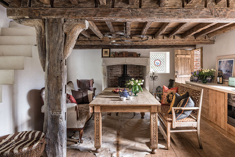
She has designed the interior layout to suit the informal lifestyle that she and her husband lead. The new front door – framed by a limestone surround reclaimed from a demolished 15th-century monastery – leads into a small entrance hall, which opens into the kitchen-dining room. “Like most people these days, we eat in the kitchen,” says McNeill. Her design for this room, combining flat-fronted, limed-oak cabinetry with cream honed marble work surfaces, gives an appealingly rustic yet contemporary look. It’s practical too: “The drawers are very deep and wide, which maximises the storage area and provides easy access to pots and pans.”
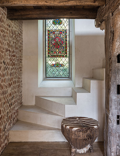
The dining table (made out of a recycled Indian door) and the bench seat (upholstered in printed Brazilian cowhide) were pieces that came from the couple’s previous home in London. “Wherever possible I used furniture that we already had. The table legs had to be extended to make it the right height for dining, but I love the carved detail on them.” The staircase, uncompromisingly sculptural in its simplicity, was designed by McNeill to accommodate a tall leaded window inset with fragments of ecclesiastical stained glass. “When the sun shines through it, the kaleidoscopic light effect created by the stained glass is magical.”
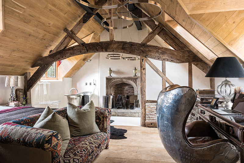
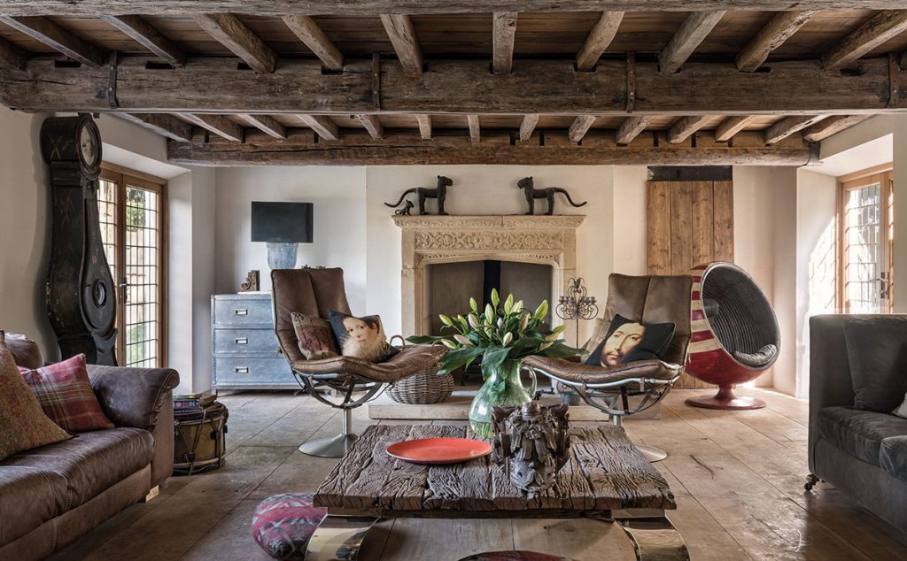
The focal point in the adjacent living room is undoubtedly the splendid 16th-century fireplace which sits midway between two sets of French doors leading to the garden. “There is so much warmth and tonal variation in the colour of the bricks and the wood that I kept the wall colour neutral throughout the house,” says designer, who adopted the unusual approach of lining all the walls with Spanish limestone. ‘They would have had to have been plastered and painted in any case, so it wasn’t such an extravagance, and I like the contrast of the smooth surface of stone against the rough texture of the wooden beams,” she explains.
The large Andrew Martin Camargo coffee table between the two comfortable sofas is another illustration of her fondness for combining rough with smooth – in this case curved stainless-steel feet support a weathered wooden surface. Other unusual pieces include the steel industrial-style chest of drawers by the fireplace and an 18th-century black Danish Mora grandfather clock. “They are of widely differing periods, but mixing styles and materials is what this house is all about. It’s certainly what I’m all about.”


