Hollywood meets Versailles in a townhouse that knows all about looking good
DETAILS
What Five-storey townhouse
Where Park, Glasgow
Interior designer Jen Bernard, managing director, Bernard Interiors
Photography Neale Smith
Words and art direction Gillian Welsh
This is no ordinary home – it is grand, opulent, seriously high-spec and impeccably finished. But all of that fails to convey that it is also comfortable, inviting and designed for living, not for just show – after all, a toddler calls this home.
The brief for Jen Bernard, an award-winning interior designer who has worked across the UK and overseas, was to create a family home with luxurious finishes and a hefty dollop of wow-factor. Bernard knew her client had high expectations and was looking for excellent service, an exquisite finish and truly bespoke features.
“We were impressed by Jen’s diverse portfolio and her ability to interpret our vision,” says Eve, the owner. “We felt she and her team could deliver something special to meet our high standards.”
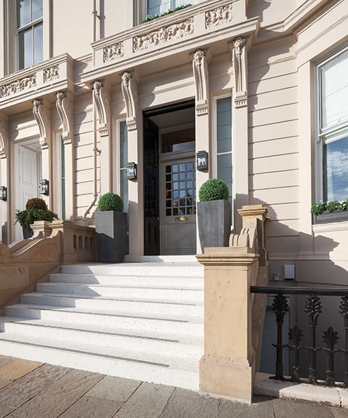
This majestic blond sandstone category A-listed three-bedroom townhouse is in the well-heeled Park area of Glasgow. Top-of-the-range cars, panoramic city views and the green acres of Kelvingrove Park are all here, a stone’s throw from the terrazzo steps and vast south-facing sash-and-case windows. There is just one buzzer at the front door – an unusual detail to highlight, perhaps, but with a significant proportion of the townhouses here having been bought by developers hungry to convert them into smart two and three-bedroom apartments, it’s still a bit of a surprise to come across one that remains intact.
Conversion might have been the fate of this particular five-storey townhouse too. Like the surrounding curved terraces, it was built in the middle of the 19th century as a grand family home before spending time as office accommodation in the second half of the 20th century; having fallen into disrepair, it lay derelict for more than five years, before being rescued by a developer. Bernard Interiors was challenged to create a design that would be contemporary yet sympathetic to its Victorian origins.
The company worked alongside the developer for three years to win planning permission to return the building to residential use. “Getting the go-ahead from the planners took a long time because of the grade listing,” explains Bernard. “Reinstating the cornicing, for example, required specialist artisan craftsmen so that it met the planners’ requirements. We were also limited to which internal walls we could knock down as we reconfigured the layout, so we had to be clever with the way we used the space.”
That clever interior design means that nooks and walkways have been inventively thought-out and beautifully constructed without spoiling the property’s natural flow. Due to the size and scale of the building (there is an impressive 9,700 square feet of floor space across its four storeys and basement), the team began the design process by carefully planning the restoration of the historic features, such as the ceiling roses, original fireplaces, bay windows and the aforementioned cornicing, as well as the grand entrance hall.
“It really was a full refurbishment,” says Bernard. “Partition walls were removed, damaged plasterwork was repaired, and all the existing electrics and plumbing were ripped out and renewed. Countless skips were filled with debris, and we had to put in scaffolding so the workers could get close enough to repair the 4m-high ceilings.”
All this effort has been worth it, as it’s these elements that create such impact and interest. The interior is then turned up a notch thanks to the layers of colour, exquisite furniture and unusual finds that have been added. Among the latter are a 19th-century Louis XV-style marble fireplace, full-height mirrored walls, and a jawdropping oversized chandelier.
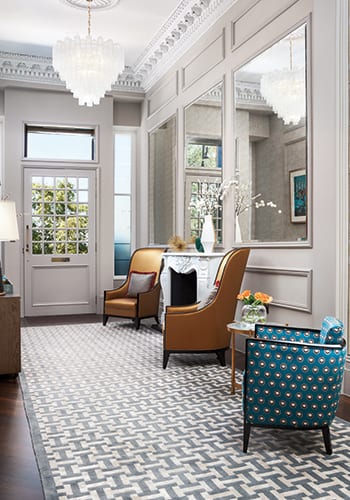
Those floor-to-ceiling antiqued mirror panels in the hall are worth lingering over. They maximise the space, flooding it with light, and bring the whole interior to life. Using them was an inspired decision by Bernard, even if she knew the practicalities of fitting them would be “a nightmare” to work out. “We had to set them out like a jigsaw, in CAD drawings,” she recalls. “In an old building such as this, the walls are never completely straight even after a renovation, so you have to leave some tolerance. A lot of subcontractors will say, ‘Oh no, we can’t do that,’ but we push and push!”
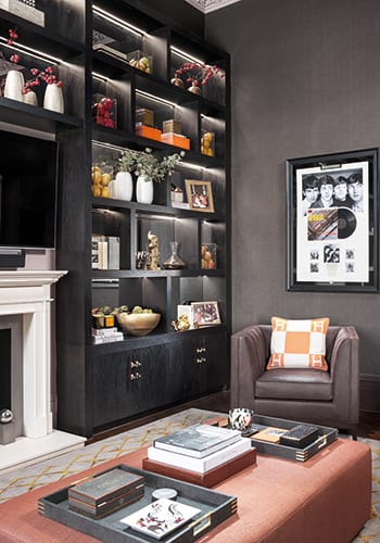
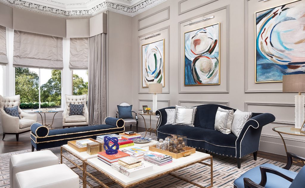
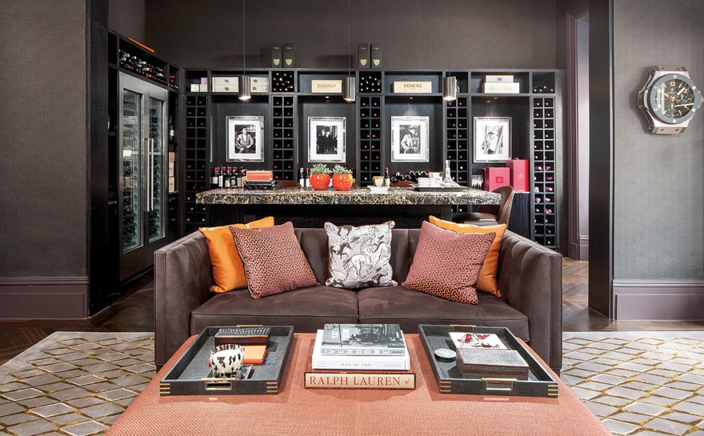
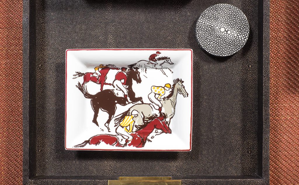
We’re still on the ground floor but there’s so much more to feast our eyes on, such as the rich blue-and-cream drawing room that is set out with refined entertaining in mind. The gentlemen’s cigar room, meanwhile, boasts a fine-wine collection and a built-in humidor; an astonishing slab of gold-flecked black marble, sourced in Venice, serves as the bar top, as orange and burgundy Hermès and Dedar fabrics glow against the smoky wenge cabinetry.
The sweeping staircase showcases an eye-popping 12m-high chandelier which cascades from the top of the house to the ground floor. The special commission, designed by George Singer, is made up of thousands of smoked Swarovski crystals, each one of which had to be applied in situ. It turns up the volume magnificently, creating maximum impact as you enter the house and ascend the winding staircase. It took Singer over a week to put it together and fit each crystal by hand, with specialist joiners required to be brought in to secure the chandelier to the cupola.
“Because each crystal had to be fitted individually, we had scaffolding erected on each floor so George could get close enough to work. It was painstaking.”
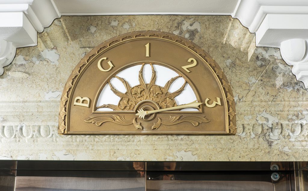
The staircase is a work of art, but if you’re not in the mood for walking, there’s a lift to whisk you skywards. It’s quite a treat – panelled with antique mirrors and illuminated by delicate gold wall lights. Once up on the first floor, you find the family living space. The large kitchen is zoned into a sitting area and a dining area, with a home office behind a partition and a snug next door which doubles as a playroom.
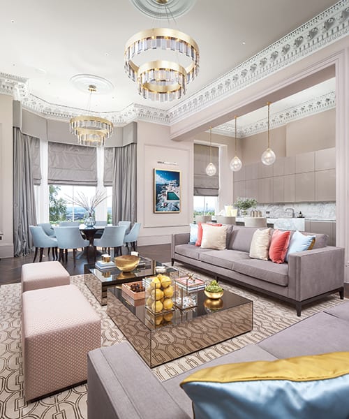
The palette here incorporates soft tones of coral, baby-blue, peach, ochre and gold, creating a chic and sophisticated backdrop for the open-plan kitchen-living space. A large circular dining table by Julian Chichester, commissioned by Bernard Interiors, takes up a position at the bay window which looks out across the Clyde. The table is surrounded by bespoke carver chairs from The Sofa & Chair Company, upholstered in Metaphores’ powder-blue fabric, with a gold chandelier from CTO Lighting suspended above it.
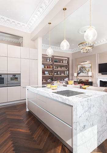
The slick, neutral-coloured kitchen has flush cupboards and a large island. The bar stools are upholstered in soft beige nubuck that complements the Calacatta marble worktops (which also came from Venice). More colourful is the sitting area, where two Sofa & Chair Company Hockney sofas are adorned with bright made-to-measure cushions and flanked by quirky brass pebble-shaped side tables from Birgit Israel.
The snug is a calm and comfortable space, with big sofas covered in mink-toned velvet and complemented by powder-blue cushions. Fun accessories and small black-and-white prints from the Trowbridge Gallery break up the mass of the smoked-oak floor-to-ceiling storage. Two oversized Slim Aarons’ photographs take centre stage on the walls and add a glamorous note.
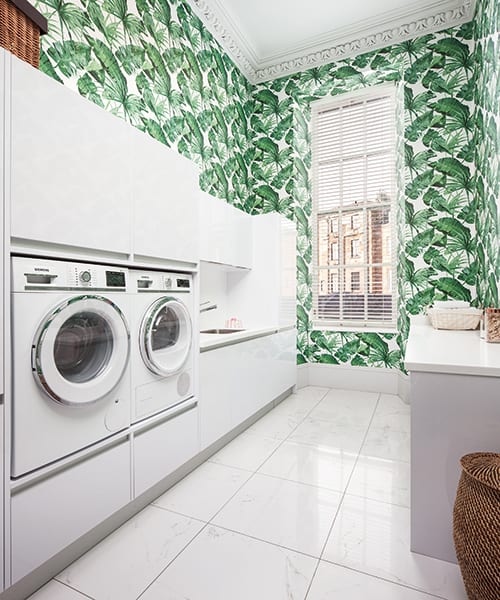
For a functional room, the adjoining laundry is wildly stylish. Its simple, handle-less glossy taupe cabinets from Porcelanosa are topped with a light-toned Caesarstone work surface, but it’s the vibrant green banana-leaf print wallcovering that sticks in the mind. Eve chose it as it reminded her of being a guest at the iconic Beverly Hills hotel, and chimed with her love of the USA and exotic travel.
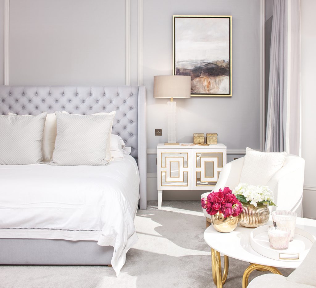
The master suite takes up the whole of the second floor. The bedroom has been turned into a haven of relaxation; pastel and cream-coloured fabrics set off textured silk wallcoverings in beaded panels. On either side of the bespoke sofa and super-kingsize bed are over-sized vintage-style white and gold bedside tables from Birgit Israel. Israel’s style, inspired by Hollywood Regency and French design from the 1930s and 1940s, shows off a blend of skilled craftsmanship, rich materials and polished surfaces – perfectly matched to the aesthetic Bernard wanted to create here. Alongside these are beautiful pieces from Jonathan Adler that bring in more touches of America’s West Coast.
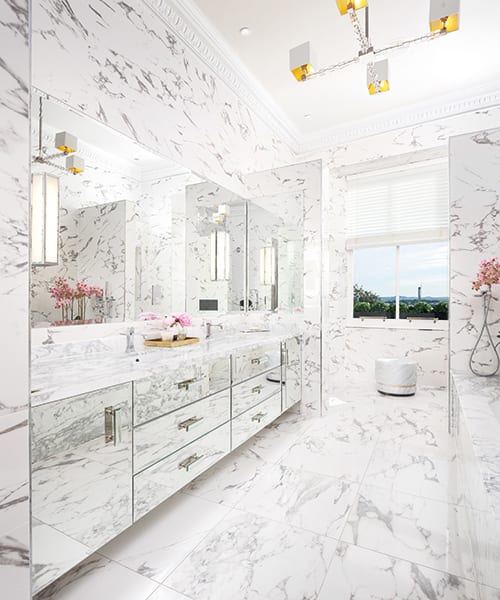
Eve’s dressing room is fitted out with bespoke wardrobes whose doors are upholstered in a shagreen leather with striking bone handles from Ochre. A coral velvet stool is illuminated by a Porta Romana crystal chandelier. Gold and peach tones continue in the bathroom, with its glittering gold-coloured taps and Calacatta-style tiles from Porcelanosa. A made-to-measure mirrored cabinet with crystal handles was designed for the room by Bernard Interiors with Tempus 4 of Edinburgh. (Tempus 4 collaborated closely on all of the bespoke cabinetry.)
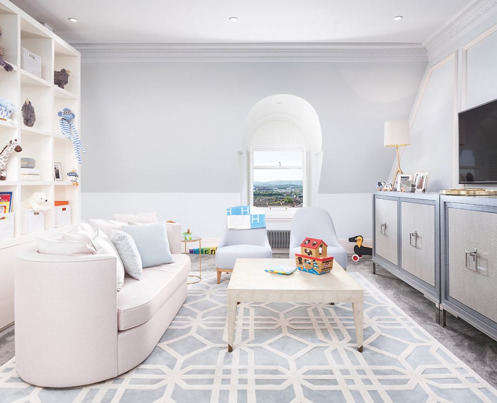
On the next flight up is the light and airy nursery suite. The geometric rug made for the room by Riviere sets the tone for a relaxing sitting space; a bespoke gloss shelving unit for displaying toys divides the room. The cot, a beautiful handmade design by Dragons of Walton Street, sits in between a pair of elegant Jonathan Adler chests. The windows are curved, which made them tricky to dress, so shutters were made to fit. Handy with all the stairs in the house, the nursery suite has its own kitchen with limed-oak handle-less doors and a light Caesarstone top. Bottles can be made up and there’s a milk store for night-time feeds. It also has its own bathroom and dressing room – just like a self-contained apartment. There’s no doubt this child is going to grow up with an appreciation of the finer things in life.
In fact, the whole house, for all its splendour and glamour, is rooted in craftsmanship. This kind of quality is built to last.


