Doing your homework and taking plenty of thinking time is the best way to get results, as this grand home in a former Edinburgh school demonstrates
Love this project? Steal the style with our moodboard
DETAILS
What A three-storey seven-bedroom converted Victorian villa
Where Merchiston, Edinburgh
Interior designer Rhian Davidson, Arosfa Interior Design
Photography Neale Smith
Words Catherine Coyle
Time is a precious commodity – just ask an interior designer. The only tradesmen you trust are in high demand and have long waiting lists, bespoke pieces take an age to be hand-crafted, clients struggle to understand why it takes so long to turn their dreams into reality (and certainly in time for Christmas), and bureaucratic hold-ups are par for the course, at least when it comes to dealing with the local authority’s planning department.
As an interior designer with a busy studio and a roster of clients, Rhian Davidson has long been all too aware of the pressures of time. Perhaps that’s why, when it came to her own home, in the sought-after Edinburgh district of Merchiston, she took the opposite tack and decided to approach its renovation and redecoration very slowly indeed, spreading out the work over a period of years.
Her house, a handsome detached Victorian villa, had long ago been converted into the pre-school of one of Edinburgh’s large private schools. It had been sold to a developer, who decided to return it to residential use. Several new houses were then built in what was once the playground, eating into the villa’s garden. Nevertheless, when Davidson and her family – husband, daughters and dog – saw it in 2010, they were smitten.
“It was a very large house, of course, but we felt there was enormous potential for us to adapt it and renovate the rooms to suit the way we live, and to do so without losing the original charm of the property,” recalls Davidson. “Many of the period features were still intact, such as extensive and intricate plasterwork and friezes, the original tiling and the balustrades in the hallway and on the stairs up to the top floor. The plentiful natural light that flooded in through the large windows from both east and west aspects was appealing too, and the shutters in most of the rooms were still in working order.”
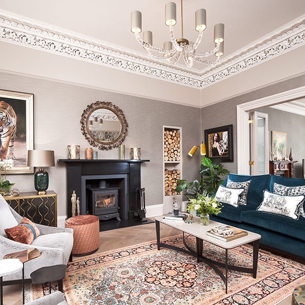
The family moved in during the summer of 2010, but the changes Davidson had envisaged making in the early days have only occurred in stages over the last eight years. While the previous owner had left the property in good basic order, her priority initially was to begin with the bones of the structure, ensuring that the house was sound. “We spent money on essential works to the roof, the chimneys, utilities, windows, alarm system and exterior,” says Davidson.
Only then did she move on to make a work space for herself (converting the former dining room into a client showroom and upgrading the home study to serve as an office for her business, Arosfa Interior Design).
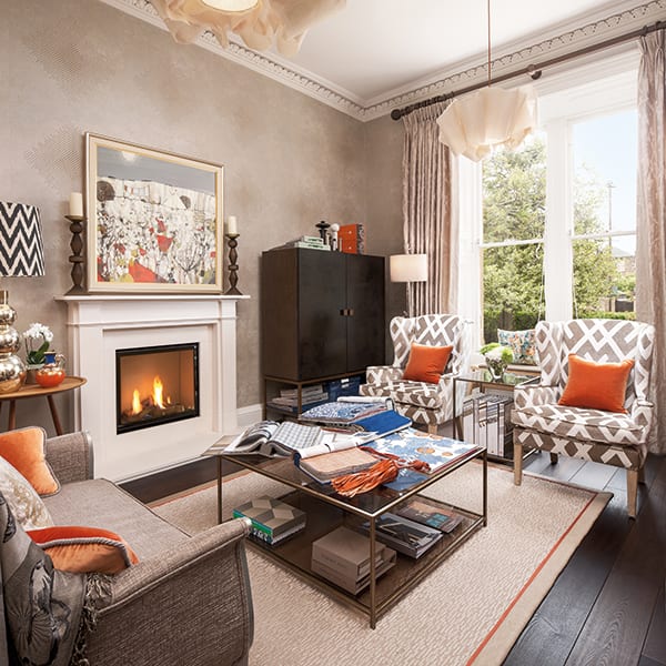
More recent renovations have seen the ground-floor layout reconfigured so that two rooms have effectively become one open space. “We knew that the downstairs didn’t flow naturally and that both we and our home would benefit from the wall between the two reception rooms being taken down and fitted with folding doors, for flexible living. This has meant that there’s now much more natural light throughout the property as well as a sense of flow from the entrance hall all the way to the kitchen area.”
Central to the success of this alteration has been the new flooring that unifies the ground level. Specialists from architectural joinery firm Laurence McIntosh ran a centre plumb line through the two reception rooms, and the parquet flooring, supplied by Russwood, was laid from this point, with straight boards used to help frame the hearth of each fireplace.
The Chalon kitchen had been installed by the previous owners. It was in great condition and all it needed was an update, which was achieved by painting the doors in Zoffany’s White Clay emulsion and fitting new copper knobs. The room’s high ceilings did require some extra thought, though: “There’s a cupola in the kitchen, which stretches up to nearly five and a half metres above the floor at its highest point,” says Davidson.
“There is also a coombed ceiling to consider. Both of these make it difficult to hang a pendant to give mood lighting when dining. After researching and a conversation with specialist lighting consultants, an Occhio lighting system was the preferred option, with lamps fitted on a track and lenses that can be opened to provide a wider light span. We tailored a three-way lighting switch for task lighting, mood lighting and lighting specific for our artwork.”
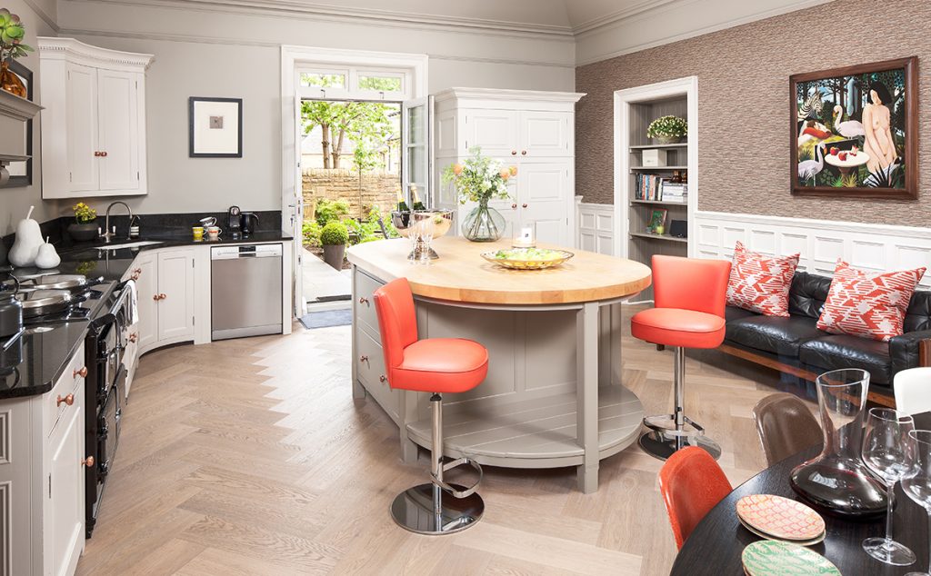
Allowing her design scheme to be led by the property’s classical elements and injecting hints of modernity via soft furnishings and personal touches that reflect this family’s way of life has created a home to be proud of. “A house of this stature deserves a little grandeur, a little opulence, a lot of elegance and a mix of old and new,” she says.


