With three projects complete, designer Anna Atwal knows how to turn a house into a home
Love this project? Steal the style with our moodboard
It’s a skilful designer who can take the contents of their previous home, repurpose them within period architecture and come up with an entirely new scheme that oozes personality and charm. Having transformed three townhouses in the New Town, one after the other, over the last six years, however, Anna Atwal is pretty comfortable by now at taking classic Edinburgh vernacular and creating homes that suit her family’s way of life, their passions and practicalities.
Her eye for what looks good may come from having studied history of art at Glasgow University, or perhaps from her background in PR; more likely, though, it’s her love of interiors and her business (she owns independent boutique Pad Lifestyle, in the capital’s Howe Street) that has honed her ability to bring a space to life. Where some designers look to match, pair or balance the decor of a room, Anna’s method is altogether more organic, and it gives her an advantage when it comes to turning a house into a home.
While her last property used colour with abandon (and was our December 2015 cover story), her current home takes a more subdued approach. There are muted, restrained tones in every room. But there’s nothing dull about it; the palette of ‘new neutrals’ – think millennial pinks, denim blue and sage in place of tired beige and magnolia – has been cleverly crafted to make a subtle but memorable impact.
“The biggest challenge here was being brave enough to go for a completely different style to what I’d had in any previous home,” admits Anna.
Having bought the house in the summer of 2016, she and her husband Haj and six-year-old son Leo moved in straight away, despite the fact that the property had lain empty for five years before being put up for sale. “If you looked beyond the dust and the aged decor, the beauty of the house was apparent,” says Anna.
“It was in great condition, with beautiful wooden panelling, cornicing and original fireplaces in almost every room. I started by painting everything white, while we got used to living there.”
The house wasn’t without its quirks – there was a spa room in the basement, complete with sauna, hot tub and plunge pool. “It was like the kind of thing you’d find in a 1980s pine-clad ski chalet. It didn’t put us off, though!”
By whitewashing the entire property and pulling up every carpet (“I wanted to let the house breathe again”), Anna created a blank canvas that gave her space and time to work out what she wanted to do. Taking their time allowed the family to get acquainted with their new home, which in turn let them focus on how they wanted to live in it. “It was actually a rather less hectic and less stressful way to do it,” says the serial renovator. “Having gotten to know the house first made the design feel really organic.”
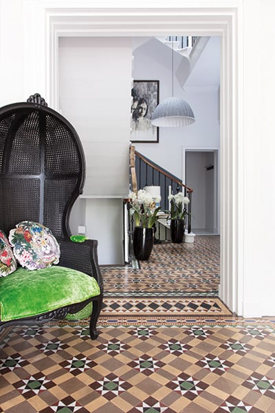
During these early months, Anna made a significant discovery: when she started stripping back the engineered-oak flooring on the ground floor, she uncovered some original Victorian encaustic tiles. “I’m a complete sucker for period detailing,” she says. Those that she could see looked to be in very good condition, but there was no guarantee that the rest of the tiles would be in a similar state.
“We decided to take a gamble and rip up the oak flooring in the vestibule and hall. Initially, it didn’t look too promising, with a ton of levelling screed across most of it. But we had a team of people working on it, scraping this away, and eventually the most fabulous coloured tiles and intact patterns were revealed. It was so exciting.
“I usually go for carpet in the hall, as I find it makes these old houses very welcoming and cosy,” she adds, “but the sheer beauty of these tiles meant I couldn’t justify covering them up.”
“The biggest challenge here was being brave enough to go for a completely different style to what I’d had in any previous home”
Buoyed by her discovery, Anna took the plunge, working room by room to inject bold, confident design into each space. Her philosophy, regardless of the project, is always to be ambitious; but, as she has grown more experienced, her style has become more refined, although it is still eclectic and full of character.
Her scheme here aimed to preserve the history of the building but in a workable, current way, bringing out the finest period features (and, since her alterations were largely decorative, there was no need to pursue planning permission or any kind of building consent). At the same time, she got to work improving other aspects of the house, such as stripping out the pine-clad sauna and refitting this space with a sleek, contemporary spa with digital controls, and creating two gym rooms in the basement bedrooms.
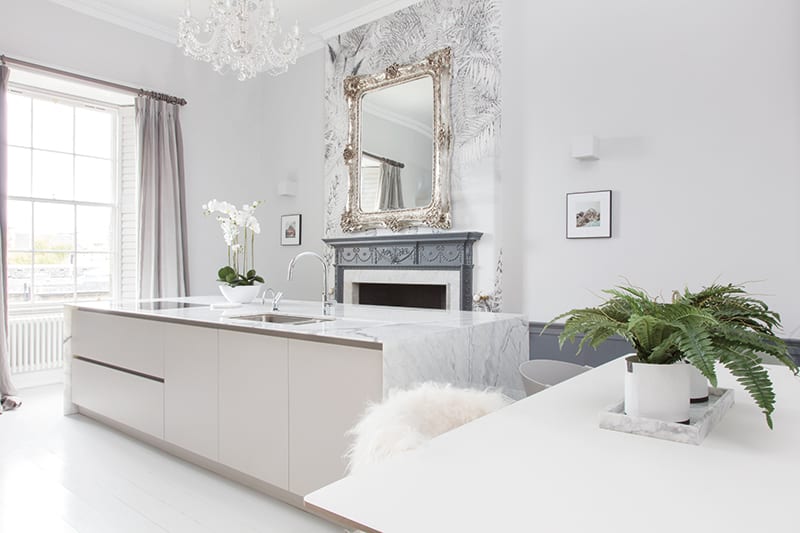
The kitchen was next on her list. It’s a large room on the ground floor, next to the family living room, and its impressive dimensions allowed her to play with scale and proportion. “We had new units made by London’s Roundhouse Design,” she explains. “It’s a very high-spec walnut design with a clean, modern finish to the front, and has been hand-painted in a light grey to work with the scheme throughout the rest of the house.”
What is most striking is the huge bookmatched marble island that she had installed in the centre of the room, below the ceiling rose. Overhead hangs a glittering pendant by the Crystal Chandelier Company. Together they make a powerful statement, which is amplified even further by the fireplace. Rather than hiding it behind some of the new units, Anna has left it exposed, adding to the room’s grandeur. The pared-back base palette of the kitchen has allowed her to be bold here, cladding the chimney breast in Christian Lacroix’s Croisette Nacre wallpaper to make a feature of it.
There’s a smattering of Jonathan Adler pieces here and there (Anna’s store sells the cult designer’s products); his playful, often tongue-in-cheek take on interiors is clearly a hit. The kitchen epitomises the style she has adopted throughout the house – an eclectic glamour that is considered and precise but which never takes itself too seriously.
Up on the first floor, in the drawing room, three large windows look out to the private gardens to the front, where a tree-dappled skyline offers an abundance of natural light.
“I love mixing old styles with new, such as painting our floors white yet retaining very old details like the tiled hall and punctuating the space with modern colour and fun details,” remarks Anna.
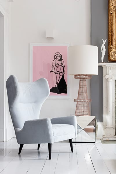
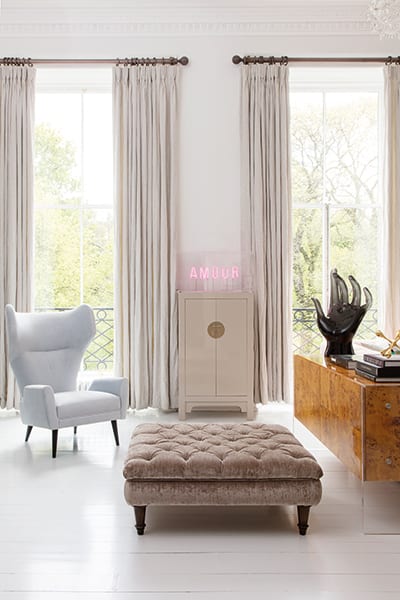
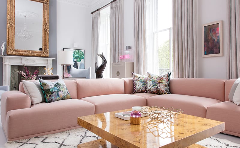
“My favourite room, the drawing room (which we call the pink room), illustrates this thinking. The colour scheme is very subtle but the giant pink sofa, the burled mappa wood furniture, funky textiles and artwork bring it to life. I’d say this room is very me. It has a bit of everything I love.”
It’s an enormous room, so she spent quite a bit of time mapping out the floorplan to ensure the family wouldn’t feel lost amid so much space. Using furniture to help create different zones has helped; determined not to go for the traditional ‘sofas round the fireplace’ look, she decided to create a snug with two armchairs by the fire and a lounge area on the other side of the room, with a console between them acting as a border.
A room this size needs bold art on its walls, which was not a problem for Anna. “We’ve been buying art for quite a few years now and have a broad collection of mostly modern pieces, with some bold colours and some fun touches,” she says. “We have hung two large works by the photographer Romina Ressia in this room. They are of a woman who looks as though she has been painted by a Dutch Old Master, with a very serious expression – yet in one of the pieces she’s blowing bubblegum and in the other she’s eating popcorn.”
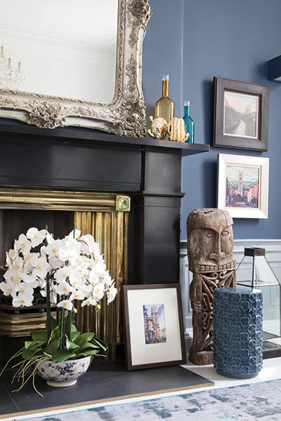
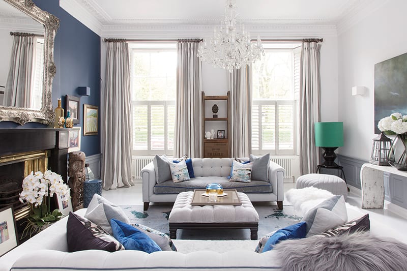
There’s just as much drama in the blue living room; it feels more tranquil, but again colour and texture have been deployed to create depth and interest. One of the walls has been painted a deep navy (a Designers Guild colour called Moonlit Night), and eye-catching cushions by Scottish artist Hatti Pattisson adorn the bespoke sofas (upholstered in Designers Guild velvet and Brera linen).
Much of the artwork in this room, and indeed throughout the house, is from Edinburgh’s Arusha Gallery, and here it is balanced by the dark-blue wall. “We wanted to keep the walls free for the pictures but I felt we needed the dark grey on the lower part of the walls to help create depth and ground the design – but that left the upper part of the walls white for art,” explains Anna.
“This colour scheme has allowed me to play with textiles and fabulous accessories to give our home personality.”
DETAILS
What A Georgian townhouse
Where Edinburgh’s New Town
Interior architect Anna Atwal, Pad Lifestyle
Photography Susie Lowe
Words Catherine Coyle


