Linking the garden to the house and opening up the interior to bring in more light and air has transformed life in this home
DETAILS
What A basement garden flat over two floors
Where West end of Edinburgh
Architect Níall Hedderman, Capital A Architecture
Main contractor S Ewing & Sons
Structural engineers McColl Associates
Words Gillian Welsh
BUDGET
The overall budget was £205,000 + VAT
BREAKDOWN
including trade and specific craftsmanship
- The extension was £65,000 + VAT
- The alteration and refurbishment was £130,000 + VAT
- The landscaping was £10,000 + VAT
- The zinc cladding on the extension cost £6,000 + VAT to supply and fit
- The glazing to the extension, including the sliding patio doors, one glass side door and a large skylight in the extension roof cost £22,000 + VAT
“Anyone looking at the building a century from now should be able to tell the original from the alteration. The trick is making the extension look distinct, while simultaneously as though it belongs.” So says Níall Hedderman, the architect behind an award-winning project in Edinburgh. His opinion might not be shared by all his fellow professionals (though the city’s planning department certainly approves), but few could do anything but applaud what he has achieved here: the smooth dovetail between old and new is one of the most impressive aspects of this home in the western edge of the New Town.
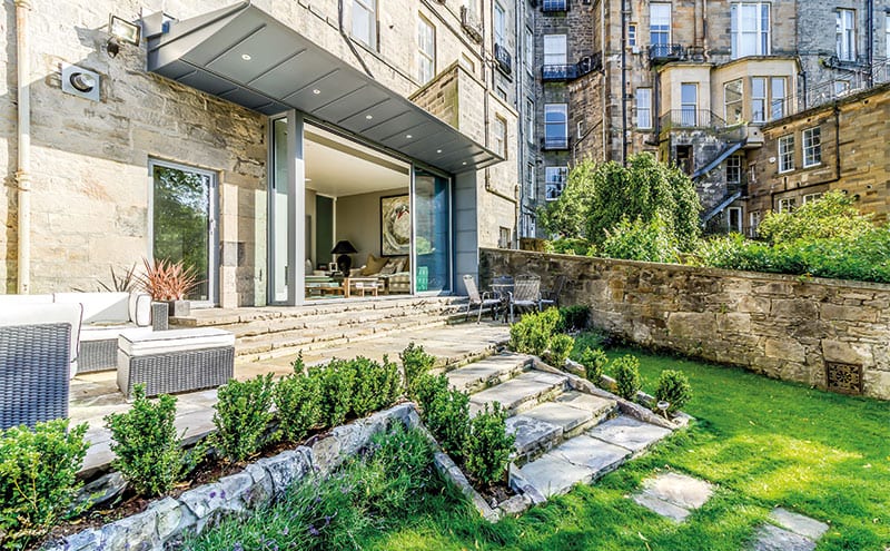
The property in question is a garden flat across two floors, the lower level of which has no windows to the front. The land slopes away to the rear, though, so it does have daylight at the back – something that Hedderman’s alterations have greatly enhanced.
Not that the first owners would have cared that those living and working in the subterranean regions of their home were doing so in the dark; these basements, after all, were for servants only, and the affluent proprietors, in the gracious public rooms of the townhouse overhead, wouldn’t have lost any sleep over the help’s lack of amenities. The lower levels of these houses were for sculleries, larders and the tradesman’s entrance; windows, if they existed, were small, and stairs were steep and narrow.
Today, with the servants long gone, many such basements are now garden flats. Those that remain unaltered, however, have brought their shortcomings into the 21st century. “Most are large enough for a family to live in, but they’re not laid out for modern life,” explains Hedderman.
“It’s not just the lack of facilities that’s the problem, it’s the relative size of the spaces that is hard to work around. Kitchens are much larger these days; we have high expectations of bathrooms; bedrooms need to be located away from living spaces. Life has changed in the last 200 years and our buildings need to adapt.”
In the decades since it became too big for residential use, this townhouse like many others had been converted into offices. It was occupied by a law firm, who used the basement as a store. When they moved out, it was taken on by a developer, who transformed the floors from ground level up into apartments.

The two-storey basement was a less appealing prospect. Planning permission had been given to divide it up and even to add an extension, but work on the warren of small, dark rooms never got started. It was sold to its current owner, who asked Hedderman’s firm, Capital A, if they would take it on. The layout and extension proposals which the planners had green-lighted were not to the new buyer’s liking – and the architect, when he saw what had been suggested, understood why.
His revisions were so extensive that a fresh planning application and amendment to the building warrant were required. “The upper floor was better suited to having bedrooms, as it had windows front and back,” says Hedderman, “so the lower floor became the kitchen, living and dining area.”

The new design had to maximise daylight and provide easy access to the sloping garden. His plan kept the existing floor levels, which stepped down into the large space that would become the kitchen, but then came a significant alteration: “We lowered the floor level of the extension from the old design but kept the roof near its proposed location. This had a double benefit. First, it increased the floor-to-ceiling height in the extension, allowing more glass into the design to bring daylight deep into the building. And, second, a lower extension floor made it easier to walk into the garden, with as few steps as possible.”
Hedderman worked closely with structural engineers McColl Associates. “I made the initial structural proposal and we worked on it together until the design was full resolved,” he says. “I’ve worked with them on many projects – they are excellent communicators; projects like this need a lot of back and forth, and they understand this.”
It’s just as well everyone was on the same page: in order to join the extension to the house, an opening had to be created in the rear wall – a wall, he points out, that has five storeys of 200-year-old, A-listed Georgian townhouse above it. The new opening is supported by three 3m-long I-beams, and each of these sits on two steel posts of the same size. There is also a series of beams in the floor. “Essentially, the opening is supported by a huge steel picture frame,” says the architect.
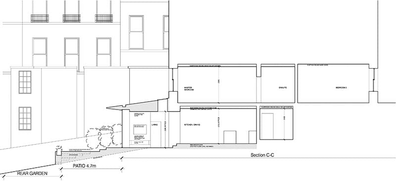
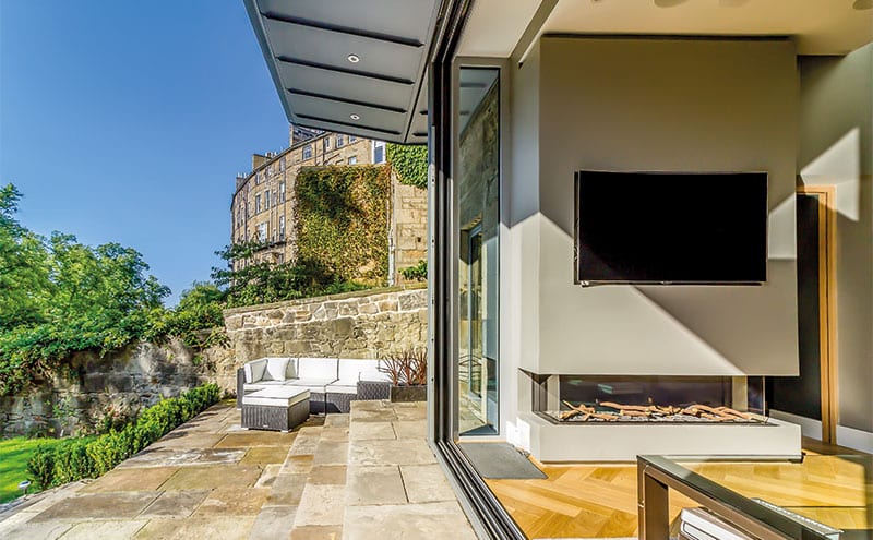
Above is a striking wedge-shaped cantilevered roof that tapers to a blade at its front edge. The thinking behind this was Hedderman’s desire to make his additions as minimal as possible, so as not to overpower the existing architecture. He also wanted the roof to provide shelter and privacy, as the extension and patio are overlooked on both sides and from above.
No ugly gutter mars the sharp line: “The roof has a discreet, built-in gutter above the glazing so it doesn’t hang over the edge,” he explains. “The area beyond the gutter is free-draining, so water runs over the edge.”
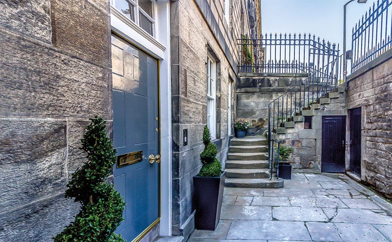
This is what allowed the zinc-clad roof to have such a thin profile. “Building regulations permit a roof (or portion of a roof) that is less than eight metres square to free-drain,” says Hedderman. “It’s only by having a detailed knowledge of the regulations and a good working relationship with a structural engineer that any contemporary design can be achieved.”
It looks effortless now, of course, but every step of this project was problematic. “It’s a bold, contemporary design. The building is A-listed and in a World Heritage Site – it doesn’t get more challenging than that!”
Going back through the planning and listed-building process to change the design was time-consuming and difficult; neighbours had to be consulted on the stone patio deck, so their privacy was not affected. Undoubtedly the biggest issue, though – apart from stopping the flats above from tumbling down – was access.
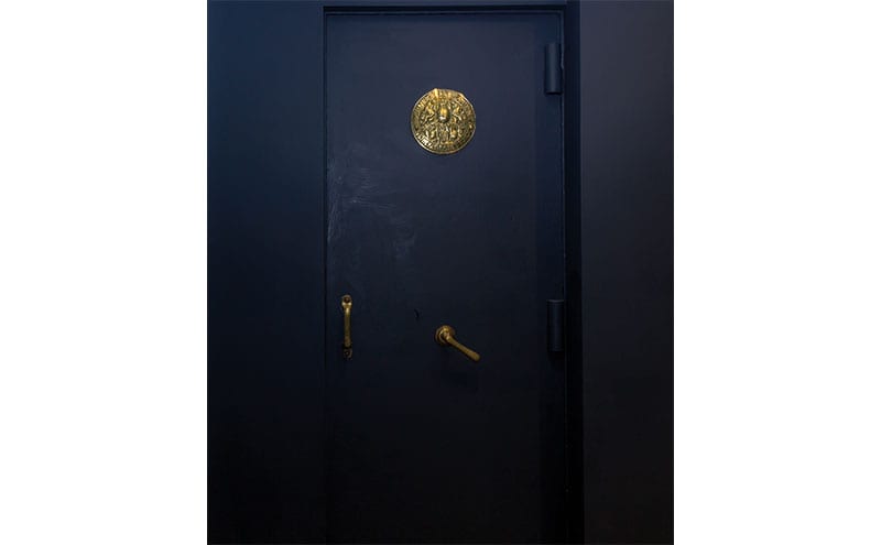
Those large steel beams (the cantilever’s is fully 6.5m long) were too unwieldy to bring down through the building from the street, so they had to be manhandled by the builder 400m along the private lane that runs behind the terrace. The glazed panels were also carried in by hand. “It was nerve-racking to watch,” admits the architect. “The contractor organised for it to be done safely and efficiently, though. The client accepted it would be expensive, but the results are worth it.”
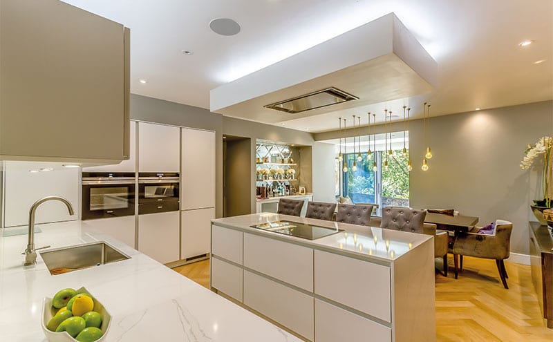
The interior also needed a complete overhaul. There are now five bedrooms, a cinema room and the splendid open-plan kitchen-living area, and it’s truly unrecognisable. With spaces flowing seamlessly from the entrance to the garden, it’s no surprise this refurbishment was included in the Royal Incorporation of Architects in Scotland’s list of the 100 best homes built in Scotland since 2000. “It meant a lot to me to have recognition from my peers,” says Hedderman.


