BRIEF To create a bedroom that felt magical for a client’s five-year-old daughter, which could be updated in the future. The client specialises in luxury children’s wear and is familiar with the chic, calm interiors of high-end boutiques. She also admires American interior designers who use bold colour and traditional designs in a crisp, clean way. The idea was to evoke this look in her daughter’s room without it being saccharine or babyish.
OVERALL BUDGET Approx £2,000 for the wallpaper, new bed, window treatments and accessories.
DIMENSIONS Approx 3.5m x 3.5m
DESIGNER Jessica Buckley Interiors, jessicabuckley.co.uk
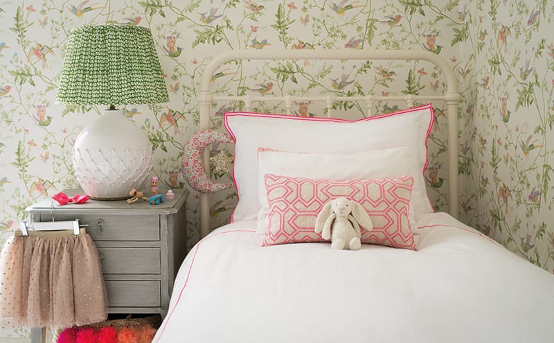
Ask interior designer Jessica Buckley what her client’s favourite bit of this room is and she answers: “The wallpaper.” You can see why – but it nearly didn’t happen. The client had been reluctant to have the paper (Cole & Son’s Hummingbirds) on all four walls, fearing it would overwhelm, but Buckley convinced her to take the plunge.
 The result is cohesiveness and, surprisingly, tranquillity (“The pattern actually becomes less noticeable when it’s on four walls,” she explains).
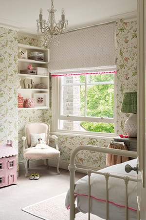
The room’s palette was built around the paper’s pinks and greens, and its traditional furniture also chimes beautifully with the classic bird and plant motifs; the iron bedstead (Feather & Black’s Oliver design), for example, pays homage to heritage.
Distinct from the neutral tones employed elsewhere in this large period townhouse, the colour scheme here has been created solely with its occupant in mind.
There’s tradition here, of course, but it’s also very youthful, with shots of neon pink adding playful notes, and contrasting prints in different scales keeping the theme up to date.
The lampshade (from Pooky), the blind (pre-existing but updated with a bobble trim from Samuel & Sons) and the chair (covered in Lewis & Wood’s Diamond & Dot) work together, enriching the overall charm.
“I encouraged them to hang art on the walls too,” adds Buckley. “It’s sometimes a difficult step for clients to take – they can be reluctant to layer images on top of a patterned background.”
Despite the room’s smallish size, care was taken to arrange the furniture so leave a play area in the middle. This, and the colours, have created a much-loved space. “The green picks out the leaves on the tree which can be seen from the window. And pink is a big favourite here.”
Jessica Buckley’s top five tips for designing a child’s bedroom
1. The room has to work in the years to come, so put money into the items that
will last, such as the furniture
2. Use accessories to make the room relevant for the age the child is now
3. As with any room, get the basics right: storage and practicalities need careful consideration
4. Consider a trundle mattress that slides under a single bed for sleepover guests
5. Be sure to ask the kids what they want in their room: it is fun to involve them
DETAILS
Photography ZAC and ZAC
Words Gillian Welsh


