BRIEF To create a highly functional kitchen in an open-plan family space, with a ‘wow’ island, and to find a design that was both contemporary and comfortable, with plenty of unique and luxurious elements.
WORKS REQUIRED Everything – the new room was a blank canvas.
BIGGEST CHALLENGE Keeping the kitchen in a similar style to the rest of the owners’ house, while making it feel fresh and modern.
BUDGET £50,000 (£10,000 was spent on the appliances, while installing the kitchen came to £12,000).
SUPPLIER Callum Walker Interiors, www.callumwalker.com
The idea of the kitchen as the heart of the home is an appealing one. It’s probably what a lot of people have in mind when they talk about their ‘dream kitchen’ – a warm, convivial space where family and friends can gather to cook, eat and spend time together. Not surprisingly, though, turning the fantasy into reality can be difficult: kitchens must be functional rooms first and foremost, and too many happy, relaxed bodies can just get in the way, hampering the essential tasks of preparing food and clearing up, and making the place feel cluttered.
With some clever thinking, however, there are ways to reconcile these conflicting demands, as this kitchen, designed by Tracy Walker-Lewis of Callum Walker Interiors, demonstrates. It belongs to a family in Edinburgh, who turned to the Perth-based firm when they were extending their property. Full-height windows were being added to the rear of the house to open it to the garden and increase the amount of daylight reaching the main living space. They seized the chance to update their kitchen – a room whose layout they felt had never really suited their lifestyle – which adjoins the living space.
They wanted a replacement that would be more modern – but not so modern that it would jar with the rest of their home, which had warm walnut timber finishes throughout. They were also looking for something with a bit of character that would feel unique to their home. Storage too was an important consideration. Their principal demand, though, was that it should be a place the whole family would enjoy spending time in.
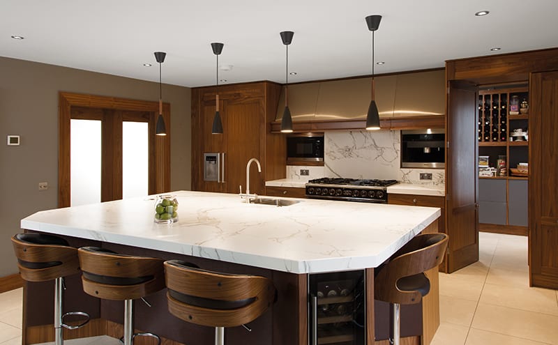
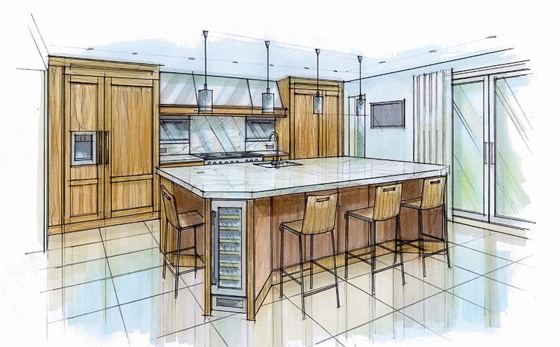
For Tracy Walker-Lewis, the best way to achieve all of these requests was via a large, square island surrounded by cabinets on two sides, with a pantry/utility room off. She had a reasonable footprint of around 5m by 4m to play with, but had to carefully calculate the proportions of each element so they would fit harmoniously together. Charles Yorke’s Wollaton range of cabinets was chosen, a plain Shaker style that feels luxurious thanks to its rich walnut wood finish.
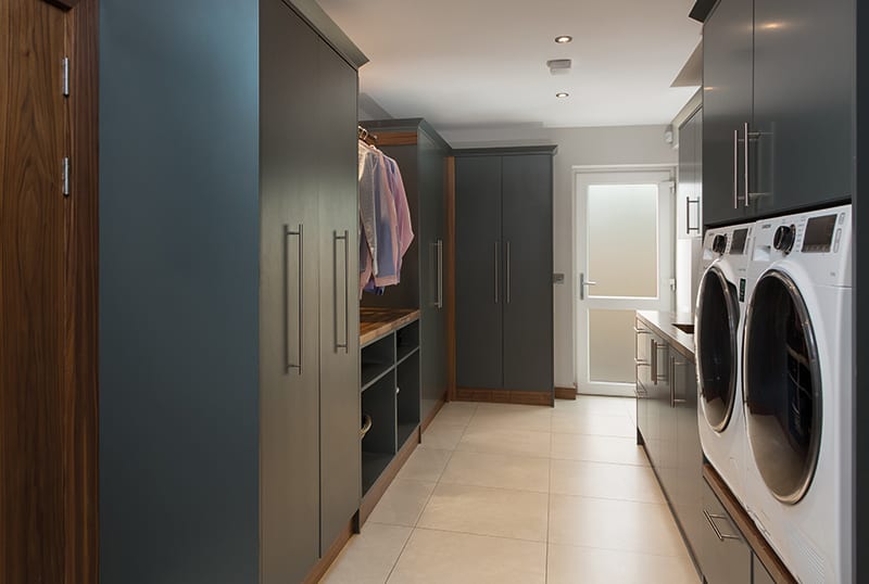
To maintain the uncluttered look, appliances either sit flush against the wall (such as the coffee machine and microwave) or are out of sight in the utility room/larder, which is accessed via concealed doors to the side of the range cooker. A sheet-metal worker was brought in to make a bespoke hood for the extractor above the hob. It gleams against the timber of the surrounding units, adding a contrasting texture and another note of practical luxury.
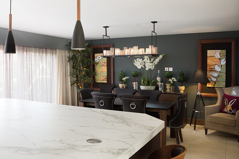
The island is large enough so that eight people can sit around it (and in comfort – there are bespoke padded fabric panels where their knees touch it), making it the social hub the owners had requested. But it is also a supremely practical piece of furniture, with built-in wine fridges on two corners, a sink and lots of space on its striking marble-effect ceramic surface.
The owners couldn’t be happier: “We wanted a ‘wow’ island,” they say, “and Tracy delivered.”
BESPOKE DETAILS
-
The extractor hood was custom-made in stainless steel.
-
Padded panels were added to the sides of the island to protect the knees of those sitting on the bar stools.
-
There is a hidden door to the pantry.
-
Some of the drawer fascias were individually carved.
KITCHEN
-
The units are from Charles Yorke’s Wollaton range, handmade in black walnut timber
-
The ceramic work surfaces and splashback are by Dekton in a style that emulates Carrara marble thanks to its heavy grey veining.
EXTRAS
-
The island has a Franke Kubus undermount sink with a Franke Minerva Helix 3 in 1 hot tap.
-
A Miele coffee machine and combi-microwave are built into the splashback behind the range cooker.
THE DESIGNER’S NOTEBOOK
Trying to put your dream kitchen together? Tracy Walker-Lewis explains what guides her most successful layouts
- Try not to overfill the space. Too much furniture will make your room feel cluttered and will detract from the finished look. Work out what you need for storage and appliances and make sure these are accommodated, but don’t feel you have to cover every wall from floor to ceiling.
- Be bold with colour choices on the walls. You don’t want rainbow-hued cabinets, but a kitchen needn’t be monochrome. Compromise by putting colour on the walls.
- Consider all of the elements together. Each piece must be looked at in relation to the rest so that no single item dominates. Having continuity of colour will help with this.
- Remember, practicality is key. Without it, nothing else matters.


