This Georgian home has found harmony on all fronts
Contradiction lies at the heart of almost every home. Our dream decor clashes with the period features, or our desire for space fights with our need to be surrounded by familiar objects, or our lust for gorgeous fabrics collides with the realities of sharing our home with sticky little fingers. Yet for some people all these conflicts are resolved. Their homes are as comfortable as they are stylish, with no compromises. It’s not the result of constant tidying-up either, but often thanks to an interior designer being able to find balance and harmony where at first there appeared none.
Rebecca Hughes is one such expert. She has worked her magic on interiors across the country, creating enviable living spaces out of unpromising beginnings. This property, a four-bedroom Georgian house in a leafy suburban street, was in good condition when she started work on it, but it was ready for modernisation. Behind its impressive façade were grand proportions, but its new owners, David and Emma Llewelyn, wanted it to be first and foremost a comfortable home for them and their four children, so Rebecca began by looking at ways to reconfigure the space.
She soon realised that knocking through to the adjoining two-storey coach-house, a self-contained two-bedroom flat that had been bought along with the house, would be the solution. It would allow a master suite to be created upstairs, so that each of the children could have their own room, with space for a very large family kitchen straddling the two buildings below.
With the owners happy with this plan, and Emma acting as project manager, the structural work got underway. The family had yet to move in at this point and were renting near by. “Even though she was working full-time and looking after the children, Emma still managed to be very hands-on all the way through the project,” says Rebecca. “She did a fabulous job.”
The designer’s brief was to create a decorative scheme that would work for family living and suit the house at the same time. Emma and David studied her moodboards and gave clear feedback. It was a useful exercise: “Ultimately my job is to realise the clients’ vision, so the most challenging aspect has to be interpreting their brief in the most beautiful yet practical way possible.”
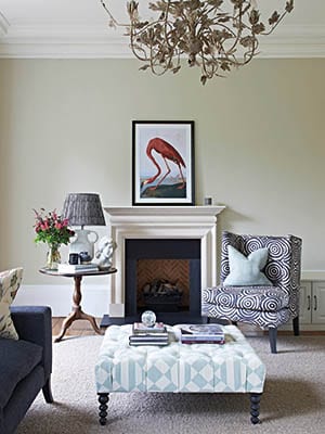
She took as her starting point the Georgian proportions and original features – ornate cornices, deep skirting boards and panelled doors. “These are probably at their finest in the front reception room, where there is a stunning moulded ceiling,” she says.
But there was no desire to stick rigidly to the past: “We wanted to give a nod to the country look but with-out it feeling too traditional.”
“The palette is a subtle variation on neutrals, with rich, tactile fabrics to add interest. Layering different textures brings the room to life”
The drawing room’s tall windows were so striking that Rebecca decided to make them the key feature of the room; rather than dress them in curtains or blinds, she has left them bare, with the original shutters refurbished to give privacy when needed. The result is that light flows through from the back of the house all the way to the entrance hall, giving a bright, airy feel that is further enhanced by a large skylight above the staircase that allows light to pour down from the top storey.
This brightness helps make the interior very inviting, with a genuinely warm feel. Rebecca and her team spent a long time researching fabrics and paints that would reflect the personality and character of the couple and their children. “The colour palette is largely a subtle variation on a neutral theme, with rich, tactile fabrics used to add interest,” she says. “Layering different textures is important in bringing each room to life.”
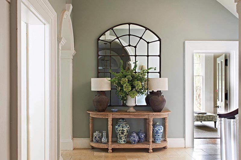
The choice of furniture plays a part in this too. Many of her best finds, both for this house and other projects, have come from Sunbury Antiques Market at Kempton Racecourse, just to the south-west of London: “I feel there’s nothing like vintage and antique pieces to make a house feel like a home,” she explains.
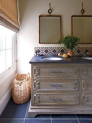
But there’s nothing precious or dainty about the items she has sourced for this family. Rather, like the weathered bookcase in the study, they are practical while being beautiful, adding character to the space. “I love to mix old styles with new,” she says.
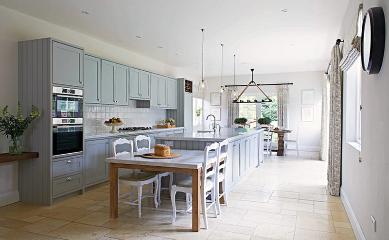
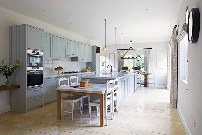
In fact, thanks to the fresh fabrics, soft colours and some bold artwork, the house has quite a contemporary feel. In the kitchen, for example, the cabinetry is a simple, classic Shaker style that feels modern, thanks to its gentle blue-grey paint (Farrow & Ball’s Lamp Room Gray). “A good proportion of kitchens that I design and install are built by a joiner rather than a specialist kitchen company – I find that the finish is just as good but there is more flexibility on space and design,” says Rebecca.
“Here, we specified Corian work surfaces because of the material’s durability and lack of joins – and given that the island in this room is more than three metres long, it was a practical solution.”
The dining chairs, sourced from Sunbury Antiques Market, give a hint of French country styling, while the glass pendants above the island are decorative yet still highly functional.
In fact, this whole enormous room has been driven by the need for functionality – essential when there are four young children in the house. There’s a breakfast table at one end of the island and a more grown-up dining area at the other, where a solid wooden table adds warmth. The room is bathed in light, thanks to glazed doors that open to the large walled garden beyond.
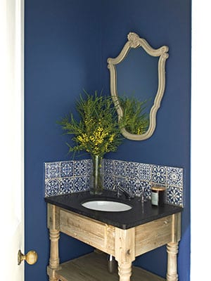
There are notes of bold colour elsewhere in the house; the rich blue in the vases of the entrance hall and on the walls of the cloakroom sings out proudly, for example.
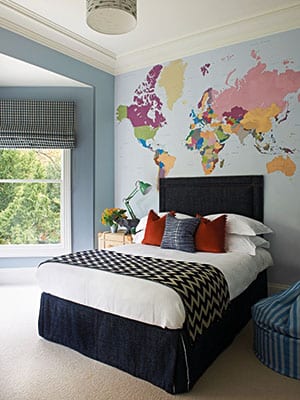
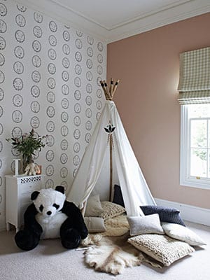
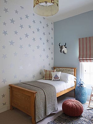
Upstairs, the reconfigured layout had resulted in six bedrooms. The children wanted their rooms to be unique, so Rebecca worked hard to give them individual spaces that not only reflected their age and character but which they wouldn’t grow out of too quickly. Cool, quirky wallpaper from the likes of Hibou Home, Cole & Son and Wallpapered.com add personality, and fabrics are colourful but robust, such as the beanbag covered in an Ian Mankin striped denim. Like the rest of the house, these are rooms where a growing family can live, sleep and play in comfort and style.
DETAILS
What A reconfigured six-bedroom Georgian house
Design Rebecca Hughes Interiors
Photography Ingrid Rasmussen
Words Judy Diamond


