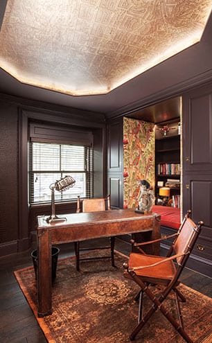
Bold, brave choices have created a home that suits its owners down to the ground
Steve and Heather Leach are risk-takers. They have the same confident approach to everything, whether it’s the clothes they wear, the deals they make or the furniture they choose. As a couple, in life and in work (they met in their teens and set up in business together), they’re a powerful force, determined to bring the best to every project they get involved in – and that includes their striking home in Edinburgh.
The pair had admired the property from a distance long before they bought it. It sits in a wide cobbled street once famed as the only road in the city where a horse and carriage could make a U-turn. Despite already owning a home in Edinburgh, along with several others around the world, the couple had set their sights on this New Town gem, and, with their children moving school, the need to be closer to the centre of town was greater than ever.
Renovating the building was an epic task. A project that should have taken nine months ended up lasting three years. Things got off to a slow start: “The property had tenants in it when we bought it,” explains Heather, “and we didn’t want to rush them.” They also had a tricky time with the Edinburgh City planning department. The house is in UNESCO’s world heritage site, so Heather and Steve’s proposals (drawn up with the help of architect Chris Gray at NGP Architecture) faced a rigorous examination. The planners could see just how sympathetic their ideas were, though, and how the changes would work in harmony with the rest of the street. As soon as permission was granted, the job got underway; the roof came off and the floors were taken up storey by storey.
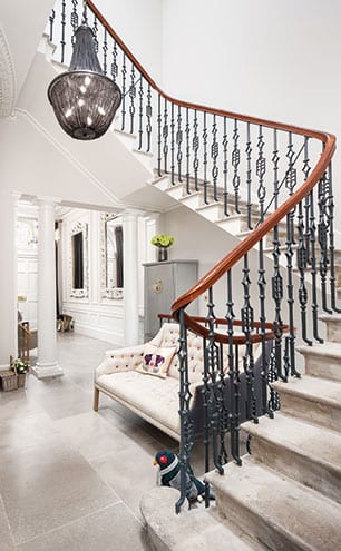
“We don’t want to move again!” laughs Steve. “This is it for us.” He describes how the layout had been bastardised over the decades and how he and Heather wanted to return it to one home, the way it had been built originally, only now with contemporary living at its heart. To that end, they were keen to incorporate soundproofing, insulation and energy-efficient heating and lighting systems at the build stage, along with the most up-to-date security and technology schemes.
As the renovations neared their end at last and the couple began looking for some external input to the furnishings, a chance encounter at Ampersand Interiors saw them team up with interior designer Carley Kyle.
“I think it was the Pierre Frey Venus wallpaper that we had in the showroom window that lured them inside,” says Carley. That wallpaper now hangs in the family cloakroom – and it’s just one of the quirky, bold additions to the house that have come as a result of the rapport the designer has struck up with Heather and Steve.
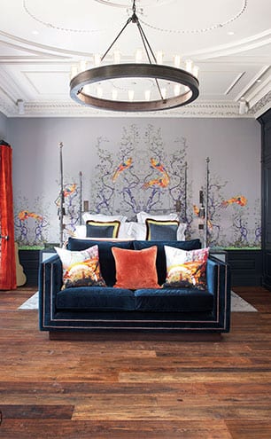
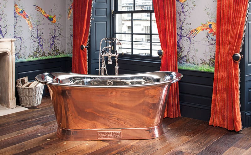
The couple’s top-floor master suite, where two rooms have been knocked into one larger space, is a prime example of this. As well as a freestanding copper bath by Catchpole & Rye, the room has space for a four-poster from And So To Bed, a wood-burning stove and a bespoke chaise longue, yet still manages to feel intimate and cosy. Studio Carpentry made the fitted wardrobes (painted in Farrow & Ball’s dark Railings), with a special glass-fronted display cabinet for Heather’s impressive shoe collection. The shutters have been painted in the same colour, which works as a foil to the GP&J Baker burnt-orange velvet curtains. These hang from hand-painted poles detailed in gilt by Edinburgh’s Rachel Bell. The strong colours and rich textures are undeniably theatrical, but the space is incredibly relaxing and oozes a very personal warmth.
“We love the high drama and the quirkiness, but this is also a place where we can really relax,” says Steve, motioning to the Buster & Punch bedside reading lights and the TV that disappears into the back of the sofa when not in use.
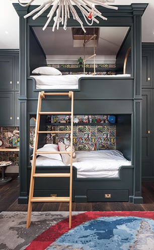
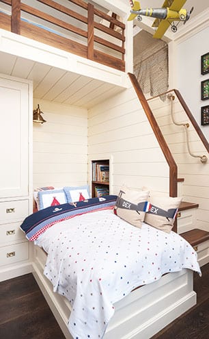
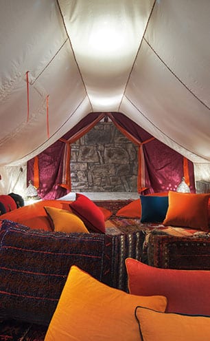
It’s not just the parents who have been given a dream bedroom; Studio Carpentry has created unique bunks for the couple’s sons (they have four children), with portholes, rope ladders and a tunnel that connects their rooms to an attic space that has a tented cinema room and a Scalextric area; these are designs that have been personalised and will last through to their teenage years. “The rug was designed using CAD technology, then it was hand-dyed to tie in with the Captain America theme,” says Carley.
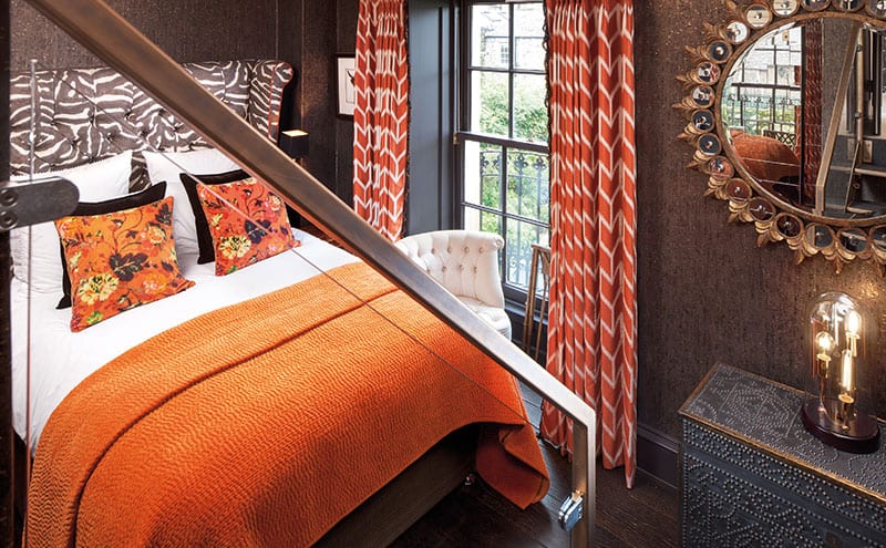
A blend of bold orange and monochrome animal prints makes the guest bedroom one of Heather’s favourite rooms. It had originally been a small bathroom accessed through the dining room, whose entrance via the hallway had been closed off. She and Steve decided to reinstate it, even though it needed a staircase to be installed for access. The glass balustrade allows guests to see the strong hues immediately on entry, cleverly creating a sense of more space to counteract the undeniably small dimensions. Fitting a sliding mirrored door to the en-suite has saved even more floor space. The tiles in the neat bathroom (from the Edinburgh Tile Company) work with the bedroom’s warm wooden floorboards and add depth, while the contrasting patterns generate the kind of boutique boudoir atmosphere the couple were looking for. The woodwork’s rich neutral tone (Farrow & Ball’s Tanner’s Brown) allows the texture of the Phillip Jeffries Spellbound wallpaper to become more prominent. This is a fun space, where guests can revel in the distinctive designs, such as the bespoke Ralph Lauren upholstered headboard that is piped in the same orange as the Kravet curtains.
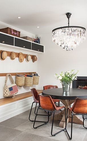
The same fastidious attention to detail is in evidence across all four storeys, courtesy of Gordon Dixon’s workmanship. The kitchen, for example, was opened up to flow into the family dining area and the garden beyond. The cabinetry was handmade by Sylvester at Studio Carpentry, each cupboard or drawer precisely designed for a particular purpose. The paint colours (pale Dash of Soot and darker Knightsbridge, both by Little Greene) allow the craftsmanship of the units and island to really sing, while appliances and accoutrements are hidden out of sight. The ‘boot room’ has personalised oak name plaques at each hook, and the dining area’s Rockett St George leather chairs have the requisite lived-in look.
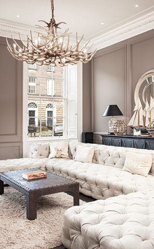
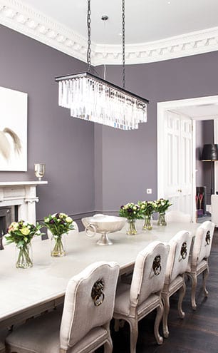
Enormous respect for the building’s architectural heritage hasn’t stopped the couple from infusing their home with their love of American interiors – the grand proportions of these rooms suit the style very much. The ground-floor living room, says Steve with a smile, is known as the ‘Restoration Hardware’ room. He and Heather love the Stateside home furnishings company so much that they had all of the furniture, fixtures and fittings for this room shipped over from the across the Atlantic. “We really love Restoration Hardware – all of its furniture is so well made,” he says. “We wanted the feel of a New York loft for this space, and I think we’ve got it.” There is plenty of tradition in this house too, though: Edinburgh specialist plasterer David Fisher & Sons won an award for the drawing room’s beautiful cornicing and ceiling work.
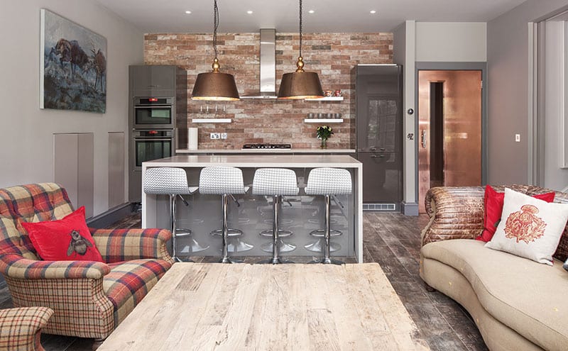
On the basement level, Heather and Steve have created a self-contained apartment. There is a sense of continuity with the rest of the house, thanks to the flooring (ceramic tiles from the Edinburgh Tile Company mimic the qualities of a wooden floor and also link the space to the sun-trap patio outside). Accents such as the low-slung pendant lights by Oka above the Magnet island continue the glamorous theme.
Steve came up with the design for the fire door: “The staircase protruded to create a platform down here, so I devised a sliding door and had it clad in copper,” he explains.
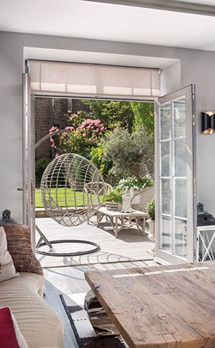
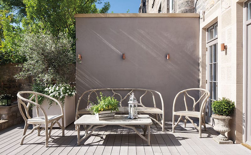
Timorous Beasties cushions give the traditionally styled Andrew Martin sofa and tartan Moon armchairs a contemporary update. Glass doors connect the indoor and outdoor spaces, with the living room flowing out to the decked terrace, where Restoration Hardware’s beautifully sculptural Arboretum garden furniture lends this area its own distinct character.
James Stewart Taylor, a friend of the family, took charge of the landscaping. “The rendered tall wall is a boundary wall, with copper lights by Lighting Design Studio in London,” says Heather. “The small garden-width wall has been added to split the space into different tiers.”
The commitment to carrying out precision work that is true to the history of the building, coupled with an unabashed love for interiors with oomph is what sets this home apart from your regular New Town abode. The owners have managed to reference the past while giving new life to the present, without compromising on their desire for high glamour.[/sociallocker]
DETAILS
What A Georgian townhouse
Where Edinburgh
Interior designer Carley Kyle at Ampersand Interiors
Architect Chris Gray at NGP Architects
Contractor Gordon Dixon
Photography Neale Smith
Art Direction Gillian Welsh
Words Catherine Coyle


