A designer in Moffat is pushing back the frontiers of stylish ideas for interiors

As you enter Moffat, you pass a sign by the roadside, describing the traditional market village as a ‘dark sky town’. To a first-time visitor, it feels a little ominous. Is it a reference to our notoriously unpredictable weather? A warning of bleak times ahead?
Today, at least, the sun is shining across the surrounding hills and Moffat is doing well. Property prices in Dumfries & Galloway might be rising at a slower rate than in the neighbouring Borders, but the town is flourishing, with new businesses opening along its quaint high street and its pretty Victorian homes being snapped up. The dark skies in question, it turns out, are actually a major tourist draw. Thanks to vastly reduced light pollution, this part of the country allows wonderfully clear stargazing once night falls.
One of the town’s own rising stars is interior designer Angela Le Baigue, who moved here from London, to be closer to her daughter’s school. But the changes she witnessed and the influx of new life to the one-time spa town persuaded her to set up shop here.
Angela originally worked in publishing. Parties, signings and launches were all held in the most exclusive, glamorous surroundings. Hooked by the interiors of these grand houses, she realised her true passion lay in design and decided to retrain as an interior designer.
[sociallocker id=”19875″]
With her business, Chantillie House, established in the heart of Moffat, Angela wanted to find a home nearby, preferably a property with development potential. She got what she was looking for in Ram Lodge. It had been sitting on the market for two years without finding a buyer, but as soon as she saw it she knew it was for her. “My husband Matthew and I bought it within a week,” she smiles, glancing around that the home she has created in little over a year.
The layout was all wrong, and it was hard to see how it could be lived in again.
The building had an intriguing past. Over the years it was variously used as a telephone exchange, a grocer’s shop and a halfway house for people in need of short-term social housing. Put up for sale, its disjointed layout and run-down spec left viewers unimpressed. Angela, however, could see past the institutional fire doors and strip lighting, and was able to visualise an extravagant six-bedroom home. “I think other people were put off because it had too much space,” she suggests. “The layout was all wrong and it was hard to see how it could be lived in again.”
Although Ram Lodge was shabby, the structure itself was pretty sound. There were areas of damp, says Angela, but nothing that couldn’t be fixed. Her starting point was the kitchen, a hotchpotch of a room that was badly in need of attention. To create more space, she moved the boiler out of the kitchen to a new home at the top of the house. The room had been divided – to no real effect – so Angela got to work, tearing down the false ceiling and partition wall, reconnecting the dining room and kitchen and opening up the area to invite in more natural light.
Her design retains many traditional elements but gives them a contemporary twist. The units, Shaker in style, have been hand-finished in Farrow & Ball’s dark Railings paint. Oversized industrial-style pendant lights by Eichholtz add real impact. The new configuration has made such commanding lighting possible; bright, airy shutters by City Blinds and honey-toned Moduleo flooring have helped here too.
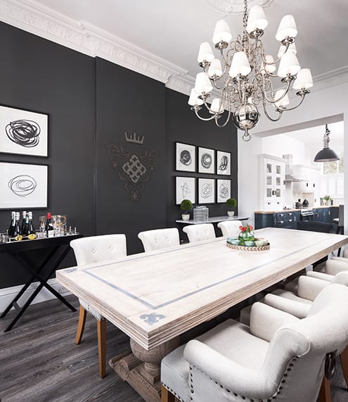
“The dining area was a joy to work on,” says Angela. She changed its light-coloured walls to a dramatic black. “The room just looked too big when they were white,” she explains. Once she had darkened the walls, she added a regal motif on the chimney-breast wall rather than reinstating a fireplace. Curtains and blinds, by GP & J Baker, give the room an air of modern elegance, while Timorous Beasties printed velvet cushions provide contemporary flourishes.
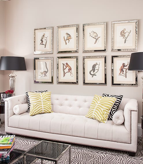
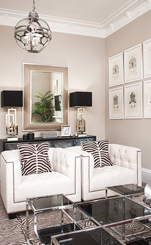
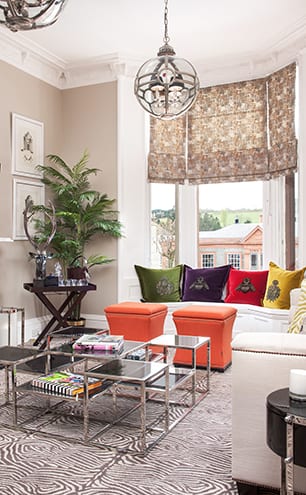
Next door, in the drawing room, space was tight so Angela had to come up with a way to maximise the room’s dimensions and make it suitable for entertaining. “I had to be particularly careful with scale and proportion when it came to the furniture,” she recalls. The studded club chairs and sofa she found were neither too deep nor long, thus saving on floor space. Oversized mirrors draw the eye upwards, as well as reflecting daylight around the room. Pattern and colour act as decoys; by using these to highlight other aspects of the room, the lack of footprint becomes less of an issue. Multi-purpose pieces, such as the orange stools that double as side tables while injecting a blast of colour to the mix, have a part to play. “I love rooms to look glamorous but I also like not taking them too seriously,” says the designer. “They should always be fun.”
The children’s bedrooms avoid all the stereotypical pitfalls, instead balancing maturity with fun.
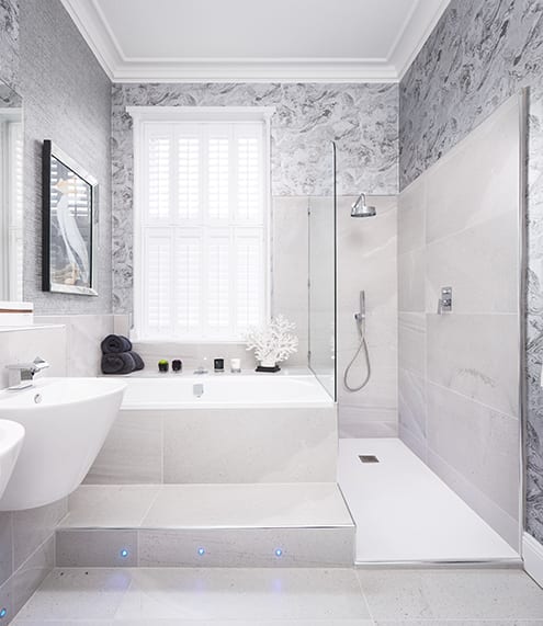
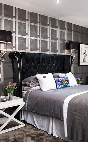
Once she had upgraded all five of the house’s bathrooms, Angela moved on to the bedrooms. She was eager to come up with a unique identity for each one. There are two master suites on the second floor, two children’s rooms on the top floor, plus a ground-floor bedroom. The master suites are intended to feel like boutique hotel rooms. They have been lavished with luxurious, tactile fabrics that demand closer inspection and bespoke pieces that are evocative of Hollywood’s predilection for Art Deco styling. A Charlotte James purple velvet headboard, customised with Swarovski crystals, epitomises the aesthetic here.
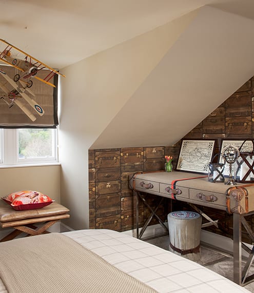
The children’s bedrooms avoid all the stereotypical pitfalls, instead balancing cool maturity with a definite element of fun. “Since they’re in the loft space, I decided to use Andrew Martin’s Attic collection of wallpapers and fabrics,” explains Angela. “One of the rooms has a sort of Harry Potter feel, thanks to school-crest wallpaper and bedside tables in the form of books, while the other has been designed for a weary traveller, complete with map wallpaper, trunks, suitcases, globes and lanterns.”
The bold prints and opposing patterns embrace the attic’s sloping ceilings and uneven walls rather than trying to play them down. It was a brave choice on the part of the designer but it’s one that has paid off.
“It has been my mission to create a luxury space with beautiful wallpapers and unexpected details, but I think I’ve achieved that in a less traditional way,” muses Angela. “I wanted a modern country feel, too, but instead of the usual cows, sheep and ducks, I’ve used monkeys, turtles and coral as a reminder of my travels.
“I try where I can to keep my work contemporary classic in style so that it doesn’t age.”
[/sociallocker]
DETAILS
What A five-bedroom house over three floors
Where Moffat, Dumfries and Galloway
Design Chantillie House
Photography Neale Smith
Art direction Gillian Welsh
Words Catherine Coyle


