This extension had a massive impact: it gave the owners a new dimension to their home
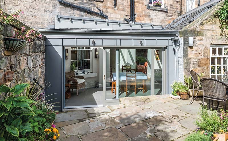
You hear a lot about potential from estate agents and property developers, but not everyone has the power to spot it, never mind unlock it. One man who does is Tim Beecher, an architect who set up his own practice in Edinburgh a decade ago. His latest project, an extension to a listed building in the heart of the city, has created new and exciting possibilities for the clients – no mean feat for what is essentially a small zinc-and-glass box. “It’s a tiny wee extension – the footprint is only around 17 to 18 square metres,” says Tim. “Its success lies in the way that it has opened up the existing rooms, allowing them to become more dynamic and useful spaces in terms of light and views.”
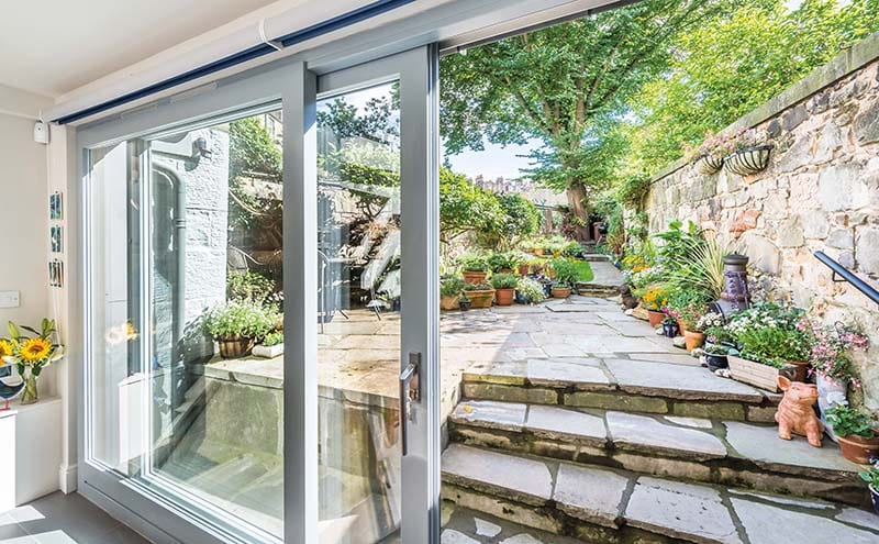
The project began when the owners, who’ve lived in the ground-floor flat for seven years, felt it was time to look at creating a better connection to their little garden. “They got in touch to discuss how they could improve the back of their house. There’s a little sliver of south-west-facing garden, a beautifully looked-after space with a lovely magnolia tree on the patio, but there was a conservatory blocking any real connection to it,” he recalls.
“I was keen for the simplest design to unlock the most potential from all the different rooms”
“After talking through their aspirations, we came around to the idea of celebrating the garden. We also talked about how to create a more generous kitchen and dining space that would connect to the garden and how to bring light into the core of the house, if possible.
“I went away and came back with strategies to tease out their priorities. I was keen for the simplest design to unlock the most potential from all the different rooms, to give a sense of openness. The owners had been going from one small space to another, so I tried to open this up to flow more freely.”
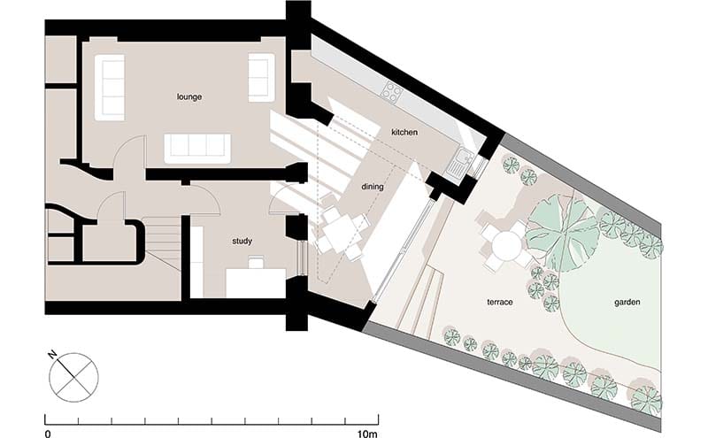
As the building is listed, there were additional criteria to meet. “We had discussions with planners and the listed-building consent officers and were advised to make some alterations such as reducing the footprint slightly,” says Tim. “The changes did effectively make an overall improvement, leading to the creation of more space outside the sliding doors. This also allowed us to make the garden stairs more generous.”
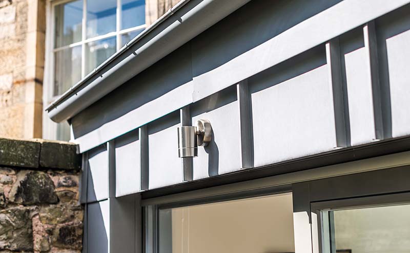
One of the other key recommendations made by planners was instrumental in shaping the final design of the extension. “The use of zinc cladding was specified as a requirement,” says the architect. “It has a traditional patina, a soft grey colour, that’s seen as being more in keeping with traditional lead finishes, and it also sits nicely against the stonework. I would have recommended zinc from the outset, but it’s an expensive option.”
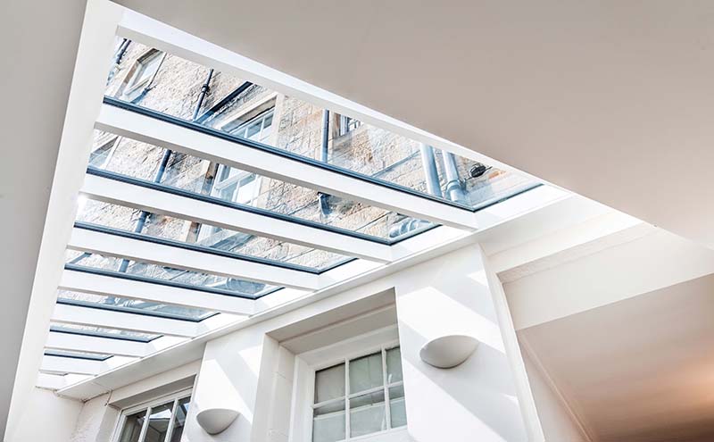
Despite its cost, he believes the zinc cladding is by the far the best solution to achieving the finishes he had in mind with what is a fairly complex structure for its size. “The zinc cladding allows us to create a contemporary form with crisp crafted details,” he explains. “The other good thing about it as a material is that its softness means it can be used to accommodate awkward shapes. The geometries of this project are quite tricky due to the triangular nature of the plan and the fact that the roof is gently sloping. As it hits the existing building, there’s a sort of rising junction. And the rooflight is another triangle that slopes at a different angle.”
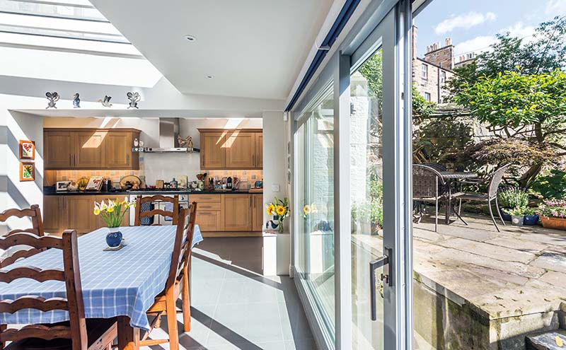
The double-glazed rooflight (the glass has a self-cleaning coating to keep maintenance to a minimum) is central to the design in terms of bringing light into the house. “It allows sunshine deep into the interior, which we were able to demonstrate to the owners via a 3D model,” says Tim. “We’d shown them how, as the sun moves through the day, the rooflight casts a moving shadow on the back of the house, so you get a real sense of what time of day it is.”
The large glazed sliding doors have also had an impact on the existing spaces: “The idea was that from the front entrance, it would be possible to see right through the back of the house to the garden beyond.”
Having so much glazing brought a number of challenges. In particular, the glazing had to be offset in other areas, such as by upgrading the thermal performance of the floor and improving the roofing insulation. “There’s always a challenge with achieving building warrants for highly glazed extensions,” admits the architect. “It meant that I had to spend a lot of time working out ratios of glazing to insulation levels and providing calculations. It’s the standard requirement, but working out these strategies can be quite restrictive.”
In the event, planning consent was granted and the three-month project finally went on site. Demolitions involved stripping away the existing conservatory and footings and making a big new masonry opening. The galley kitchen outshot was opened up to the new extension to form a combined kitchen and dining space. The door and window from the lounge that previously connected to the conservatory were removed, creating a view of the garden’s treetops from the lounge. A new floor slab was installed, forming the concrete base to the underfloor heating, atop which a small timber structural frame supports the sliding doors and roof. The existing garden wall butts up against and supports the extension at the left-hand side.
Access to the site was very restricted, with most of the materials coming in through the rear garden via a narrow lane and small stone gateway. The biggest element of the build, the sliding doors, were too large to come around the back and had to be lowered down from the street into the front basement lightwell, then taken through the flat to reach the site. Happily, all this had little impact on the neighbours, and indeed on the owners themselves, who remained in their home during the build. Even the tricky logistics had little impact on the schedule.
“The roof glazing is a complicated shape – the double-glazed roof units are not standard rectangular forms, they are more trapezoidal, and individually templated – and I was concerned that this would cause delays,” says Tim. “But things actually went relatively smoothly.”
The positive impact on the owners’ living experience is out of all proportion to the size of the new addition to their home. “It feels like a much bigger extension than it is. It’s just a tiny zinc-and-glass box but it has unlocked the potential of the existing rooms, created more space and now provides a direct link between the flat and the outdoors. It means the garden can now be enjoyed all year round. It’s an oasis in the middle of the city.”
DETAILS
What An extension
Where Edinburgh
Architect Tim Beecher
Photography Chris Humphreys
Words Caroline Ednie


