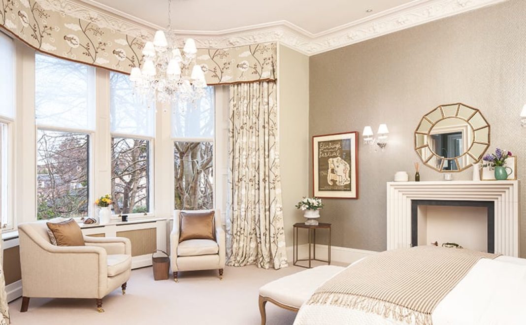
A grand Victorian home in Edinburgh has been brought up to date with a renovation that will look good for years to come
Compromise. It’s one of those terms, like ‘dry rot’ and ‘refused overdraft’, that clients, designers and architects live in dread of. It spells the end of dreams and a making-do with second best – doesn’t it? Actually, that’s nonsense, says the refreshingly down-to-earth Jo Smith. As both owner and interior designer of a six-bedroom property in Edinburgh that has recently undergone a complete refurbishment, she has been at the sharp end of a lot of difficult decisions lately.
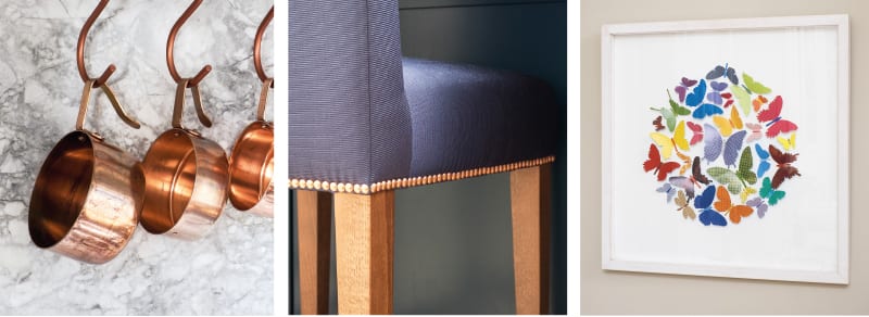
“The sheer size of our house and the number of rooms we were renovating was an enormous challenge,” she says. “We were constantly juggling the budget and making compromises along the way. Everywhere, apart from the kitchen, was subject to compromise in terms of whether we could afford a certain wallpaper, fabric, light and so on. You have to be flexible and have a few different options up your sleeve if for some reason Plan A needs a rethink.”
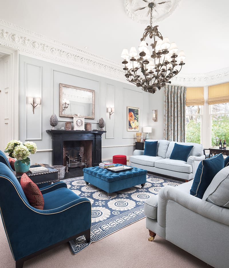
This admirably pragmatic approach doesn’t mean there is anything second best about the aesthetics or the execution of this project. On the contrary, everything about the décor and the layout suggests it has been well crafted and well thought-out – as well it might, given that Jo, who runs Mrs Smith Interior Design, took her time making plans.
She and her husband Matt bought the Victorian villa in the Bruntsfield/Morningside area in 2013, attracted by its big windows, high ceilings, beautiful cornicing and generous proportions. As well as six bedrooms, it has four public rooms, six bathrooms and an orangery, as well as an extensive garden.
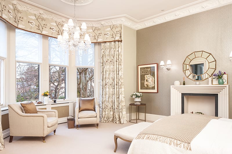
Jo calls it “a strong, solid house with good bones”, the result of being well looked after over the years. Nevertheless, some original features had been lost and the decoration didn’t seem to suit the house. “Everyone has a different approach to decorating their home,” she acknowledges. “The décor and taste of the previous owners wasn’t to my liking – but then why should it be?”
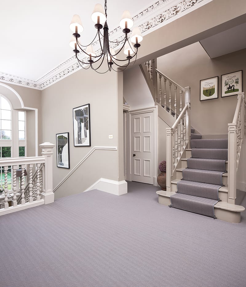
With nothing urgent needing doing, Jo bided her time. “I was itching to reconfigure and redecorate and put my stamp on it,” she admits, “but we lived here for two years first without changing anything.”
Having moved up from London with their young family, it made sense to wait until they were properly settled in before embarking on any building work. Jo used the time to work out exactly what she wanted to do. “The house was in a very beige state when we bought it,” she says. “I wanted to inject some colour, depth and personality. I try not to be too formulaic – I like to walk around a house and not quite know what I might find in the next room. It gets a little bit repetitive when the same colours or tiles or fabrics are used all over a house. Each room should have its own identity, purpose and atmosphere.”
This is just a taster, you can browse the full article with more stunning photography on pages 186-198, issue 112.
Subscribe nowDETAILS
What A six-bedroom villa
Where Edinburgh
Photography Neale Smith
Words Judy Diamond


