


Journalist and author of new book Your Not Forever Home Katherine Ormerod shares her guide to achieving beautiful interiors whether you’re a renter or a home owner
If you have never used a needle or hammer or paintbrush – outside of mandatory school classes way back in the day – I want to start by reassuring you that you are far from being the only one in this position.
To help you orientate yourself into the décor mindset, I’ve mapped out the three key principles of interior design, which will not be breaking any ground but might help you as you start to think about where to begin decorating your own home.
Where once home trends were thematic and lasted for a decade – think shabby chic, mid-century modern, Scandi minimal – a stylish home today is far more a smörgåsbord
of multiple references, something we can thank the Internet for.
Now it’s not so much about the trend, it’s more about many micro trends for you to pick and choose from, as you see fit. A muted palette of tonal whites paired with faded deckchair stripe curtains, jute carpeting and bouclé upholstery is just as current as turbo-charged pinks and greens mixed with floral block prints, a velvet sofa and a scallop-edged rag rug.
a stylish home today is a smörgåsbord
of multiple references
Today it’s really all about your own personal mood board, but keeping in mind these three principles can offer a bit of a red thread to help you go from your initial inspiration to final result.
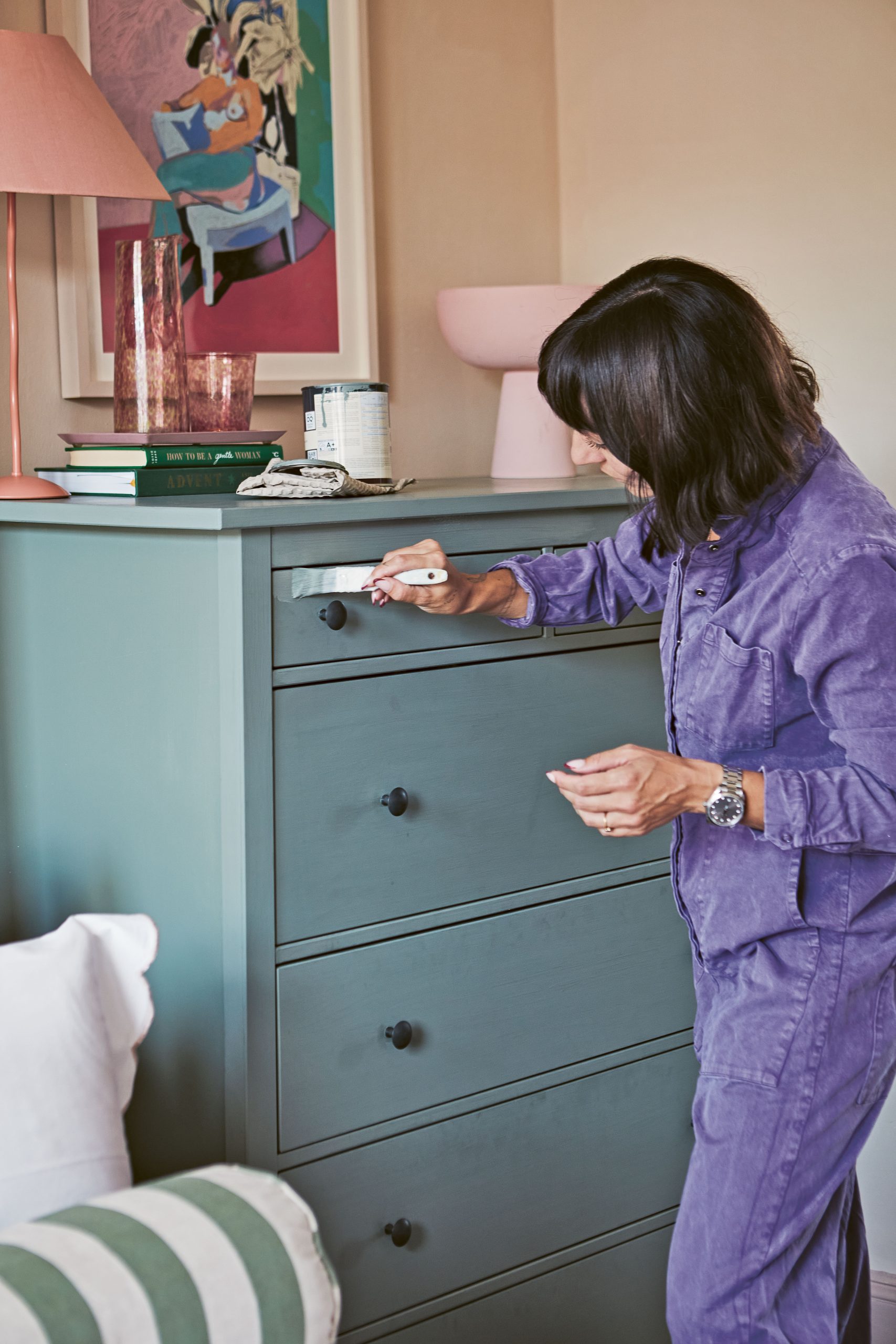
First principle: Be clever with colour
Colour is back with a vengeance. If you’ve been living in clean, minimal spaces for the past ten years, in various shades of white and grey paint tones named after some kind of stone, the current vogue for bold pigment can be bewildering, even scary.
Equally, if you’re naturally inclined to vibrancy and you’re currently living in a space that is painted sterile, brilliant white, don’t despair because there are so many ways of introducing colour – from artwork to painted furniture and bold soft furnishings.
Finally, don’t lose heart if you are able to use paint to colour your walls, but feel absolutely overwhelmed with the 72 shades of sage available at your homeware store. Colour isn’t anywhere near as intimidating as it might seem and, while I enjoy poring over paint cards, if you do a few tester swatches in the room you’re painting, you won’t go far wrong.
How to build a colour palette
As for creating a palette, there are some really basic foundations that can help you match colours together and decide on your perfect tones.
For starters, it’s always worth thinking about colour in terms of temperature. Colour comes in warm shades and cool shades. Taking pink as an example, it’s natural to initially consider the shade from a pale or dark perspective – the pale being English rosy, the dark being Barbie’s camper van magenta.
But also important is the temperature of the pink – is it a bluer or greyer cool pink (veering towards a lilac), or a yellower, peachier warm pink? Cool pinks will have an edgier, slightly more off-kilter vibe – they won’t feel sugary and are a great choice with earthy shades.
Conversely warmer pinks have a bit more of a 90s vibe, and will feel softer, and (obviously) warmer.
Work with the space
The same paint shade will look wildly different depending on the light of a room – in fact can look wildly different even in the same room. All the old rules about painting small rooms in light colours to create space and trying to warm up cooler facing rooms can feel prescriptive, because hey, maybe you want to double down on the moody, low light of that tiny north-facing room!
But if you are looking to warm up a darker or cooler light space, you want to avoid the bluer pinks and other colder temperature colours, for example. What is most important to keep in mind is that cool shades work well with cool shades.
So, if you fancy a pink and green combo, don’t sweat so much about whether you should pair a bright with a pastel, but instead focus on the temperature of the contrasting colours.
Learn the basics
While I’m all about breaking the rules, it’s always instructive to have at least a glancing knowledge of the classic guidelines when it comes to the light you are working with.
So how can you tell which kind of room you have? Stand in your room and point a compass out of the window (use your phone!) and you will be able to work out which direction it is ‘facing’.
- North-facing rooms get the least light and can feel cave-like and cool in tone, often only getting reflected rather than direct sunlight.
- South-facing rooms conversely are the brightest of all and will have the longest hours of sunlight over the day, so will appear ‘warmer to the eye’.
- East-facing rooms will be brightest and warmest in the morning, becoming cooler into the afternoon and evening, with west-facing following the exact opposite.
The story goes that north-facing rooms benefit from warm temperature palettes with yellow and red-based pigments, while south-facing rooms can manage cooler tones with
blue, grey and green undertones.
If you are in a property where there is no chance to paint, these lessons can still be relevant – in terms of rugs, soft furnishings, curtains, sofas and even artworks. But remember you are always allowed to lean into that cooler temperature vibe, or try and make a warm room even warmer. Really, it’s up to you to decide how toasty you want it to get in there.
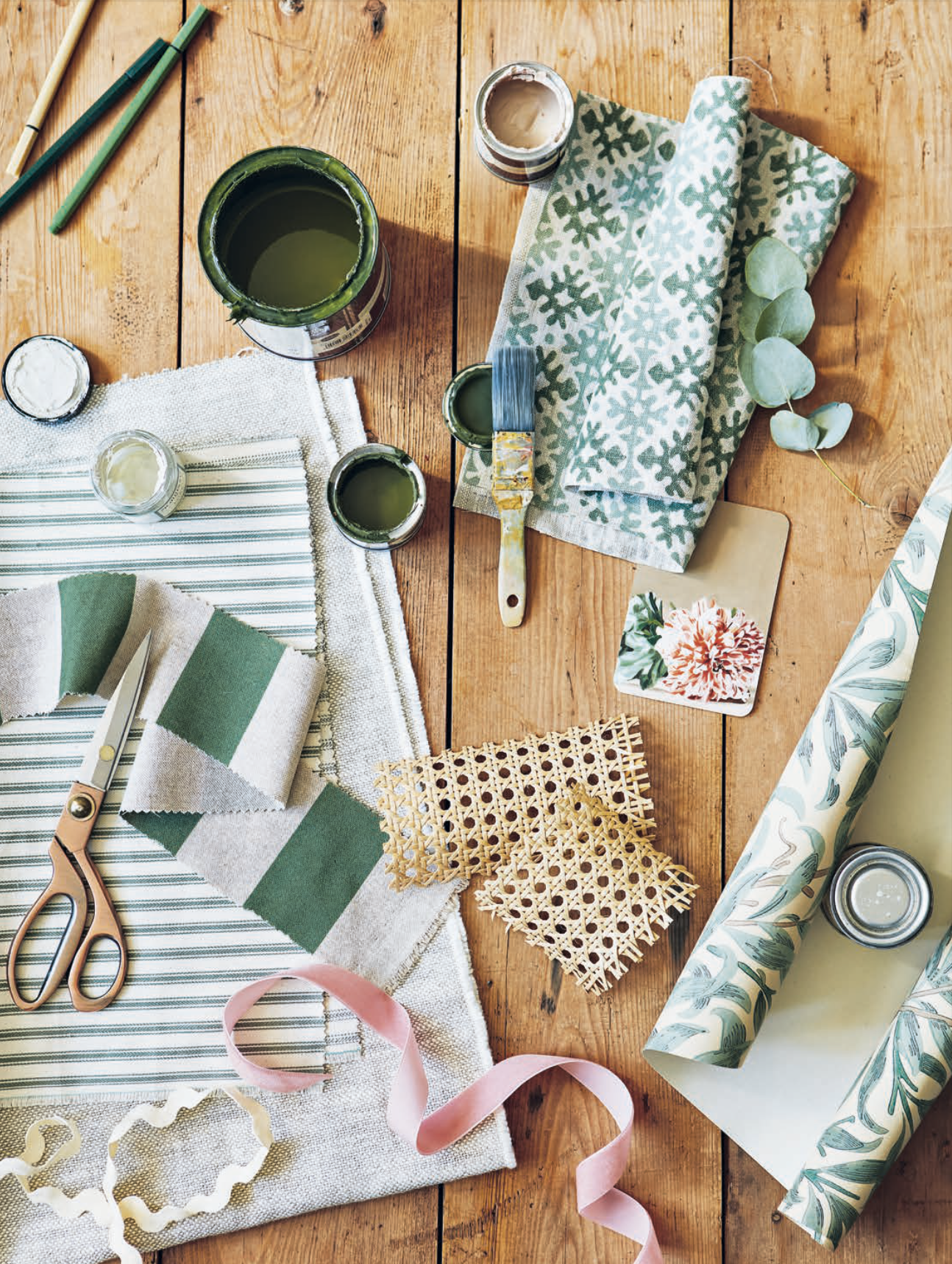
Principle two: Play with pattern
Like colour, for many years pattern has been on the backburner. Prints and motifs were, for the best part of a decade, seen as chintzy and overly fussy and didn’t fit into the overall pared back, visually quiet Scandinavian minimalism that swept the globe. Even now there will be many amongst you who view prints as old-fashioned or twee.
However, there is always a way into pattern, even if you are interested only in the most minimal of motifs. Checks, stripes and gingham are a more graphic and pared back way to go, though clean block prints with repeating patterns can be very minimal in approach.
On the flipside there is also a brand-new enthusiasm and movement towards maximalism with print, though these days it’s seriously curated. Layering tonal yet impactful layers
of print with pattern on sofas, curtains, rugs, wallpaper, art, cushions and pretty much anything else has always been a skill, but with today’s explosion of décor design content, brands and young designers are doing it a new way.

Much like putting an outfit together, finding a balance between prints that doesn’t look cacophonous, but instead feels unexpectedly tranquil, is harder than it might look.
- Give patterns space to breathe. Working with pattern and print is as much about where and how you mix the plain fabrics and surfaces as the patterns themselves. If you choose a sofa with a bold print, go for plain cushions and a more muted pattern like a Berber style with your rug. Alternatively, a strong wallpaper pattern works well with a plain sofa accessorized with printed cushions.
- Keep the colour palette tight. I generally opt for two, or at tops three, colours and I prefer patterns that don’t have endless tones in them because it keeps it simpler and more minimal.
- Print and pattern scale is important to balance. In any room where you have two or more large scale prints or patterns, you are going to be creating a lot of noise. Instead, choose one large scale pattern then complement it with smaller scale prints.
- Take it bit by bit. I know that people love mood boards and comparing scraps of fabric with paint swatches and putting it all together, but I have found by experience that you never know how print and pattern will feel until it’s in the room at scale and volume. A great example is in my kitchen; I used patterned temporary tiles, which made so much more of an impact than I had expected from simply looking at the single taster square. It made me want to dial back any other print in the room and lean in more to plain surfaces – if I’d already bought other bold patterns I’d have been scuppered!
- You can start anywhere. Begin with your artwork, with your rug, your sofa or your curtains. It’s just a question of building the print and colour story to add depth to a room.

Principle three: Take advantage of texture
Texture is what really separates nice rooms from truly lovely rooms. Aside from the tactility that texture offers, it also gives a room that elevated, dimensional look.
Speaking simply, without texture a room will fall flat. There are lots and lots of ways to add texture that you might not have considered. One of the nicest things about using natural materials is that they come with texture inbuilt. Wood, cotton, jute, linen, marble and so on all have their own hand feel.
And of course, textured fabrics offer a multitude of options. Bouclé – that bobbly, almost popcorn-like textured wool – has become incredibly popular, while natural linen and wool throws, velvet textured trims and tassels all add dimensionality.
Another popular textured material, rattan, offers a good way to add texture to bland furniture. Plants and flowers can add texture, reeded glass can add texture, brushed chrome can add texture. There are so many ways to work with it.
Texture is particularly important if you are looking to keep a very neutral palette and pare back on print and colour. In that case, it will be the different material textures that tell the story in your room.