All the elements of the classic Glasgow tenement are
celebrated in a skilful refurbishment that also leaves
space for its owners’ personalities to shine
This home, a top-floor flat in a traditional tenement, is a love letter to Glasgowhttps://homesandinteriorsscotland.com/2020/02/an-eye-for-design-leads-the-way-in-this-daringly-painted-tenement-in-edinburgh/ that rewards close reading. Its owners, retired scientists Louise and David, were living in Washington DC when they bought the place a few years ago; they were moving back to Scotland after two decades away and were keen to bring on board a team who knew Glasgow and knew how to revive the property while tackling a long list of improvements.
“It was a mess,” laughs David. “Everything needed doing. The plaster was crumbling, it needed new wiring, plumbing, flooring… We also wanted to add a bathroom. It wasn’t a small job.”
Given they were 3,500 miles away at the time, the duo appealed to the British Institute of Interior Design for help and were contacted by Anna Saroukhanova and Ralf Heckmann of Heckmann Design.
“They’d both studied in Glasgow and knew it well,” says Louise. “They were really eager to work on a tenement building. Anna was particularly keen to be consistent with the city’s visual vernacular.”
Despite their practice being in London, Anna and Ralf were committed to the project from the start, taking the train up every week to oversee progress. “They were both absolutely brilliant to work with, which really helped with us being so far away. It’s not easy over such a great distance, but they were extremely communicative and responsive,” says David.
The design work began in the summer of 2022 and the couple had moved in by the following June “I had Frank Worsdall’s book The Glasgow Tenement,” says Anna. “I got it a long time ago, when I was still in the city. I combined this with researching this part of the southside where the flat is so I could see how layouts had changed over time.”
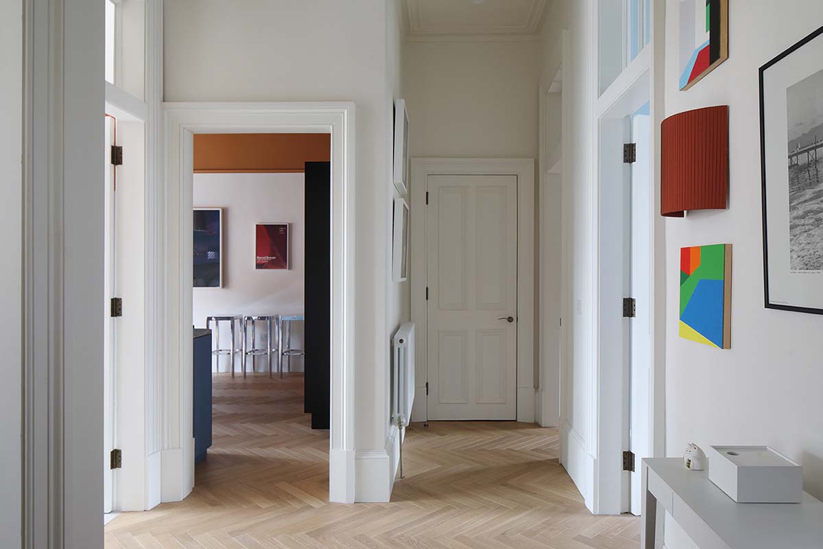
Originally, the flat had three bedrooms and one bathroom, but in the new arrangement two bedrooms have been condensed into one with space carved out for an en-suite. The floors were relaid to make them more cohesive; a beautiful parquet now runs through the property. All the uPVC window frames were replaced with timber-framed conservation-style double glazing.
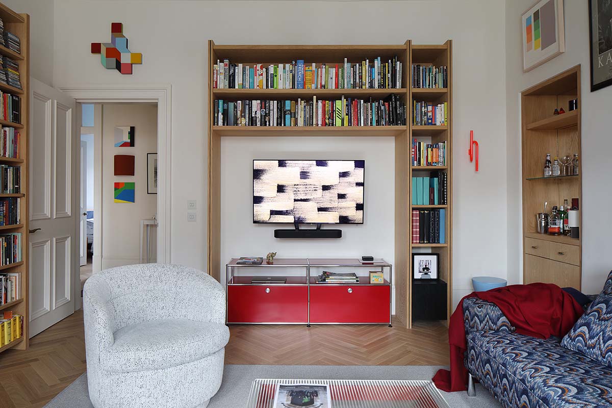
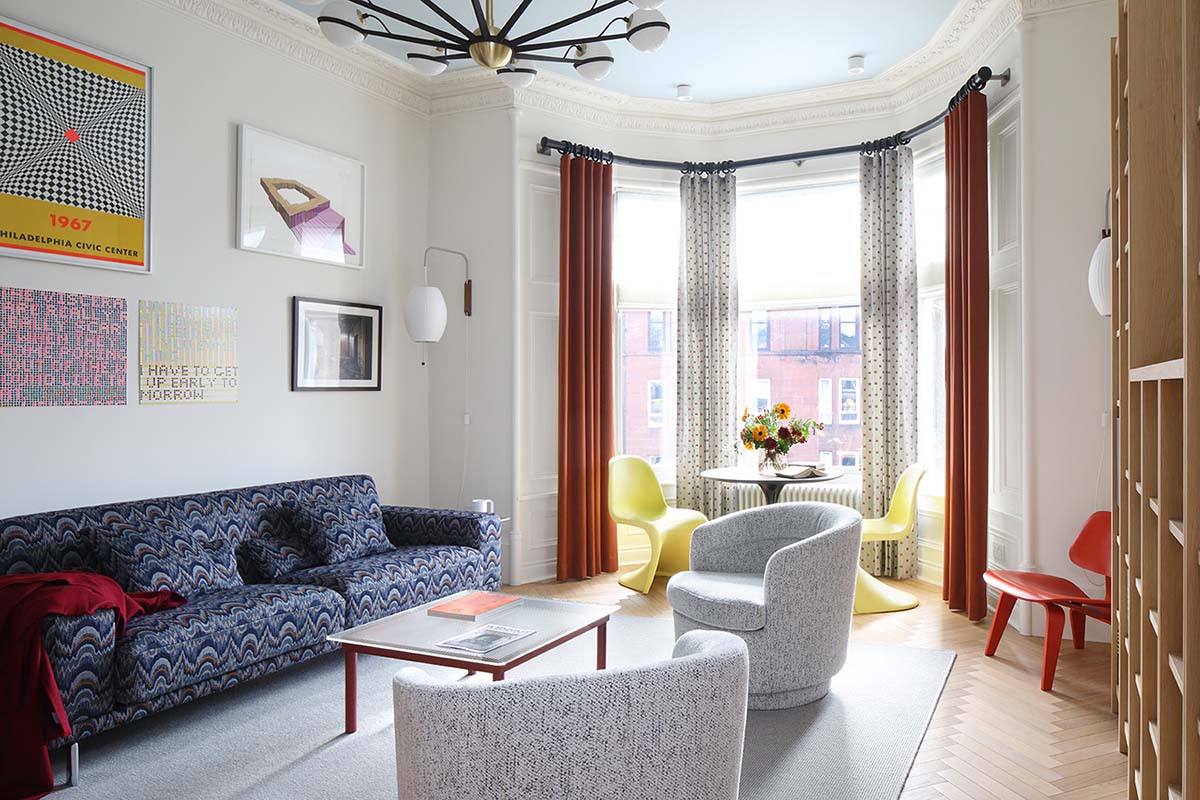
The tenement isn’t listed, and the owners have “modernist, semi-minimalist” tastes, so it would have been easy to ignore the flat’s history and go down a purely modern route. Anna had a better idea: “We restored all the rooms,” she says. “I researched typical Glasgow cornices and found a beautiful leaf-and-bead motif at Stevensons of Norwich which we used in the living room. Every visitor said they thought it was original – so I guess it worked!”
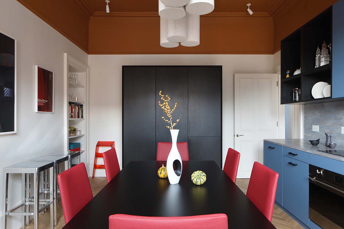
The kitchen was moved to the front of the property to maximise the light. The same approach was applied to the living room, so the communal spaces could benefit from the views and the bedrooms could get a little more privacy. All the joinery was sketched out by Heckmann Design and made in Wales by Sonabuild. The project’s main contractor was Standard Construction.
The mysterious blue-grey of the kitchen’s Corian countertops complements the blue cabinets wonderfully, but the real show stopper is overhead. “It was very brave of David and Louise to allow that to happen – I wasn’t sure they’d go for it,” laughs Anna of the ochre ceiling.
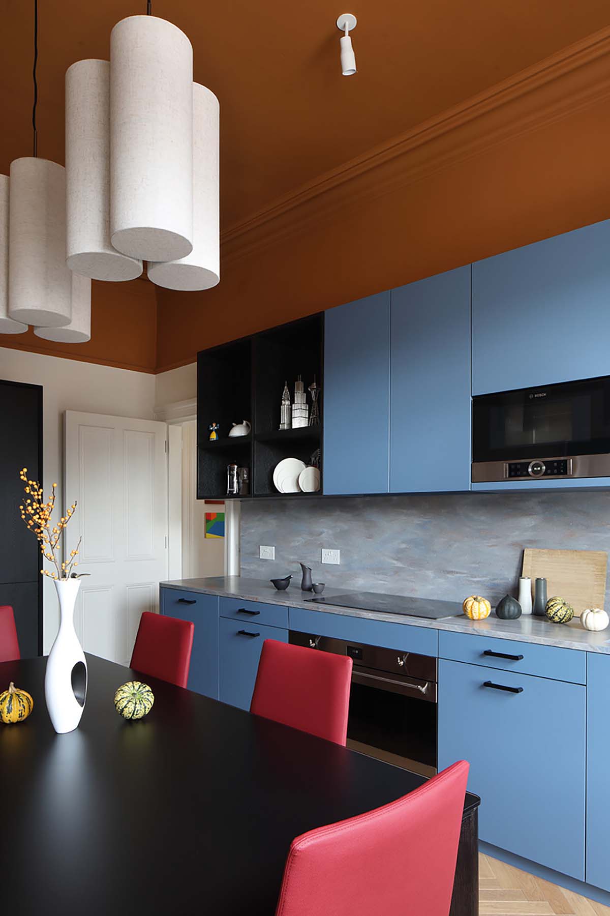
“The colour is obviously a reference to the tiles that were often used in the closes of Glasgow’s tenements. I like working with bold colours generally, but when we met these
clients and saw their art collection, I knew it would work. I could see the language in their pictures and I knew we could go bold and create something interesting for them.”
Louise and David love the colourful ceiling but their favourite element of the kitchen is actually the bespoke pantry. It’s another piece by Heckmann Design, with Japanese and mid-century influences, a black exterior and warm oak inside.
“It’s something I didn’t have before,” says Louise. “Our apartment in the US was too small for something like this. I love it.”
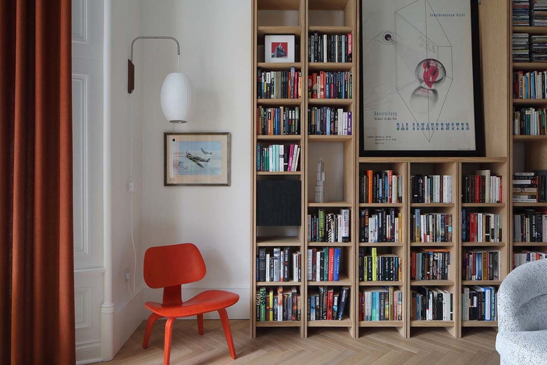
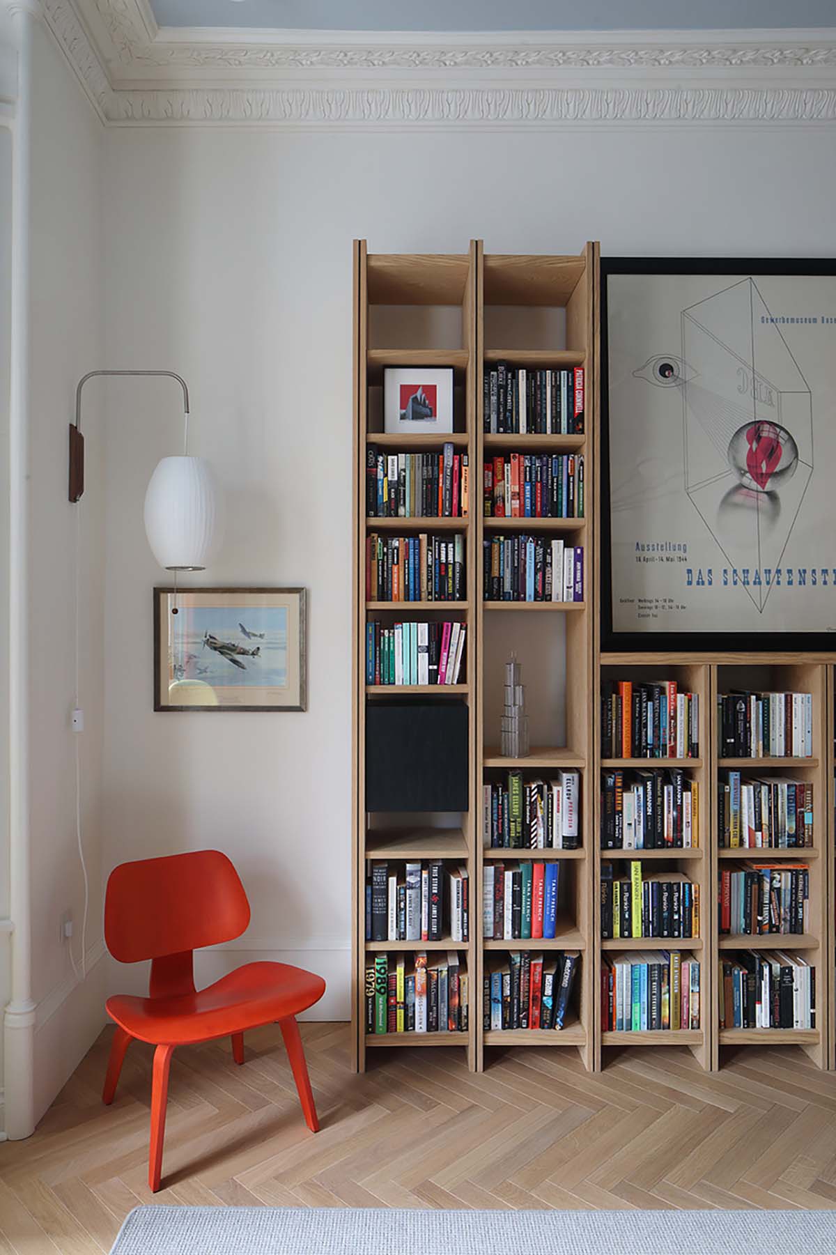
More bespoke joinery can be found in the living room. “The shelving was designed to work with a unit the clients already owned,” Anna explains. “The integrated black boxes were important to me: they provide visual balance and are a nod to their modern artwork. I knew they would understand it. There’s also a bar tucked into a press in the corner. I learned that a niche in Glasgow is called a press! The contractors kept correcting us.”
The Art of Upholstery, a Glasgow-based firm, recovered an existing sofa, and the curtains were made by another local company, Gilding the Lily. A seating area was created in the bay window using a Tulip table and bold yellow Verner Panton chairs.
“Layering textures is very important for me,” says Anna. “I always think of fine restaurants and how they put something crunchy, chewy and soft together on the same plate. It’s always various textures presented well. That’s how I think interiors should be – just surprising you constantly.”
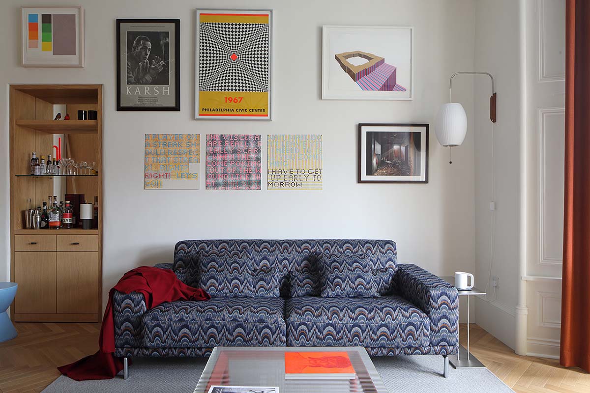
The layout of the artwork is a good example of this approach. Anna sketched out where she wanted each piece to go and it has made the walls feel effortlessly curated. “She came in and said, ‘Right, we need an art wall, and you can’t just string them all along the same eyeline, five foot six inches high’ – which is what I would’ve done!” David laughs. “She placed them brilliantly. I’m so impressed with how she organised that wall of art.”
Tenements are notorious for their long, skinny bathrooms but Anna found a way to create balance. “By stretching the shower from wall to wall, we widened the room visually. The position and direction of the tiles also helped with this. The band of coloured tiles was another nod to tradition, and placing it lower helped to bring those tall ceilings down and make the space feel more comfortable.”
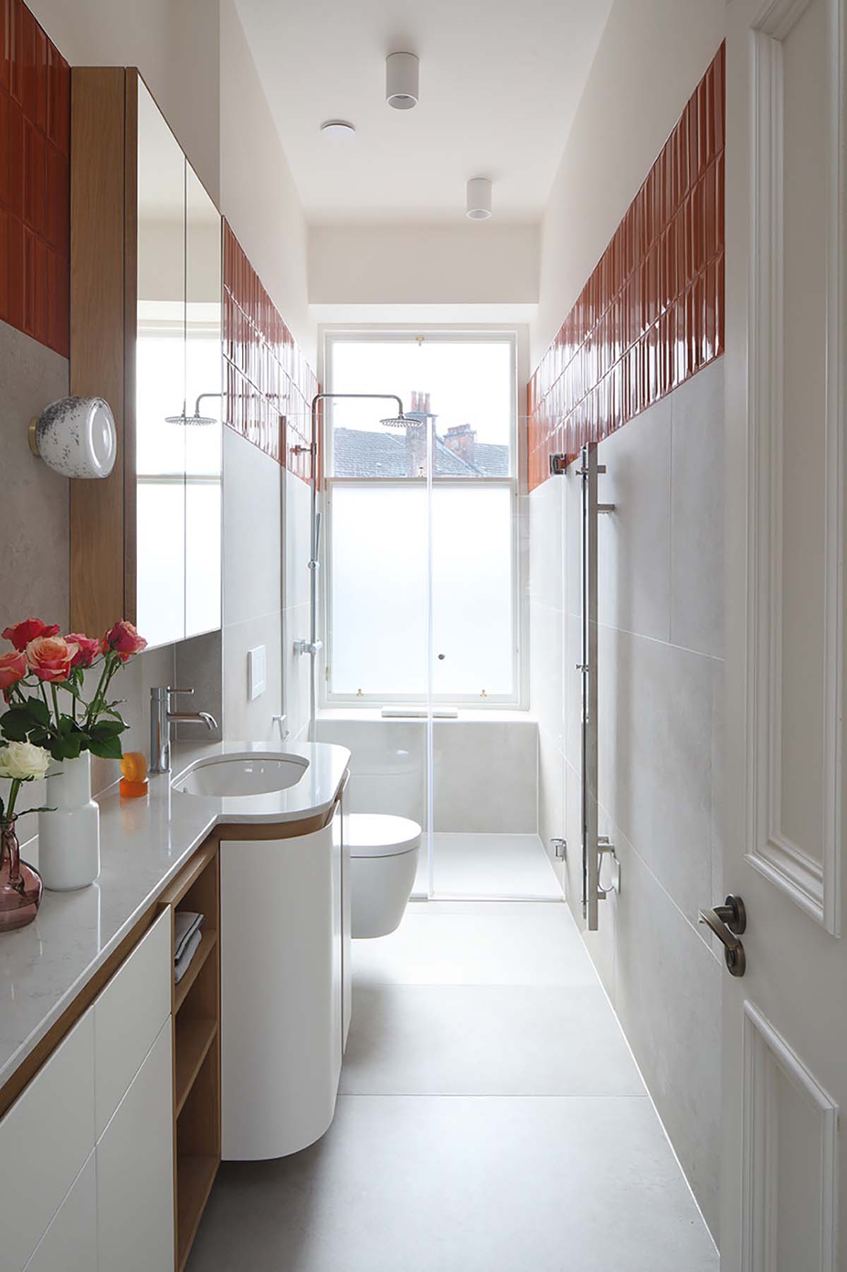
There’s more custom joinery in the units of both the bathroom and the en-suite: a mix of pleasing curves broken up by plain oak. The main bedroom is a tranquil space, purposefully minimalist in design. “The clients read a lot. They’re surrounded by books and they’ve got art and interesting objects everywhere,”
Anna says. “I wanted to create a space where they can switch off from that, somewhere to
realign their senses.”
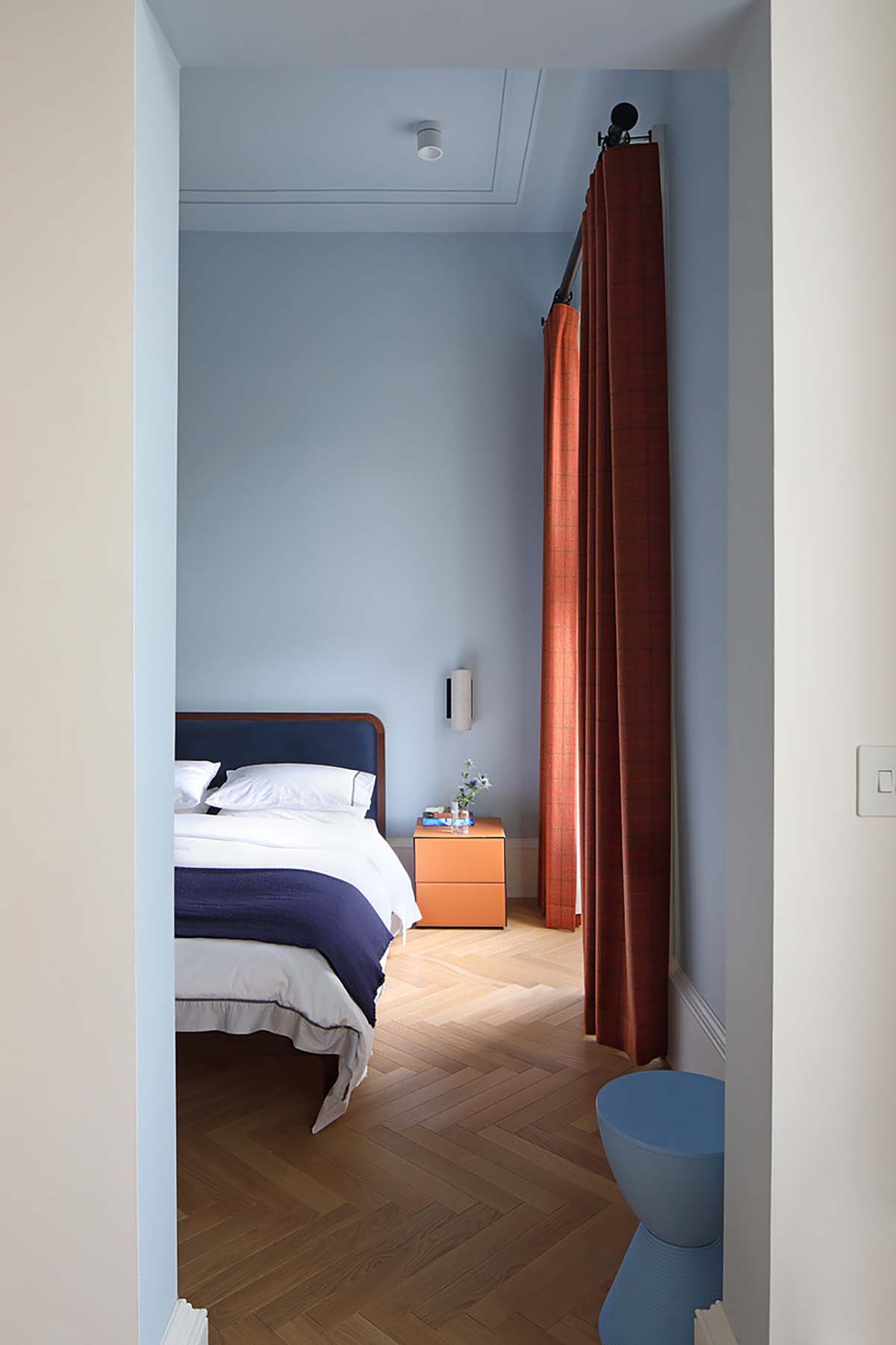
Soft blue walls, a Heal’s bed and Italian leather-clad side tables make this a peaceful
spot. “And tartan curtains,” smiles Anna. “We had to use tartan somewhere – I couldn’t resist! But it’s a modern tartan, a really warm colour.”
The cornice in the bedroom is suitably modern as well, just two lines running off the edges of the ceiling. It quietly summarises the blend of old and new found throughout the flat. “Homes are such a personal thing,” Anna concludes.
“We tried to be considerate of the building’s history but create something tailored to David and Louise as they’re so full of character themselves.”
An eye for design leads the way in this daringly painted tenement in Edinburgh


