Perfect for cooking and socialising, this kitchen’s vibrant palette cleverly complements the geometric glazing overhead
photography Chris Snook | words Miriam Methuen-Jones
BRIEF To extend the kitchen into a larger area for socialising while incorporating views of the garden and lots of natural light. The design also needed to respect the history of this Victorian home. KITCHEN The Main Company PROJECT ARCHITECT StudioDH
How do you like your lime? Mixed with cream, atop a crunchy biscuit base? Paired with salt and tequila for a lip-smacking margarita?
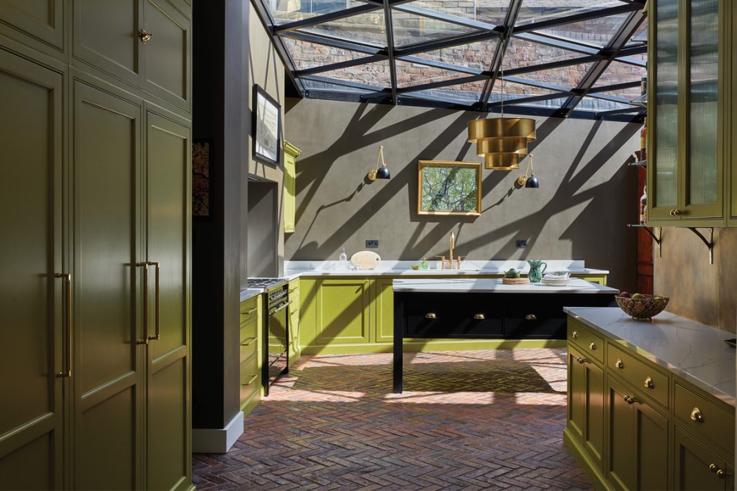
The owners of this house like it enough to make it the foundation of their new kitchen. Every inch of the hand-built cabinetry is drenched in Little Greene’s vibrant Citrine paint.
“This is certainly one of the bolder kitchens we have designed,” agrees Julia Dale at bespoke maker The Main Company. “The clients wanted the whole concept to be based around Citrine, and it’s an incredibly striking colour.”
The kitchen redesign was part of a larger project headed up by StudioDH; here, the aim was to extend the existing kitchen to create a more sociable area, while respecting the history of the Victorian home.
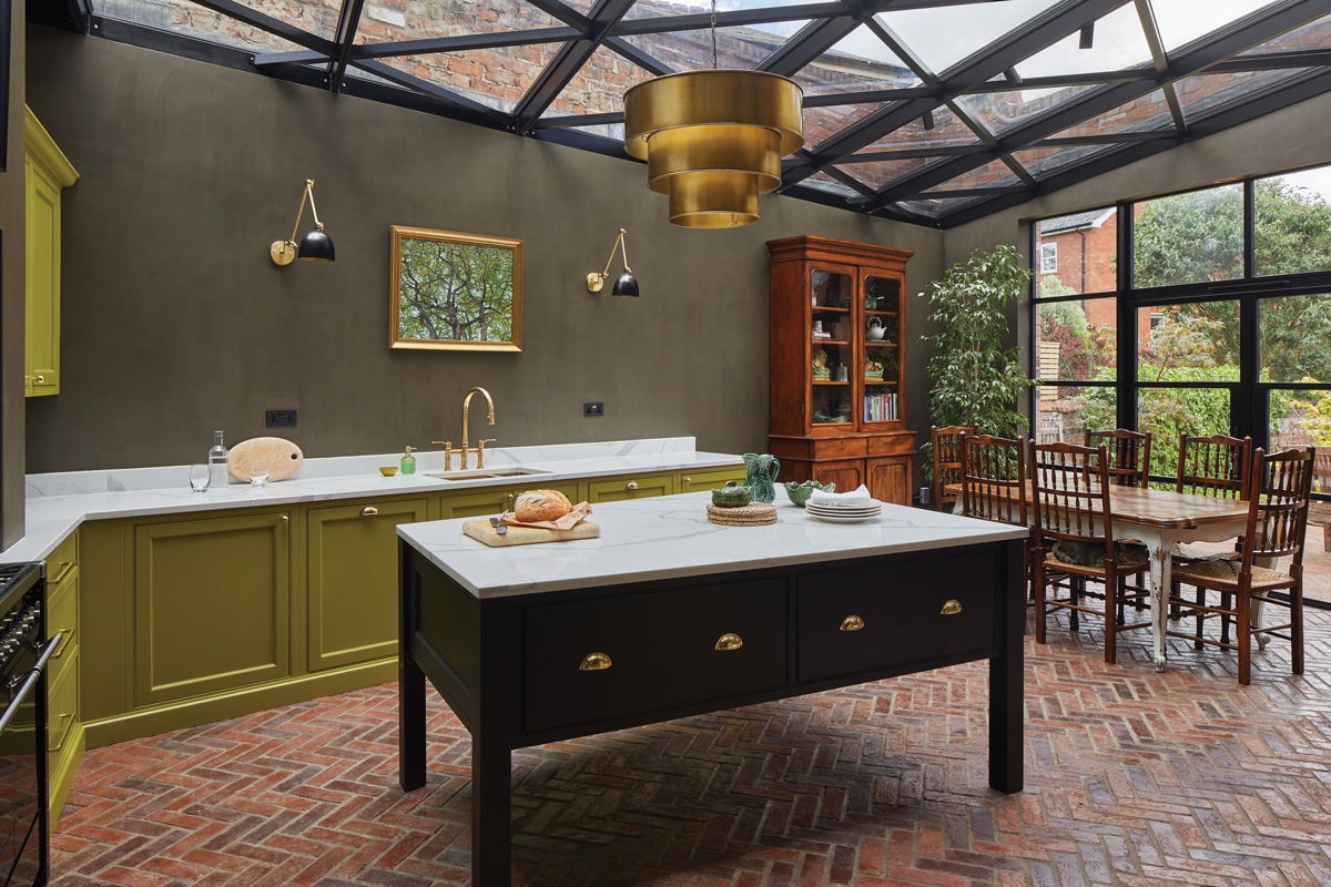
The owners knew they wanted a traditional style for the cabinetry, but only if it could be paired with this unexpected colour.
“The bright paint choice allowed us to bring in some modern flair,” says Julia. “We really enjoyed creating the space with the owners, and choosing the other materials and colours to complement the lime.”
The zesty hue is not the only thing that catches the eye, though; there’s a stunning roof designed by the project architects overhead as well.
“It’s an incredible geometric design,” says Julia. “It gives the kitchen an extra dimension, resulting in a space that changes throughout the day as the sunlight moves across the room.”
The shadows cast by the roof structure become part of the kitchen’s decor.
“It did require some additional planning by us, as the owners didn’t want the units and appliances to detract from the roof, so we needed to think of a different way to house the extractor fan and taller units.”
Floor-to-ceiling storage in a less obtrusive part of the kitchen, coupled with an integrated extractor, solved the problem. “This lets the roof take centre stage and maximises the light throughout.”
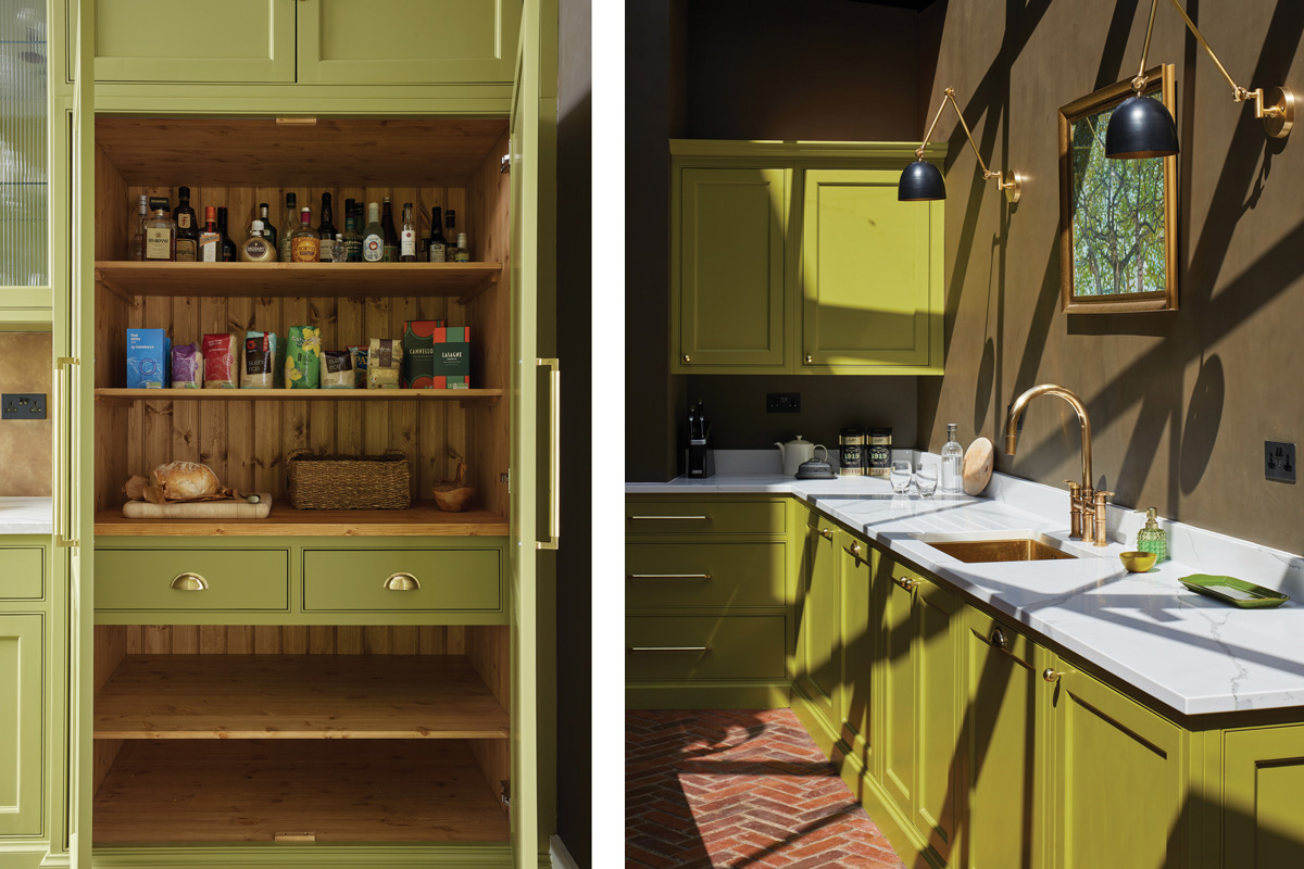
A prep area is sandwiched between a ‘quiet’ space for storing ingredients and mixing drinks, and the more sociable dining area with the dinner table and access into the garden.
“The kitchen really is the hub of this home, used for entertaining, cooking and experimenting with recipes. We needed to create zones to ensure the owners could achieve everything in one open-plan space.”
The clients were keen to combine old and new, so fitted and free-standing kitchen furniture was chosen. The large island is one of the latter and is painted in another Little Greene colour, Jack Black.
Traditional brick slips, laid in a herringbone pattern, serve as flooring, extending beyond the new kitchen into the dining area, which is peppered with vintage pieces.
The antique dresser, in particular, helps to soften the space, as do the walls finished in Little Greene’s Light Bronze Green.
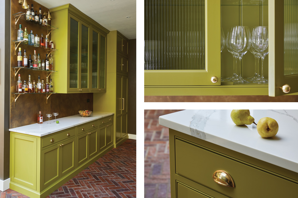
Tactile brass is everywhere, appearing in the lighting (Endon Lighting), the mixer tap (Perrin & Rowe), the door handles and the splashback behind the bar area.
“The owners like the kitchen design to do the talking, so they tend to keep the worktops clear,” says the designer.
“The bar, however, is a real focal point, with open shelving used to display glassware and their favourite tipples.”


