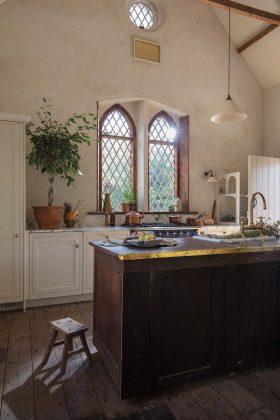
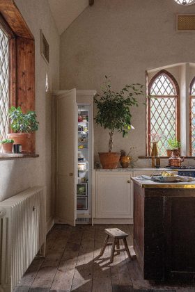
This characterful kitchen by Harvey Jones creates harmony with a mix of original features and reclaimed materials
words Miriam Methuen-Jones | photography Laura Marin Rupolo
At the risk of sounding like a little heathen, it wasn’t the sermons that caught my attention on Sunday mornings when I was a child, it was the windows.
Even my small-fry church had beautiful ones, arching high above my wee head and casting entrancing shadows across the walls opposite. Aged four, and still getting to grips with reality, I confidently told my parents that I would live in a church when I was older.
Several decades on, I understand their smirks. But I stand firm on the windows. Churches have some of the best around.
One lucky couple are living out my dream. This charming kitchen is part of a large-scale renovation of a rectory, just next door to an 800-year-old stone church.
RECTORY RENOVATION
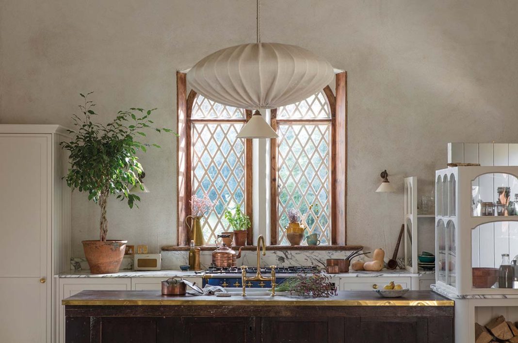
The kitchen area is 3m long and nearly 5m wide, but feels much larger than that, since it’s open to the dining room.
A superb Lacanche range in a vivid blue is the star of the show.
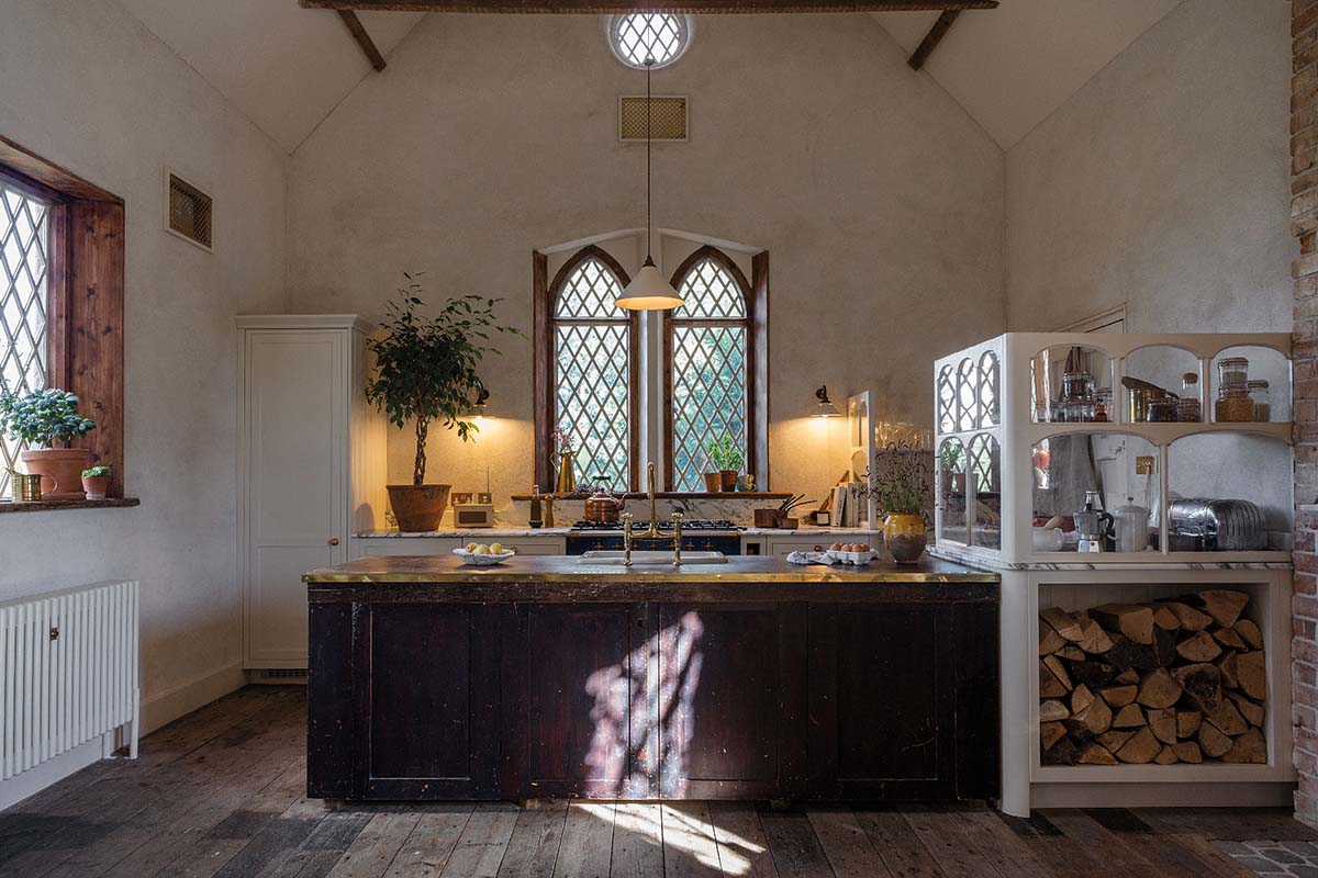
In front of it is a peninsula (rather than a kitchen island), containing drawers and a white ceramic sink, and close to the door that leads to the garden are a couple of striking portioned-off, above-counter spaces that serve as a pantry.
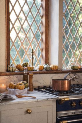
And, of course, there are those enviable windows.
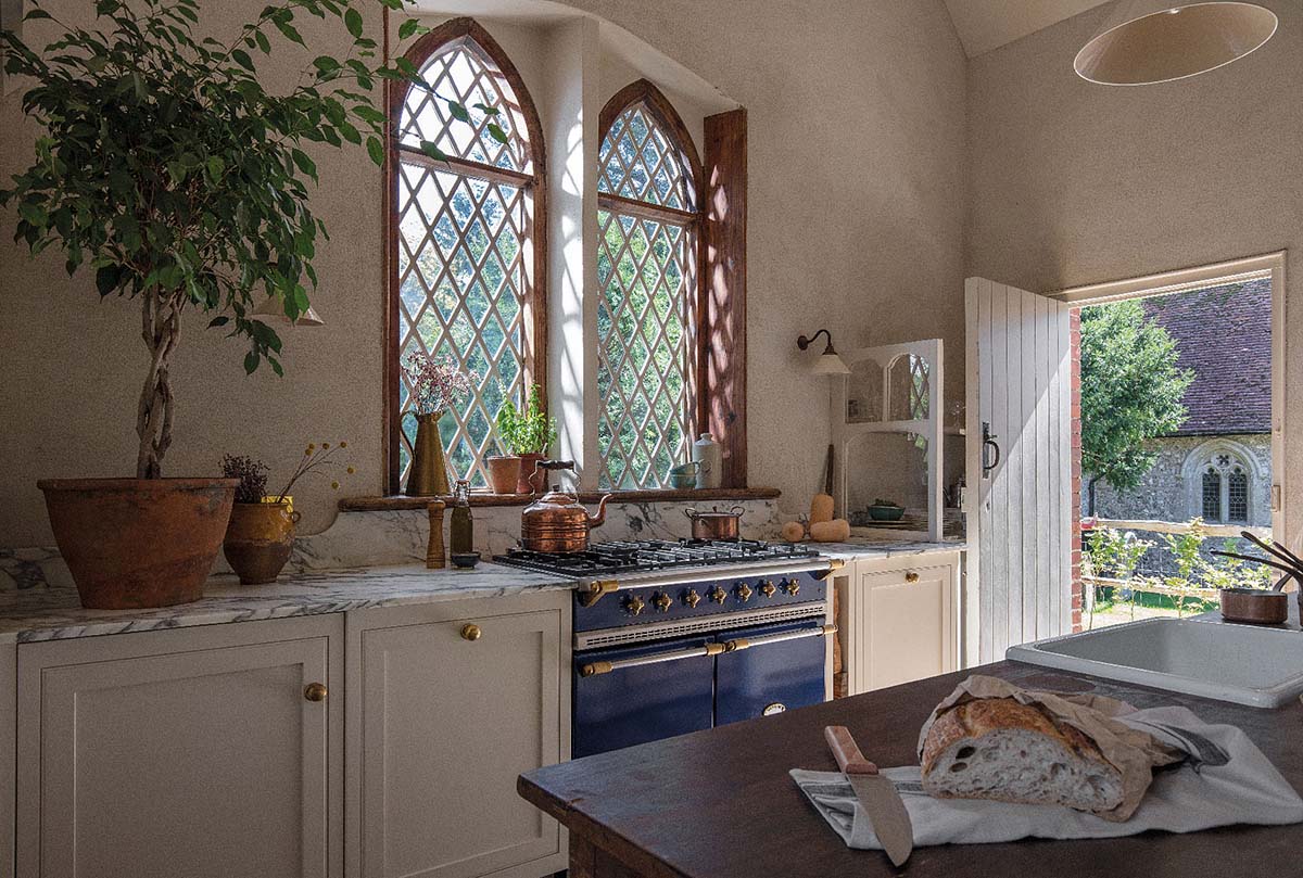
“They are original to the house,” confirms Graham Leach, senior kitchen designer at Harvey Jones. “They correspond with those in the church next door, which is more than 800 years old. Aside from the wooden architrave in the reveal, it’s all exactly as it was originally.”
The sill is wide enough for pots of herbs and a vase of flowers, the kind of personal touches that make the place feel vibrant and homely.
The pantry area, on either side of the door pictured below, provides much-needed vertical storage.
“There was a lack of wall cupboards and not much in the way of general storage in the kitchen,” explains Graham, “and it also serves as a sort of entryway.”
The tall ‘cupboard’ in the left-hand corner of the kitchen is actually a fridge, so these few shelves work hard.
“The countertop glazed frames provide relief between the busy pantry and the elegant simplicity of the rest of the kitchen,” adds the designer.
COLOUR OF TRANQUILITY
The side door out to the garden is used heavily, so these glass partitions protect their contents from passing traffic while welcoming you in and echoing the arched windows.
Adding to the airy feel is the colour palette, carefully chosen to generate a sense of tranquillity.
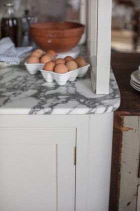
The cupboards are finished in a warm beige (a Little Greene colour called Clay Mid), and the worktops and splashback behind the cooker (white Arabescato marble with charcoal-grey veining) are similarly understated.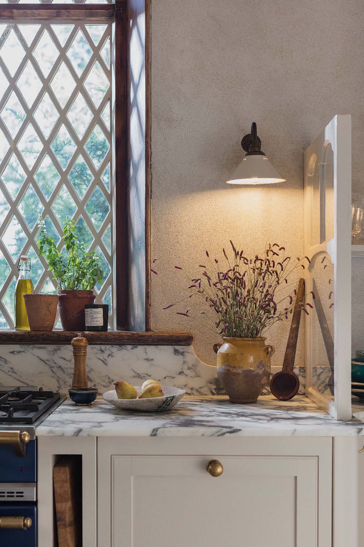
The edges of the worktops are rounded, while the peninsula unit has an attractive brass trim along one side.
This kitchen truly feels like it belongs here, and as if it has always been a part of this home. In fact, prior to being rescued by the current owners, this area of the house was in a terrible state.
The now welcoming dining area was full of junk, and had holes in the ceiling, and those glorious arched windows were obscured behind abandoned pieces of furniture.
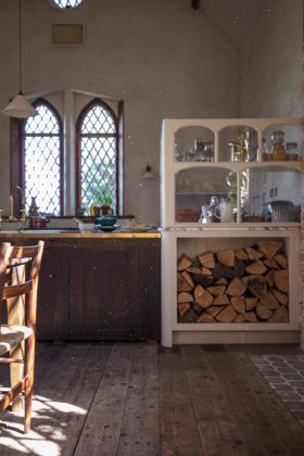
Now, everything makes sense as old meets new in a considered way. The dark colour of the windowsill and trim complements the vintage sink unit, and the new cabinets blend beautifully with the pale walls.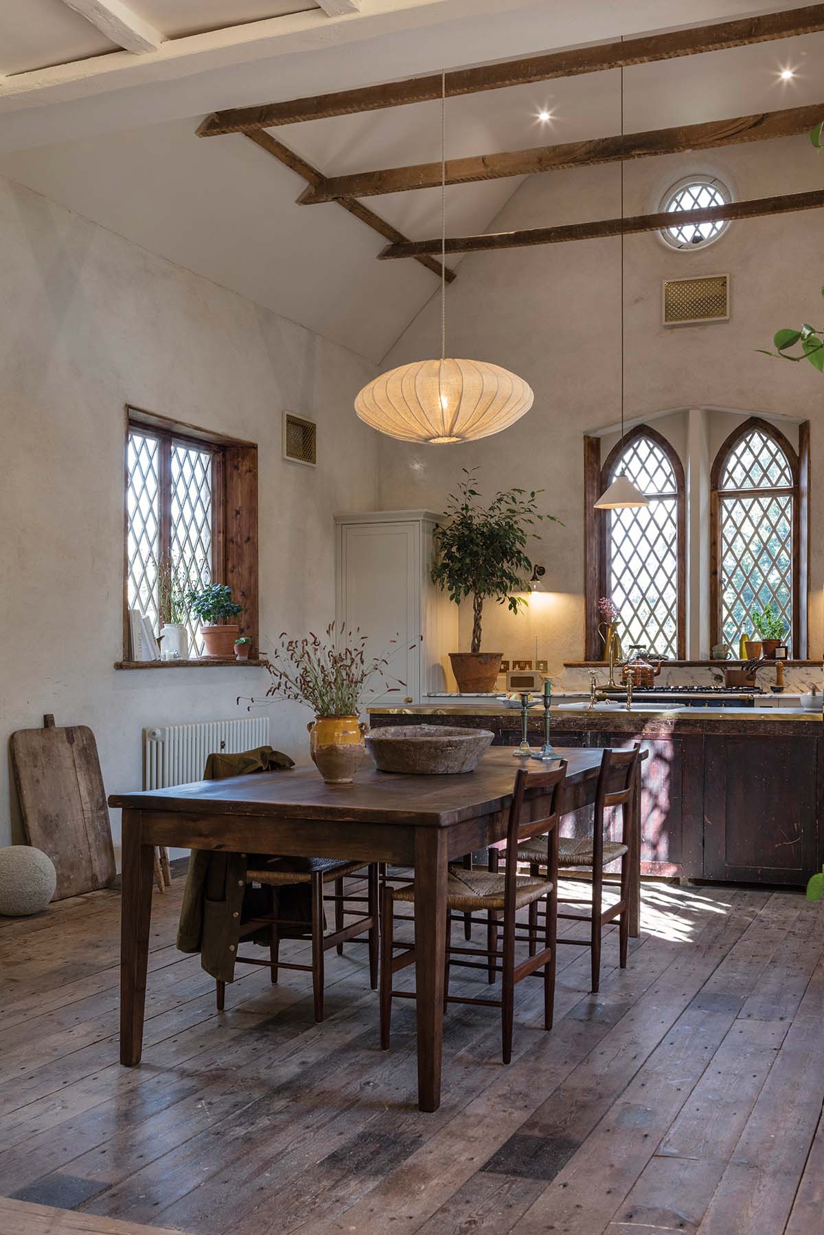
The original solid oak floors have been revitalised and relaid, allowing for a smooth transition from kitchen to dining area.
There, a woodburner surrounded by exposed brickwork is, surprisingly, a new addition, setting the scene for cosy evenings around the dining table.
This project might be next door to a church, and it might have eye-catching windows, but there is no slavish devotion to ecclesiastical style.
Instead, it feels like a home, and a well-loved one at that.


