A once graffiti-strewn block of student accommodation has returned to its roots as a beautiful Georgian townhouse, thanks to Nicola Harding and Jonathan Rhid Architects
words Natasha Radmehr | photography Paul Massey
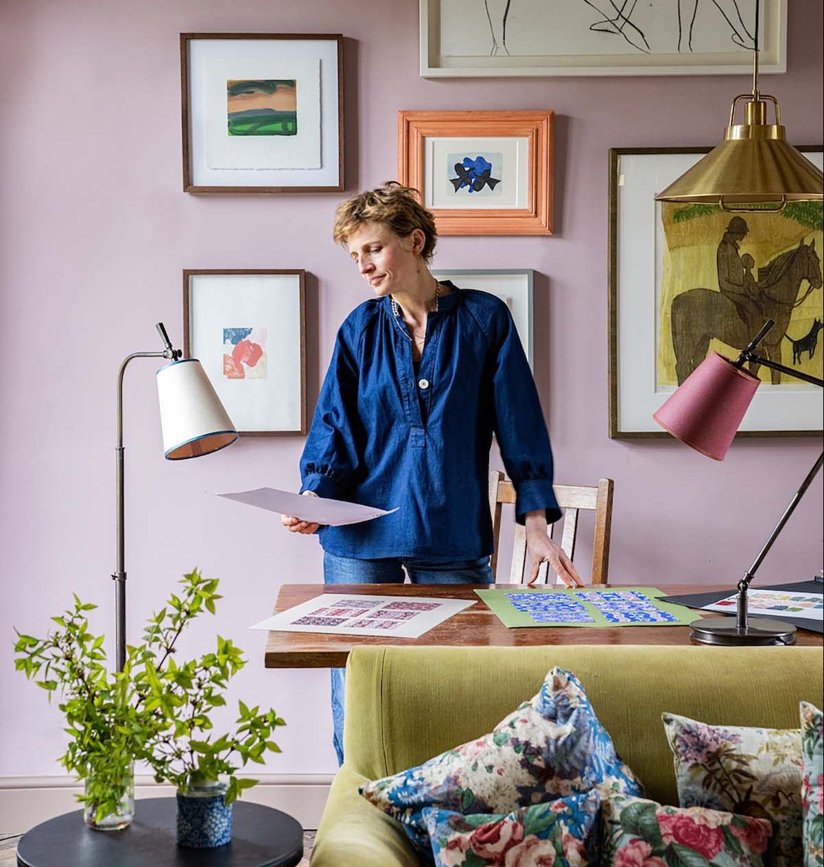
As the daughter of a helicopter pilot, the interior designer Nicola Harding was never settled in one place for too long. “Moving from home to home, I was always trying to figure out that slightly intangible thing that makes somewhere feel like home,” says Harding, who studied theology at Edinburgh University before a career as a garden designer led organically to interior design.
“My driving force has always been this overwhelming desire to create a sense of belonging. Not just fitting a client’s practical, everyday needs but addressing those deep-held fantasies we unwittingly accumulate over time. How we imagine putting the children to bed; the sense of relief felt when we come home after a difficult day; the Sunday lunch we’ve always wanted to throw our friends…”
Such wholesome pursuits had been absent from this particular Grade-I Georgian townhouse for quite some time. When it was purchased by its music producer owner and his wife as a family home in which to raise their three children, it bore the mildly debauched signs of many years spent serving as student accommodation.
The walls were graffitied with scrawls and scribbles, ceilings had been dropped, the rooms were subdivided and the exquisite period features were hidden behind stud walls and thick layers of magnolia paint. “It looked like a squat,” recalls Harding.
Yet despite its squalid state, its potential was blindingly obvious. Harding collaborated with the architect Jonathan Rhind to reconfigure and restore the five-storey building. “We wanted it to have a sense of intimacy and not feel too draughty, lofty or grand,” she says. “We also wanted the original architecture to have a chance to sing.”
The cornicing was repaired, false ceilings and partitions were removed, windows were elongated, and the walls and ceilings were replastered with lime plaster. “This was a significant investment, but they were determined to do it, and it was worth it – you can feel the difference,” she adds. “It has a very serene quality.”
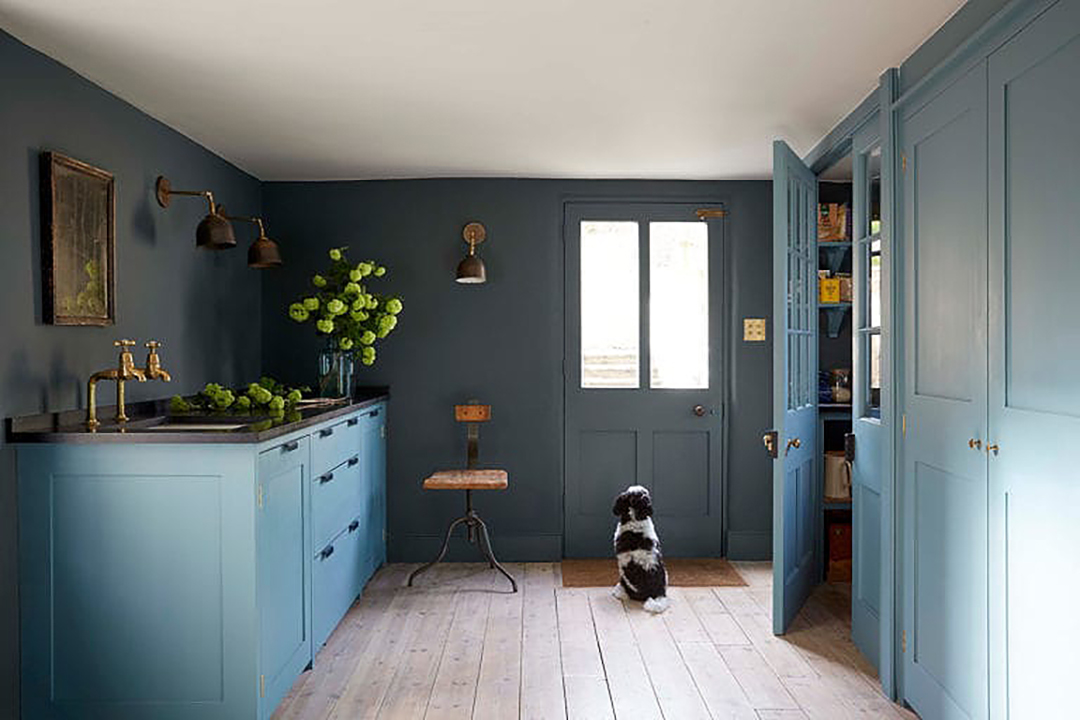
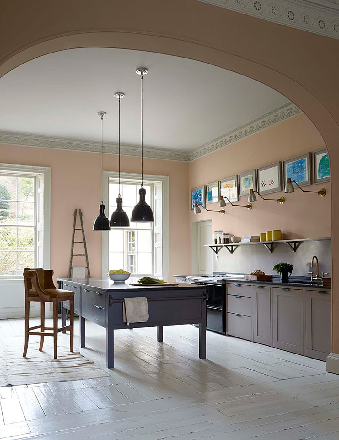
To stop the family from feeling too spread out, the interior designer placed the Plain Edinburgh kitchen at ground level rather than in the basement, where it would traditionally be located. It’s a real hub of the home, spread across the entirety of that floor with four zones for cooking, dining, playing and working so that everyone can busy themselves with different things while occupying the same space (and it doesn’t get too cluttered as detritus can be tucked away in a walk-in pantry at the back).
Charmingly, the paintings lining the wall above the worktops were all done by the kids in an art workshop with Harding. “We used good-quality paints and paper so they had an intensity of colour often missing from the stuff that comes home from school,” she explains.
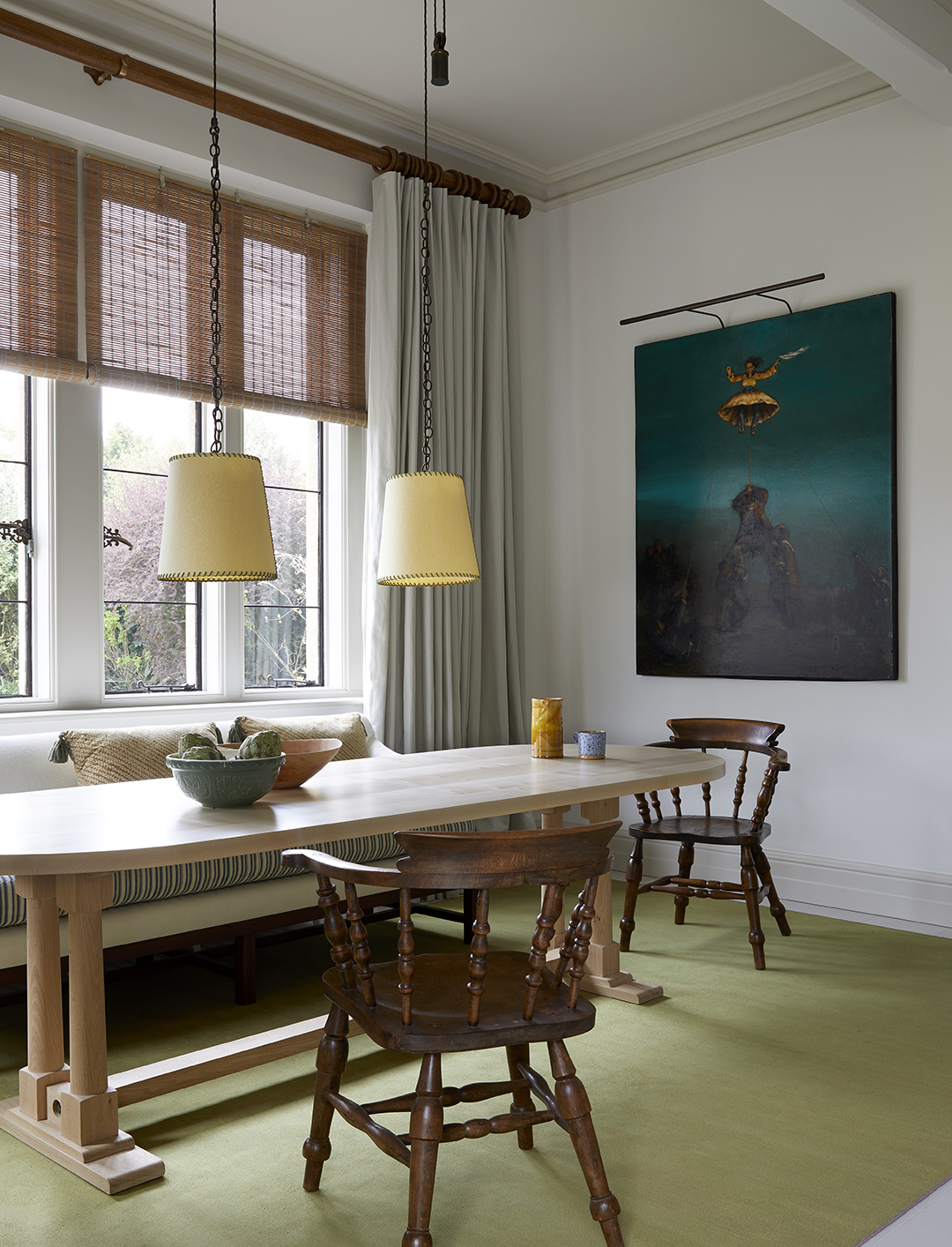
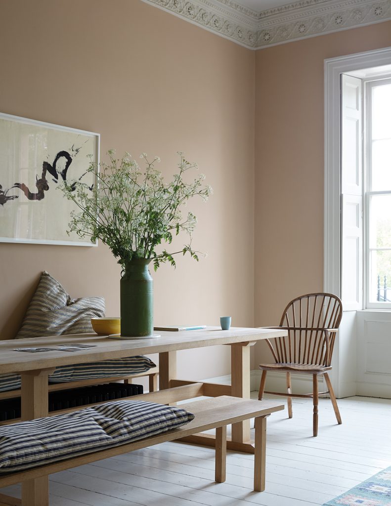
The kitchen is sandwiched between two other family rooms; below is a warm and nuturing snug on the lower-ground floor, with the light-filled, more formal double-reception room above on the first floor where a grand piano sits opposite artwork by Antony Gormley. The fresh and airy bedrooms occupy the upper floors.
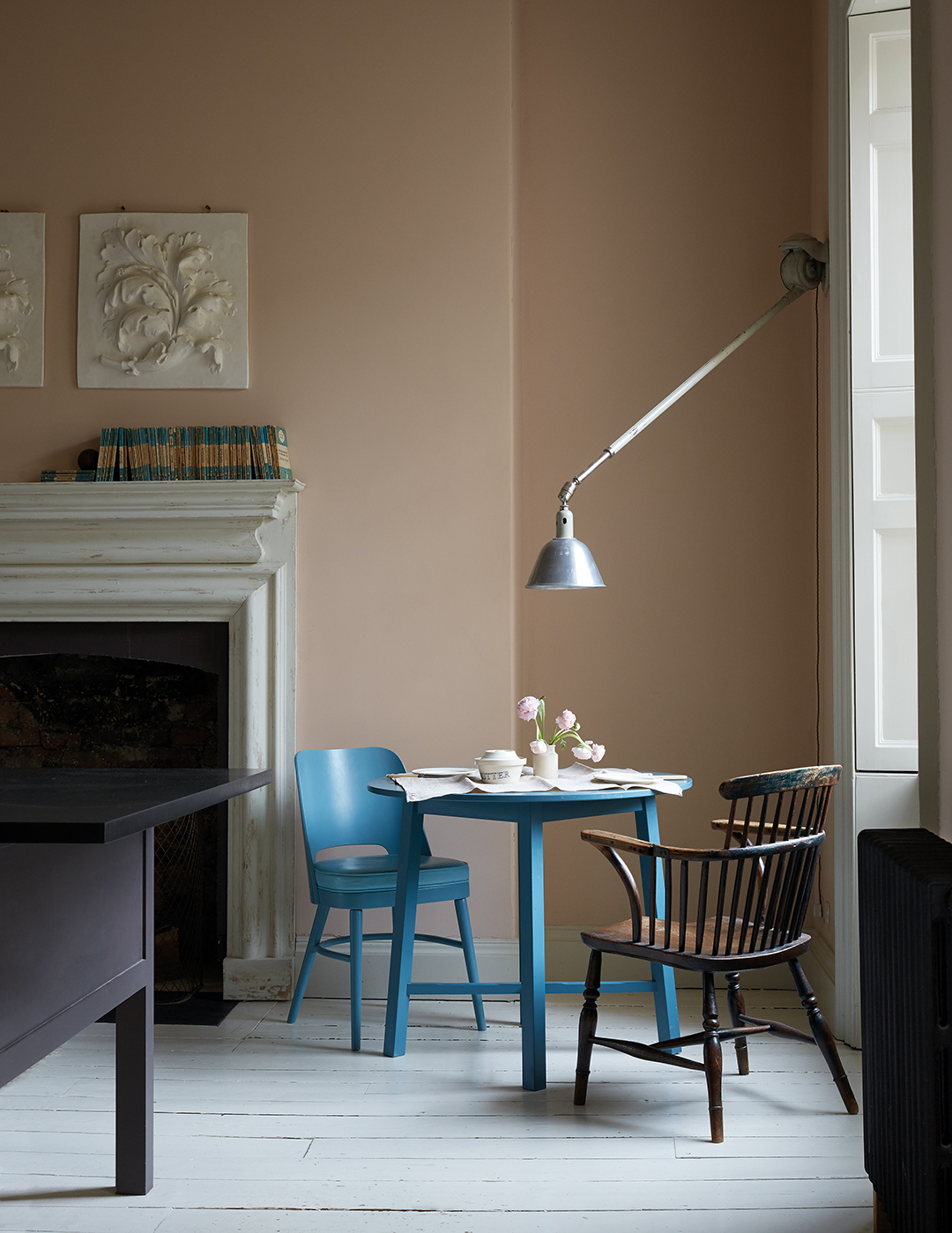
The palette follows the natural light levels; the south-facing rooms at the front of the house are painted pale colours to reflect the brightness of their location, while richer, darker shades wrap around the rooms at the back. The hall stairway is a gorgeous smoky blue, but the boldest choice is seen in the guest bathroom, painted a velvety black.
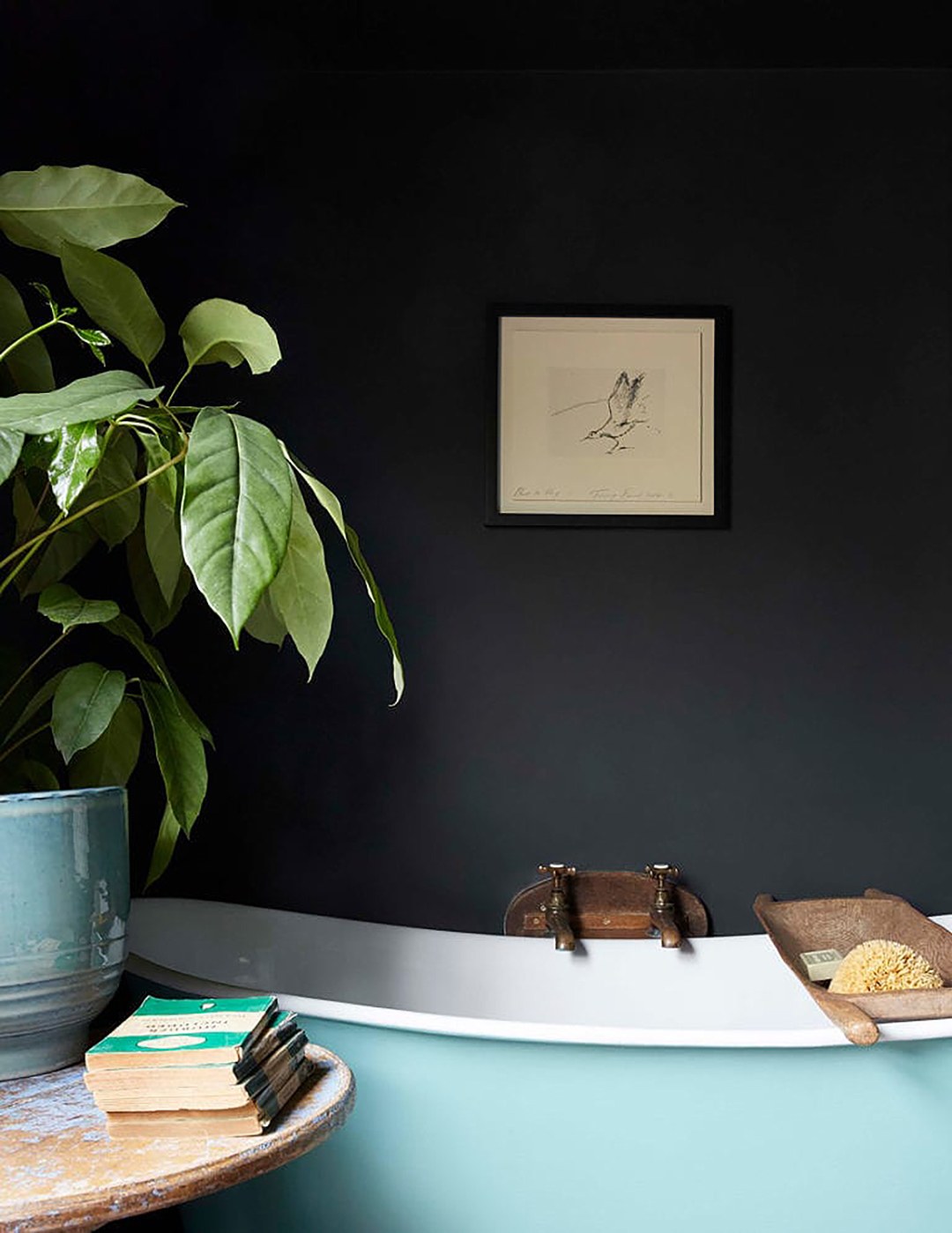
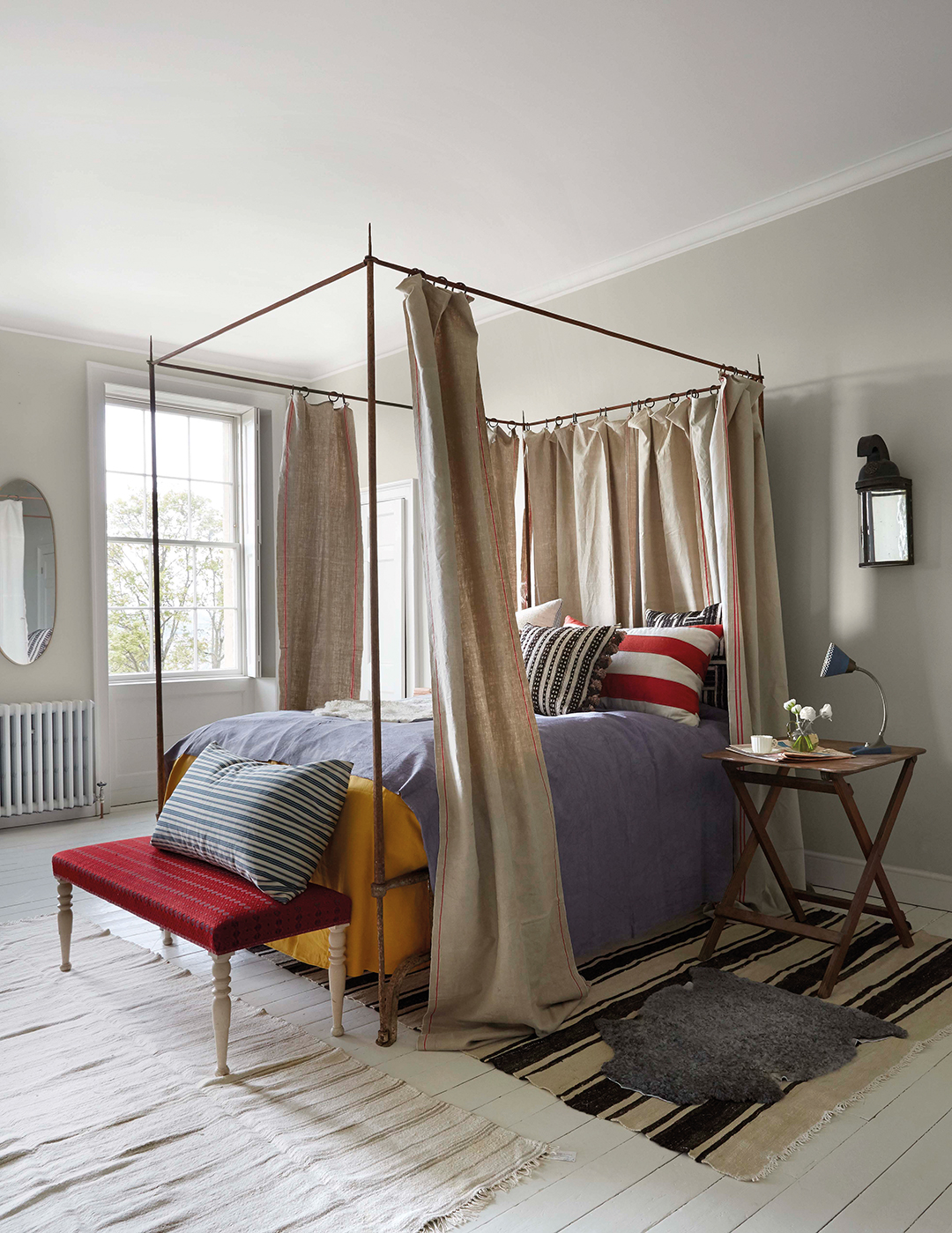
“Colour played a big part in making the house feel intimate. I think that was aided by not making things too formal – so not too much symmetry, and using antique textiles to create a sense of age, depth and soulfulness. We also didn’t blast entire spaces with lighting, so the light is just where you need it, creating these really inviting, glowing corners that you feel drawn to.”
Although the home’s Georgian heritage is celebrated it didn’t dictate the textiles or furnishings, which are a canny mix of antiques and bespoke pieces by Howe London, as well as furniture from the family’s previous home. The interior designer loves combining items from different periods to create a timeless look that speaks to the personalities of the owners, as well as the nature and context of the building.
Her newly launched homeware collection, NiX, has been designed to provide the well-made essentials that underpin a home and allow the more characterful, one-off objects to shine: the side table that’s just the right height, the wall lights that are angled just so.
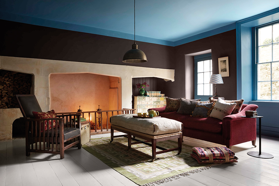
One of Harding’s favourite pieces in this home is the Howe London St Bernard armchair by the kitchen fireplace, which used to be in one of the kids’ bedrooms.
“It got a bit ripped because their dog chewed it, so we did a visible repair which has really enhanced its story,” says the designer. “That’s what makes a house feel like a home – it’s not just chucking in a few scalloped edges because that’s what was in this week’s Sunday papers but finding things that have meaning and link to your personal story.
“The greatest kick of all, for me, was that the family stepped into this home when it was finished and didn’t feel like it was someone else’s house. They felt it was truly theirs.”
Discover more
To read more about incredible interiors, the latest know-how on home trends with expert advice and awe-inspiring architecture, subscribe to Homes & Interiors Scotland.


