Karen and Hugh Pizey worked with architects Loader Monteith to build a modest home extension that has had a huge impact on their family living.

Photography Dapple Photography
Words Natasha Radmehr
Nature has a way of guiding us towards the right decisions, doesn’t it? It’s what convinced Karen and Hugh Pizey, owners of this family home in a conservation village in Stirlingshire, that they’d found their place.
“We had this huge space outside that none of the windows or doors looked or opened out to, so you couldn’t enjoy it or feel it was part of the home,” recalls Hugh. “We wanted to reconnect the house to the light and greenery outside.”
The Pizeys approached Glasgow-based architects Loader Monteith to undertake the project after seeing how they had successfully rearranged and extended the Shieling, a historic cottage in the heart of Fintry’s conservation area, thoughtfully improving the relationship between the house and its verdant surroundings, all while navigating conservation regulations. There was a clear synergy between the owners’ vision and the practice’s expertise in environmentally sensitive design.
Architect Iain King led on the project, and Matt Loader, co-founder and director of Loader Monteith, recalls feeling energised by the prospect of reconfiguring Karen and Hugh’s home to celebrate – and incorporate – the expansive stretch of land behind it.
“The garden was narrow and beautiful, and it just went on and on. Yet it was barely visible from inside of the home. We couldn’t quite believe that it all fell within the ownership of one property,” he says.
With 1,650 square metres of garden at their disposal, the architects were originally briefed to design a roomy, light-infused extension on the ground floor comprising a kitchen, dining area, study nook and shower room. But they questioned whether it was necessary to go big with it and felt they could achieve a dramatic transformation that would tick all the boxes while keeping the extension’s footprint to a minimum.
“Building is a pretty destructive, not to mention expensive, process, which is why we tend to encourage people not to do it unless they have to,” explains Loader.
“We prefer to get the area you already own working as hard as it possibly can. The less you can get away with building, the better.”
They settled on an addition covering just 15 square metres – far less than the owners had first envisaged – and through smart spatial planning they overhauled the “dark and cluttered” ground floor into a fresh, open area with a front-row view of the mature garden.
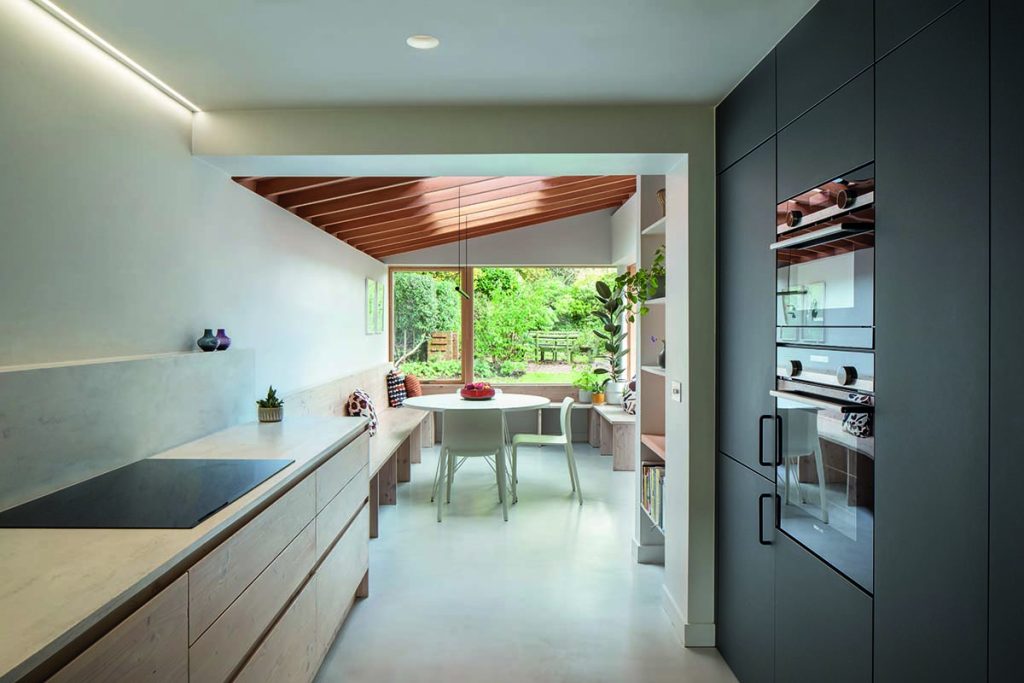
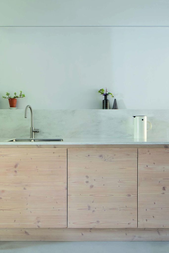
A new galley-style kitchen, custom designed in collaboration with Archispek, sits at the heart of the space. Corian acrylic worktops, timber and microcement allow the natural light to diffuse gently and evenly throughout the space.
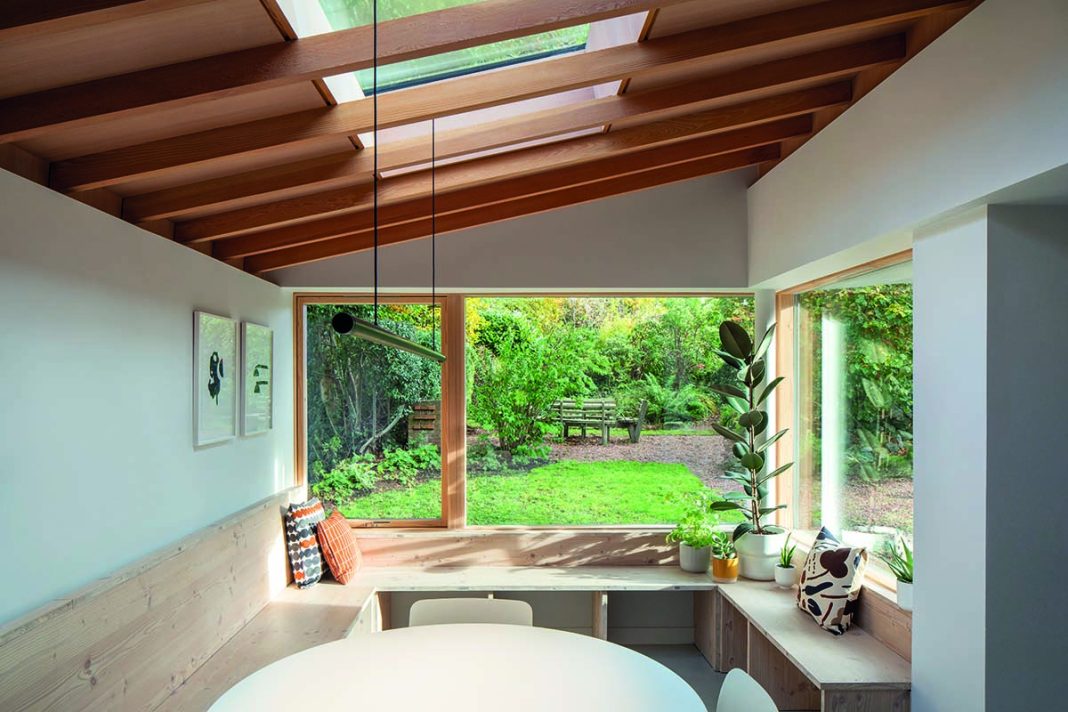
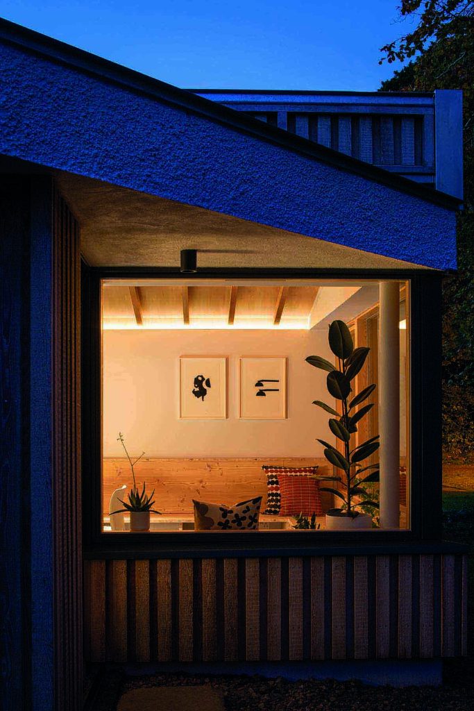
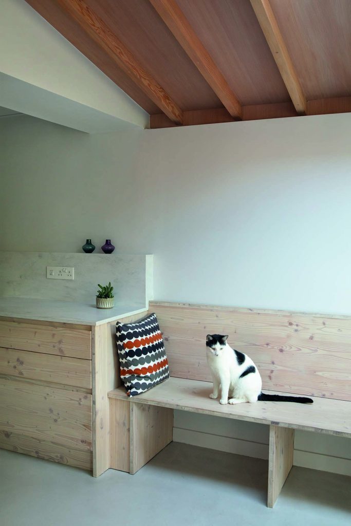
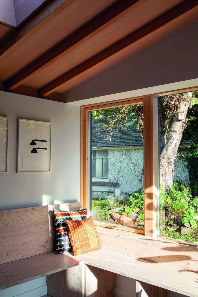
The continuity of materials draws the eye from the kitchen to the extension. Pale Douglas fir cabinets connect seamlessly with a wraparound window seat (made from the same timber) in the newly extended dining area, which projects into the garden.
When they gather here at mealtimes, the family feel as though they’re eating alfresco.
“We love watching the birds from the dining table,” says Hugh. “This is a really nice space to keep an eye on the cats and hear the children playing outside.”
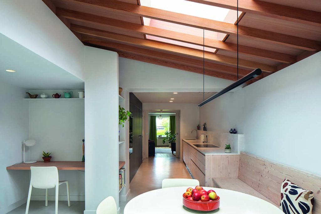
Karen and Hugh coveted a modern, uncluttered look and their reference images were drawn from properties with clean, sharp lines and exposed structural elements.
“A lot of the precedents they showed us were of house extensions down in London,” says Loader.
“I know it sounds a bit odd to say that something in Hackney is similar to a conservation village in Stirlingshire, but you can actually draw parallels between them – there’s a cottage-like tightness to those areas in London, and you can see how the judicious use of neutral materials such as concrete and timber make a place feel airy and bright, even if it’s not big.”
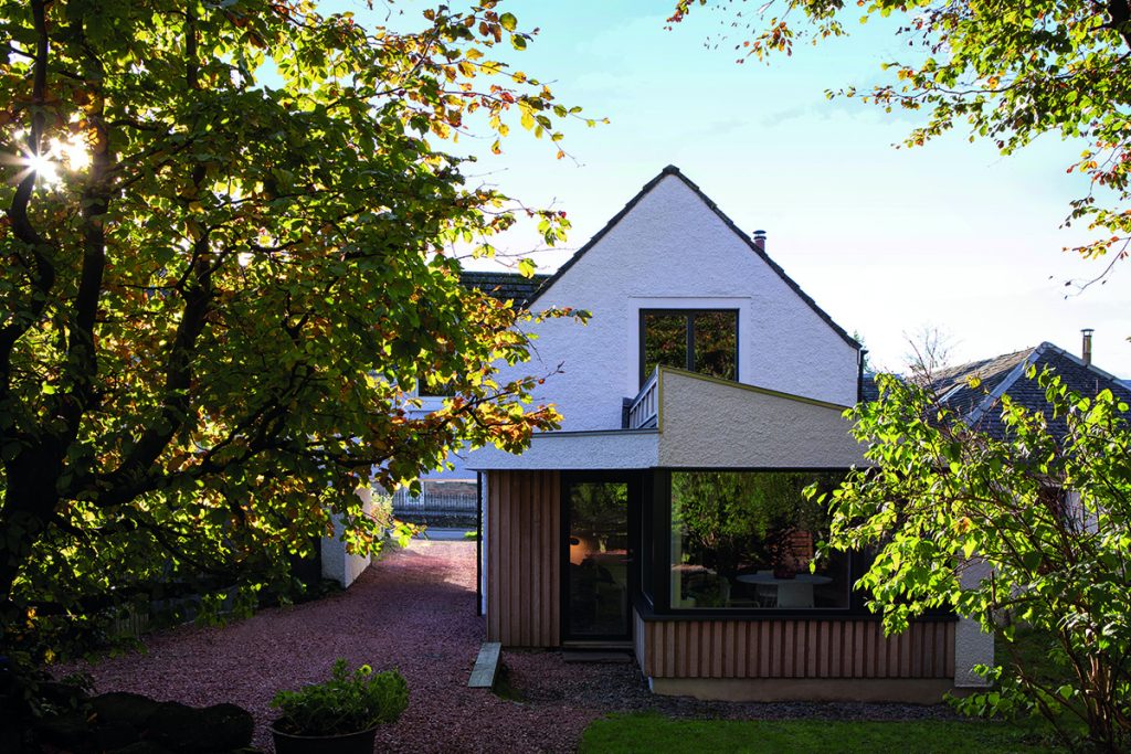
The addition flows neatly from the original home, which was built in the 1980s but designed to look like an old cottage.
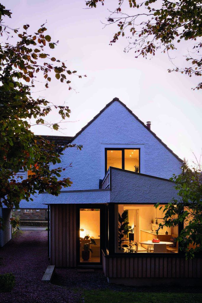
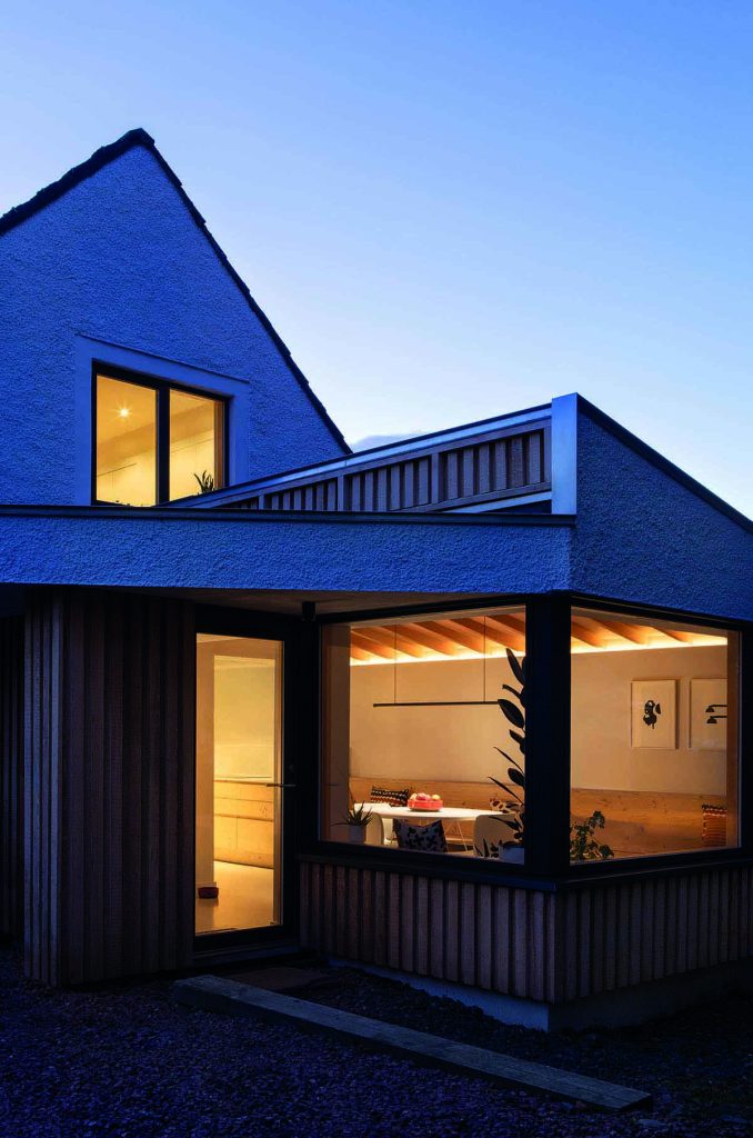
There are subtle folds in the extension’s roof planes, earning it the nickname Origami House. These serve the dual purpose of reducing the visual bulk of the building – important when extending in a conservation area – while allowing for a more open relationship between the interior and exterior.
Tucked beneath one of the folds is a new side entrance leading to a utility and shower room, which can also be accessed through a hidden door within the kitchen units.
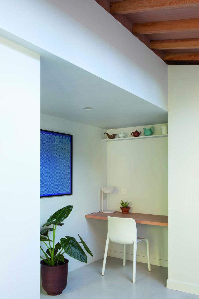
The Pizeys also have the study area they desired for their children next to the kitchen.
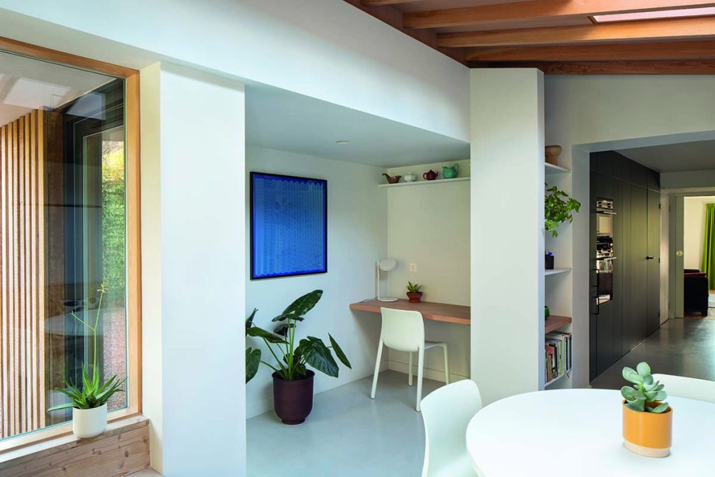
“A defining principle of a lot of our work is that it is meticulously put together,” says Loader. “I’d say the biggest challenge on this home was making it look effortless and simple; maintaining that neutrality of appearance actually takes real work.”
With functionality such a key feature of this home, it’s no surprise to learn that the streamlined aesthetic of Scandinavian modernism has an influence on Loader Monteith’s work. Yet Loader says the architects most often find inspiration much closer to home.
“We have the Scottish landscape right on our doorstep. There aren’t any nicer parts of the world,” he smiles.
Check out the gallery below:
Find out more about the Origami House project by visiting the


