Bert & May’s founder Lee Thornley has elevated an ‘average’ home in York into a Scandi-inspired, timber-clad haven.
What A Scandi-inspired four-bedroom family home
Where Poppleton, York
Architect Mass Architecture
Photography Simon Bevan
Words Natasha Radmehr
Bland. Basic. These are not commonly sought-after qualities in a new home, but then Lee Thornley – who recalls this being his first impression of his current abode – wasn’t exactly a typical house hunter. The design entrepreneur’s eye for improvement has always been his calling card: his boutique hotel in southern Spain, Casa La Siesta, was built using salvaged materials, while the interiors brand he founded, Bert & May, was born of a passion for reclaimed Andalusian tiles.
So when he and his partner Phil happened upon an unassuming three-bedroom home on the fringes of York three years ago “with no remarkable architectural details”, Thornley felt the familiar stirrings of a design project ripe for construction.
“I was determined to prove you can take something a bit average and boring and transform it into something really interesting,” he says. “I think that was the vision, really; to create a cool space from something that most people would say was really dull.”
The two-storey home was built in 1959, so it felt natural to lean into a Scandinavian-influenced, mid-century aesthetic – but it was never going to be a simple case of ripping out the pink carpets and replacing the kitsch fish-patterned tiles.
After living in the house for a short period to understand its bones, the couple enlisted the help of York-based practice Mass Architecture to reimagine its structure and introduce a brighter, airier feel in line with Nordic design sensibilities.
It was very much a collaborative process. “Phil is better at understanding the engineering and architectural side of things, whereas I’m stronger with the fluffy, interiors aspect,” says Thornley, whose two daughters, Lyla, 11, and Iris, 8, got involved by curating their own Pinterest boards.
Most of the internal walls, both upstairs and downstairs, were removed, so they were able to see it as a shell. A double-storey extension and garage conversion at the back increased the footprint, and the loft was removed entirely to create more breathing space upstairs. Three bedrooms became four (three on the first floor, with the master suite downstairs), and the ground floor was transformed into a light-flooded living area.
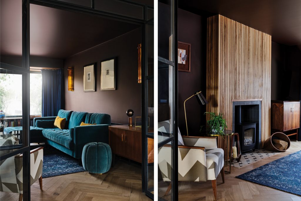
“I think that main living space is my favourite part of the house, because it’s always so light – so even here, where it pours with rain half the time, it always feels like a healthy place to be,” says Thornley. “You put on the fire and it feels really good.”
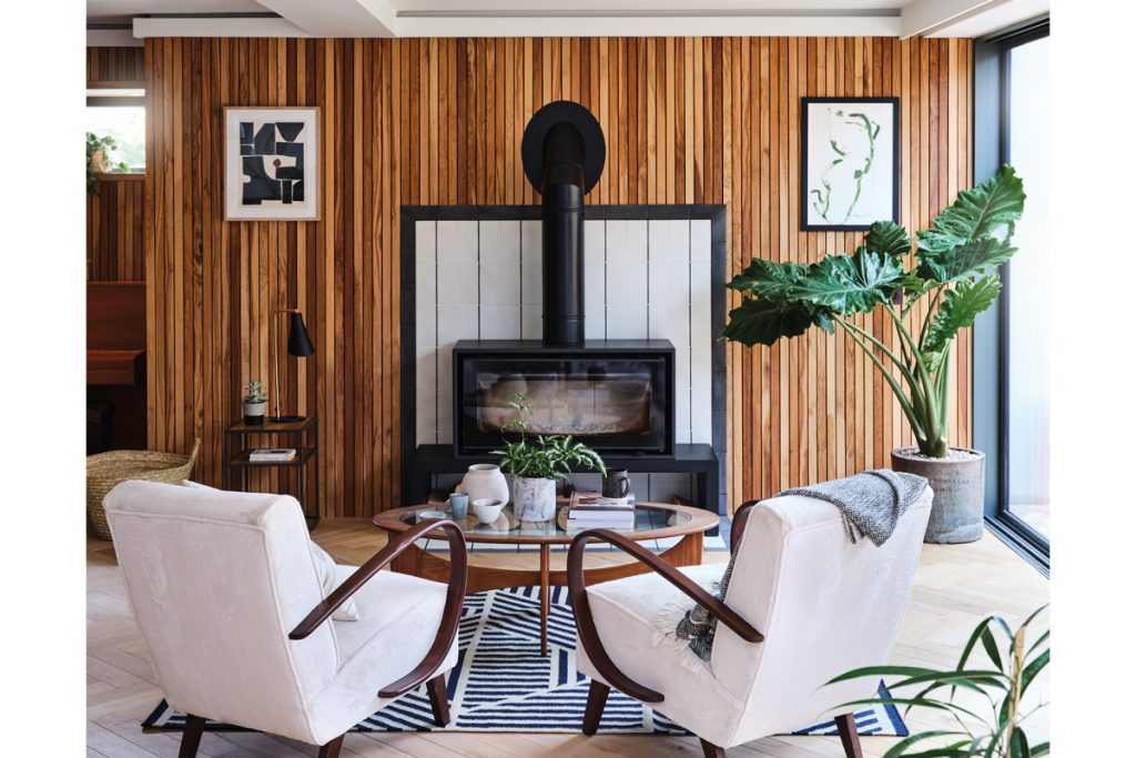
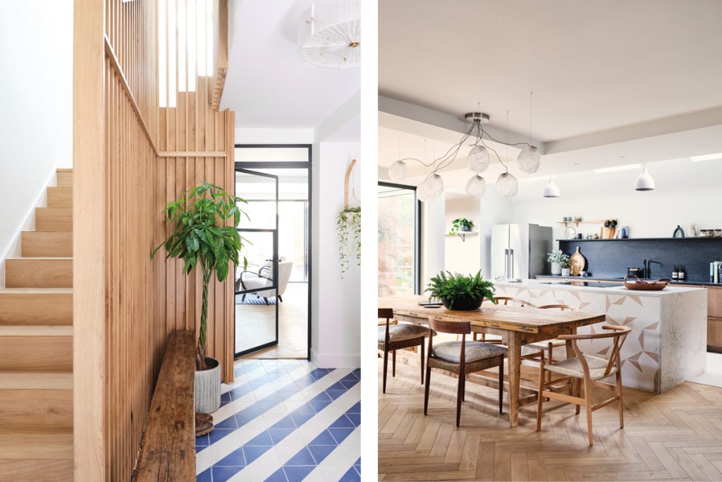
Neutral, earthy tones contribute to the soothing feel of this kitchen, dining and living area: a neat row of Caesarstone-topped timber units line the back wall, with a central island clad in Bert & May’s Hexagonal Split tiles in pearl and Brighton stone, a pale terracotta. Over on the other side is a dining table hewn from antique Spanish wooden shutters and a cosy sitting area where the couple can perch on vintage 1950s cocktail chairs in front of the Stovax woodburner and look out to the garden.
As a family, though, they find they often gravitate to the adjoining snug, separated from the main living space by sleek glass Crittall-style doors. Here, the vibe is a little moodier; a plush teal Made sofa rests against walls painted in Little Greene’s powerful Purple Brown, complemented by mahogany mid-century furniture.
“We love Everyman Cinemas, so we were trying to create a little Everyman at home,” laughs Thornley. “We wanted it to be somewhere we could watch a movie or hang out together of an evening, so it has a nice log burner, a sofa and big, thick velvet curtains. It’s a room that’s easy to drink a bottle of red wine in.”
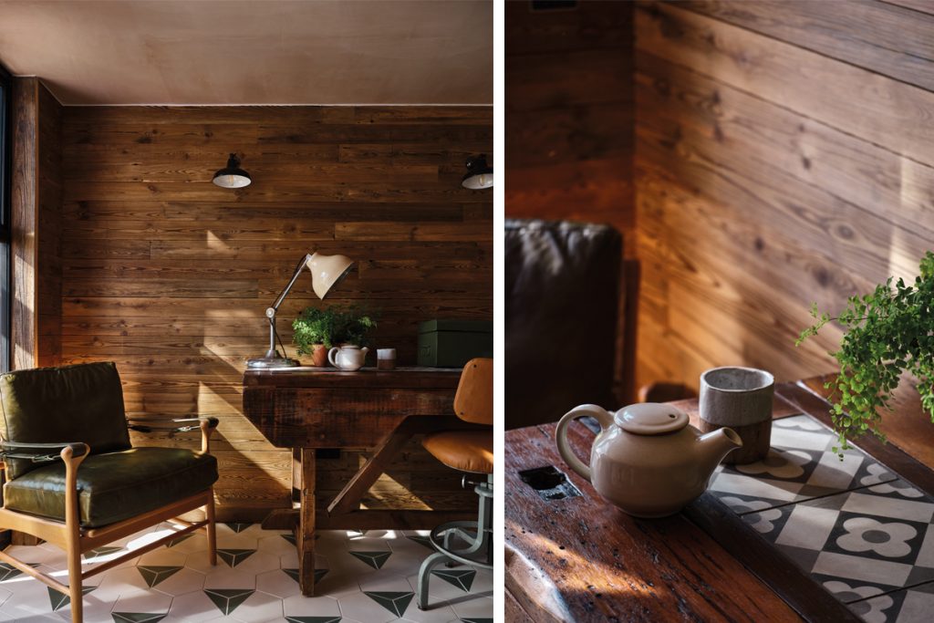
The relaxed warmth of the home is enhanced by the judicious use of timber throughout. The Urban Front entrance door is a beautiful, weighty iroko wood that opens into a hallway dominated by a modern staircase framed by a bespoke stairwell screen of slender oak pillars. Elsewhere, several of the rooms – from the living spaces to the office to the master bedroom – have wood-panelled walls comprising elegant matchstick slats, also found on the rear façade of the property.
“Most of the wood throughout the house is reclaimed oak sourced from the UK,” says Thornley. “Longevity and sustainability are so important. Sometimes people get sidetracked thinking about whether or not a product has been made in a green way, but if it lasts you six months it’s not very green. Thinking about how things will age over time is important. It’s very unlikely that this reclaimed oak would ever need to be changed; that would only happen if someone didn’t like the look of it.”
Where you won’t consistently find wood is the one place us Brits tend to be most comfortable using it: the floors. Havwoods herringbone wood flooring features in some rooms, but other areas, such as the office and entrance hall, are tiled. Bert & May’s striking blue Alalpardo tiles, configured in a striped pattern, welcome guests at the front door, and the Hexagonal Split makes a second appearance on the office floor in a fennel and Brighton stone colourway.
“Tiles just feel a bit more modern than a classic timber floor would look. Combined with underfloor heating, they’re amazing,” says Thornley. “If you want, you can place a rug on top and then in summer you can remove the rug and have a whole different look.”
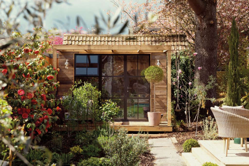
In summertime, the garden comes to life thanks to green-fingered Phil, who “lives and breathes” Gardeners’ World and took ownership of the outdoor space, which has a lush border, lawn area and vegetable patch. Nestled at the back is his beloved pottery shed, which is less dusty old shack and more modular living space – unsurprising, given that it’s a Study Box, part of the Bert’s Box collection that arose from a collaboration between architects Box 9 Design and Bert & May.
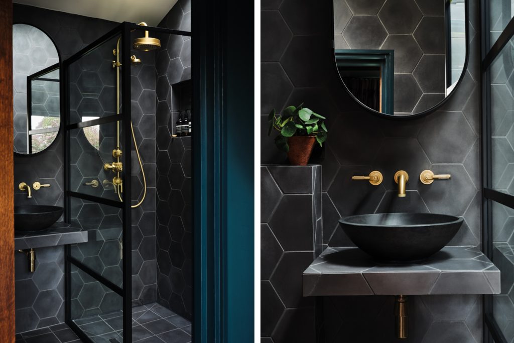
The greenery isn’t confined to the garden. A glass corridor on the ground floor is filled with plants (“Almost like a conservatory,” notes Thornley) and connects the kitchen to the couple’s standalone bathroom and bedroom, which extends into the garden area. The forest green walls and concrete-coloured tiles reflect the outdoor environment and lend a luxe appeal. “We always wanted our bedroom and bathroom to be a bit like a boutique hotel and an escape from normality,” explains Thornley, who knows a thing or two about creating that ambience.
But central to the home’s design is liveability, which guided the majority of the decisions. “We used brands such as West Elm and Fisher & Paykel, who might not be the cheapest but are still accessible,” says Thornley. “We tried to pick things that would be in keeping with the property, because I don’t want a house filled with crazy-expensive things that make it more like a museum or a design magazine. I wanted it to reflect who we are.”
That’s the advice Thornley frequently finds himself giving anyone who comes to him seeking his expertise on how they should style their living spaces. “You’ve got to be you, and you’ve got to create something that you love,” he says. “You have to design according to the way in which you actually live. That’s what makes it a home.”
