

Pink, blue, green and yellow are harmonious inside a home that’s built on fresh, beautifully balanced colour
What A five bedroom Victorian terraced house
Interior Design Jessica Buckley Interiors
Photography Zac and Zac
Words Judy Diamond
A lot of the time we decorate out of necessity: the upstairs neighbour’s bath has overflowed and your wallpaper has peeled off, or because you wake up one morning and realise you can’t take another day of tasteful grey, or because your bold new sofa has just been delivered and it clashes horribly with every other colour in the room. But these are reactions against what is already there. You are remedying a problem and the solution is nearly always obvious. What happens when there is nothing to react to? Facing a completely blank canvas, it seems, is what we really find difficult.
That was certainly the case with the owner of this house, in a Victorian terrace in London. She’d moved down from Scotland with her young family for work and had settled into this five-bedroom property. There was a lot to like here, but the decor was just so plain and uninspiring, with every wall a smooth stark white. She wanted to add colour and pattern but wasn’t sure how to go about it or where to start.
Happily, the first person she turned to is someone who lives and breathes colour and pattern. Jessica Buckley has built a flourishing business by skilfully adding both to her clients’ homes up and down the country. “I love fresh pretty colours and relaxed patterned fabrics that make rooms look inviting and cosy,” she says. “I’m not interested in rooms that are grand, formal or too perfect.”
Getting the blend right – of traditional but not stuffy, put-together but not uptight, bright and busy but not overwhelming – needs an expert eye and a firm grip on design decisions. Buckley was up for the challenge: “The client wanted to add layers of personality to the house,” she recalls. “The brief was quite open – she did have a wallpaper that she liked, which was the jumping-off point for the colour scheme, but other than that she was open to our ideas.”
The paper in question was Robert Kime’s Gaia, and the owner was considering it for the hall. Buckley, though, felt this might make the staircase feel dark and narrow. “It was, however, such a perfect wallpaper for the drawing room,” she says. “So the starting point was to use it for that room and develop the scheme from there.” (The hall got a crisp, clean look instead – a warm off-white, with all the woodwork painted in a dark blue.)
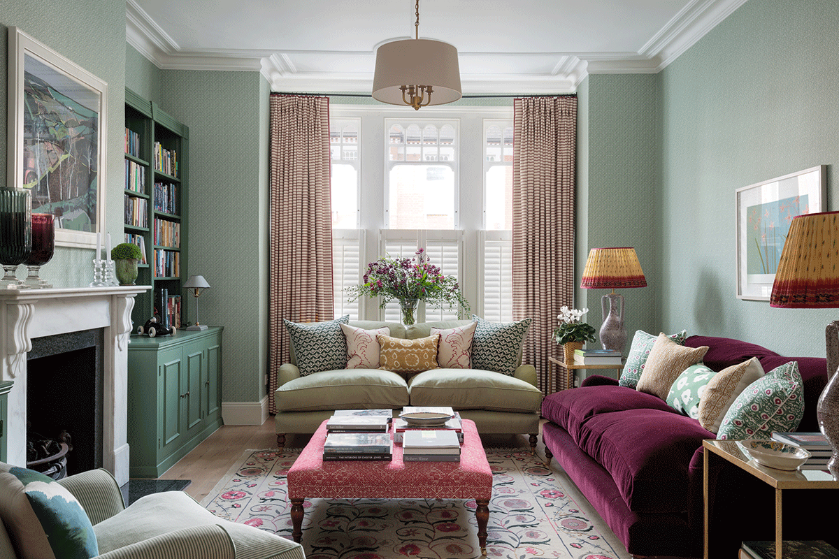
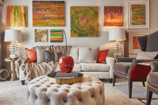
The drawing room set the tone with its palette of blues and greens. Linen, mohair velvet, wool and cotton were used for the soft furnishings, with variations in the thickness of the weaves to ensure the room doesn’t feel repetitious. The George Sherlock sofas were expensive, but to Buckley these are true investment pieces: “Good quality hand-built sofas last for life. We chose some very beautiful upholstery fabrics for them: a pretty pale green linen and a berry-coloured Mohair velvet, both from Claremont.” The rug, in contrast, is a very savvy buy from OKA.
If the general overall feel is relaxed and welcoming, the designer admits the drawing room is slightly more formal than the rest of the house. “We wanted it to be elegant – a place for our clients to retreat to after the children had gone to bed where they could unwind or entertain guests. We picked smart but not stiff fabrics – for example, we used a loose-weave linen striped fabric for the curtains rather than, say, a silk or a damask.”
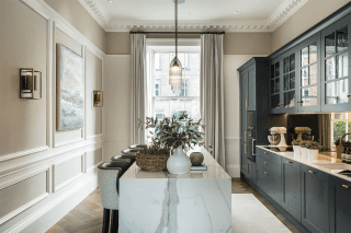
The challenge in the kitchen was to break up the expanse of white. To introduce softness and colour, the walls were painted a warm sandy tone, while a new cabinet was built for the TV to sit on; with the woodwork painted green, it injects some vibrancy to the room. Simple curtains were also hung at the doors leading to the garden. “I love large glazed doors and windows but they become a huge expanse of black once darkness falls – curtains are the solution.”
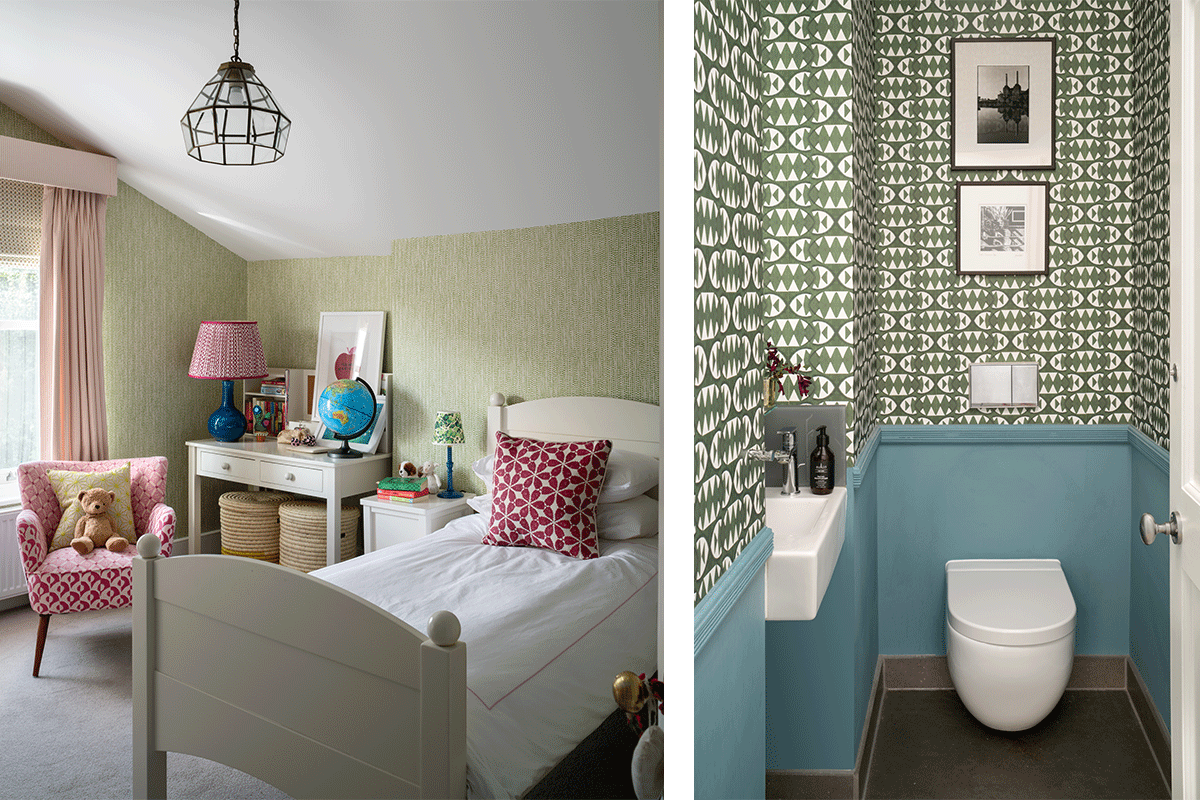
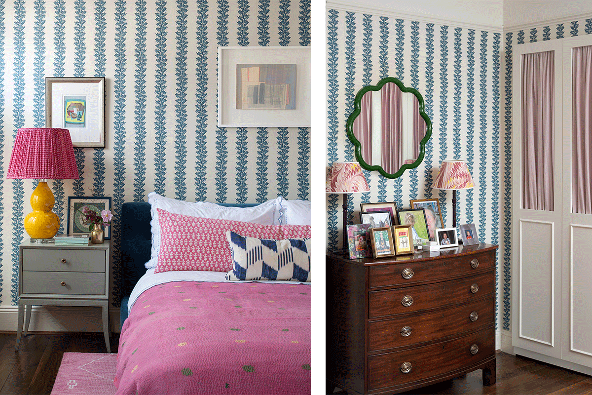
Buckley’s work continued upstairs in the master bedroom. “Not all bedrooms need to play it safe with so-called restful colours,” she says. “We suggested a bright pink rug for this room – I loved it but was unsure what the client would think: thankfully, she loves it as much as we do.” The work of artisan weavers, it took months to make; offsetting its cost, the existing bed was reupholstered in a navy velvet, while the chest of drawers was a find from Georgian Antiques in Edinburgh.
The owner, says Buckley, is delighted with the way things have gone: “We’ve been asked to come back and work on two further rooms, which we’re in the process of finalising now.”
If you’d like to read more of our Interiors features pick up a copy of the magazine, or subscribe here.
Also in issue 134 (Jan/Feb 2021):