


The potential of this huge lateral apartment was sorely ignored until new architect owners rethought its layout and released its promise
Photography Zac + Zac
Words Catherine Coyle
What A reconfigured Victorian flat
Where Comely Bank, Edinburgh
Architect Luke McClelland Design
Luke and Joanne McClelland were seeking out more space when they returned to Edinburgh from London in 2018. Both architects had trained in the city and knew the allure of Edinburgh would draw them back at some point, its classical architecture and more reasonable property market (at least compared to London’s) making the latter look less and less like their forever home. Originally from Belfast, Luke spent time at Foster + Partners refurbishing the Royal Opera House, before setting up his own practice. Aware of the scale of traditional Edinburgh townhouses, he was eager to show how a large project could be done effectively and stylishly without breaking the bank.
The pair found their project up for sale online where it was languishing, prospective buyers put off by its poor state of repair. They could see its promise, however, and were able to visualise what could be done with it, so they took the plunge in the knowledge that large-scale renovations would be required. “The property comprises the drawing-room levels of two adjacent Victorian townhouses that had been knocked together to form one apartment during the 1970s,” explains Luke. “As architects, we could see the potential for creating a light-filled home if we made just a few key alterations.” They were so convinced it would work that they went ahead and put in an offer without actually seeing the flat in person.
And when they did, it just confirmed what they already knew: the existing layout didn’t work at all, there was a lack of light and the decor was well past its sell-by date. “The small, isolated kitchen belied the grand scale of the property, and the bathroom was a lesson in ’70s turquoise chic!” recalls Luke.
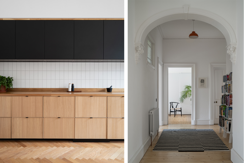
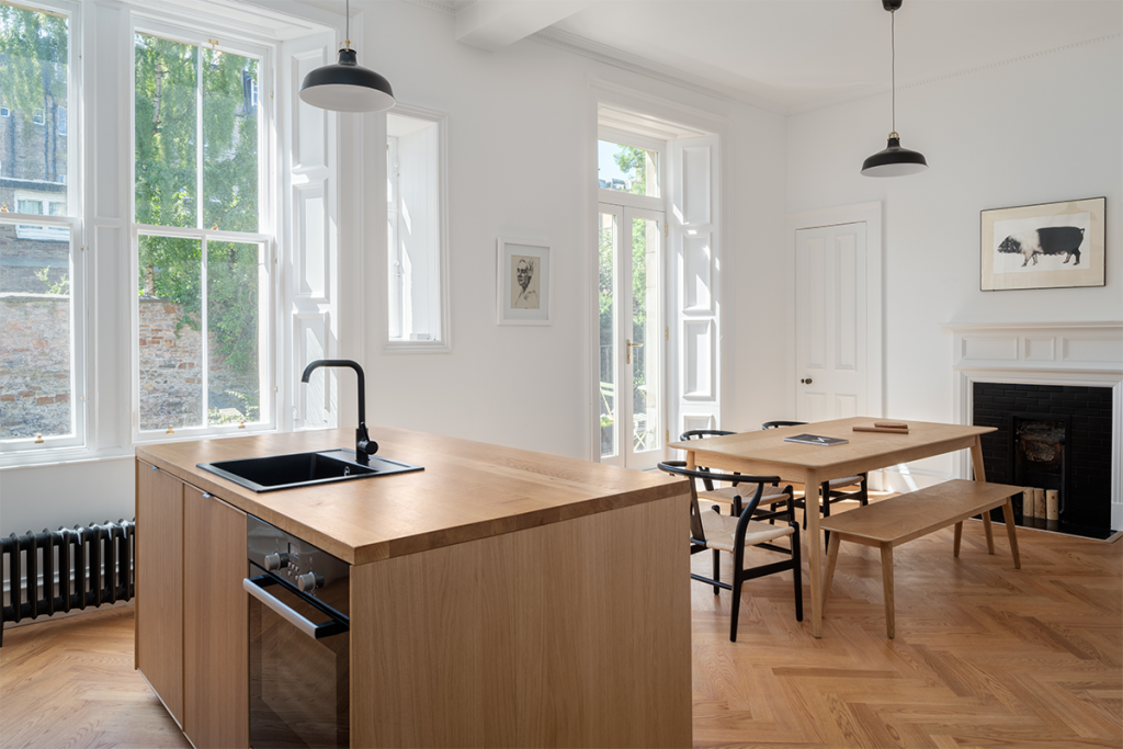
“There was no connection between the kitchen and the living space and the bedrooms were spread apart at the far corners of the property.” Add to that no outdoor space and only one bathroom and the couple knew there was much they could do to drastically improve the way the apartment functioned. The plan was to create two open-plan living areas, one a kitchen-diner and the other a drawing room. They began by widening the doorways between the two drawing rooms, in the process encouraging natural light back into the front of the house, and deeper into the heart of the building. Two south-facing balconies, accessed through the kitchen, were created to solve the problem of the missing outside space and a cupboard was repurposed as a second bathroom. “The renovation took around ten weeks and cost just under £70,000,” says Luke. “We were ambitious but were keen to keep the budget below £400 per square metre.”
Mindful of the period detailing but also influenced by Scandinavian design, the pair were determined to show that a minimalist and light-filled space could be achieved within a relatively modest budget. “We retained all of the original features including floorboards, cornices and coving, and the sash-and-case windows were overhauled and draught-sealed. Fireplaces were either replaced or retained as a feature.”
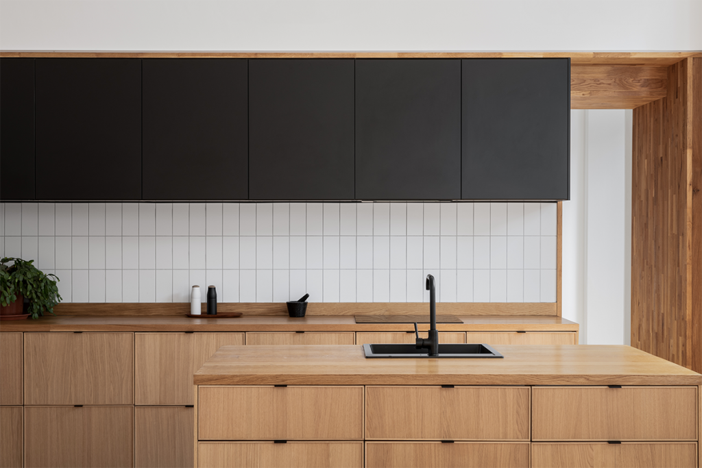
The kitchen is perhaps the best example of how cost savings can be made without sacrificing style. It’s made up entirely of Ikea components: wall-mounted matt-black Kungsbacka cabinet doors combined with lower timber-veneer Ekestad doors. “The Kungsbacka range appeals as it’s made out of recycled plastic PET bottles and reclaimed wood,” says Luke. “The full-stave oak work surfaces, from WoodWorktops, are treated with Osmo top oil every 12 months to keep them in good condition.”

Looking to the work of Norm Architects in Copenhagen, whose clean, subtle aesthetic fits with hard-working spaces, Luke and Joanne employed simple techniques to elevate the sense of craftsmanship, without having to plough lots of cash into this space. For example, by encasing the kitchen cabinets in a stud bulkhead, they appear to be recessed into the wall. This also conceals messy detailing like the cooker’s extractor hood. “The oak surrounds are just standard worktops cut down and used to frame the cabinets and to give the impression of a more expensive, hand-crafted kitchen.”
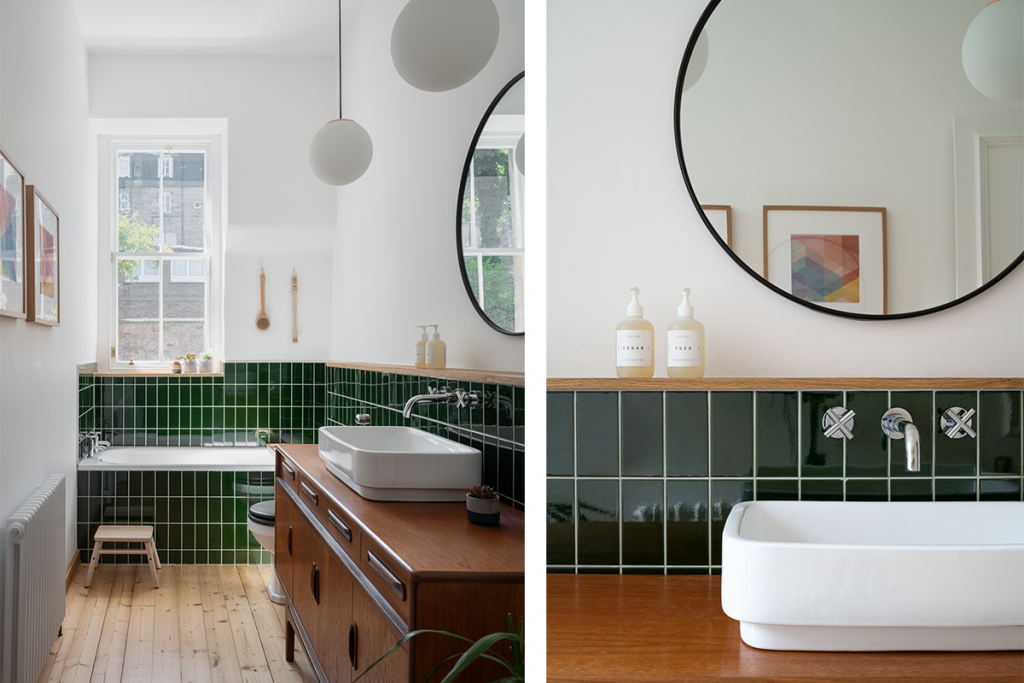
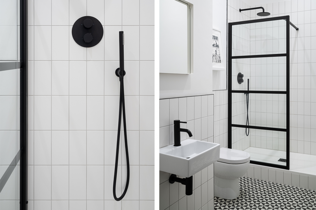
Equally crafty methods were used in the new bathroom space, where a shower room has been formed by expanding a cupboard into the adjoining pantry, with a small utility room formed within the space left behind. Keeping the scheme monochrome, with a black Crittall-style shower screen by Lusso Stone and matt-black sanitary fittings, is in keeping with the mid-century Scandi aesthetic found throughout this home. “In the bathroom, bright green glazed tiles (V&A Racing Green from British Ceramic Tile) and a vanity unit fashioned from a restored 1960s sideboard by Kofod-Larsen for G-Plan gives the room a warmer feel.”
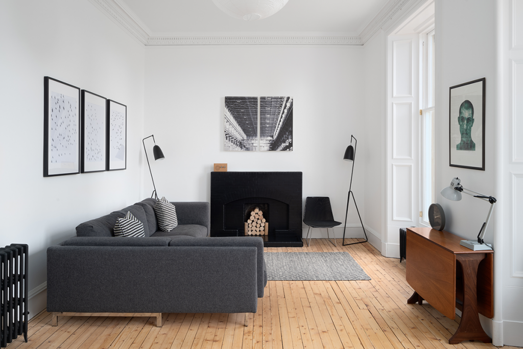
Elsewhere in the apartment, the architects were careful to balance the Victorian sensibilities that these townhouses so wonderfully display with a cooler, more modernist edge. Softened by the introduction of natural materials – a herring-bone engineered oak floor gives cohesion to the space – the adornments are minimal but deliberate and very effective. Reclaimed cast-iron radiators, a duo of fleamarket teak armchairs upholstered in green, an understated dining table and chairs (by IO Living and My Haus) work just hard enough to suggest the aesthetic without overwhelming the architecture in this smart, hardworking home. “The black-framed images are by Thibaud Hérem. When we moved to Edinburgh from London, we took these with us as a little reminder of the city.”
Looking for more? Explore this modern build inspired by Alvar Aalto