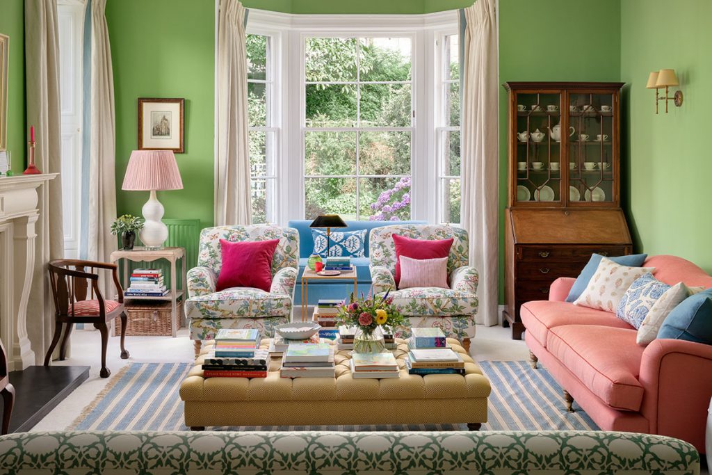
A chilly, unused, north-facing room in a traditional Edinburgh villa is now a welcoming, cosy space for relaxing or entertaining
DETAILS
What A living room in a two-storey detached Victorian villa
Where Edinburgh
Interior design Jessica Buckley Interiors
Photography ZAC and ZAC
Words Gillian Welsh
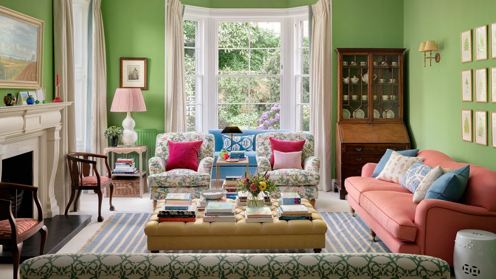
Looking at this bright, warm and welcoming space today, it’s hard to imagine that not so long ago it was a chilly, unused, north-facing room in a traditional Edinburgh villa. Interior designer Jessica Buckley had been commissioned to turn it into something really special and to make it suitable for two purposes: a room that would be comfortable enough to be used every day, yet equally able to function as an entertaining zone on more formal occasions. It looks effortless – but it almost didn’t happen.
The colour that is so crucial to the success of the design scheme is, as Buckley concedes, “not for the fainthearted”, and it took a lot of careful balancing of tones and fine-tuning of the various pinks and greens to create the effect she was looking for.
“This room is very much in my signature style,” says the designer. “It contains all the things I love most: a cosy, layered look, with lots of colour and pattern. Colour is a huge part of what I try to bring to my schemes, and this particular room demonstrates just what an impact it can have.”
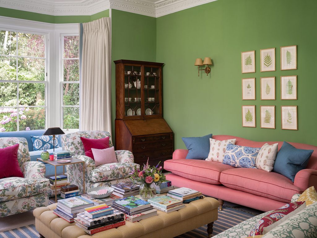
The grassy shade was selected as a reference both to the client’s love of her garden and her appreciation of traditional country-house style. Finding the right green was key, of course, and Buckley and her team considered many different variations, whittling down the options until they settled on this one: Invisible Green by Edward Bulmer Paint. “It has an intensity that creates a real warmth, something the room lacked in its previous incarnation,” she says.
That scheme was dominated by grey-white striped wallpaper, and to start with at least, the client was reluctant to change the walls as they’d only just been freshly decorated by the previous owner. As Buckley’s moodboards took shape, however, it became ever more obvious that the frosty grey stripes had to go. And then the vivid green was proposed: “It was our boldest suggestion, and certainly outside the client’s comfort zone,” admits the designer.
And yet this leafy tone already had a presence in the room, which looks out over the garden’s mature trees; and with Buckley’s assurance that it wouldn’t overwhelm, it got the go-ahead. It is the base, topped with pretty patterned fabrics in various shades for armchairs and cushions to connect with the garden. “The wall colour and the floral fabric were the first choices to be made, and then everything else was selected in reference to them.”
The designer’s technique of layering natural colour with softer hues and familiar motifs has produced a space that’s approachable and characterful, evoking calmness and a sense of contentedness.
It feels as if it has developed organically rather than being put together all at the same time. “This gradual evolution, typical of country-house interiors, was very much an influence on our design choices,” acknowledges Buckley.
The budget was directed towards larger “forever pieces” such as the fabrics and the custom-made sofa, while decorative accessories, cushions and lamps were chosen from “the more modest end of the spectrum, using items we knew would look more expensive than they actually are”.
The upholstered chairs and sofas, classical in shape, are deliberately mismatched to avoid stiffness and formality.
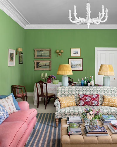
The room is well lit thanks to the large bay and a smaller west-facing window; it is so long, however, that the dining area, in the far corner, doesn’t receive much natural light at all.
To address this, plug sockets were installed in the floor in the centre of the room where a pair of contemporary lamps on the console can be lit. Their spice-coloured shades cast a soft, ambient glow.
Although there’s plenty of seating options – at the windows, fireplace and table – it doesn’t look crowded. “Offering a variety of seating lets your guests choose what is most comfortable for them – not everyone likes an upright chair or a low-down squishy sofa,” says Buckley. “And I always like to make sure that every seat has a table or tray nearby on which to place a book or a drink. It just makes the room so much more usable.”


