The recipe for a happy and harmonious home is clear in this richly decorated Glasgow apartment

Photography ZAC and ZAC
Words Gillian Welsh
An easy route to contentment is to surround yourself with things that make you happy. And happy is certainly how Lynn Strang now feels in her classically styled ground-floor conversion in the west end of Glasgow. When she moved in seven years ago, the two-bedroom apartment was in a good state of repair; the decor, though, while tasteful enough, was sorely in need of updating.
“I wanted a grown-up home, one that would reflect my love of life and colour, and indeed my colourful personality,” she says. “I did have a budget for the work that needed doing, and I stuck to it. But I didn’t pay attention to the cost of an individual item and instead went with how it made me feel. If I loved it, it was in, as simple as that.”
Attracted by the bold use of colour she’d seen in the work of interior designers Chelsea McLaine, she asked the studio to take on her flat. “Lynn specifically told us she didn’t want anything beige or boring, and admitted she needed to be pushed a little out of her comfort zone, which delighted us,” recalls designer Abigail Crowther.

This desire to be braver informed the new scheme, as did the owner’s own look-book, artwork and fashion sense. “Based on her brief (and her fabulous outfit), we quickly realised that Lynn was a colourful character – in the best possible sense – who would be great fun to work with.
We knew we’d be able to reimagine her home as a really special place in which she’d enjoy entertaining family and friends.”
Two rooms were to be tackled: the drawing room, with its ornate cornicing and fireplace, and the massive master bedroom. For the latter, an integrated dressing room was built to house the owner’s extensive collection of shoes, bags and clothes.
This supremely practical storage space is essentially a self-contained pod – minus the lid, so natural light can filter in from the big bay window. It looks as if it is made from solid wood, but has in fact been constructed from particle board (Egger’s Sepia Gladstone Oak).
“Building a standard partition-based dressing room wouldn’t have worked – it would just have looked like a clumsy addition,” explains the designer. “We replicated the original pedimented detail from the door around the top of the pod and added classically inspired panelling to the outside walls.”
The studio’s cabinetmakers had other work to do in this room too. The bedroom door had warped, so an exact replica was made to replace it, with all the original ironmongery reattached.
Missing sections of parquet flooring were meticulously patched in, filling the spaces where a hearth stone had been removed by a previous owner.
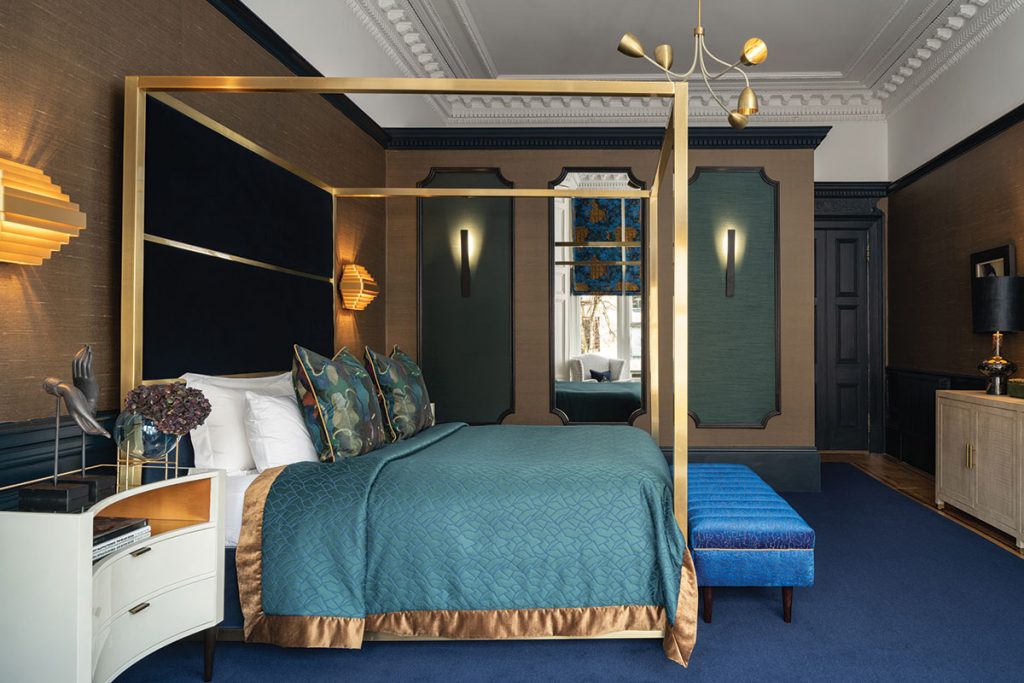
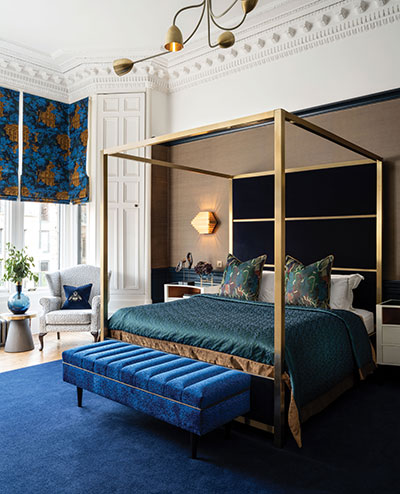
The key colour in the scheme is ultramarine, which stemmed from the Nobilis fabric used to make the roman blind. The other tones all complement this: the bronze-toned Arte wallcovering provides a neutral yet glamorous backdrop, punctuated the jewel hues of the sapphire ottoman and the emerald bedspread.
The glossy bedside cabinets ramp up the opulence factor, as do Heathfield lamps with liquorice velvet shades lined in gold.
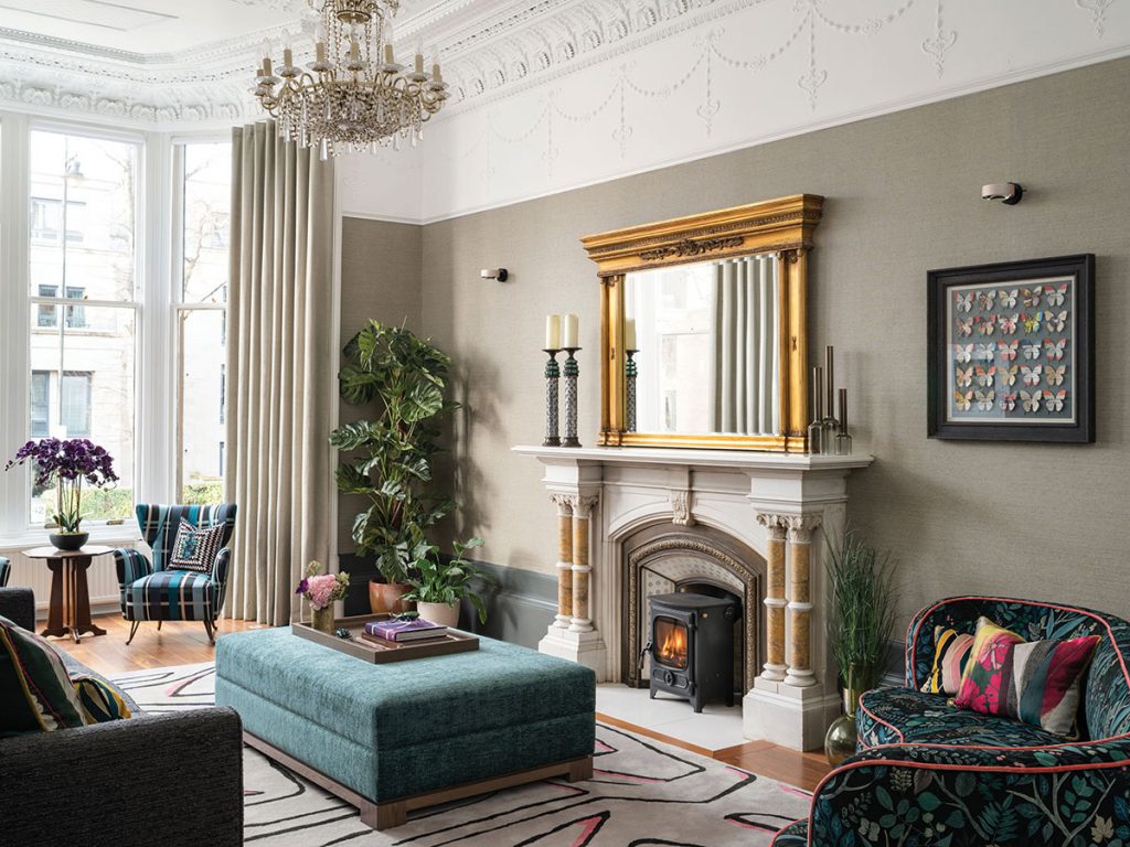
If the bedroom is relatively restrained, the drawing room goes all out for maximalism. “It was quite a challenge combining the grand scale of the rooms with the intimate, relaxing atmosphere we were looking for,” says the designer.
Some of the owner’s treasured pieces of furniture and art were incorporated into the scheme, but not her brown leather sofa – it was just too low-slung to suit the room. In its place is a curved sofa by Julian Chichester, upholstered in a bold blue and green Christian Lacroix velvet. The repetition of pink accents throughout the room takes the eye on a journey from one piece to the next.

The studio’s cabinetmakers had other work to do in this room too. The bedroom door had warped, so an exact replica was made to replace it, with all the original ironmongery reattached.
“Because these rooms are so big, natural light does not necessarily reach every corner, so we had to really think about the best way to light them,” says the designer.” A variety of styles has been used, from the asymmetric Porta Romana pendant in the bedroom (to disguise the asymmetric nature of the room following the installation of the dressing room), to the next-generation LED Occhio wall lights in the drawing room, which cleverly highlight both the ornate cornicing above and the quirky artworks below.
That artwork has emotional resonance for the owner. “These pictures all really spoke to me at the time I bought them – and they still do,” she says. “The Margaretann Bennett painting in the bedroom, for example, reminds me of a great night out in the 1990s. It makes me smile.”
A successful, cohesive refurbishment like this doesn’t happen by accident. Abigail Crowther surveyed the site thoroughly, checking every detail including ease of access. This, she discovered, would be limited by the layout of the hallway – and that meant two of the very large pieces of bespoke furniture (the teal cabinet in the lounge and the bleached timber cabinet in the bedroom) had to be brought in via the windows. “The one for the bedroom weighs 120 kilos, so it really was a challenge – it took four guys to lift it,” she says. “It was nail-biting, but so worth the stress.”


