The client wanted to create zones for different activities and have a space that reflected his personality
BRIEF The flat, bought off-plan, was all white. The client wanted to create zones for different activities – chilling in front of the TV, having friends or family over for lunch, cocktail parties – and have a space that reflected his personality.
DIMENSIONS Kitchen-dining-living, 50sqm; drawing room, 35sqm
WORKS REQUIRED The kitchen, utility area and dining space were all kitted out.
BIGGEST CHALLENGE Finding furniture that could hold its own in these large spaces, to give the feeling of luxury without breaking the budget.
OVERALL BUDGET £15,000.
DESIGNER Anna Campbell-Jones of Habitus Design, www.habitus.design
Photography Steven Mclaren
Words Gillian Welsh
A brief to turn a generic space into a more personal one is the kind of task interior designers are given every day. Most will take their cue from the client’s existing furniture and decor, gleaning hints about their personality from the pictures on the walls or the colour of their cushions. So Anna Campbell-Jones of Glasgow’s Habitus Design had quite a challenge on her hands when she first met the owner of this flat, Stephen. “He only had a sofa, a table and a couple of crazy Art Deco lamps, which he wanted to be part of any new scheme,” she recalls.
He had only recently moved into the three-bedroom drawing-room flat on the first floor of a converted town-house in the Finnieston area of the city. The developer had done a decent job, but it didn’t feel like home. Once client and designer got talking, Campbell-Jones began to get a clearer picture of what she thought Stephen would like. “He told me he wanted the flat to be a sanctuary from the stress of his demanding job,” she says. “But he also likes entertaining a lot; he wanted the look to be Art Deco with a mid-century twist, with a bold use of colour to tie it together. He said he felt he had flamboyant taste tendencies, but he did ask me to stay on the right side of Liberace!”
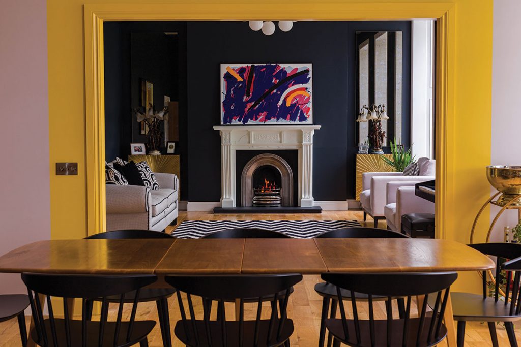
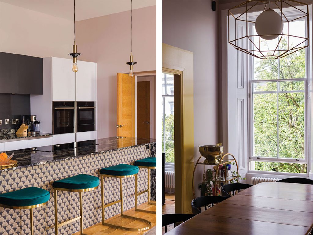
The focus of her work was the open-plan kitchen-dining-living room and the drawing room. The developer had knocked through to connect the two, but the opening between them just wasn’t tall or wide enough to feel completely in proportion with the magnificent ceiling height. To avoid the expense and planning issues involved in changing this, Campbell-Jones’s clever solution was to simply make the opening look bigger by painting the surround in Farrow & Ball’s sunny yellow Babouche, a striking contrast with the dark and moody Railings used on the walls of the drawing room.
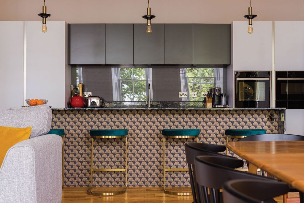
The kitchen’s position suited the sociable layout. “It’s the first space you see as you enter the apartment and it’s very much the hub of activity,” says the designer. The Bauformat kitchen had been installed by the developer; Habitus spruced it up first by applying an Art Deco-style BN wallcovering to the front of the island and then giving the walls a coat of Farrow & Ball’s Peignoir paint, its pale grey-pink tone nicely offsetting the white kitchen units.
The paint also works well with the splashback; the developer had only installed a small upstand, which Stephen had replaced with back-painted glass from Forsyth Glazing. The colour, Astral Gray, has a hint of metallic sheen and reflects the windows and trees behind. “He says he picked it to give him something interesting to focus on when he’s doing the dishes.” The granite worktop was specially heat-treated by the supplier so there’s no need for it to be resealed each year. A key element of successful open-plan living was already in place: “Good extraction is vital with connected spaces like this – in this kitchen, there’s a discreet high-powered fan (similar to a bathroom extractor) in the ceiling.”
Campbell-Jones decorated the rest of the room too, mixing furniture from various decades of the 20th century as a counterpoint to the building’s Victorian character, while hints to the past have been recreated with a dado and the application of satin and matt paint. The wide engineered oak floorboards are from Atkinson & Kirby’s Caledonian range, installed by the developer.
The large Coco sofa is by Duresta and the velvet armchairs are from Sofa.com. The painting above the fireplace is by Florentine artist Walter Fusi, who Stephen discovered after seeing one of his works in the home of a relative in Italy; he loved this one as he felt the abstract nature and vibrant colours matched his personality. Among the other artwork on the walls is a print by the great Erté, giving a nod to the other Art Deco elements in the room, such as the Ziggy sideboards from Swoon.
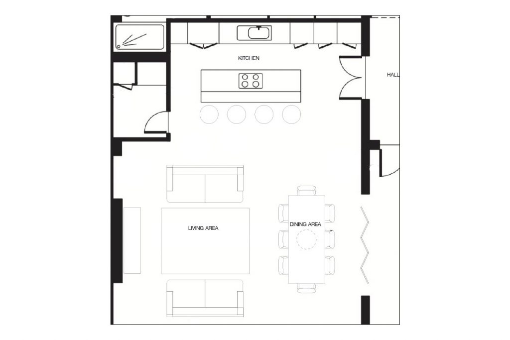
KITCHEN
-
The owner is a keen baker and particularly enjoys his Great British Bake Off-style Neff slide-and-hide oven.
-
The back-painted glass splashback is from Forsyth Glazing in Astral Gray.
-
Blanco sink and tap.
-
The worktops are Indian Black granite from the Sensa range by Cosentino.
EXTRAS
-
Two bins, for general waste and recycling, are integrated into a slide-out cupboard.
-
The island contains the hob. This means the owner can cook while chatting to his guests on the bar stools.
BUDGET BREAKDOWN
-
The floors and kitchen were in place already.
-
Decorating, £1,500.
-
Reclaimed fireplace (from Glasgow Architectural Salvage) and associated work, £3,000.
-
Plumbing (to move radiators), £350.
-
Electrics (alterations and installations), £1,000.
-
The remainder of the £15,000 budget was spent on rugs, lighting and furniture.
THE DESIGNER’S NOTEBOOK
Anna Campbell-Jones discusses the project’s peaks and troughs
-
The biggest expense Installing the living-flame gas fire, and sourcing an antique surround of a scale that would look as if it had always been in this classically proportioned space.
-
Most nail-biting bit Trying to find the gas supply for the living-flame fire without lifting the flooring. A genius gas man found a way to connect it by lifting out the boiler in the utility room.
-
Most difficult Finding a vintage unit the right size, style and price to place under the TV.
-
Most rewarding part of the process Successfully integrating the pieces of furniture that the client already owned and that had meaning to him – the large black-and-white sofa and the heirloom Ercol dining table, the latter complemented by Hay chairs sourced from Tojo.


