BRIEF To create a family kitchen that would feel timeless but contemporary. The owners wanted it to be a space for everyday family life but also one that would work if they were entertaining friends for dinner. The design needed to fit into the new extension to their Stirlingshire home.
WORKS REQUIRED The kitchen, utility area and dining space were all kitted out.
BIGGEST CHALLENGE Creating a social hub to serve a variety of purposes, all while maintaining a homely feel.
DESIGNER Cameron Interiors, www.cameroninteriors.co.uk
Photography Douglas Gibb
Words Miriam Methuen-Jones
Once you’ve built your dream extension, how do you go about filling it with all the things you want? A blank slate can be inhibiting when there are so many different styles and layouts to consider. The owners of this fresh new addition knew they needed professional input, so they turned to Cameron Interiors to help them devise a classic yet contemporary kitchen that would satisfy their needs as a family.
This meant creating dining spaces for them and their children and a lot of room for cooking communal meals. They also love to entertain, so a key part of the brief was that the space should be able to accommodate dinner parties and other get-togethers. With all this in mind, Kirsten Robeson, MD at Cameron Interiors, got to work drawing up plans for a colourful space that could be used in many different ways.
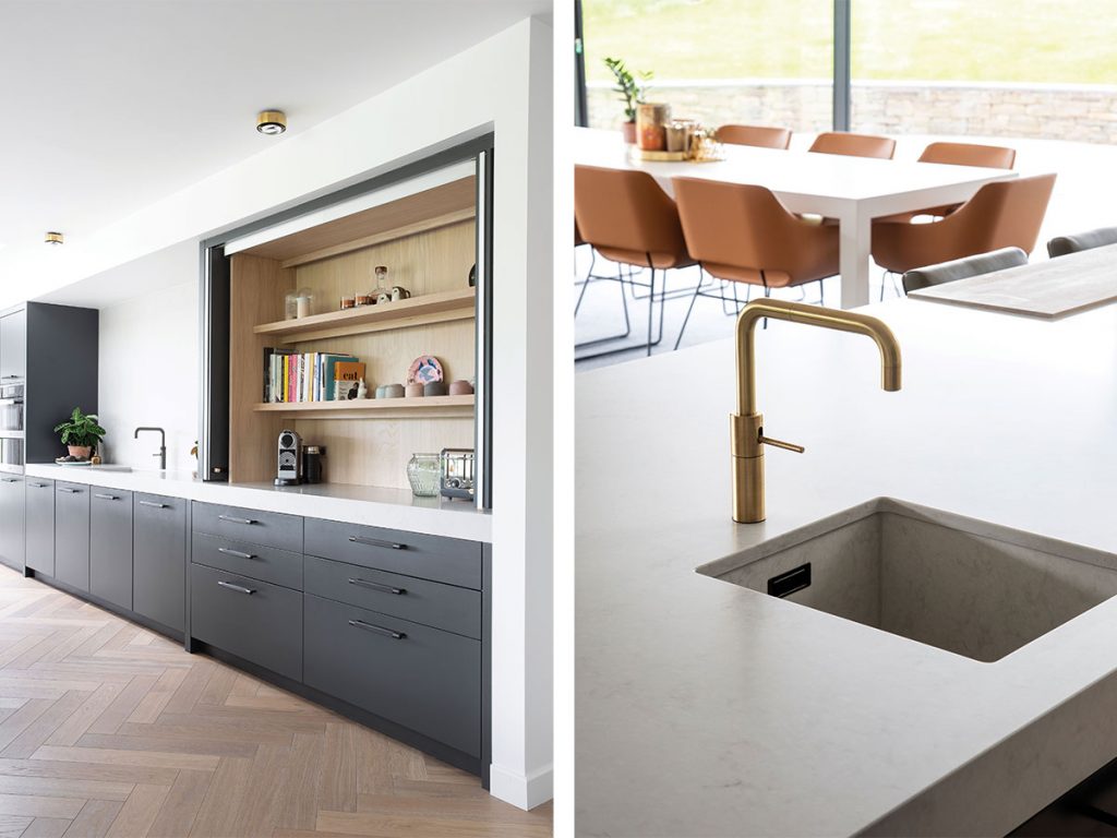
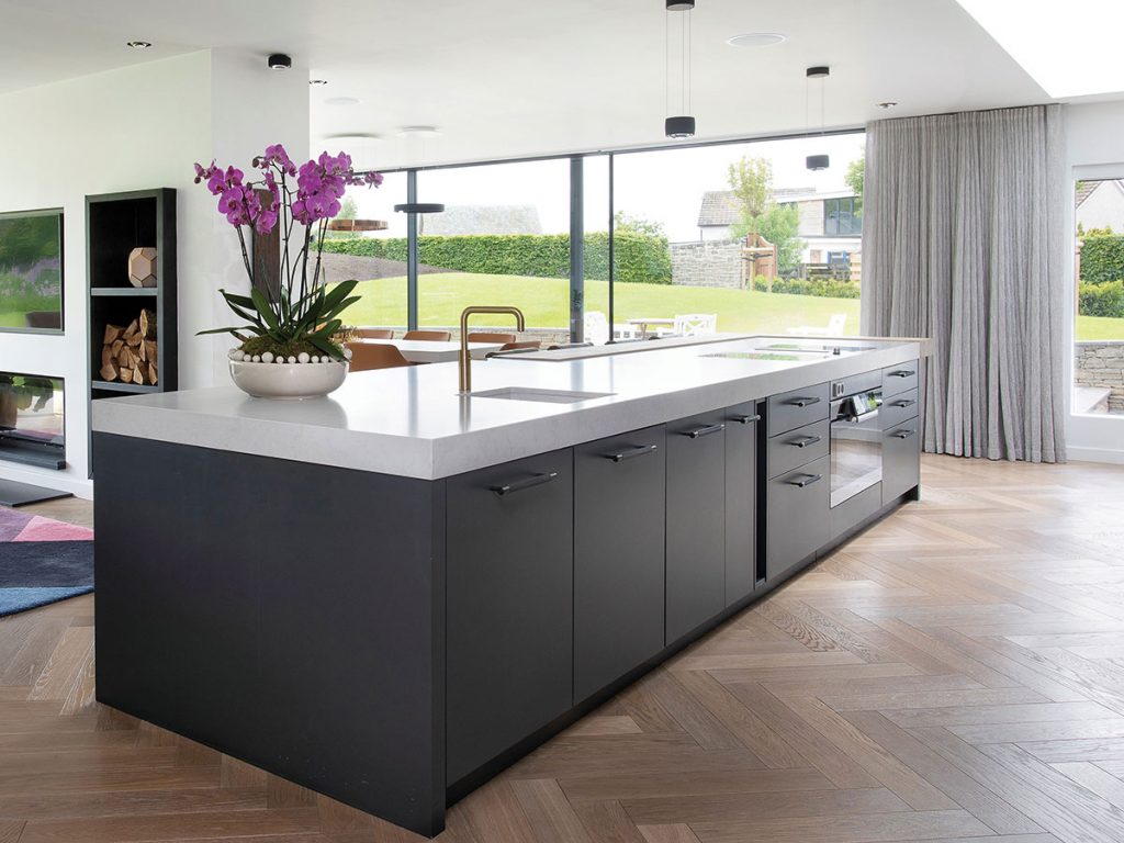
She specified bespoke cabinets and plenty of work surfaces as a starting point. All of the cabinetry along the back wall was handmade and painted by Cameron Interiors’ furniture partners in England. The natural oak herringbone flooring was chosen in a lighter grey to complement the cabinets.
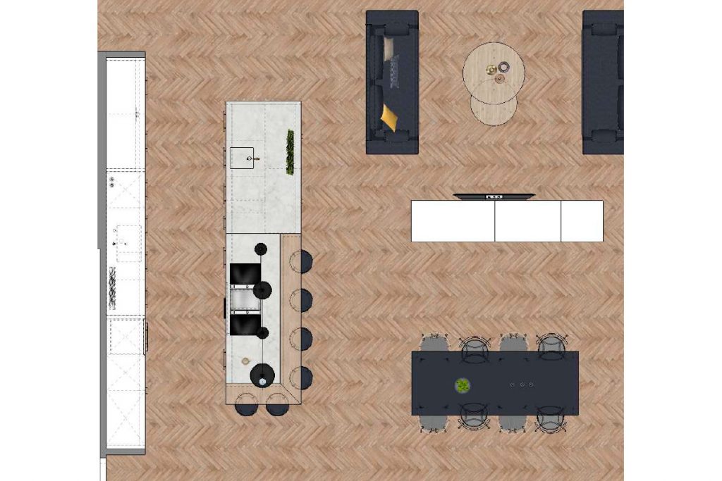
The interior of the units, drawers and adjoining pantry were all made from grey oak specifically matched to the flooring in order to pull everything together. There are two long sections of worktop ripe for any budding chef to conquer, and since it was important for the space to be multifunctional, a Spekva solid oak breakfast bar was incorporated into the central island as a place to enjoy informal dining.
As a bonus textural detail, the breakfast bar was given a white oil finish to match the flooring. The main body of the island is in a cool grey Caesarstone; the integrated sink, made from the same material, appears almost to disappear into the surface, leaving an uninterrupted view from the kitchen into the dining area and living room, allowing the cook to still feel part of the conversation.
There are a few treats dotted about. For example, there’s a pantry unit (distinct from the full-blown pantry to the rear of the room) containing all the accessories and appliances that usually clutter up kitchen worktops – the toaster, coffee machine and even some cookery books. (The need for a kettle was eliminated altogether by the installation of two Quooker taps.) The unit has lots of thoughtful touches, such as internal LED lighting and pocket doors that slide out of sight when open.
KITCHEN
-
Caesarstone worktops in London Grey were chosen, with matching sinks to give a sense of consistency.
-
There’s a SubZero integrated fridge with water dispenser and a Liebherr integrated freezer.
BESPOKE DETAILS
-
All cabinetry was handmade and painted by Cameron Interiors’ furniture partners in England.
-
The Quooker taps were custom painted to match the room.
-
Oak herringbone floors from Strathearn Stone & Timber complete the look.
EXTRAS
-
A pantry to the rear of the main kitchen houses a Gaggenau integrated wine fridge, custom shelving, a further worktop, and clever hidden storage.
-
Unframed doors, a flush hob and lack of gaps between the breakfast bar and island work top were chosen to avoid dirt traps
Aware that this open-plan space would be hosting regular dinner parties, Kirsten was keen to minimise noise and lingering food smells. With that in mind, a Bora Classic hob with an integrated downdraft extraction system was chosen, meaning there was no need for a typical extractor visible overhead.
Even the less glamorous side of entertaining has been considered. The Caesarstone worktops are nonporous, making cleaning extremely easy. Kirsten also purposely chose unframed doors so there was nowhere for dust to collect. Similarly, the flush hob and lack of gaps between the breakfast bar and island worktop were designed to avoid dirt traps.
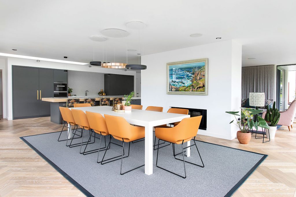
The dining area is an immediate showstopper thanks to the combination of a relatively simple white table from Bulthaup and ten of Tonon’s Lili chairs in tan leather. These chairs were specifically chosen for comfort, to encourage diners to linger around the table after eating, and for practicality, since the leather is durable and easily wiped clean.
They were originally considering pink, but Kirsten and the client settled on this orangey hue as a more traditional choice that would stand the test of time. The colour works extremely well with the decor of the living area as well as brightening up the grey kitchen cabinetry. This entire dining area is washed by the light that streams in through the SkyFrame windows, allowing the green of the garden to become another feature.
All in all, the clients were left with a flexible space which is playful through its use of colour, practical for their everyday requirements, and welcoming for gatherings of all kinds.
THE DESIGNER’S NOTEBOOK
Planning to transform your kitchen? Kirsten Robeson offers her top tips for the process.
-
Find a good designer: Make sure you click with the designer, and that they listen to you. You should feel able to tell them exactly what you like and – often more importantly – what you dislike. A good designer will always take on board your suggestions and preferences.
-
Picture it: When you start creating your dream kitchen, really try to imagine yourself in the space. How will you and your family use it? I do this for every kitchen I design as it helps with the final flow of the space.
-
Consider the small things: We’re often caught up in the big things like cookers, islands and layout – but it’s often the little things that make a difference. For example, consider where the bin is in relation to your sink; dribbling wet teabags to the bin every time you make tea will drive you crazy.
