Defiantly contemporary yet evoking time-honoured design, this Tiree new-build pays tribute to the traditions of the Hebrides
DETAILS
What A contemporary addition to a traditional cottage
Where Isle of Tiree
Architect Roots Architecture
Structural engineer Woolgar Hunter
Internal fit-out David Vale
Photography David Barbour
Words Caroline Ednie
Heritage might not be the first word that springs to mind when you see this striking new-build on the Isle of Tiree, but paying tribute to both his own roots and the traditional building style of this corner of the Hebrides is exactly what Micheal Holliday of the appropriately titled Roots Architecture has done.
“The original house here was my gran’s, and was an important part of my childhood,” he explains. “When I inherited it four years ago, I really wanted to revamp it to suit modern lifestyles. However, like many traditional houses on the island, the cottage had been built according to the Gaelic motto of ‘back to the wind, face to the sun’. That meant it was sheltered from the prevailing wind but failed to take advantage of the views.”
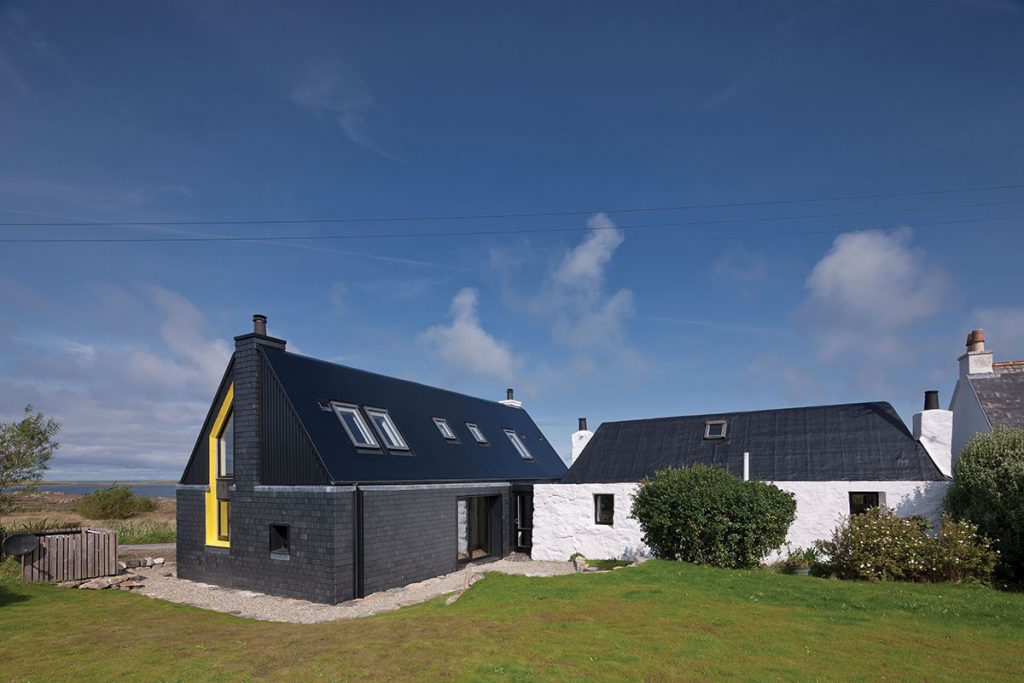
Holliday’s solution was to retain the cottage, converting it into a self-contained one-bed ‘granny flat’, then add new living accommodation in the form of a two-storey extension. This sits at a 90-degree angle to the original building and has a much better connection to the sea and island views.
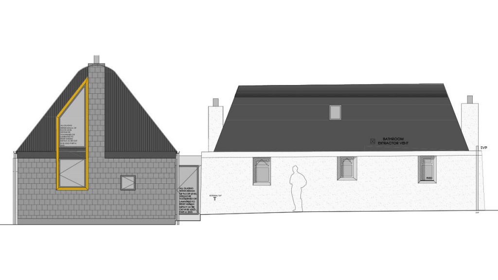
“The main design concept was what a traditional Tiree house would look like if redesigned for the 21st century,” says the architect. “Island houses have really thick, textured walls, with deeply inset windows. Roofs are lightweight, with curved ridges and no overhanging eaves.”
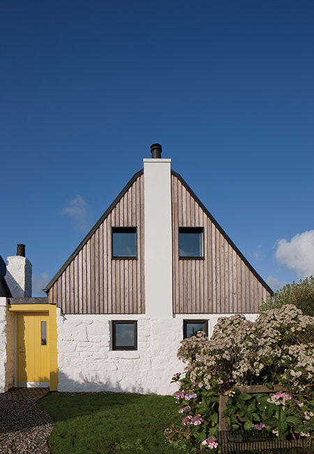
These details have been reimagined in the design for Four Winds, as the house is known. It incorporates the original stone walls from the adjoining cattle byre – these were retained and restored so that it feels as if the extension has been slotted into the existing wall, connecting it to the cottage and the site.
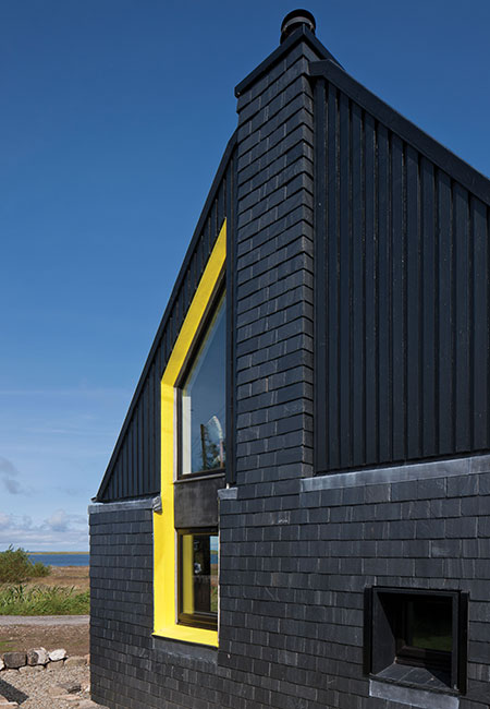
Heavy, slate-clad walls, recessed eaves and deep-set windows echo the local vernacular, as does the distinctive curved roof ridge – the islanders’ aerodynamic response to the Atlantic gales. Splashes of colour found in the landscape – yellow for gorse and buttercups, red for tractors and sheds – break up the monochrome palette.
Despite its larger size and higher roof level, the local planners viewed the plans for the extension sympathetically. “As the ridge lines of the new-build and the existing house wouldn’t be viewed side by side due to the 90-degree angle, they were happy to proceed with the overall design,” says Holliday.
The construction was unusual in that the project included some ‘live-build’ courses where architecture students came to Tiree to learn construction techniques (run by Tog Studio, a Roots Architecture initiative). “Effectively, you’re the client, architect, teacher and lunch co-ordinator! It’s really intense but it was a lot of fun, and everyone who came up was fantastic, really hard-working and keen to learn.”
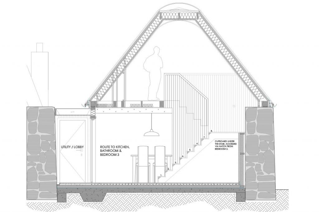
Four Winds was constructed via a ‘breathing wall’ timber kit with sheep’s-wool and wood-fibre insulation. The vertical slate and larch cladding offer shadows in the sun and texture in the rain.
“The fibreglass roof gives the same sleek black aesthetic as the traditional tarred felt roofs on Tiree, but it’s much more durable, with a 25-year guarantee,” says Holliday. “The curve of the ridge was very specific and had to be a certain way; it would have been difficult to find an off-the-shelf product that fitted that radius. The fibreglass allowed us to achieve this and all the bespoke finishes that we designed such as the sunken rooflights.”
Laying the roof was a real challenge. “It was very weather-critical – you can’t have any moisture at all in the fibreglass. This meant it had to be done in a day; overnight would have been dewy and the fibreglass wouldn’t have bonded to the roof. We had a team of joiners who started laying the plywood roofing sheets at 6am, with the fibreglassers following on from 10am. You have to be brave!”
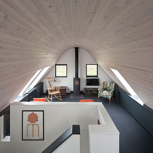
Inside the new element is an open-plan kitchen, two bedrooms and two bathrooms, all on the ground floor. A timber ‘core’ incorporates the stair, building services and storage. Upstairs is one large living and dining area with a curved ceiling to echo the ridge, with rooflights looking out to sea.
“To help with the finishing work we employed David Vale, a local cabinetmaker who’d previously built super-yachts,” says Holliday. “The pine timber ceiling has been applied with the utmost care using a laser level to ensure all the lines run through perfectly. It took a huge amount of expert craftsmanship to install it. We applied a light wash to it as we wanted the roof to feel light, almost as if it had been dropped on to the heavy stone walls. It feels delicate, as though it’s made out of fabric or paper. Painting it would have hidden the grain and knots and the craftsmanship.”
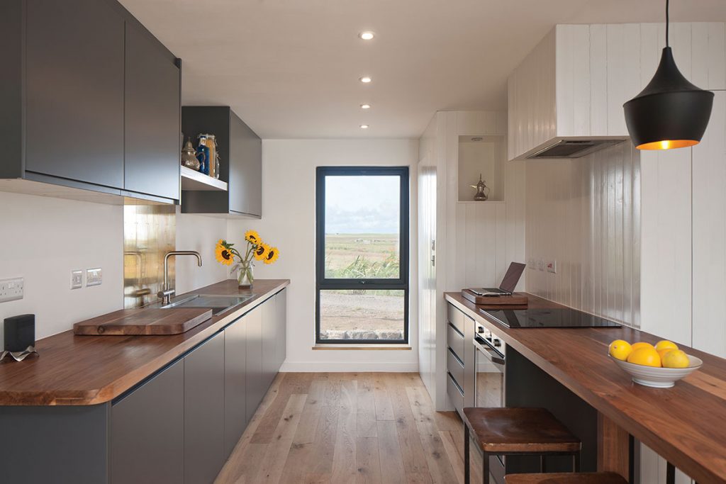
Other key finishes include walnut kitchen worktops, chosen to provide a rich and natural contrast to the clean monochrome walls and units. The splashback, made from reclaimed brass door-kicks, reflects the light and ties into the brass details in the bathrooms, skirtings and door handles. The window sills have been made from old snooker tables.
Tadelakt Moroccan plaster walls give a sleek polished texture to the bathroom and bedroom walls and were finished by Holliday’s former partner, Lynne Cox. “We were keen to reflect the architecturally heavy walls internally, to make them feel as monumental on the inside as they are externally,” he says. “We remembered a holiday we’d had in Morocco where we’d admired Tadelakt plaster walls.
Lynne spent a week with Goldtrowel in Essex learning how to do it herself – she is only the second person from Scotland to go on this training course. It involves applying three different layers of plaster where you can vary the amount of dye in each layer to get different depths of colour; you can then scrape it back and polish it to get that wonderful smooth finish. It’s a real work of art on Lynne’s part.”
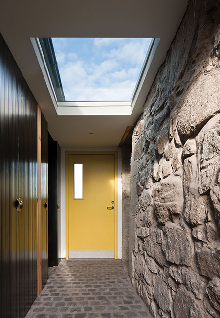
The junction between the cottage and extension is a shared entrance. “It’s like an air lock, standing between the rough-textured stone of the old house and the glassy near-perfect wood finishes of the new house,” says Holliday. The reclaimed stone cobbles are perfect for muddy wellies and damp jackets.
The house has an air-source heat pump, with under-floor heating downstairs. “We didn’t want be reliant on high-tech systems that we couldn’t repair ourselves, or have to bring over specialists from the mainland to fix any problems,” says the architect. “We wanted to make it as simple as possible to run.”
The project took two years to complete. “Living on an island requires you to think in a lot more detail than you would if you had a builder’s merchant on your door-step – you’re constantly working out what will physically fit on the lorry and boat. We had weekly deliveries that we carefully sequenced, always thinking ahead. I’m an architect, not a house-builder, so it was a roller-coaster journey. And living on a building site for a year and a half was tough,” he concludes. “But it’s so gratifying to see the architectural ideas and years of labour come together in such a beautifully crafted house.”
