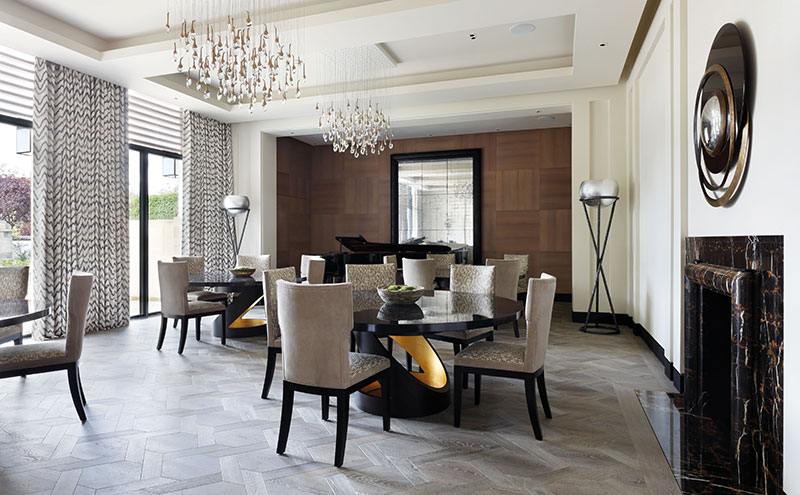
Sensual curves, elegant proportions and flawless interior design scheme make this a modern mansion like no other
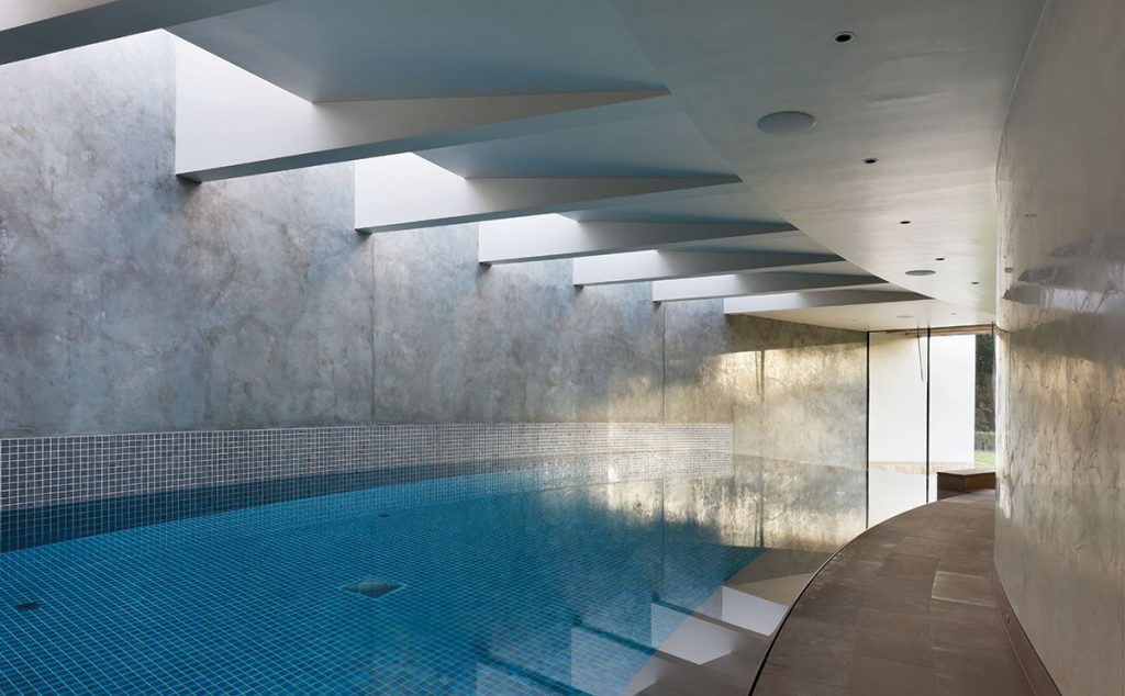
DETAILS
Photography Alexander James
Words Catherine Coyle
Does your home have a split personality? Most do. Family nest, home office, place to host, place to kick back – it will be performing a multitude of functions every day, some more successfully than others. Having enough space so that everything works in harmony, it seems, could be the very definition of luxury in our modern age. If that’s the case, this house is as luxurious as it gets. Built from scratch to a clear brief, following up with an interior design scheme that gives each room its own well-defined identity, it has a monumental 16,200 sq ft of floor space.
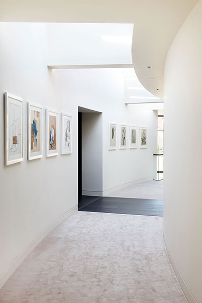
Taking three years to complete, it’s the kind of house most of us can only dream of. It’s a complex structure, full of character and in many ways utterly unique thanks to its curved form, with a wonderfully peaceful and secluded setting. “The circular design had already been established by the architect, James Mate at Wildblood Macdonald, by the time we started work,” says Mark Gillette, who was responsible for the interiors, “so we decided to incorporate as much of the curve as possible to the inside of the house.”
The brief was challenging: the owners, a retired couple, needed big spaces to accommodate extended family gatherings and be comfortable for large fundraising events, but it couldn’t just be an echoing museum devoid of warmth: the house also had to work for them as their home.
One way to find this balance was to have a more formal grand façade on the street side, with the rear of the property containing the more intimate family spaces. The skills of the architect and the designer are at the heart of getting this blend right.
“It was an incredibly complicated structure,” remembers Mate. “In essence, it consists of a massive concrete base with a steel frame sitting on top. The solid front to the street then dissolves to the rear, giving way to a curved timber box that almost appears to be floating. It is contemporary and cutting-edge but also very liveable.”
Gillette came to the project two years’ after Wildblood Macdonald had begun, but his contribution has been crucial to its success. One of his central concerns was to give this new-build a personality that wouldn’t date. “We were responsible for the overall perspective – my team and I had to create the character of the house and make it into a home, ensuring there were user-friendly and intimate spaces with elements of luxurious finishes,” he says.
“It was essential to avoid having any vast, austere spaces where there could be noise transfer.”
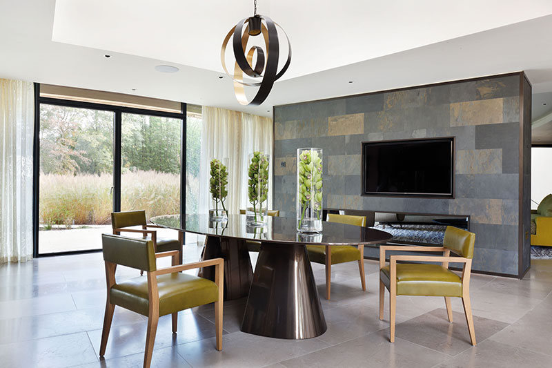
On the ground floor, between what is now the family lounge and the dining room, he built a wall to house the audio-visual system with a fireplace and decorative firebox below to connect the two areas. The slate wall becomes a focal point and helps with the acoustics, creating a more intimate atmosphere. The partition is framed in bronze, and there’s a warmth in the natural tone that reappears time and again throughout the scheme.
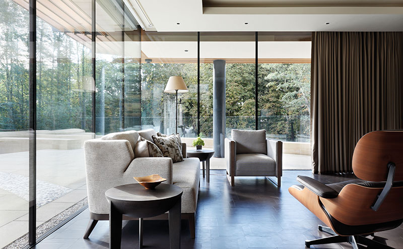
On the sitting-room side, two oversized Promemoria Butterfly armchairs have been customised in a Dedar linen and edged in a green Edelman leather that matches the Rubelli-covered lime green velvet sofa. “Most of the furniture, interior architecture and cabinetry is bespoke to give the necessary luxurious finish and to work with the building’s curves,” points out Gillette.
The study is the epitome of understated elegance, the tone set by a bespoke chocolate-brown leather floor by Element 7. The owners chose the sofa, side tables and chairs from French furniture manufacturer Ecart after Gillette had taken them on an extensive buying trip to Paris.
“I always encourage my clients to visit makers and craftsmen in their studios, and, where possible, to commission pieces from them,” he explains. There is a diverse selection of furnishings from a variety of European suppliers throughout the house, giving it a distinctly international flavour.
The pared-back simplicity of the interior belies the skill and detail that has gone into its planning. Some of the ceilings in the ground floor, for example, have been lowered to accommodate services and other necessities. Rather than trying to disguise this, Gillette decided to make a feature of it; the drops now create wonderful architectural shadow lines, like a reverse coving, and mean there is no risk of the ceilings looking like vast, flat plains.
The kitchen has its own striking touches too: everything follows from its gently curving wall – the Guido Blue polished limestone floor by Stone Age has been cut to follow the curve, as have the units by Artichoke. A customised Eucalyptus pendant light by Ochre casts a warm glow onto the island’s Calacatta marble work surface.
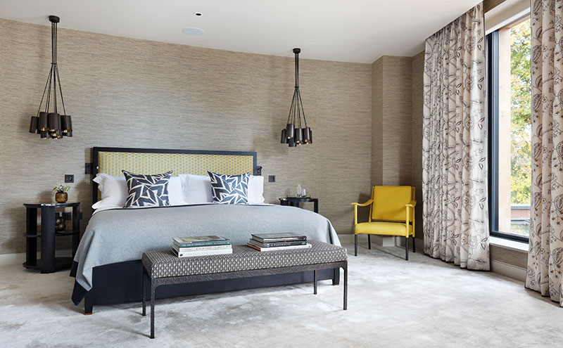
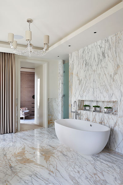
There are five bedrooms on the upper floor, where a ‘bridge’ gives views into the dining room below. The triple-aspect master suite – bedroom, bathroom and dressing room – enjoys wonderful views of the gardens and is bathed in natural light. Gillette exploited this with a hand-painted silk Fromental wallpaper that elegantly brings elements of nature inside. There’s more Calacatta marble in the bathroom, bookmatched this time to create the classic butterfly design.
Edinburgh cabinetmaking firm Laurence McIntosh collaborated closely with the designer, supplying the doors, architraves and all of the built-in furniture as well as fabricating many delicate custom veneers with unusual finishes. The Duddingston-based architectural joinery specialist has a strong relationship with Gillette’s interiors company, and is often the first port of call when a project requires quiet, understated luxury.
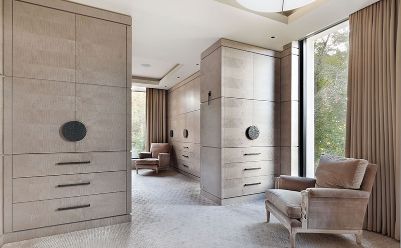
This can be seen in the dressing room – a work of art in silvered sycamore built by Laurence McIntosh’s skilled cabinetmakers to Gillette’s specification, featuring hammered door furniture by Ged Kennett that subtly repeats the circle motif. The wardrobes are cedar-lined; the timber is a natural moth-repellent and gives off a warm woody scent.
“The grain has been cut in different directions to give the shadow lines that appear like stripes,” notes Gillette. “It’s magnificent.There are fewer artisans around these days, so working with them gives clients a story and an emotional connection to their home that is priceless.
