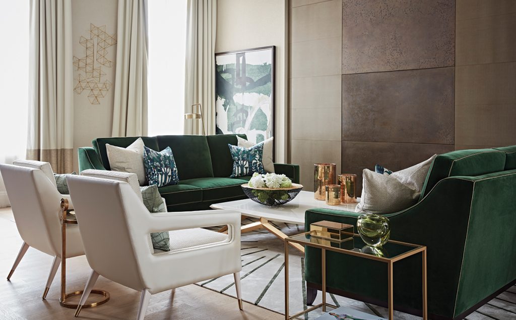
BRIEF This living room was part of a show apartment at a recently completed development. A strongly artistic, eclectic and vibrant theme was requested, as the project was launching at same time as the Frieze Art Fair.
BIGGEST CHALLENGE The angled walls meant it was tricky to find furniture to fit the space. The aim was to draw the eye away from the irregular shape of the room as well as from the low bulkhead on a third of the ceiling.
DIMENSIONS 38 sq.m.
BUDGET Approx. £60,000
DESIGN Taylor Howes
Of all the rooms in a house – and in a way that would be just unthinkable in a kitchen or a bathroom – the living room is perhaps the only one where aesthetics could justifiably take precedence over practicalities. Even then, it can’t be all form over function if the space is to have any kind of longevity. Nevertheless, the key parts of the brief for this impressive living room were that it should be heavily and obviously influenced by art, that it should make an instant impact, and that it should look and feel deeply luxurious.
One reason for the emphasis on its visual qualities is that it’s part of a showhome. The client, a property developer, had picked out three of the apartments at its redevelopment and commissioned design firm Taylor Howes to give them interiors befitting of the location and the building’s grand scale and history. The focus on art was a neat tie-in with the Frieze Art Fair, the annual celebration of the best in contemporary art from around the world, which was opening at the same time as the new apartments were being launched for sale.
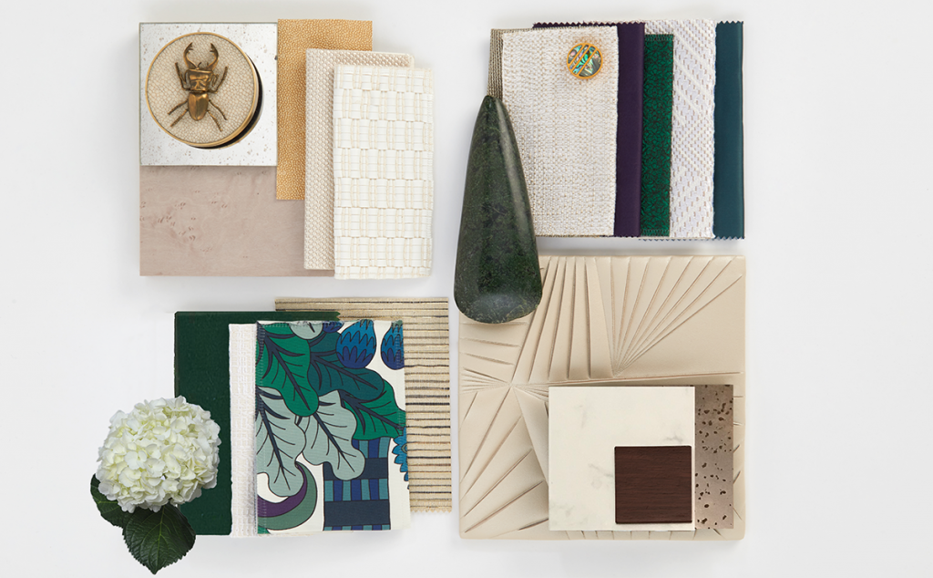
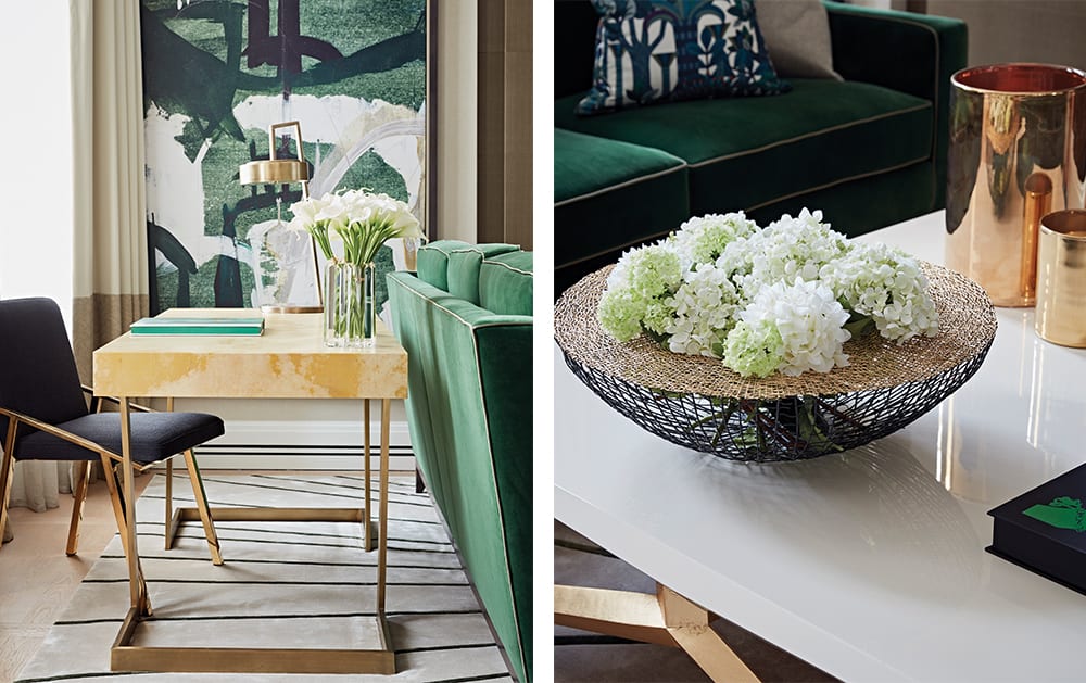
Each of the show flats was to have its own individual style, but all three were to have a scheme based around bold colours and rich, jewel-like tones. For this particular living room, malachite – an emerald-like crystal – was the inspiration for the overall colour palette, as can be seen in the rich green upholstery of the sofas, the soft furnishings and the artwork.
The team at Taylor Howes came up with the necessary eclectic mix of bespoke pieces and dramatic artwork, but they also used their considerable skills to ensure the room would be a space to be enjoyed as well as admired.
Most of the £60,000 budget was dedicated to sourcing and designing furniture that would perfectly suit the interiors. Some £6,500 went on window treatments, £5,000 on decorating, and £6,000 on artwork and accessories.
FURNISHINGS
-
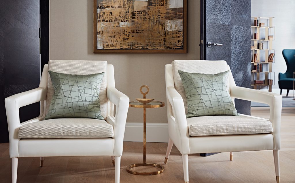
The art on the walls is complemented by the striking rug, the shapely chairs and the sculptural floor-standing lamps.
-
Statement pieces from designers such as Marc de Berny, who made the geometric table, and Tom Dixon ensure this room feels unique and very personal.
PALETTE
-
The materials palette includes a lot of polished metal, particularly gold and copper tones. This contrasts with matt finishes of the timber and stone elements.
-
Greens take centre stage, but are balanced out and warmed up by cream and brown tones.
BESPOKE DETAILS
-
The sofas were made to measure by Taylor Howes’ in-house designers to perfectly suit the room’s proportions.
-
A television is concealed behind a sliding electric panel so that it is only visible when in use and doesn’t become an unnecessary focal point.
Pieces from Tom Dixon, such as a statement metallic shelf in the study area, as well as a unique table from Marc de Berny, serve as strong style statements, while the bespoke sofas, designed in-house by Taylor Howes, were built to match the room’s impressive dimensions. A number of off-the-shelf pieces were also utilised, but were given a luxury makeover by upholstering them in opulent velvets and rich silks, with several punchy Hermès patterns incorporated into the scheme for added interest.
With Frieze taking place, the artwork had an important role to play. The commanding feature staircase wall, for example, with its dark-green wallpaper, needed a strong, dramatic piece of art to counteract the boldness of the background. To satisfy this, metal sculptures were mixed with abstract paintings and striking photographs to create a talking point and variety. The result, saturated in vibrant colour and with a seamless blend of rich textures and fabrics, is a room that is the height of luxury.
THE DESIGNER’S NOTEBOOK
Karen Howes, founder of Taylor Howes, gives her top tips on designing a living area
- Take time to think about the brief and about how you envisage using the space and making it work for you. Think about form as well as function – it needs to be a practical space as well as a beautiful one.
- Set yourself a realistic budget and itemise each piece that you want to include. Knowing how much you can spend will spur you on to source items cleverly. If there’s an expensive special piece you really want, you then know that you have to make savings in other areas.
- We always include one or two ‘wow’ pieces in our schemes, but they don’t have to be big-ticket items. What matters is that they stand out but don’t fight with each other.
- Scale and proportion are key to producing a balanced room with the right dynamic.
- Art and accessories are the final touches that make all of the difference. If you don’t want to be brave with upholstery, you can still create impact by introducing bold colours here.
DETAILS
Design and photography Taylor Howes
Words Aemilia Ross


