Meticulous detailing and precision planning are at the heart of this new-build steading in rural Perthshire

DETAILS
What A two-bedroom new-build with guest annexe
Where Ballathie, Perthshire
Builder David Taylor
Photography Neale Smith
Words and art direction Gillian Welsh
Familiar with renovating property, experience of living all over the world, a no-nonsense approach to business and an eagle eye for décor: these are all attributes of the owners of this new house in rural Perthshire, and they were all crucial to the success of its design and construction.
Glimpsed from the road, it’s a powerful, striking-looking building, but it is also rather understated – you wouldn’t guess that behind the perimeter wall and the plain stone façade is a remarkable interior with a double-height vaulted ceiling. As well as its contemporary open-plan kitchen-dining-living room and extensive master suite, it boasts underfloor heating, a guest annexe (complete with turret) and a built-in garage with enough space for three cars.
The owners had been searching for a stone-built property in the countryside, but everything that appealed to them had the same drawback – too many bedrooms; they wanted a sense of grandeur but they didn’t want lots of rooms they’d never use.
Eventually, having had no luck in their quest, they began to think seriously about the possibility of building their own home; this was something they had done successfully in the past and they were willing to give it another go. The search switched to finding a plot in the right place and, three years on from purchasing a site in a picturesque corner of Perthshire (close to the famous Kinclaven Bluebell Woods), they have finally moved in.
The actual build only took a year; the design, passage through planning and the specification of the interiors took twice that.
The owners designed the house themselves, working closely with Rod Paul of the Denholm Partnership and the builder David Taylor, and took their time figuring out exactly what they wanted. The planning authorities appreciated the building’s long, low form which merges a traditional steading with elements of Scottish Baronial, and gave them the go-ahead.
It’s just a year old, but already the house looks as if it has been part of the landscape for a long time. This was precisely the effect the owners wanted; their home has all the benefits of a new-build but its appearance and finishes are influenced by the very best of traditional craftsmanship, as can be seen in classical elements such as the hand-built stone perimeter wall, the external stonework of the house itself, the diamond and scallop details to the roof and the striking vaulted ceiling.
The results owe a lot to their astute and sensitive choices, and to the care and skill of the various professionals who worked alongside them: architecture practice the Denholm Partnership in Comrie, which drew up the plans; Boyles Stonemasons of Auchterarder, responsible for the external work; builder David Taylor, who, as well as helping with the design, sourced and co-ordinated most of the trades; and Perth’s award-winning Callum Walker Interiors, which was tasked with designing and supplying the kitchen and the master bedroom suite.
Tracy Walker-Lewis, who led the Callum Walker team, was impressed with the house and determined to do it justice. “We knew we had to get the look and feel of the kitchen just right,” she recalls. “It’s the first room you come to from the entrance hall, and you have to pass through it to access the rest of the house. It needed to make an impact and to reflect the clients’ style, but it also had to work on a practical level.”
The space itself, which measures 5.2m x 6.6m, reaches up more than 6m at its highest point. The challenge was to devise a layout that wouldn’t feel dwarfed by the dimensions. To complicate matters, it also had to gel with the look and feel of the adjoining living room, whose colours and design had already been chosen by the owners. Sufficient space also had to be allocated to a dining table as well as to a substantial island with bar seating.
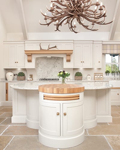
“The island was a particularly important feature, since it needed to look good from the doorway as you enter the room,” explains Walker-Lewis. “It’s also the first thing you pass as you come in, so I wanted it to be curved rather than angular, to keep the flow of the room soft.”
Her design is a half-circle, around which the bar stools are positioned (“A curve always makes for better social interaction than sitting in a straight line”) with curved panels in the knee space. At the top of the curve is a barrel unit, whose timber work surface is a pleasing contrast with its painted finish. The ‘business’ side of the island, opposite the hob and the sink, has an under-counter three-drawer freezer (there’s also a full-size larder fridge in the room) along with storage cabinets and more drawers, one of which has the house’s name, Bluebell Lodge, carved into its oak front.
“I was very careful not to make the island too big – it was essential that its surface could be cut from a single piece of granite to avoid joint lines,” says Walker-Lewis. “I had curved quadrants added to the corners to give a sense of softness.”
Above the hob is a customised mantel by Charles Yorke. Made with oak accents to help pick up on the oak detailing in the rest of the kitchen, it has swept-back arms to allow more surface space on either side of the cooking area. The panelling detail above it complements the cabinet doors and adds to the impression that these are pieces of furniture rather than a standard fitted kitchen. It echoes the other mantelpiece in the room, an even more imposing piece which sits above the wood-burning stove in the open fireplace.
Surprisingly, the room’s height posed few issues. “The beams and vaulted ceiling are stunning features and the furniture we chose for the kitchen complements them beautifully.” The room is filled with natural light and has spectacular views to both the front and rear, with even more light coming in via three little high-level windows.
Where the ceiling did give Walker-Lewis a headache was in working out how to light the island. She had incorporated task lighting into the hob and sink areas through under-cabinet LEDs, but there was no scope for this above the large expanse of granite. Her solution was to suspend a dramatic light over the island, which was sourced by the client. It’s enormous – so big, in fact, that it had to be assembled on site – but it’s entirely in proportion with the room.
“Scale is such a key factor in good design,” agrees Walker-Lewis. “If you don’t take it into consideration, or you don’t get it right, everything will feel unbalanced and out of place. If you’ve got high ceilings and you’re using a traditional style, it’s important to keep the cabinets high and in proportion. The same goes for flooring – a small tile will create a busy effect. In this project, we went for large slab on the flooring to complement the open-plan look. It worked well with the scale of the room.”
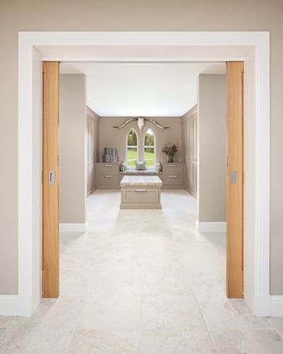
As well as the kitchen and adjoining utility room, Callum Walker Interiors had been commissioned to create the master suite bathroom and dressing room. “The clients had already considered how much storage was needed, so our main task was to refine the interiors and give the room added character to soften the tall storage,” Walker-Lewis recalls. The owners really had helped out, precisely measuring their existing wardrobe space to gauge how much would be required in the new dressing room, and specifying which of the various pieces of furniture from their old home were to be incorporated into the bedroom so that the room could be planned.
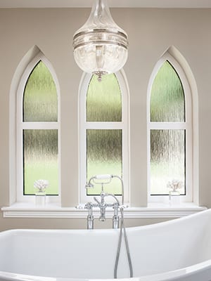
The key piece in the en-suite is a Callum Walker showroom ex-display bath, sourced by the owners; with a bit of minimal adaptation, it fitted harmoniously with the room’s colours and style. “One of the clients told me she loves it,” smiles the designer. “She says when she’s in the bath, it makes her feel like she’s at the Savoy. In fact, she says, it’s better than the Savoy!”
Considering the quality of the finishes and the scale of the job, the fitting out of the kitchen and the master suite was completed remarkably quickly, taking just four weeks during the year-long build. The preparatory work undertaken by the owners went a long way towards pre-empting any problems and meant that many potential hiccups were ironed out at the planning stage.
Finding the right craftsmen was also crucial, and geography helped, too. “We’ve worked in every part of Scotland, sometimes in quite remote places, so it was fantastic to be close to our studio base for a change,” says Walker-Lewis. “Having the clients based locally during the build was a bonus too, and made all our communication so easy.”

This is not to say that there weren’t anxious moments. The owners had meticulously chosen their colour palettes months before, and had clearly visualised how the new interiors would look, but actually bringing everything together (including their existing furniture, much of it now repainted or reupholstered) was nerve-racking – would it look as good in the flesh as it did on the plans? They needn’t have worried; aided by a commitment to working with high-quality local suppliers, including Dunkeld’s Jeffreys Interiors and Perth’s Adam McNee Interior Design, who supplied many of the new furnishings, the overall elegant look came together beautifully.
The skilled craftsmanship and careful planning is not restricted to the interiors. Through the gates made by Steven A. Bell Blacksmiths and past the ‘Bluebell Lodge’ sign made by Boyles Stonemasons, both local firms, there is much to admire in the understated exterior. Chartwell Green paint sings against the stonework. The garden, newly laid with lawns, has two seating areas, one of which is covered. Both invite quiet contemplation of the lush surroundings.
At the back of the house is a playhouse for the owners’ grandchildren, who are regular visitors. A wooden sculpture sits at the entrance to the guest annexe and two tall topiary twists flank the main door. Up on the roof, the attention to detail continues, with an Oxford-style clock cupola and cockerel weathervane by Good Directions.
It’s no wonder the owners say they feel immensely proud every time they return home. It took a while to get there, but the wait was most definitely worth it.


