Enriched with texture, colour and pattern, a penthouse in Glasgow’s west end
Love this project? Steal the style with our moodboard
DETAILS
What A renovated, extended penthouse with roof terrace
Where Glasgow’s west end
Interior designer Margot Paton and Abigail Crowther, Chelsea McLaine
Photography Susie Lowe
Words Catherine Coyle
This impressive penthouse in the west end of Glasgow had been in Margot Paton’s family for over ten years when she was faced with the dilemma of whether to do it up and move in – or sell up and move on. Her son, Matt, had been living there for a long time and it felt like a real bachelor pad (“The scheme was very monochromatic, with lots of grey”). But with him in the process of packing up, she and her partner, David, tried to see it through fresh eyes.
“This place is just so unique,” she explains. It really is one of a kind: the apartment is part of a converted former telephone exchange, and it has so many intriguing original features, including very unusual proportions.
In the end, won over by the flat’s amazing roof terrace, she and David decided to move in and embrace the opportunity to make some changes. Margot, the design director of interiors firm Chelsea McLaine, certainly didn’t waste any time overhauling the interior to better reflect her own style.
The property’s high ceilings had been necessary to house all of the communications equipment and wires when the building operated as an exchange, with a further two-foot gap above that for air circulation. Its listed status means that original elements such as these can’t be altered. Margot was unfazed: she has embraced the lofty ceilings to layer colours, textures and patterns to great effect.
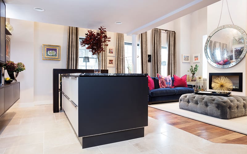
With colleague Amber Wiseman, she began in the open-plan kitchen, dining and living area, where the first task was to reconfigure the layout to suit her lifestyle. “Previously, the kitchen was like an enclosed pod to the right as you entered the main space,” she explains. That was too limiting for someone who likes to cook and entertain, so she began by removing a wall that separated the kitchen and the lounge area.
At the other side, she realised she didn’t need a large dining table and that the space would be better served with a bespoke island and breakfast bar. “We were out with friends one night at a champagne bar, and David fell in love with the granite that had been used as the bar top,” she recalls. “The design for the kitchen really emerged from that.”
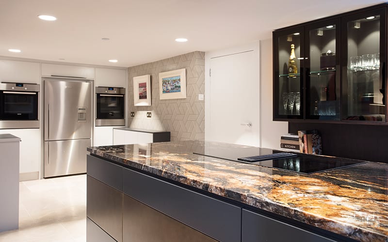
Back at the Chelsea McLaine studio, a search to match the granite was launched; eventually, an unfinished piece of the right colour and veining was sourced in Italy, and it was fashioned by the specialists at Hillington’s Rocca into the black island that forms the centre point of the new kitchen. “I knew I didn’t want a standard kitchen,” says the designer. “I wanted it to look furnished rather than fitted, and to be a part of the living space.”
With her in-house cabinetmaker on board to fashion the black display cupboards, island and breakfast bar (the latter using Cosdon handle-less units in a graphite and brass finish), Margot was able to create a very detailed, bespoke look that mirrors the high-spec furnishings elsewhere in the open-plan space. “The shadow gap between the lip of the island and the top of the drawers, for instance, is a detail that you just don’t get unless it’s a bespoke piece,” she points out.
Lights by Occhio, recessed into the lowered ceiling, pick up the golden, metallic shimmer in the granite. Equally worthy of note is the Miele hob with its internal extractor fan. “For open-plan kitchens, it’s a real find,” says Margot.
The motor is quiet and turns on as soon as you start cooking, sucking up smells and steam instantly. It has the added bonus of solving the problem posed by the planning restrictions that prevent alterations to this listed building – an extractor could not have been installed via the walls, floor or ceiling, so this integrated model from Miele is ideal.
Splitting this huge space into different zones has helped make it feel more manageable. It has also allowed the various sections to be dressed individually; they can be bold and make a statement, but without overwhelming the whole room.
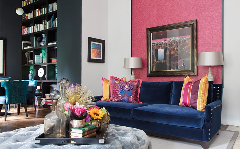
This can be seen in one previously underused corner: now that the large dining table has been removed from the kitchen area, a smaller dining nook has been fashioned on the other side of the living space, making this a much more stylish and practical corner of the room. A commissioned artwork by Gordon Wilson shines against a dark, almost-black wall, painted in Zoffany’s Ink.
Scale is everything. Overhead is a pendant by Chantelle Lighting, a statement piece that draws the eye to the ceiling (bypassing the vast expanse of wall), which has been covered with a matt textured paper by Arte that mimics the properties of tin tiles; it allows the light to pick up the pattern and shimmer, and effectively makes this corner feel more in proportion.
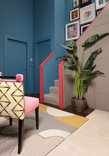
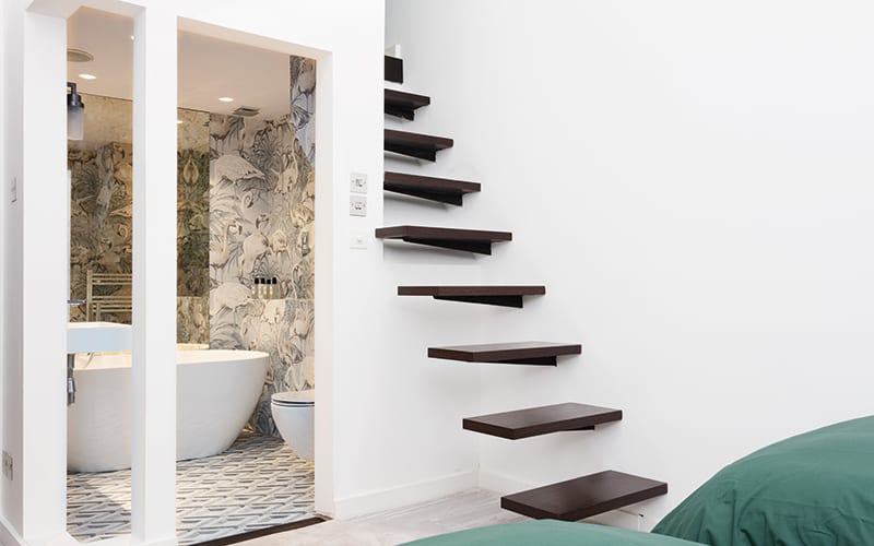
There are three bedrooms off the hallway, each of which has its own en-suite. Rather than being nothing more than a passageway leading to other spaces, the hallway has been treated as a room in its own right, with made-to-measure walnut cabinetry providing useful hanging and storage space, a dedicated gallery in the stairwell and a feature wall, framed like a piece of art.
The master suite is a lesson in the importance of lighting. As elsewhere, Margot has taken a layered approach here, with dimmer switches and bedside reading lights to create mood and change the atmosphere for nocturnal luxury. The room is relatively tall and narrow, but the decorative choices give the illusion of balanced space.
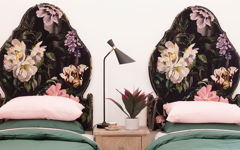
A custom-made Charlotte James headboard upholstered in a Nobilis fabric is set boldly against Jim Thompson’s impactful Bamboozle wallpaper; these are daring additions that might not have succeeded in an ordinary-sized room, but here they work hard to harmonise the proportions. An opaque glass pocket door to the en-suite saves vital floor space too.
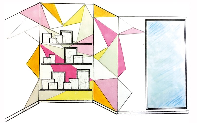
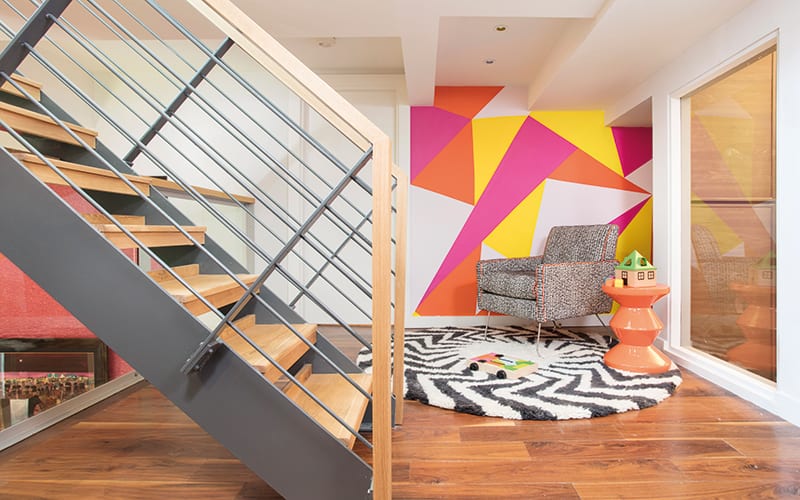
Knowing they’d often have family to stay and friends to entertain, it was important to Margot and David to make the best use of the upper levels in the penthouse. The mezzanine connecting the lower and upper floors had been a bit of a no-man’s-land before, but it has since been rejuvenated as a children’s playroom (complete with a hand-drawn geometric mural by Chelsea McLaine’s Abi Crowther, who played a key role throughout this project), and equipped with furniture for crafts and games.
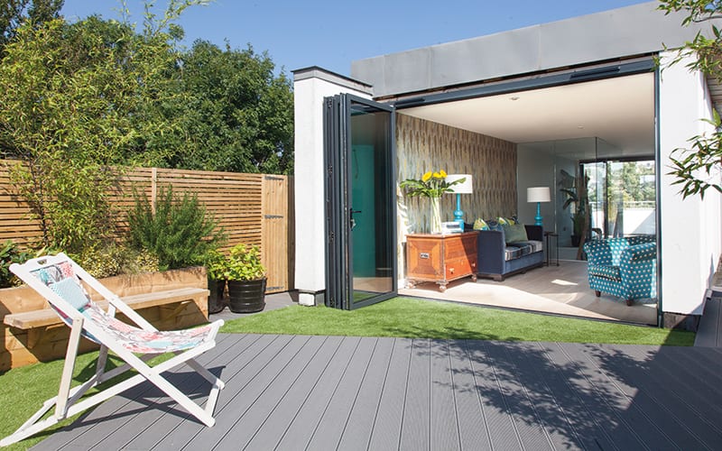
The staircase leads to the top floor, where Margot and David have devised a multi-purpose space that capitalises on their roof terrace. “We use this floor all the time – it’s enclosed, so it’s perfect for kids and dogs. It’s also a real suntrap. It’s the best thing we ever did.”
The building’s listed status made it a challenge to get services up to this level, admits Margot, and installing the likes of underfloor heating became difficult as a result. Everything had to be carried up the many staircases. The bi-fold doors, for example, had to be brought up in sections and reconstructed in situ. David’s friend, the architect Alan Park, helped with the necessary planning and paperwork.
Creating the glazed room was a huge undertaking, but the results prove it was worth it. “One of us can be watching television or working up here and you don’t see the lights or hear any sound elsewhere in the apartment,” says Margot. She drew on her surroundings to inform the decoration of this room:
“With almost 360-degree views, the outlook is incredible. My task was to add softness through the furnishings, bringing in pattern and creating a calm oasis.” She has used textiles but limited the number of patterns: there’s Maringa wallpaper by Arte and turquoise accents in the Babylon lamps by Heathfield, but it’s the views across the city beyond the glass that rule here.
An important addition to this roof den is a work by Gary Brander that Margot commissioned the Scottish artist to paint for David, based on a photograph she’d taken on a trip to Portland, Oregon. It depicts a rusty barn belonging to the pilot of the plane David’s father, a navigator, flew in during the Second World War. It’s a beautiful piece whose deep hues conjure up the blueberry farm where the barn is found, while also serving as a discreet reminder of a lost loved one. The colours come alive in the natural daylight that bounces off the glazed surfaces all around.
“We looked at what we had, appreciated this apartment and made it work for us,” says Margot, as she gazes out across the city skyline.


