The discovery of rot could have stopped this project in its tracks. Instead, it forced a rethink of the plans – and a radically better design emerged

DETAILS
What A three-bedroom new-build
Where Musselburgh
Architect A449 Architects
Contractor Gloss Projects
Photography David Barbour
Words Caroline Ednie
You never know what you’re going to discover when you embark on a renovation. Your project might look as if it needs nothing more than cosmetic improvements, but the minute you scratch the surface, you risk biting off more than you can chew.
That was the case for Archie and Tricia Macdonald and their Musselburgh seafront home. It appears always to have been here in its current form, so seamlessly does it fit into the stone sea wall. However, the story of its recent reincarnation from a dark 1980s steading conversion into a light-filled three-bedroom family home is one that took quite a few twists and turns, before eventually emerging as a contender for the RIBA House of the Year.
It’s a story with a personal angle too, as the house has been in Tricia’s family for nearly 60 years. “My parents bought the site in 1959,” she explains. “There was a house already there, but it had been burnt out. So my father, who was an architect, developed it and we eventually moved in in 1961. By the time my sister and I left home, it had become too big for my parents on their own, so my father developed an outbuilding/steading at the back of the house for them and they moved there in the early 1980s. They split the plot in two and sold off the portion with their old house. So the site of where Archie and I live now was the original stable development.”
They moved in in 2013, at which point the shortcomings of the 1980s conversion had become very apparent. “It was too small, for a start,” says Tricia. “There was only one bedroom and bathroom. And, despite its location, it had almost no view of the sea.”
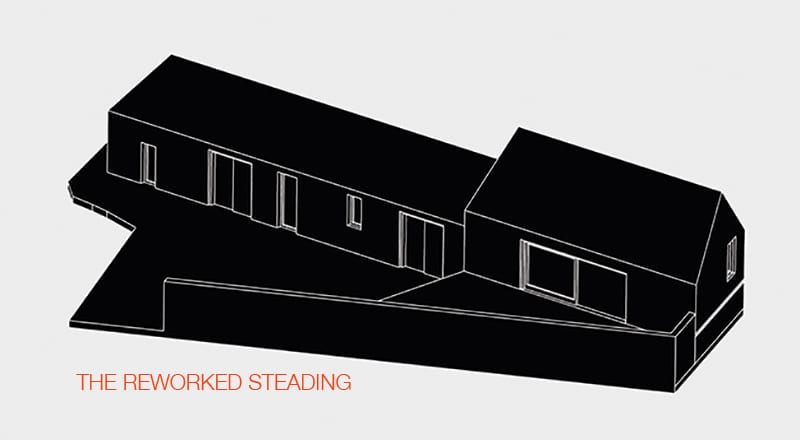
Word of mouth led the couple to local Portobello-based architect Matthew Johnson of A449 Architects. Their initial brief was modest: an additional bedroom and bathroom was the main request, along with opening up the house to the sea views. Following discussions, Johnson devised a plan that involved some reconstruction of the original cottage and an extension to the east. Planning permission was granted without a hitch and the contractor was appointed in 2015. At this point, however, the game changed.
“When the builders took off the roof of the original cottage they discovered some rot in the rafters. So we were looking at a replacement roof. And when they investigated a bit further, they discovered the walls were a bit shoogly,” recalls Tricia. “So the architect came up with another plan: if we knocked down the three walls of the original cottage, with just the sea wall remaining, we could approach it as a new-build and we’d save the VAT.”
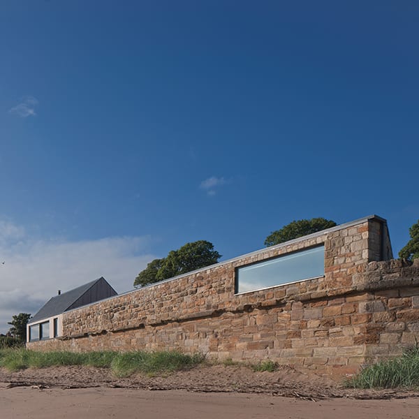
Matthew Johnson explains the starting point, and heart, of the new design. “Only the sea wall, robust enough to withstand the tide, was in a suitable condition to be retained, so the remaining walls were rebuilt to ensure the structural and thermal integrity of the new house. We love the fact that this wall, essential in holding back the sea for so long, has become an integral part of this new building.”
There were clearly many advantages to the radical design rethink. “The original building was introverted and largely hidden from the public realm,” points out Johnson. “We wanted to change that with a prominent new addition that responded more appropriately to the location. The logical position for this new extension was the raised terrace at the east end of the site.”
It also made sense to offer the most frequently used spaces the opportunity for the best view, so the new pitched roof extension houses the double-height living, kitchen and dining spaces. To the south side, a large sliding glazed panel provides access to a garden terrace, while to the north another 6m-wide panel allows panoramic views to the coastline.
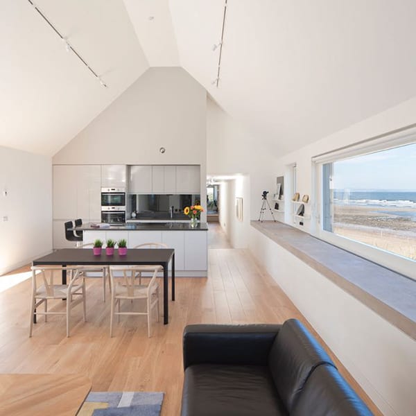
“Externally, the wedge-shaped extension footprint enabled us to create a distinctive interpretation of a traditional gable form. From the road to the south and east the gable is defined and pronounced, while from the beach to the north it blends harmoniously with the rest of the elevation.”
The main entrance creates a clear distinction between the ‘public’ living space in the new extension, and the ‘private’ spaces in the original stone steading to the west. This area now features a 23m-long corridor running the full length of the existing steading, and incorporates a utility area, an en-suite master bedroom and a guest bedroom and bathroom, culminating in an office space.

Glazing at each end frames views including Inchkeith and the coast of Fife, and, to the north-east, the Isle of May and the island of Fidra and its lighthouse. Further round when the sun is in the west, the top of the Bass Rock can be seen jutting above the Gullane dunes.
Following acceptance of the radically revised planning application, the house in its current form began to take shape, watched closely by Archie and Tricia, who rented a property nearby during the 17-month project. “I was just keeping an eye on things,” says Archie. “And it worked out well, as I would often be there when the contractor had some queries; it meant that any changes could be made there and then.”
During construction, the couple also took the opportunity to source and organise many of the internal details, such as the kitchen, which they chose from Wren and had installed by the contractor. The emphasis throughout is on simple, high-quality finishes and hardwearing materials, such as the engineered oak floors atop the underfloor heating. “We were constantly looking at the contract to see what was allocated to different things and finishes,” says Archie. “The contract tended to go for the best possible option, while we were trying to go for a compromise between the best and what we could afford. We could have spent an awful lot more on some aspects, such as lighting. But the main thing is that the fabric of the house and the whole build quality is the best.”
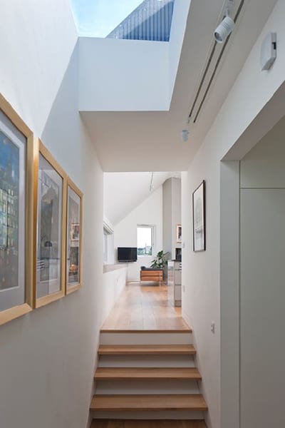
The house they’ve ended up with is quite a change to what they were used to. “Our previous home was a basement flat in the centre of Edinburgh, so this new house, with its cathedral ceilings and amazing views, is an incredible contrast,” says Tricia. “Our old house had a big garden that needed a lot of work – it was on a steep slope, with lots of steps, and was actually one of the reasons we wanted to move. Here, we’ve deliberately created a garden that is very low-maintenance. Archie is a great gardener and he organised it. It didn’t come from a plan, it just evolved, really, from discussions one morning standing here with the contractor and Matthew.”
The radical design rethink had another positive outcome, namely that the house is now much more energy efficient, thanks to substantial solar gain, high levels of insulation and underfloor heating. “We’ve got a wood-burning stove but we have to think twice about putting it on, as it can get too hot. It’s just for decoration, really, as the house is so well insulated,” says Tricia. “For our first energy bill, we put the gas reading in and our supplier said it couldn’t be accepted. When we phoned up to ask why, we were told we hadn’t used enough gas for the reading to register! So, yes, in terms of energy efficiency, it’s performing really well.”
Their efforts over the past couple of years have really paid off. “Overall, the sea views are key to the living experience,” says Archie. “We also love the idea of the long corridor which has our bedroom and dressing room off it. That works really well. We also effectively have two guest bedrooms now, with the study at the far end of the sea wall doubling as a bedroom, which is great when the family come to stay. We can have guests staying with minimal disruption.”
In fact, there’s nothing the couple would change – well, apart from perhaps just one thing: “The only slight drawback at the moment is that our bedroom window is a sliding door, which means that Hector, our five-year-old Lakeland terrier, can run in and out whenever he wants!” says Tricia. “We might have made the window the same width but up a level! But everything else is perfect.”


